wikipeida version - https://en.wikipedia.org/wiki/Human_processor_model
(material from:
Designing the User Interface bySchneiderman, SIGGRAPH 96
course notes #12 - Graphic Design for Usable GUIs)
So far we have talked a lot about fairly conceptual things, now we're going to talk some about putting some rough numbers to those concepts ...
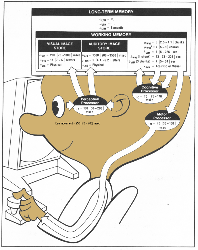
the Model Human Processor
approximation that allows us to make some predictions
wikipeida version -
https://en.wikipedia.org/wiki/Human_processor_model
Model Human Processor- p26 of The Psychology of Human-Computer Interaction
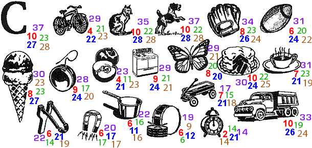
chunks
BCSBMICRA
CBSIBMRCA
or
4865267437
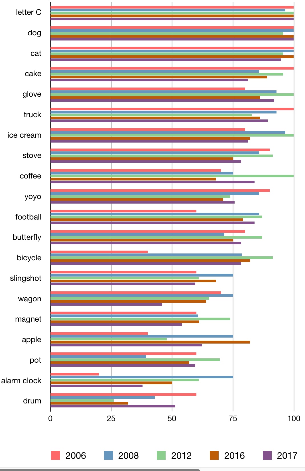
Here is what the results look like from my last four cs 422 classes
Comparing the
last five classes:
A bit more on
text. You have several general choices of font styles to use
Fitts's Law - Paul Fitts - 1954 - Speed and Accuracy in
Hand/Arm Movement
time
Tpos to move the hand to a target of size S which lies distance D
away is
Tpos = IM
log2 (D/S + 0.5) where IM = 100 [70-120]
msec/bit
Faster to hit a bigger target. Faster to hit a
closer target.
Different IM constants for
different devices (finger, mouse, joystick, trackball)
Predicts human speed in rapid aimed
movement in one dimension
Others including MacKenzie and Buxton have made modifications to
create 2D
and 3D versions where it is the smaller dimension of
the target area that is critical
Tpos = IM
log2 (D/min(S1,S2) + 0.5) where IM = 100
[70-120]msec/bit
A very detailed discussion can be found here: http://www.yorku.ca/mack/phd.html
and wikipedia: http://en.wikipedia.org/wiki/Fitts's_law
So why should we care about this?
A
Web-based Interactive Visualization
http://www.simonwallner.at/ext/fitts/
or http://fww.few.vu.nl/hci/interactive/fitts/
MSDN article on Fitts and Web Design
http://msdn2.microsoft.com/en-us/library/ms993291.aspx
With computer screens we also have the advantage of having edges
to the display that can stop our pointer from moving, making it
hard / impossible to overshoot targets at the edges, which is why
most menus sit there, but if you are mostly working in the center
of the display, it can make more sense to have pop-up menus appear
nearby to minimize movement.
Power Law of Practice
time
Tn to perform a task on the nth trial follows a power
law
Tn = T1n-a
where a = 0.4 [0.2 - 0.6]
note this is just skilled behaviour using perceptual
and motor skills, not knowledge acquisition.
you will get better as you continue to perform as task, but the amount of improvement keeps decreasing ... though fatigue will also be a factor.
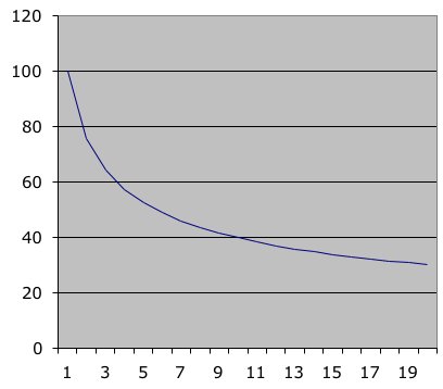
Vertical axis is time (seconds), Horizontal axis is trial number
First time users
will be near the left side of the graph, everyday users to the
right.
If you want to
test how every day users perform with your new interface then you
need to make sure to let them practice with it enough to get past
the issues of initial use.
Keystroke Level Model - Card, Moran, Newell - 1983
only
gives predictions for execution time, not acquisition time
(planning)
these numbers are based on mouse & keyboard
but they are easily applicable to track pads, pens, and touch
screens as well
K
- Keystroking - striking keys
(pressing
a shift or a control counts as a K as well)
best
typist 0.08 sec (135 wpm)
good
typist 0.12 sec (90 wpm)
poor
typist 0.28 sec (40 wpm)
non-typist
1.20 sec (9 wpm)
B - Pressing a mouse
button (or touching the screen)
down
or up 0.10 sec
click
0.20
sec
P - Moving the mouse at
a target (numbers are slightly different for just moving your hand
or a pen)
fitts
law 0.1 log2(D/S + 0.5)
average (mouse) 1.10 sec
H - Homing - switching
hand between mouse and keyboard 0.40 sec
M - Mentally preparing
for a physical action 1.35 sec
R - System response
Ms are hard to place - there are a set of heuristics (p 267 Card book)
Say
we are using a word processor and see an incorrect character on
the screen. We use the mouse to position the insertion bar,
delete the incorrect character, add the new character and then
return to where we were in the document:
| 1 | move hand to mouse | H[mouse] |
| 2 | position mouse after bad character | PB[left] |
| 3 | return to keyboard | H[keyboard] |
| 4 | delete character | MK[delete] |
| 5 | type correction | K[char] |
| 6 | reposition insertion point | H[mouse]MPB[left] |
How useful
are all these numbers really ???
exercise for the
end of today's class - in a group of 2 (one with a computer) work
out the keystroke level sequence (Ks, Bs, Ms, etc) for the
following task - trying to make a reservation for a Valentine's
Day dinner:
- bring up a new browser window
- go to google
- search for top chicago restaurants
- Click on the Girl & the goat to see google’s data on it
- click on the menu link to go to the Girl & the goat website
- try to find a table for tonight
Evolution of the word processor as the technology improves
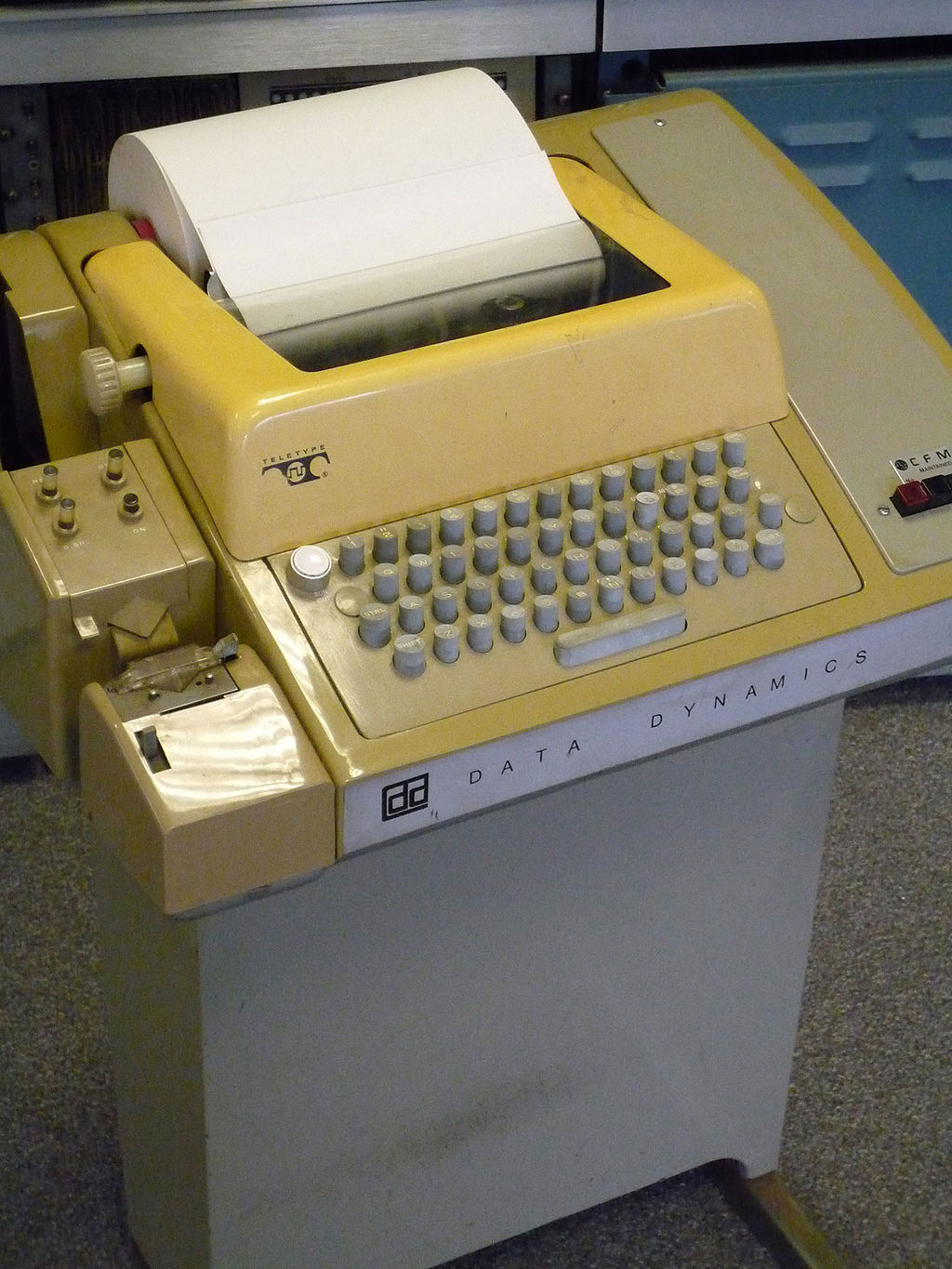 Image from
Wikipedia
Image from
Wikipedia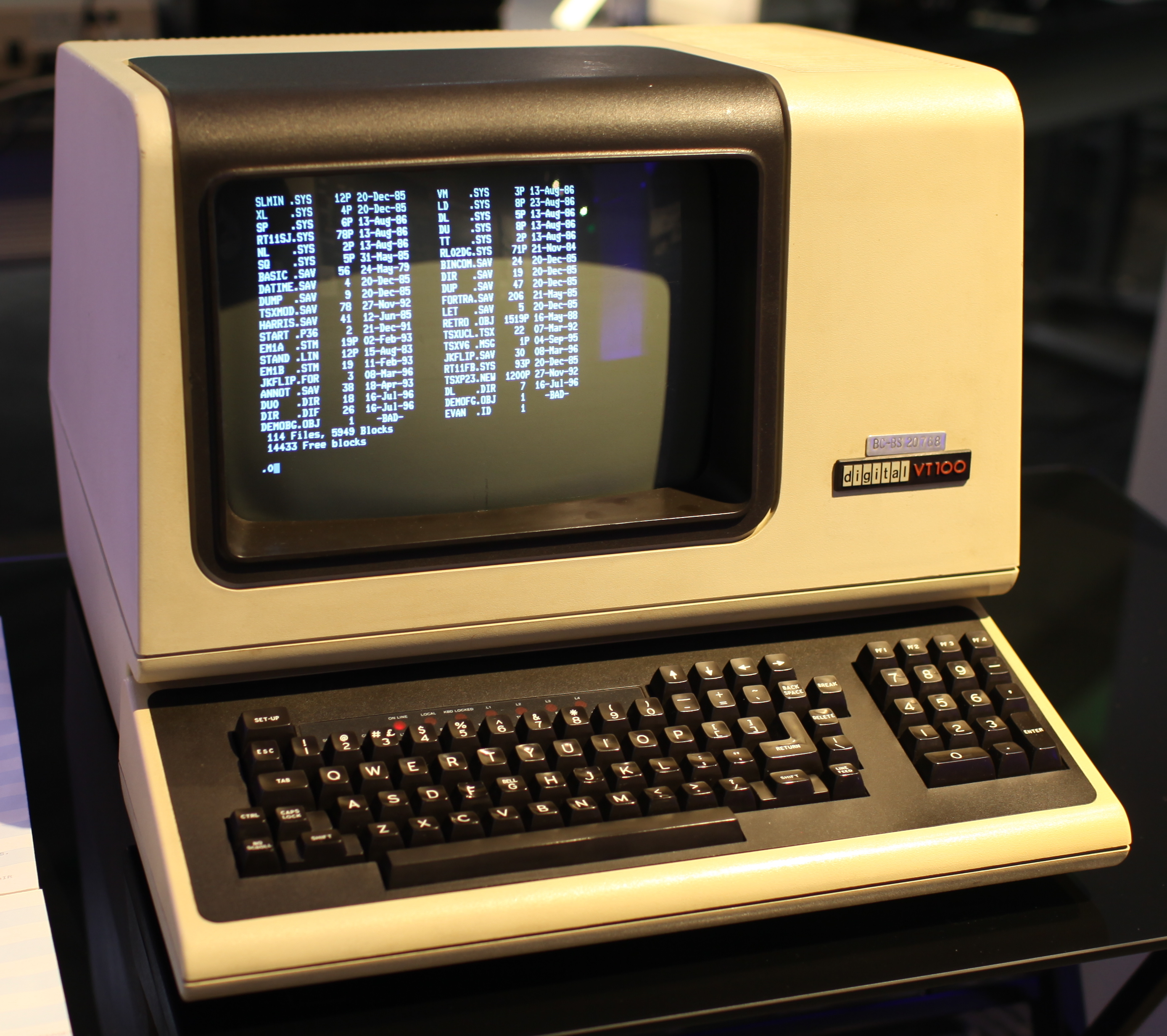 Image from
Wikipedia
Image from
Wikipedia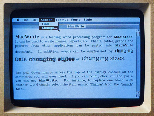 image from BoyceBlog
All of the previously mentioned concepts end up being dealt with in terms of windows, icons, dialogue boxes, and menus
the middle of the course will deal with principles for designing these in more detail. Here are some general rules which should help with the projects before we revisit these again in detail
windows
give the user the ability to see multiple pieces of information at the same time
icons
now imagine you
have only a 32 x 32 or 128 x 128 pixel grid to display that
icon.
icon sizes have
become much, much larger for desktop computers, laptops, and
tablets - but devices such as watches, google glass etc are back
to having smaller displays - gizmodo
menus are lists
of verbs, nouns, adjectives and adverbs
on devices with
displays we see the menus visually, but we can also have
audio-only menus like we used to have on classic telephones, but
which are also making a comeback in audio interfaces
menus
dialogue boxes are 2D layouts of verbs, nouns, adjectives
and adverbs
dialogue boxes
When asking the user to enter data, try to help by making the
expected format obvious in the form
Of course this is tricky because all of these things are culturally dependent
Many tools exist for building interfaces and they change fairly regularly