The project will take a look at termperature data collected from various rooms in evl over the last six years. You job is to create an interactive visualization and analysis tool to help the user better understand what affects the temperature in evl. This tool will allow the user to decide things such as: how warm to dress for a given day and room, where to place new equipment so rooms and the equipment don't get too hot, how to change the settings for the university heating and cooling, etc.
For the last six years we have used a one-wire system to monitor temperatures in the lab. Every minute new temperature data is collected and displayed. Each hour the current temperatures are saved to a text file. At this point the data comes to 15 MB.
The data is available at www.evl.uic.edu/aej/424/11p1data/history.txt.zip
In this case the data is already pre-processed to be an appropriate size and in an easily readable form. That won't hold true for the later assignments.
Each line of the file looks like: May/04/2008 10:00 PM FF00080057FB1810 67
The first element is the date, the second is the hour and minute, the third is AM or PM, the fourth is the sensor ID, and the fifth is the temperature in degrees Fahrenheit.
The temperature sensorIDs can be correlated to rooms
- 3B00080058124B10
- meeting room - 1
- 73000800B1D9BD10
- main lab - 2
- DB000800B1E8E710
- machine room - 3
- F2000800B1D88510
-
lounge
- 4
- 35000800B1EC2510
- prototype space - 5
- DB00080041634E10
- classroom - 6
- FF00080057FB1810
- office space - 7
Here is a small map showing where the various rooms are geographically. While this project will primarily rely on graphs to show the data, you will very likely need to show some kind of simplified map as an informational graphic to tell the user which room is which.
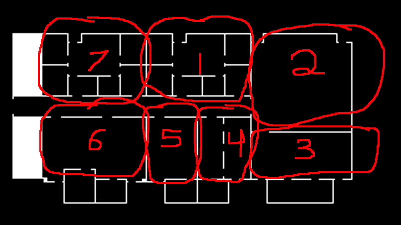
There is a non-annotated version of the map at www.evl.uic.edu/aej/424/11p1data/evl_2nd_floor.jpg that you might help.
in general the data is collected on each hour (eg 10:00) but if the program was offline at that time it might be at a different minute, or there might be several in the same hour if the program is stopped and started again. There may also be holes in the data due to power failures or program crashes.
While the data files contain a few more days, for this project we will focus on the days from aug 1 2005 through jul 31 2011
You should start by looking at data itself and do some simple plots and statistics in your favourite spreadsheet / plotting program. This will give you an idea of the range of the data and what data is missing. If you haven't used shell scripts before to parse data then you should become acquainted with them. grrep, awk, sed and their friends will save you a lot of time.
What kinds of patterns are visible? Your job is to help the user look beyond the cyclical patterns for longer term trends and aberrations that are hiding there, and see what changes in the real world could have caused them. Some of these changes are related to how hot a summer was or how cold a winter was, others are related to human behavior - when are people coming in to the lab and turning on machines? when does the university turn on the heating or the air conditioning?
The goal here is to create an interactive visualization tool to aid in your analysis and to back up any conclusions you draw.
You will very likely need to relate this data to other data sources such as the schedule of classes, outdoor Chicago temperatures, calendars.
Your visualization and analysis tool should be written in processing. As this is primarily a graph-based visualization the Milk / Tea / Coffee example should give you a nice head start on this. As graphs are a very common visualization this will give you a chance to write a set of graphing code that you can reuse and improve in future assignments.
You should start by getting processing installed and doing some initial tests to load in the data and start displaying it. You should then start to draw some sketches of what the interface might look like and how you want to arrange and display the data. You can use other software to generate statistics about the data if you find that useful but be sure to document that process. Be careful of missing data when you generate statistics.
Also be careful of leap years, and how the days of the week shift from year to year.
In past terms the students have shown a desire to show all of the data to the user right away. You should be careful not to overwhelm the user. As Schneiderman said "overview first, zoom and filter, details on demand." Appropriate levels of aggregating data will be very important here.
It is also important to note that 'getting it to work' is just a prerequisite to using the application to find answers to your questions. It is that usage that will give you ideas on how to improve your app to make it easier and more intuitive to find those things.
The application you create should help the user perform the following tasks:
Task #1 - document the repeating seasonal patterns
Task #2 - given the results from task #1, document the long term trends and short term variations in those patterns
Task #3 - given the results from task #2, what are the events that have the largest affect the data. What are the dates where the pattern changes.
Task #4 - Predict the average room temperature in each EVL room for October 2011 and November 2011. At the end of the course we will see who was the best predictor. Note that taking an average of all the previous data will likely make a very poor prediction. There are trends in the data that you should take into account when making your predictions. The results should be given in this format on your web page:
- 3B00080058124B10, average 10/11 in F, average 10/12 in F
- 73000800B1D9BD10, average 10/11 in F, average 10/12 in F
- DB000800B1E8E710, average 10/11 in F, average 10/12 in F
- F2000800B1D88510, average 10/11 in F, average 10/12 in F
- 35000800B1EC2510, average 10/11 in F, average 10/12 in F
- DB00080041634E10, average 10/11 in F, average 10/12 in F
- FF00080057FB1810, average 10/11 in F, average 10/12 in F