- R - https://www.r-project.org
- R studio - https://www.rstudio.com
- Shiny - https://shiny.rstudio.com
- Shiny Dashboard - https://rstudio.github.io/shinydashboard
- leaflet for maps - https://rstudio.github.io/leaflet
- ggplot2 - https://r4stats.com/examples/graphics-ggplot2
and http://www.sthda.com/english/wiki/ggplot2-essentials
- R cookbook - http://www.cookbook-r.com
- Visual Studio Code - https://code.visualstudio.com
- Swirl for learning R - https://swirlstats.com
Start RStudio and you should see something similar to a modern IDE with an area for viewing and editing code, a terminal, an area for seeing the current state of the R environment, and a multi-purpose area.
A lot of the power of R comes from the variety of packages that can be installed into it
To see what packages are currently installed, in the terminal at the > prompt, type installed.packages()[,1:2]
To see which packages are out of date type old.packages()
To update all old packages type update.packages(ask = FALSE)
Some useful libraries to install with install.packages()
include:
- shiny
- shinydashboard
- ggplot2
- lubridate
- DT
- jpeg
- leaflet
I will be going through a demonstration of using these tools to visualize some local temperature data in class. For over 15 years we have been collecting temperature data in the various rooms of the lab, trying to understand why the temperature used to change so dramatically at times, trying to keep the people and the machines here happy.
The relevant files are located here
What this code produces is interactive, hosted on the shiny site, here
and a snapshot below:
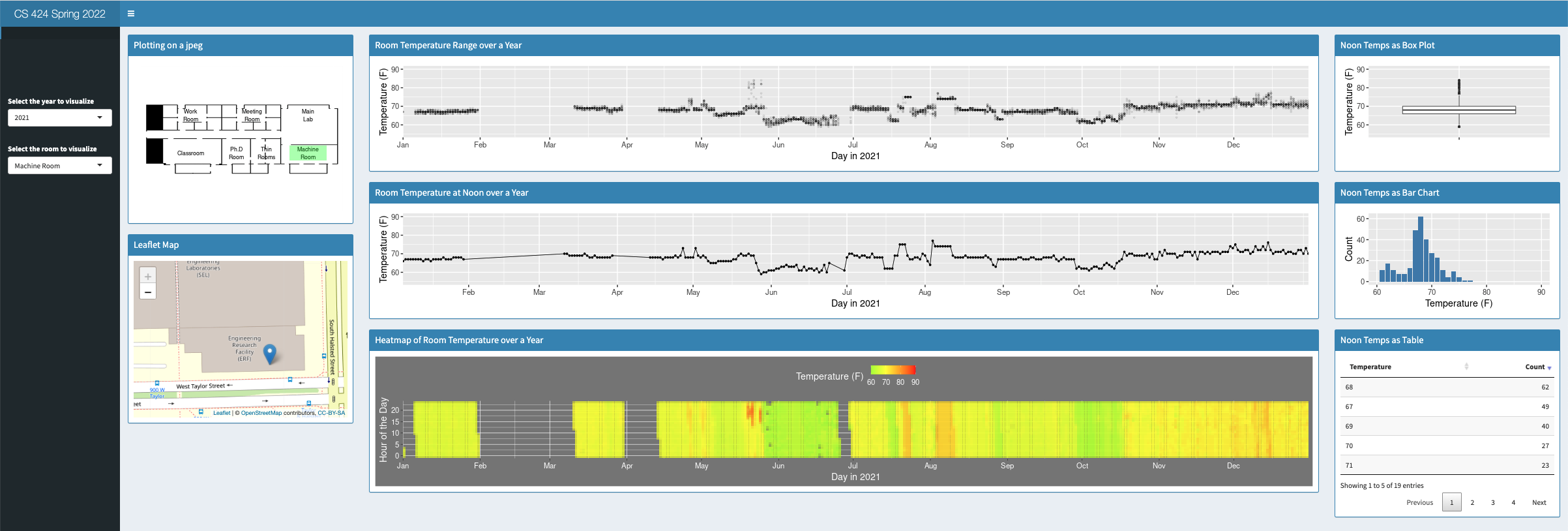
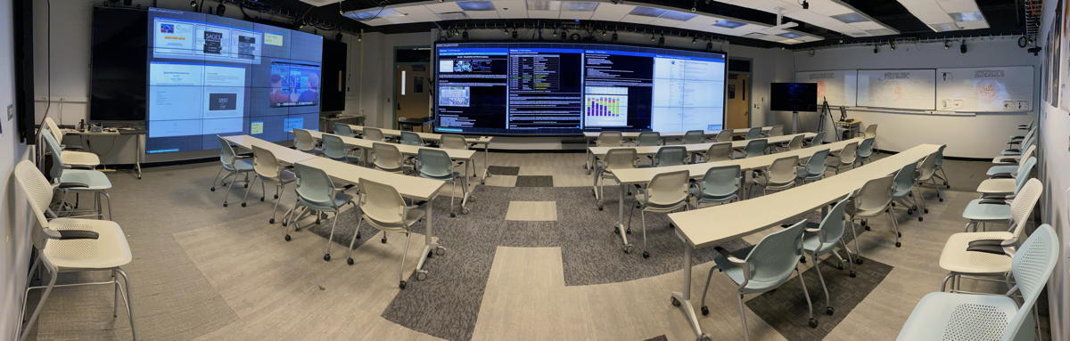
The visualization was designed to run as a compromise between an HD display and our wide classroom wall and in either case be touch-screen compatible, which is also why the version you download has the menu at the upper left slightly lowered so people could reach it to interact with it at the wall. The projects will involve developing and demonstrating visualizations for this classroom wall.
Lets play a bit with the evl temperature data using R and R studio. As you go through this tutorial take a screen snapshot including each of the visualizations. You will be turning these in through gradescope.
one nice way to do this is to copy and paste the following relevant commands below into the RStudio console (in the lower left panel of R studio) one by one to see their affect on the current environment.
download a copy of the evlWeatherForR.zip file from the 'relevant files' link above and unzip it.
set the working directory to the evlWeatherForR directory
setwd("dir-you-want-to-go-to")
test if thats correct with
getwd()
to get a listing of the directory use
dir()
read in one file
evl2006 <- read.table(file = "history_2006.tsv", sep = "\t", header = TRUE) ... be careful to avoid smart quotes. You should now see evl2006 in the Global Environment at the upper right
take a look at it
evl2006
and then some commands to get an overall picture of the data:
str(evl2006)
summary(evl2006)
head(evl2006)
tail(evl2006)
dim(evl2006)
hmmm almost all the fields are integers including the hour and the temperature for the 7 different rooms, but Date is a factor - what is a factor? use the Help viewer in R-Studio. R assumes that this is categorical data and assigns an integer value to each unique string.
convert the dates to internal format and remove the original dates
newDates <- as.Date(evl2006$Date, "%m/%d/%Y")
evl2006$newDate<-newDates
evl2006$Date <- NULL
we didn't need to use the
intermediary newDates, but it can be safer when you are starting
out so you can check your results before you write over things
you didn't mean to. Right now our data sets are small enough
that we shouldn't need to worry about running out of memory.
if we use str(evl2006) again, now we have newDate in date format
try doing some simple graphs and stats
plot all temps in room 4 from 2006 using the built in plotting
plot(evl2006$newDate, evl2006$S4, xlab = "Month", ylab = "Temperature")
we can set the y axis to a fixed range for all temps in a given room
plot(evl2006$newDate, evl2006$S4, xlab = "Month", ylab = "Temperature", ylim=c(65, 90))
the built in plotting it nice to get quick views but it isn't very powerful or very nice looking so now lets get the noon temp and plot it for one / all the rooms using ggplot
if ggplot2 is not already installed then lets install it
install.packages("ggplot2")
and then lets load it in
library(ggplot2)
we want values from evl2006 where $hour is 12
noons <- subset(evl2006, Hour == 12)
we can list all the noons for a particulate room
noons$S2
note that you can see similar information in the environment panel at the upper right
or plot them
ggplot(noons, aes(x=newDate, y=S2)) + geom_point(color="blue") + labs(title="Room Temperature in room ???", x="Day", y = "Degrees F") + geom_line()
we can set the min and max and add some aesthetics
ggplot(noons, aes(x=newDate, y=S2)) + geom_point(color="blue") + labs(title="Room Temperature in room ???", x="Day", y = "Degrees F") + geom_line() + coord_cartesian(ylim = c(65,90))
add a smooth line through the data
ggplot(noons, aes(x=newDate, y=S2)) + geom_point(color="blue") + labs(title="Room Temperature in room ???", x="Day", y = "Degrees F") + geom_line() + coord_cartesian(ylim = c(65,90)) + geom_smooth()
no points just lines and the smooth curve
ggplot(noons, aes(x=newDate, y=S2)) + labs(title="Room Temperature in room ???", x="Day", y = "Degrees F") + geom_line() + coord_cartesian(ylim = c(65,90)) + geom_smooth()
just the smooth curve
ggplot(noons, aes(x=newDate, y=S2)) + labs(title="Room Temperature in room ???", x="Day", y = "Degrees F") + coord_cartesian(ylim = c(65,90)) + geom_smooth()
we can show smooth curves for all of the rooms at noon at the same time
ggplot(noons, aes(x=newDate)) + labs(title="Room Temperature in room ???", x="Day", y = "Degrees F") + coord_cartesian(ylim = c(65,90)) + geom_smooth(aes(y=S2)) + geom_smooth(aes(y=S1)) + geom_smooth(aes(y=S3)) + geom_smooth(aes(y=S4)) + geom_smooth(aes(y=S5)) + geom_smooth(aes(y=S6))+ geom_smooth(aes(y=S7))
show smooth curves for all of the rooms at all hours at the same time
ggplot(evl2006, aes(x=newDate)) + labs(title="Room Temperature in room ???", x="Day", y = "Degrees F") + coord_cartesian(ylim = c(65,85)) + geom_smooth(aes(y=S2)) + geom_smooth(aes(y=S1)) + geom_smooth(aes(y=S3)) + geom_smooth(aes(y=S4)) + geom_smooth(aes(y=S5)) + geom_smooth(aes(y=S6))+ geom_smooth(aes(y=S7))
we can play with the style of the points and make them blue
ggplot(evl2006, aes(x=newDate, y=S4)) + geom_point(color="blue") + labs(title="Room Temperature in room ???", x="Day", y = "Degrees F")
we can create a bar chart for all the temps for given room
ggplot(evl2006, aes(x=factor(S4))) + geom_bar(stat="count", width=0.7, fill="steelblue")
or just the noon temps (note that we only see temps that existed in the data so some temps may be 'missing' on the x axis (e.g. 79)
ggplot(noons, aes(x=factor(S5))) + geom_bar(stat="count", fill="steelblue")
we can do a better bar chart that treats the temperatures as numbers so there wont be any missing, and we can get control over the range of the x axis.
temperatures <- as.data.frame(table(noons[,6]))
temperatures$Var1 <- as.numeric(as.character(temperatures$Var1))
we can get a summary of the
temperature data
summary(temperatures)
summary(temperatures)
ggplot(temperatures,
aes(x=Var1, y=Freq)) + geom_bar(stat="identity",
fill="steelblue") + labs(x="Temperature (F)", y = "Count") +
xlim(60,90)
and then could create a box and whisker plot of those values to see their distribution
ggplot(temperatures, aes(x = "", y = temperatures[,1])) + geom_boxplot() + labs(y="Temperature (F)", x="") + ylim(55,90)
and then could create a box and whisker plot of those values to see their distribution
ggplot(temperatures, aes(x = "", y = temperatures[,1])) + geom_boxplot() + labs(y="Temperature (F)", x="") + ylim(55,90)
in this example we had several
temperature values for a given time in each row (called "wide
data") but sometimes you get "long data" where, in this case,
each of the temperature values would be in their own row with an
identifier saying which room it is. The reshape2 library can
covert between wide and long data. In this case we can convert
the noons data with
longNoons <-
melt(data=noons, id.vars=c("Hour", "newDate"))
ggplot(longNoons) +
geom_line(aes(x=newDate, y=value, color=variable))
or break them up into 7 separate
plots
ggplot(longNoons) +
geom_line(aes(x=newDate, y=value, color=variable)) +
facet_wrap(~variable)
so we have a lot of options here. Shiny allows us to give a user access to do these things interactively on the web using a GUI.
Some things to be careful of:
- be careful of smart quotes - they are bad
- be careful of commas, especially in the shiny code
- remember to set your working directory in R Studio
- try clearing out your R studio session regularly and running your code to make sure your code is self-contained using rm(list=ls())
- be careful of groupings to get your lines to connect the right way in charts
- be careful what format your data is in - certain operations can only be performed on certain data types
While we used R in RStudio last
time, today we are going to use R in a Jupyter Notebook. RStudio
and Shiny are nice for creating interactive applications on the
web and the IDE is very helpful for seeing information about the
data you have loaded and the functions available to you. Jupyter
is better for showing the sequence of an investigation through a
data set.
You should first should install
Anaconda (Individual edition, Graphical Installer) (with Python
3.8) to make the package management somewhat easier - https://www.anaconda.com/products/individual#Downloads
Then launch Anaconda-Navigator.
Then follow the tutorial here: https://docs.anaconda.com/anaconda/navigator/tutorials/r-lang/
through step 4 and create a new R notebook by going to Home in
Anaconda Navigator, Launching Jupyter Notebook, and then in the
upper right using the New dropdown to create a new R notebook.
Note that during the creation of the new environment choosing a
version of Python other than 3.7 might cause the install to fail
for incompatible packages.
Note that Anaconda and Jupyter
are using a separate set of R libraries from the ones in R
studio. There are ways to link the two, but for now this keeps
it simple. RStudio will likely be running R 4.1.X while Anaconda
will be running 3.6.X.