Week 1
Administrivia /
Introduction / History / OmegaLib Tutorial
Administrivia
Introduction
CS 526 Computer Graphics
II focuses on current topics in Computer Graphics and often acts
as a testing ground for new courses in this area here.
This term the course is going to focus on high resolution large
format displays
How this class relates to to other similar / related
CS courses
CS 422
|
User Interface Design |
Focus on developing effective user interfaces
|
Every spring
|
CS 424
|
Visualization & Visual
Analytics
|
Focus on visualizing and
interacting with different kinds of large data sets
|
Every fall
|
CS 426
|
Video Game Programming |
Focus on creating complete audio visual interactive (and
fun) experiences |
Every spring
|
CS 488
|
Computer Graphics I |
Focus on the basics of how computers create images on
screens, OpenGL |
Every fall
|
CS 522
|
Human Computer Interaction |
Focus on interaction and evaluation of interactive
environments |
once every other year |
CS 523
|
Multi-Media Systems |
Focus on the creation of Educational Worlds |
once every other year
|
CS 524
|
Visualization & Visual
Analytics II
|
Focus on visualizing and
interacting with 3D data sets
|
once every other year
|
CS 525
|
GPU Programming |
Focus on shaders and parallel processing |
once every other year
|
CS 526
|
Computer Graphics II |
Focus on current trends in computer graphics
|
once every other year |
CS 527
|
Computer Animation |
Focus on creating realistic motion |
once every other year |
CS 528
|
Virtual Reality |
Focus on immersion |
once every other year |
History
Paint-based
40,000 BC - Cave paintings
1500 BC - Frescoes
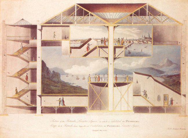
1793 - Fixed 360 degree Panoramas - Robert Barker in Leicester
Square, London - link
1840s - Moving Panoramas - John Banvard's Mississippi Panoramas -
3.6m (12 feet) high and 800m (2600 ft) long - link

Film-based
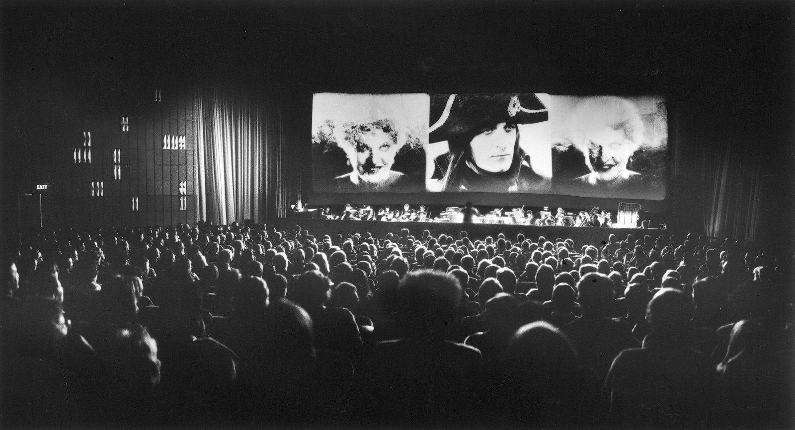
1927 - the film 'Napoleon' used three cameras for the Triptych
finale for greater impact - giving a 4:1 aspect ratio (3 x the
standard 1.33:1 of the time) - link
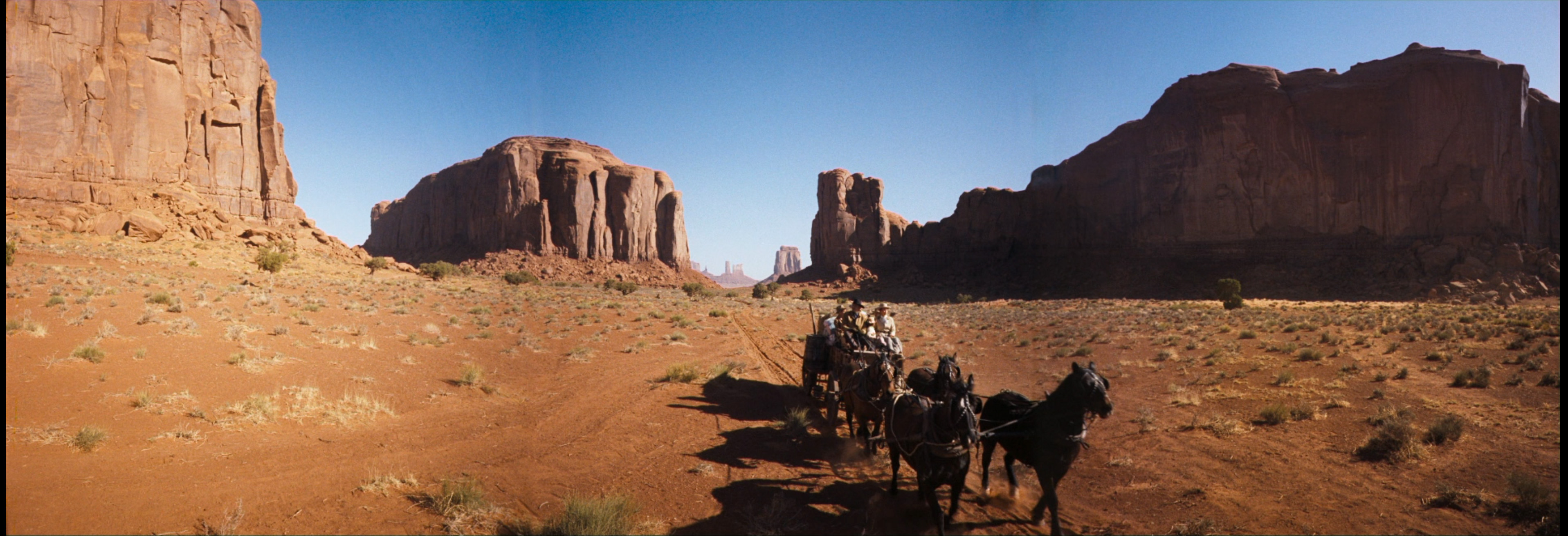
1952 - Cinerama - three 35 mm film cameras and projectors giving
at best a 146 degree field of view for films like How the West was
Won or This is Cinerama - link
1970 - IMAX - standard screen is 22m by 16m (72 feet by 52 feet)
with 65mm film - link
Its
hard to compare an analog medium like film to a digital one but
you can roughly say that digital 4K (roughly 4096 x 2160 pixels)
is equivalent to 35mm film, depending a lot on the quality of
the film stock and the shooting conditions, which is why
SIGGRAPH had people giving talks on computer graphics with
slides through much of the 1990s.
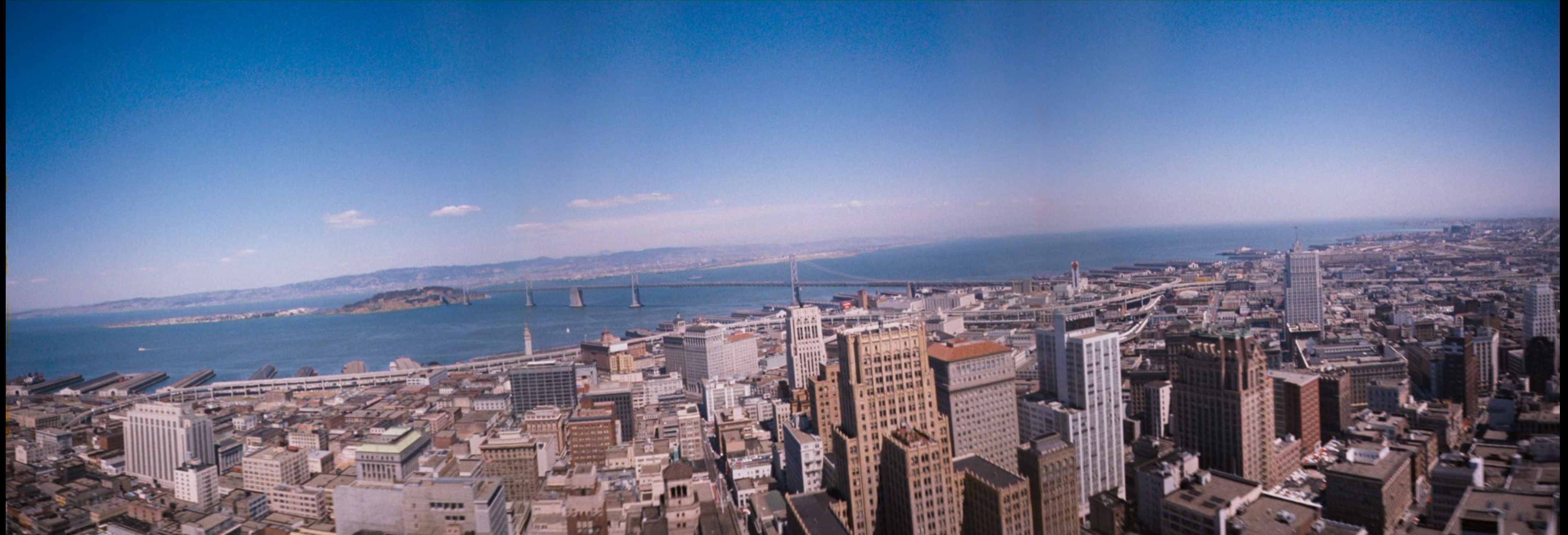
We also started seeing big screens in use at places such as NASA.
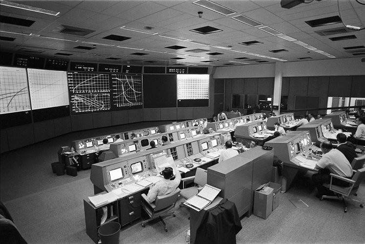
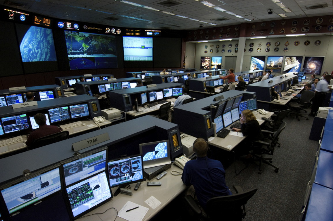
Then we move into a time where the imagery on the screens is more
interactive
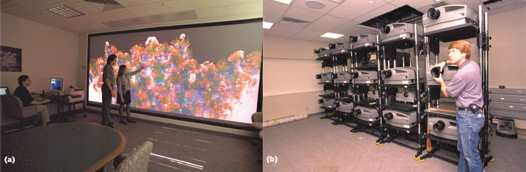
- Projector-based
Systems
- 1992
4 Mpixel 3D CAVE at evl/UIC (3 walls and a floor) - link
- 1994
8 Mpixel 2D PowerWall at U of Minnesota
- 1995
8 Mpixel 3D InfinityWall at evl/UIC
- 1999 20
Mpixel wall at Lawrence Livermore National Lab - link
- 2002 60
Mpixel wall at Sandia National Laboratories

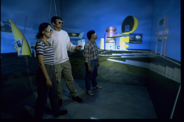
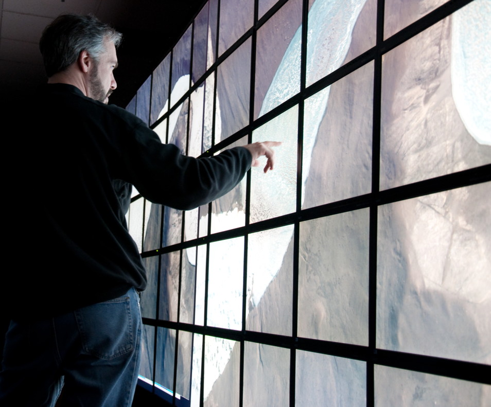
a Classic CAVE
1999 wall at Lawrence Livermore National Lab from the user's
view and also whats behind the screen, which is very typical
of the large high-resolution projection wall setups - photos
from link
- LCD-based Systems
- 2005 106 Mpixel 2D
lambdavision at evl/UIC
- 2005 205 Mpixel 2D
HiPerWall at UC Irvine
- 2008 256 Mpixel 2D
Hyperwall-2 at NASA
- 2008 287 Mpixel 2D
HIPerSpace at UC San Diego
- 2008 307 Mpixel 2D
Stallion at TACC/UT Austin
- 2012 1500 Mpixel
2D Reality Deck at SUNY Stony Brook
2005 LambdaVision wall at evl, which is very typical of the large
high-resolution LCD wall setups
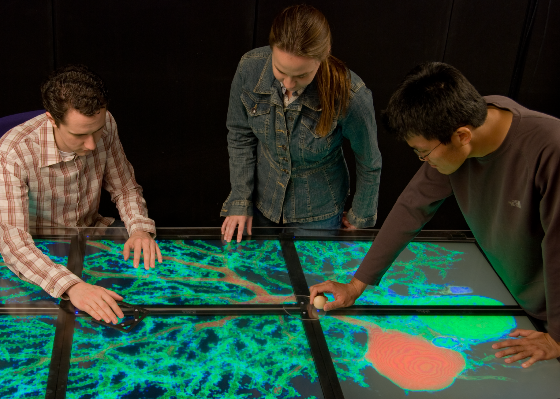
and these can be in other orientations like tables as in evl's
LambdaTable - based off of the needs of communities that are used
to working with very high resolution paper maps. People present
information on walls but we are more used to interacting with
information on tables.
Whether projection-based or flat screen-based it can take a
cluster of computers to drive the larger versions of these
displays.
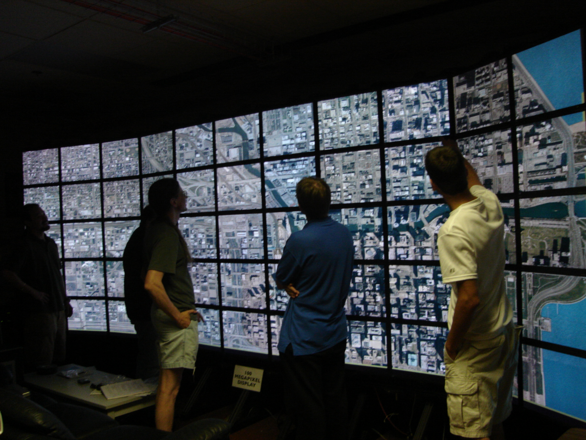
Large format displays are often shown running a single
visualization across the entire display, such as here when the
ENDURANCE team was using a large wall at evl to look at quickbird
satellite images of the lake they will be working at.
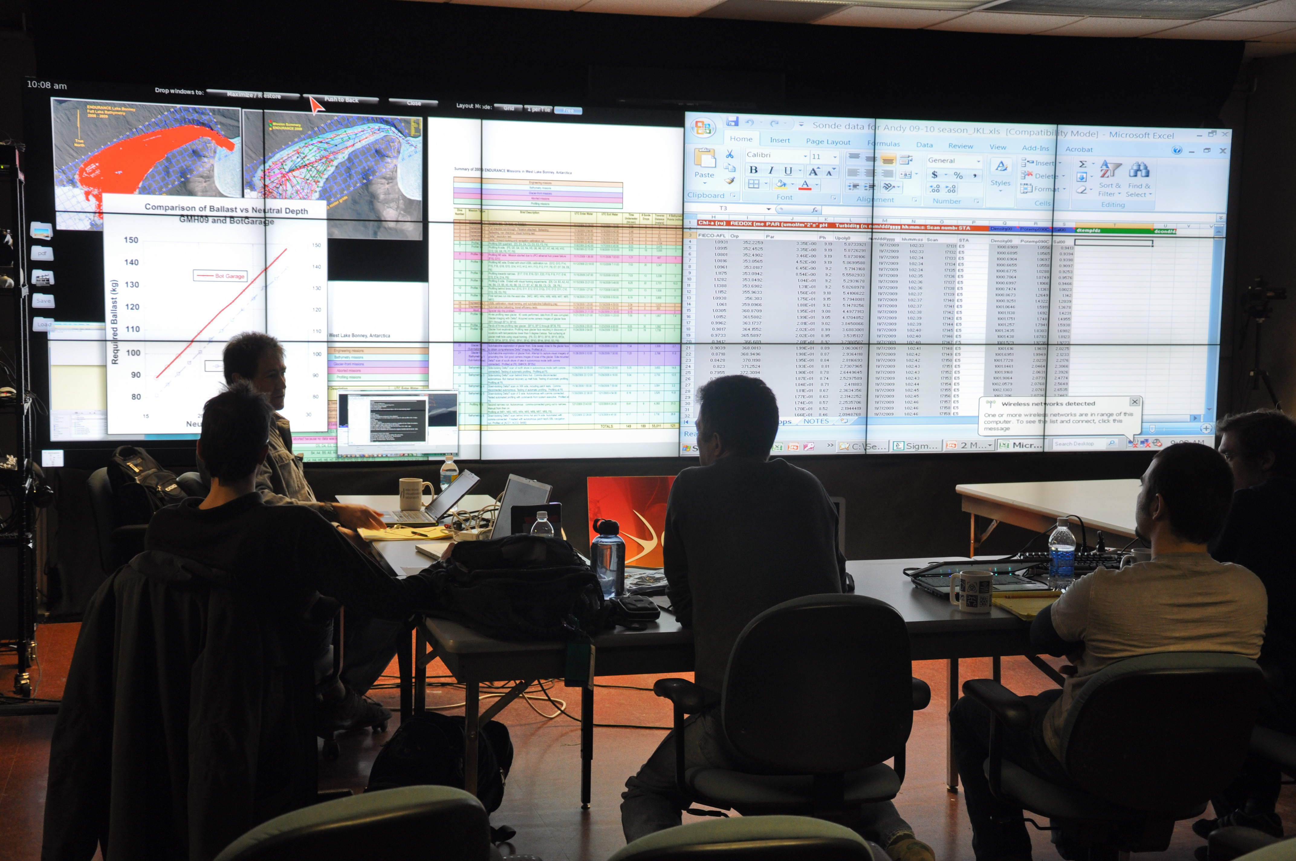
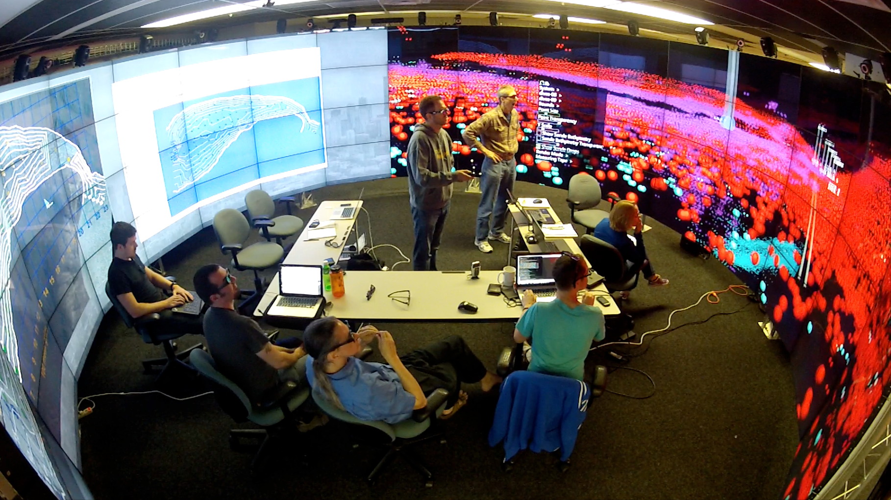
However the real power of these displays may come from showing
multiple inter-related visualizations at the same time as in this
photo from the ENDURANCE project at evl when data had been
collected from the lake and now the quality of that data needs to
checked. This would be done on a newer wall.
a couple years later the team came back again and we did similar
work in the cave as shown below, now integrating multiple
monoscopic and stereo windows, and including head and hand
tracked visuals into the mix.
We will talk more about the various types of hardware next week
and the software (both middleware and application level) that
drives these kinds of displays the week after that.
It is also important to have a convenient way of moving data
onto the display and interacting with it once it is there so we
will talk about that.
We will investigate physiological issues in terms of how people
view and interact with these displays. What does it take to
provide 20/20 vision? How important is audio? How much physical
motion is involved when interacting or even looking at all of
the data on these kinds of displays?
We will also look at people collaborating using these displays,
both co-located and remote collaboration. How are these kinds of
spaces shared? How do people manage both public and private
information.
and to make things more interesting we will hold the class
meetings, project demonstrations, and paper presentations inside
one of our large format high-resolution displays, the cave2. We
will be trying various configurations during the class to see
what works better.
BEFORE NEXT CLASS:
We will collect Wireless MAC addresses from everyone so you can
connect to our internal network on the next class. Please enter
your information today so you will be able to connect on Thursday:
http://tinyurl.com/nychzp8
Download the SAGE Pointer software - http://www.sagecommons.org/resources/sage-pointer-and-ui/
Create an image (jpg, pdf) with a photo of yourself, your name,
and your interests related to this course
Next time at the beginning of class everyone will use their sage
pointer to drag and drop their image onto the screen and give a
brief 1 minute introduction so we can get to know each other a
little bit.
so, for example I could show something like this:
We will all be using the SAGE software regularly in the class so
be sure to bring a laptop with the sage pointer running with you
to class each day.
Project 1 / SAGE
Tutorial / OmegaLib Tutorial
First off, lets have everyone introduce themselves.
Point your sage pointer to lyra.evl.uic.edu to drag and drop your
picture with info onto the cave-2 wall.
To get people ready for working on project 1 we are going to have
a tutorial on OmegaLib, one of the pieces of software we use to
drive cave2.
omegalib is available at https://github.com/uic-evl/omegalib
the wiki is a good starting point and in particular the section on
python programming.
Here is google group for omegalib, which is a good place to post
questions about the library: https://groups.google.com/forum/#!forum/omegalib
Coming Next Week
Hardware
We are going to focus on a few papers as a
class during the course.
Before next class please read
The Future of the CAVE
DeFanti, T.A., et. al.
http://www.evl.uic.edu/files/pdf/future.pdf
Each person
should produce a 1 page PDF file critiquing the paper
including your name, the title of the paper, a short
paragraph summary of the paper, a list of things you
found interesting in the paper, and then what you think are
the positives and negatives about the research.
In class on Tuesday everyone will use sage to drag and drop
their file onto the wall and a subset of the students will
be asked to talk more in depth about what you found in the
paper
last modified 8/27/13