(other good sources of material here are: Information Architects
by Saul Wurman, Envisioning Information, Visual Explanations
by Edward Tufte, Film Directing: Shot by Shot by Steven Katz and
Comics and Sequential Art by Will Eisner)
We finished last time talking about Charles Joseph Minard's 1861 graphic showing Napoleon's losses during his 1812 march to and from Moscow.
We will start off this class with another good graphic:
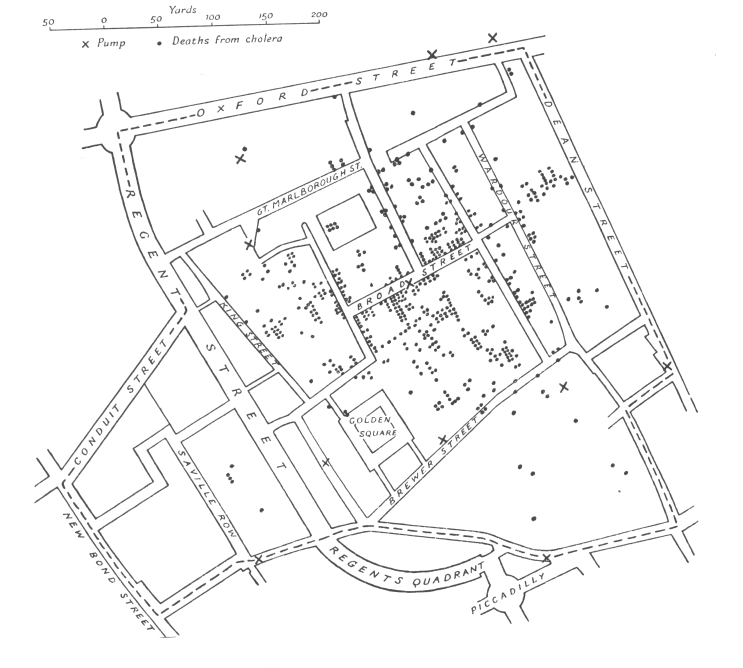
The first was by Dr. John Snow(1813-1858) a distinguished British Anesthesiologist
who plotted over 500 deaths in central London from Cholera in September
1854. Deaths are marked by dots and the location of the 11 water pumps
in the area are marked with Xs. The deaths seemed centered around the Broad
St. pump. When people stopped using the pump, the epidemic ceased. Note
that at the time the infectious theory of disease was not generally accepted.
Disease was believed to be
caused by morbid poisons coming from dead bodies and decaying organic
matter, and spread through the air.
Here is some of his own text: (full text available at
http://bbh.hhdev.psu.edu/courses/440/SnowCholera/snow_on_cholera_exercise.htm)
Very few of the fifty-six attacks placed in the table to the 31st August
occurred till late in the evening of that day. The eruption was extremely
sudden, as I learn from the medical men living in the midst of
the district, and commenced in the night between the 31st August and
1st September."
"The greatest number of attacks in any one day occurred on the 1st of September, immediately after the outbreak commenced. The following day the attacks fell from one hundred and forty-three to one hundred and sixteen, and the day afterwards to fifty-four. A glance at the above table will show that the fresh attacks continued to become less numerous every day. On September the 8th-- the day when the handle of the pump was removed--there were twelve attacks; on the 9th, eleven: on the 10th, five: on the llth, five; on the 12th, only one: and after this time, there were never more than four attacks on one day. During the decline of the epidemic the deaths were more numerous than the attacks, owing to the decease cf many persons who had lingered for several days in consecutive fever.
"There is no doubt that the mortality was much diminished, as I said
before, by the flight of the population, which commenced soon after the
outbreak,- but the attacks had so far diminished before the use of the
water was stopped, that it is impossible to decide whether the well still
contained the cholera poison in an active state, or whether, from some
cause, the water had become free from it."
Here is the actual data:
Date No. of Fatal Attacks Deaths
August 19 1
1
20 1
0
21 1
2
22 0
0
23 1
0
24 1
2
25 0
0
26 1
0
27 1
1
28 1
0
29 1
1
30 8
2
31 56
3
September 1 143
70
2 116
127
3 54
76
4 46
71
5 36
45
6 20
37
7 28
32
8 12
30 <pump handle removed
9 11
24
10 5
18
11 5
15
12 1
6
13 3
13
14 0
6
15 1
8
16 4
6
17 2
5
18 3
2
19 0
3
20 0
0
21 2
0
22 1
2
23 1
3
24 1
0
25 1
0
26 1
2
27 1
0
28 0
2
29 0
1
30 0
0
Date
unknown 45 0
Total 616 616
Here is the graphic reprinted in the Visual Display of Quantitative Information, p24
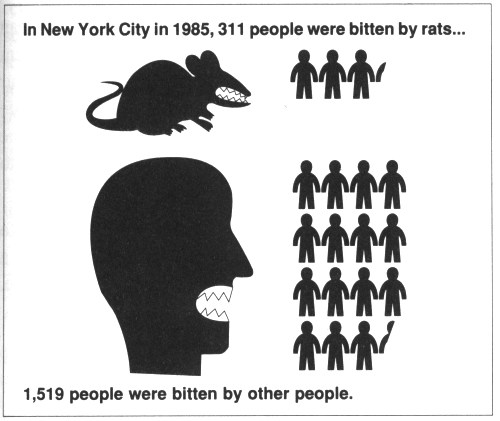
Here is another effective graphic from Information Anxiety p 177 which takes 2 numbers and creates a visual and visceral interpretation
What Makes a Good Graphic
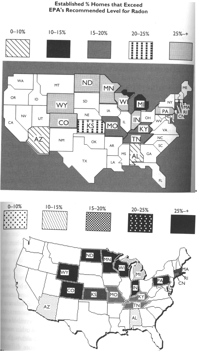
Here is a comparison of a good graphic and a bad graphic dealing with Radon from Things that Make Us Smart, p70-71.
Why is the first version bad:
- density scale is not an ordered additive sequence - the viewer must
keep referring back to the legend
- 'white' states are assumed to have low levels of radon when they
are actually not part of the data
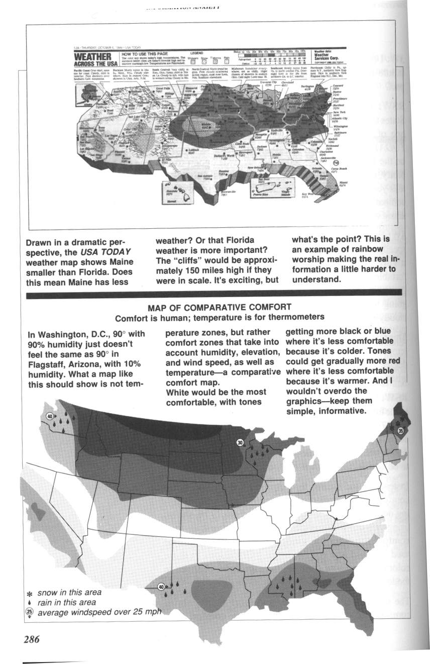
Here is another comparison from Information Anxiety, P286. This time the focus is on over designing the graphic. Trying to make the graphic 'exciting' makes it harder to get information from it.
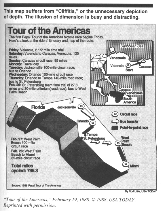
Here is another bad example:
Naturalness is an important design principle - better when the properties of the representation match the properties of the thing being represented. Representations that make use of spatial and perceptual relationships make more effective use of our brains. If these representations use arbitrary symbols then we need to use mental transformations, mental comparisons and other mental processes, forcing us to think reflectively. In experiential cognition we perceive and react efficiently. In reflective cognition we use our decision making skills.
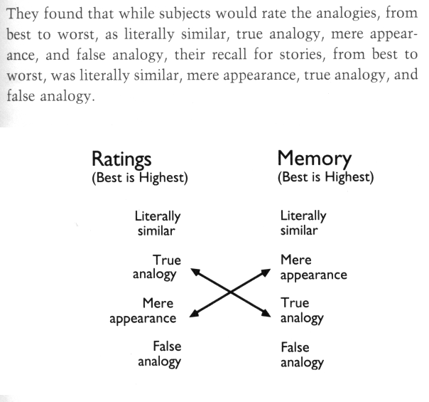
Here is an example where we compare a textual version of some information to a simple graphical representation
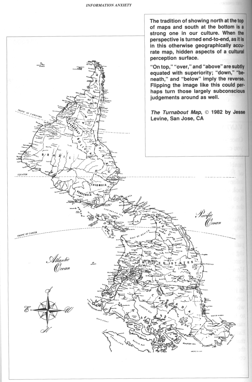
Here is a familiar image in an unfamiliar orientation (though I'm told that at least some students in South America have this as their 'traditional' view of the continent.)
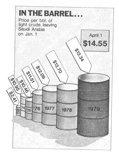
Mark Twain commented about '3 kinds of lies: lies, damn lies, and statistics'
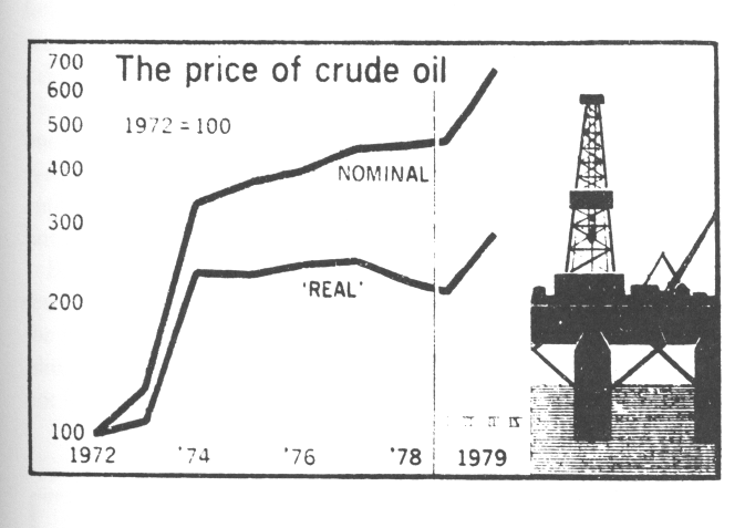
Here is a comparison of 2 graphics of the same data. The first has a high 'lie factor' compared to the second. Part of the lie in the first figure is not taking inflation into account, but the figure itself 'lies' by using 3 dimensional figures to represent a change in a single dimension. The extra dimensions make the difference seem larger - similar to starting a graph with the axis not at the origin.
Principles of graphical excellence from Tufte:
- well-designed presentation of interesting data - a matter of substance, statistics and design
- complex ideas communicated with clarity, precision, and efficiency
- gives to the viewer the greatest number of ideas on the shortest time with the least ink in the smallest space
- requires telling the truth about the data
- graphics reveal data
- graphical displays should
- show the data
- induce the viewer to think
about the substance rather than the design, technology, methodology
- avoid distorting what
the data has to say
- present many numbers in
a small space
- make large data sets coherent
- encourage the eye to compare
different pieces of data
- reveal the data at several
levels of detail
- serve a clear purpose
- description, exploration, tabulation, decoration
- closely integrated with
the statistical and verbal descriptions of the data
- the representation of numbers, as physically measured on the surface of the graphic itself, should be directly proportional to the numerical quantities represented
lie factor = size of effect shown in graphic vs size of effect in data
- clear, detailed, and thorough labeling should be used to defeat graphical distortion and ambiguity. Write out explanations of the data on the graphic itself. Label important events in the data.
- show data variation not design variation
- the number of information carrying dimensions depicted should not exceed the number of dimensions in the data
- graphics must not quote data out of context