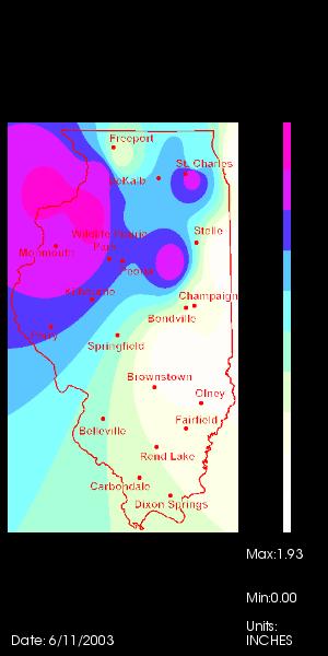
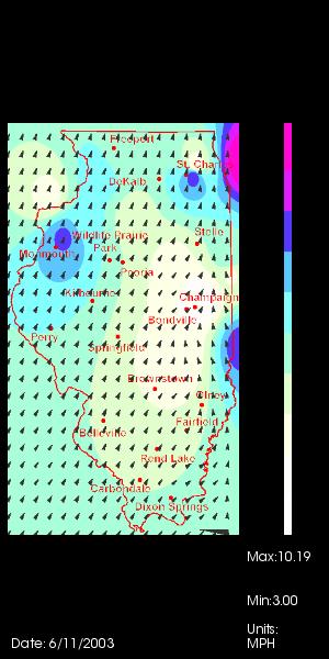
Here is an example visualization.
The data being visualized is the average wind direction for the date
6/11/2003. The
image also has a colormapping of
the average wind speed. To the right you can see the scale and at the
bottom
are the text for displaying the
date and the range of values.
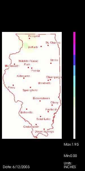
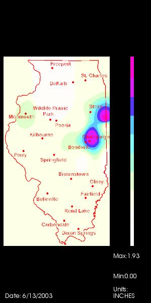
Here are three images of an animation
of total precipitation for 6/11/2003 to 6/13/2003.