Isosurface Generation Using VTK
|
|||||||||||||||
Using Python and Tkinter |
|||||||||||||||
|
|
|||||||||||||||
2.2.2. Creating a Color Selector Dialog
This mini-tutorial will require the use of the GUI builder class provided here. The author is biased toward a grid layout because he believes that the flexibility it provides is excellent and allows scalability. Of course, the same can be said about absolute positioning of widgets, too. The primary drawback is that scalability of widgets can be problematic. Nevertheless, if one sets a flag to restrict the resizing of the dialog box, this scalability problem will go away. The first thing to do when designing a dialog box with the grid packer is to sketch out the location and size of the different widgets. Below is a rough example of how the final dialog box will appear: |
|||||||||||||||
|
|
|
Color Chooser |
X |
|
|
||||||||||
|
0 |
Color |
<Color Label> |
|||||||||||||
|
1 |
Red |
### |
---[]-------- |
||||||||||||
|
2 |
Green |
### |
-------[]---- |
||||||||||||
|
3 |
Blue |
### |
----[]------- |
||||||||||||
|
|
0 |
1 |
2 |
||||||||||||
|
|
|||||||||||||||
|
Figure 2.3: “Sketch” of
Color Chooser dialog box |
|||||||||||||||
|
Notice that it is acceptable for a widget to exceed a 1x1 grid unit. The “Color Label” area will represent the mixture of the red, green, and blue sliders. Each of the sliders is 2 units wide and 1 unit high. The remaining labels are 1x1 unit. The GUIBuilder class has a class named SliderWithValue that is a combination of Tkinter.Scale and Tkinter.Label. It allows the programmer to set the scale and label values in addition to setting the function callback for an update when the slider is moved. Because the color chooser manipulates something besides its own label value, it is necessary to override the function callback mechanism with one’s own function callback from another location. Another tough case is getting the widget to change color based on the other slider widgets. Implementing the other text labels are fairly straightforward. Now, to implement this dialog piece-by-piece. First, it is important to examine the grid layout. The numbers appearing to the left and below the dialog box indicate the starting grid locations for objects. In the case of the text labels, they are all in column 0. Technically, the slider appears in columns 1 and 2. The color label is 2 units wide and resides in row 0. For each widget, it is important to set up the appropriate grid configuration. Because of the tedium involved with making these specifications, it is often easier and more flexible, to have a Python hash object whose keys correspond to the parameter names that Tkinter is seeking, and the values of this hash correspond to the values for each of these parameters. Below is the code necessary to implement this layout without any functionality…yet. |
|||||||||||||||
|
#
Import the modules for the code import
Tkinter #
Boolean constants I_TRUE = 1 I_FALSE
= 0 #
Create the dialog box (modal setting ignored because #
of previous problems) using the GUIBuilder class #
(assumed to be included earlier in this code) root
= Tkinter.Tk() root.title( 'Color Chooser' ) #
Default grid settings guiFactory = GUIFactory() # A pseudo-static class for widget creation gridSettings = { 'padx':5, 'pady':5, 'sticky':Tkinter.SW, 'row':0, 'rowspan':1,
'column':0, 'columnspan':1 } #
Color label labelColor = guiFactory.newLabel( dialog,
'Color', {'justify':Tkinter.LEFT} ) gridSettings[ 'row' ] = 0 gridSettings[ 'column' ] = 0 gridSettings[ 'columnspan' ] = 1 guiFactory.packItem( labelColor, gridSettings ) labelColorChanger = guiFactory.newLabel(
dialog, '', {'justify':Tkinter.LEFT,
'width':18} ) gridSettings[ 'column' ] = 1 gridSettings[ 'columnspan' ] = 2 guiFactory.packItem( labelColorChanger, gridSettings ) #
Red labelRed = guiFactory.newLabel( dialog, 'Red', {'justify':Tkinter.LEFT} ) gridSettings[ 'row' ] = 1 gridSettings[ 'column' ] = 0 gridSettings[ 'columnspan' ] = 1 guiFactory.packItem( labelRed, gridSettings ) sliderRed = SliderWithValue( dialog, 0, 255 ) widgetRed = sliderRed.getWidget() gridSettings[ 'column' ] = 1 gridSettings[ 'columnspan' ] = 2 guiFactory.packItem( widgetRed, gridSettings ) #
Green labelGreen = guiFactory.newLabel( dialog,
'Green', {'justify':Tkinter.LEFT}
) gridSettings[ 'row' ] = 2 gridSettings[ 'column' ] = 0 gridSettings[ 'columnspan' ] = 1 guiFactory.packItem( labelGreen, gridSettings ) sliderGreen = SliderWithValue( dialog, 0, 255 ) widgetGreen = sliderGreen.getWidget() gridSettings[ 'column' ] = 1 gridSettings[ 'columnspan' ] = 2 guiFactory.packItem( widgetGreen, gridSettings ) #
Blue labelBlue = guiFactory.newLabel( dialog, 'Blue', {'justify':Tkinter.LEFT} ) gridSettings[ 'row' ] = 3 gridSettings[ 'column' ] = 0 gridSettings[ 'columnspan' ] = 1 guiFactory.packItem( labelBlue, gridSettings ) sliderBlue = SliderWithValue( dialog, 0, 255 ) widgetBlue = sliderBlue.getWidget() gridSettings[ 'column' ] = 1 gridSettings[ 'columnspan' ] = 2 guiFactory.packItem( widgetBlue, gridSettings ) root.mainloop() Example 2.4: Grid layout
code for Color Chooser dialog box |
|||||||||||||||
|
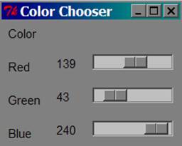
Near the top of the code section, a root window is generated with the title ‘Another Test’. This is followed by the creation of an object of type ModalDialog that will originate from the root window, have the title ‘Color Chooser’, and should be modal (the value I_TRUE). However, as of this version of the code, this last parameter will be ignored because of complications with creating a modal dialog box. For this reason, none of the dialog boxes created by this class will be modal despite its name. This code is redundant to some extent because it is the same thing with some tweaks. Starting at the beginning, the hash variable named gridSettings allocates some common parameter names for the grid widget packer along with values that should create a somewhat pleasing appearance, though this is not a guarantee. The author has noticed that the code used for creating the composite widget of a slider and label do not line up vertically, so the bottom of the label value is higher than the slider. It should be noted that the initial grid settings are established in this hash. That is, the grid placement will begin in row 0, column 0 with a size of 1x1. For future references to location, a coordinate system will be used that uses the following notation: (row, column). Additionally, widget sizes will be in the format width x height. Please note that all widgets are generated using the GUIFactory class The first item to place is the label “Color”. It will be located at (0,0) with a size of 1x1. The function packItem will place the item in its respective location on the container widget. The adjacent label that will show the current color will be placed at (1,0) and have the size 2x1. It is given a width of 18 in order to allow this label to “fill” the space of the dialog box sufficiently. The next row of items to be placed relates to the red value slider. At (0,1) with a size of 1x1 with a left-justified text, a label will be placed with the text ‘Red’. The unchanged portions of gridSettings will be applied to the GUIFactory packer. Next to this label is the composite slider widget from GUIFactory. It will have a range of values from 0 to 255. It is possible to change the major and minor tick increments, but no specific changes were made here. The widget will be located at (1,1) and have a size of 2x1. It should be noted that this process repeats for the green section and the blue section with sizes for appropriate widgets remaining the same, while placement incrementally changes. The outcome should look like the following: |
|||||||||||||||
|
|
|
||||||||||||||
|
Figure 2.3: Color Chooser dialog box |
|||||||||||||||
|
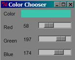
Changes update each of the labels for the sliders, but there is not any color change. However, if a new function callback is specified that would solve this problem, the sliders would not update. The author, at this time, is not certain why multiple function callbacks cannot occur with Tk widgets in Tkinter. As a result, a completely new function callback has to be used that performs the old functionality as well as the new functionality. Yes, it is true, this is not a good example of OO-programming; however, this is just an approximation of OO-programming. Below is the function to add before the code provided in example 2.4. |
|||||||||||||||
|
#
Color extraction function adapted from that given in the web resource #
"An Introduction to Tkinter". This function must preceed # the original code from the last example. def doUpdateColorLabelsEtc( self, *unusedArgument
): redValue = sliderRed.getValue() greenValue = sliderGreen.getValue() blueValue = sliderBlue.getValue() sliderRed.configureLabel(
{ 'text':redValue } ) sliderGreen.configureLabel(
{ 'text':greenValue } ) sliderBlue.configureLabel(
{ 'text':blueValue } ) rgbColor =
"#%02x%02x%02x" % ( redValue, greenValue, blueValue ) labelColorChanger.config(
background=rgbColor ) #
Add the following lines to the last section of code. sliderRed.addSliderCommandBinding( doUpdateColorLabelsEtc ) sliderGreen.addSliderCommandBinding( doUpdateColorLabelsEtc ) sliderBlue.addSliderCommandBinding( doUpdateColorLabelsEtc ) Example 2.5: Code for
Color Chooser box to be able to change colors |
|||||||||||||||
|
One of many
reasons why these examples work is that the “main” function of the Python
program contains variables which are considered to be at global scope. This allows variables to be used anywhere
without having to pass them to functions.
This is a bad practice to have but works great with examples. Ideally, one class should be designed for
each dialog box, one class for VTK stuff, one class for the GUI builder, and
one class for building the application-specific GUI. There are three
parts to this function. The first
thing to note is the *unusedArgument serves as a empty placeholder for other
objects which prevents the dreaded number of parameters does not match. Inside the code,
the values of the sliders are obtained for each slider color. Then, this value is then set as the value
of the slider. In order to change the
color-capable label, it is necessary to do some formatting so that the string
representing the RGB value can be passed to the next object without a
problem. Here, the string for
formatting the RGB characters is the following: "#%02x%02x%02x", which means the following— there are three hexadecimal conversions
taking place. All parts of the string
are generated by hexadecimal. The 0
following the % sign indicates to use a leading zero if necessary. The % sign for string concatenation is
important in order to get all of the values correct. For example, the bottom image would have
the following hex value: 3AC5AE. This color would then be assigned using the
background color parameter. Finally,
the addSliderCommandBinding assigns the previously mentioned function
as the callback function. Below is the window that should appear after resizing it (again): |
|||||||||||||||
|
|
|||||||||||||||
|
Figure 2.4: Color Chooser dialog box with color changing ability |
|||||||||||||||
|
|
|||||||||||||||
|
|
|||||||||||||||
|
Creating a Tkinter Main Window |
|
|
|
||||||||||||