Project 3 - NetCDF on a Sphere
With the growing concern of unpredictable violent weather there has been a movement to both visualize and predict the climate. This movement is continuing to generate large amounts of climate data. Luckily, a common format is starting to emerge for climate data, netCDF. NetCDF is a easy to use file format that has many supporting tools and a large development community. Personally I have experience with Ferret, a visualization and analysis tool for 2D climate data. In my MS research I collaborate with researchers from Argonne National Lab and Princeton, both work with large climate simulations. For Project 3 I proposed to create a visualization that is able to view multiple netCDF data sets on a 3D sphere, play an animation, and generate streamlines. This page will discuss the tools used to create project 3, and findings along the way.
Tool: VTK, c++, xCode
Data Processing:
ParaView, NCO, Ferret
Source Code:
www.evl.uic.edu/ekahle2/524/project3/project3_src.zip
Data:
available on request
data is ~600Mb
Inspiration
The Driving force behind project 3 is a high resolution data set from Chris Kerr from Princeton. This data contained ultra high resolution atmospheric simulation data at 10Km. The result is the ability to simulate naturally occurring Hurricane.
Some related work to this is the science on a sphere project. In this project, researchers have created a spherical projection surface, which movies are played on. Some examples of this:
Background:
NetCDF is a common climate data file format. It was created by the Unidata Program Center in Boulder Colorado. The reason it is so popular is because its:
The reason to visualize climate data on a sphere is to gain insight to the larger picture. When viewing data on a flat map, it is not always clear to see how features in one region influence other region in the world. The idea of this project is to include multiple data sources to view this larger picture.
Data:
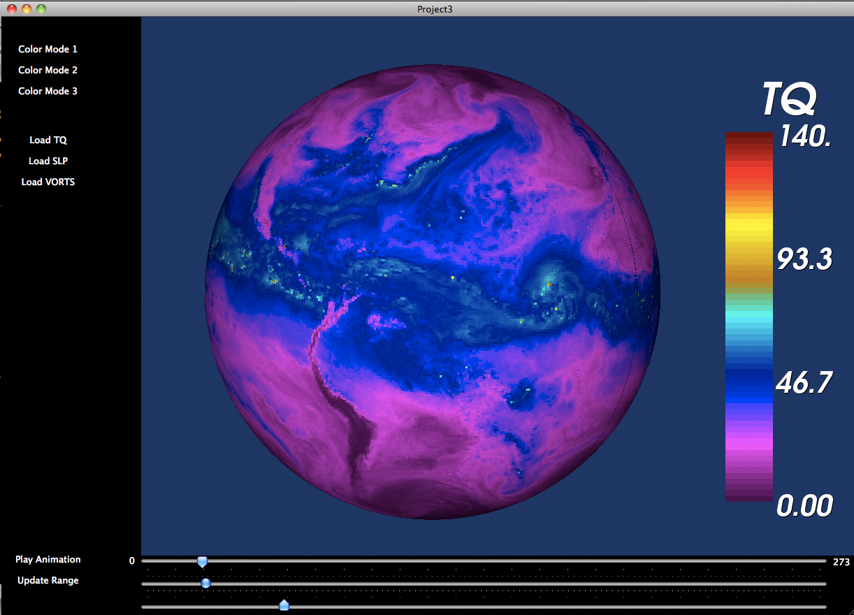
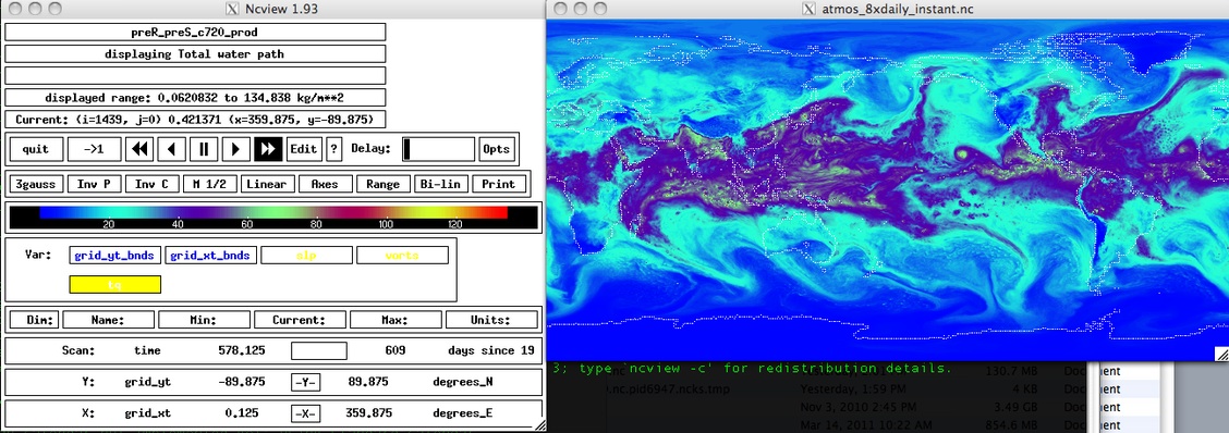
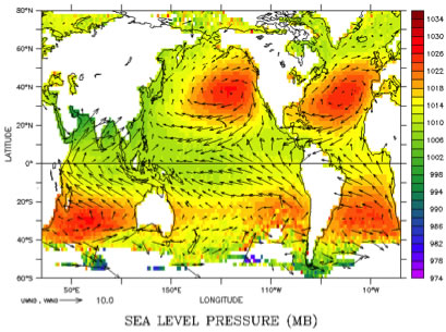
The first data set I am interested in is the atmospheric data. The original data size is 3.09 Gb. This data comes from a simulation ran on an IBM-BG/p which took 25-30M CPU hours to complete, generating 43TB of data. The time range of the simulation is 01-aug-1980 3:00 – 01-sep-19 00:00, totaling 247 time steps. The attributes I am interested in are TQ, or water column, and SLP, sea level pressure.
The second data set I im interested in visualizing is ocean data. This data is 3.49 Gb which contains SSS, sea surface salinity, SST, sea surface tempeture, and ocean current velocity. One of the major problems I encountered with this data is that depending on the griding selection within paraView, gives you access to different parameters. Unfortunately the vector data is defined on different grids and I was not able to create a structured vtk file to export.
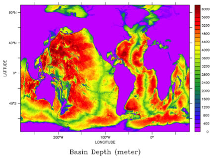
To complete the picture of the globe I wanted to include high resolution bathymetry and topo images. Because of challenges with the data processing this never made it in the application.
The goal of this visualization was to combine atmospheric, ocean, bathymetry, and topo images to create a layered complete representation of the globe.
Implementation:
The first approach to load data into VTK was to load it as points. As points, I was able to display a sphere with the color scalar. While this worked it was clearly not a sphere and did not fit in the my overall goal. The next approach was to represent the data as 3D glyphs. Again I was able to represent the data but this time the data consisted of spherical geometry that resembled reptile scales. I also attempted to load in the vector data. The issue with the vector data is that the vectors themselves are not originally defined on a 3D grid, so when I changed the representation to 3D, the vectors did not look correct. What was represented was a series of parallel vectors pointing ether up or down.
In order to work with the data I needed to reduce it. By leveraging the netCDF operator library I sub-sampled the grid from 720x1440 -> 360x720. Through paraView I converted my netCDF data to vtkStructuredGrid data via .vts, and saving each time step in a separate file. Through these steps I effectively reduced my time step file size from 37Mb to 7.3Mb.
Within VTK I used the vtkXMLStructuredGridReader which was very efficient in reading in the files. The geometry was extracted through vtkStructuredGridGeometryFilter which was easily able to convert the data to a sphere and color by a scalar.
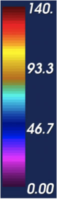
One of the features I wanted to add was the ability to have a color bar that interpolated between colors. In the class no one has found a simple solution to this. By using vtkColorTransferFunctions I was able to solve this problem. To create this you create a vtkColorLookupTable. Set the table range to scalar range. Create a vtkColorTransferFunction, and AddRGBPoints. Set number of table values. Then loop through the color space extracting the color at the position from the colorTransferFunction, then setting the color in the table. Finally build the color lookup table. Be sure to setScalarRange on your mapper.
Findings:
When dealing with climate data be aware of data griding
If a input/output connection within VTK should work, it probably does
.vts is much faster than .csv