(material from:
Designing Visual Interfaces by Mullet and Sano, and Designing
the User Interface by Schneiderman and Plaisant)
http://www.vischeck.com/vischeck/
And some more about colour:| level |
2017 |
2016 |
| bat (0-4) | 0 (0%) | 0 (0%) |
| mole (5-9) | 0 (0%) | 1 (3%) |
| dog (10-14) | 0 (0%) | 0 (0%) |
| cat (15-19) | 4 (3%) |
2 (7%) |
| tiger (20-24) | 14
(37%) |
10 (34%) |
| hawk (25-29) | 15
(39%) |
13 (49%) |
| robot (>29) | 5 (13%) |
3 (10%) |
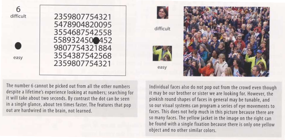
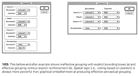
"The eye travels
along the paths cut out for it in the work" Paul Klee
not naturally
occurring in man-made artifacts - need to establish relationships
among components
Benefits of structure
Gestalt
Principles - 1920s
how individual elements are grouped into gestalts (wholes) during visual perception
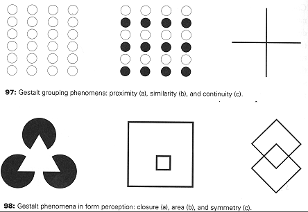
Principles:
Group related elements together establishing a hierarchy of elements and groups, then structure the display to reflect the relationships between the elements while maintaining balance.
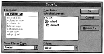
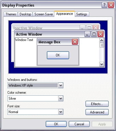
And how about
saving a file. The old windows way looked like this:
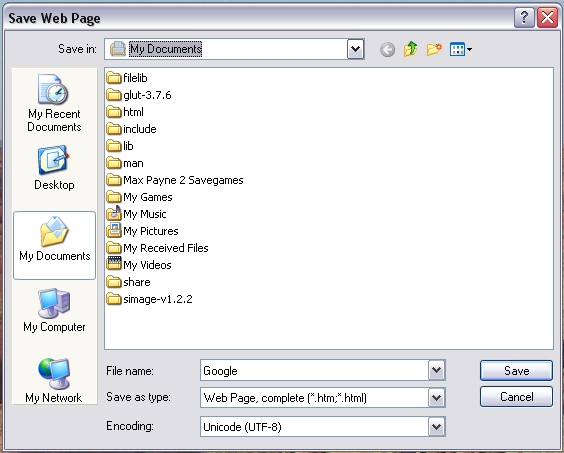
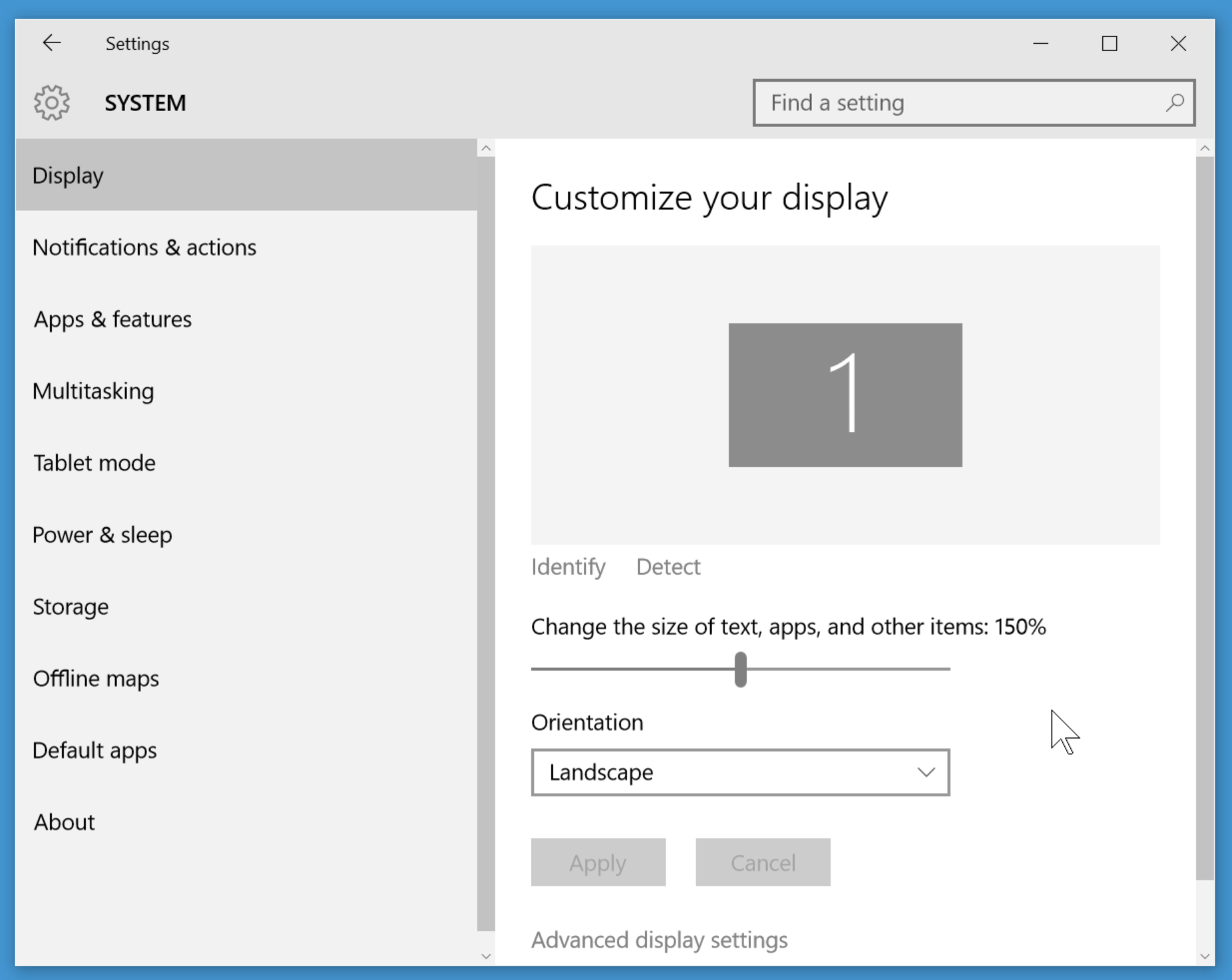
So how does
something like this look in a more modern version? Here the visual
hierarchy better matches their relationships, and the 'Save'
button is moved next to the file that is being saved.
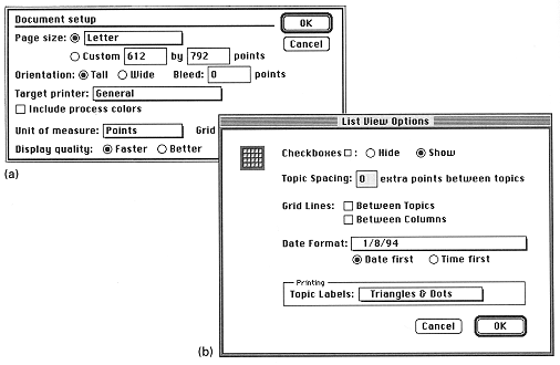
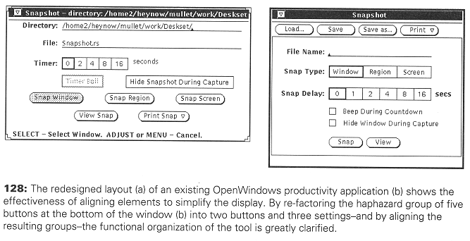
Common Errors:
Haphazard layout
- should establish spatial relationships to organize the elements
of the design. The image on the left is very chaotic making it
hard to see the relationships. The image on the right is much
better organized, making the relationships clear.
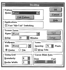
Ambiguous
Internal Relationships: consistency in the alignment of the boxes,
but not in their contents, and several things are 'almost aligned'
- enough to be distracting but not enough to be immediately
obvious (Name vs Delay, Slow)
How are these things set in a more recent version of windows?
and finally in
Windows 10
Conflicting Symmetries:
Here the
boundaries but not the contents are symmetrical, the eye is drawn
to the boundaries not the contents. This is also an example of
excessive contrast with the excessive number of boxes, and other
issues in aligning the contents of the boxes.
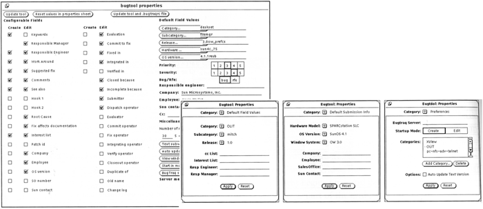
Aligning Labels
but not controls:
Alignment
within, but not across controls. Things start out OK at the top
and then completely self-destruct in the lower half of the
dialogue box
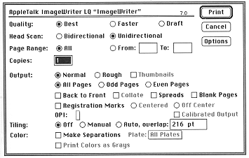
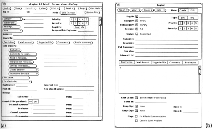
False structure
- adding boxes to impose structure adds visual noise and excessive
hierarchies of 1.
Excessive
display density - the larger (75% of the screen with a small font)
was replaced by the 3 smaller more focused dialogue boxes
Techniques:
Symmetry:
Alignment:
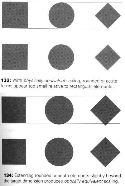
Optical Adjustment:
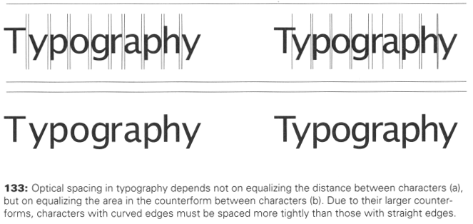
For more
information on typography you may want to check out 'helvetica' a
documentary by Gary Hustwit.
and a bit about text size and layout a bit in regards to what
happened at the Oscars
Why Typography Matters
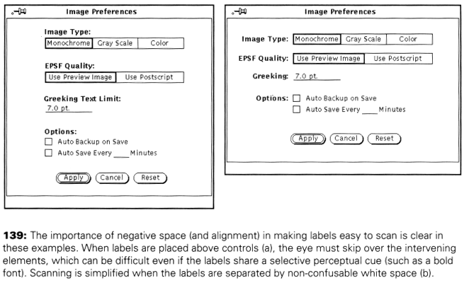
Negative Space:
Lets also take a
look at the interfaces for some devices with particular purposes,
rather than general PC interfaces.
In particular
its important to note that there are no [X] close boxes or other
standards of the desktop computer interface, but the rules about
layouts and white space, icons, and feedback all apply.
PS3's XMB (2006)
http://www.youtube.com/watch?v=hCPOob3Bya4
Xbox One
Interface (2013)
https://www.youtube.com/watch?v=nrs8tgdVlgM
Kindle Fire
interface (2011)
http://www.youtube.com/watch?v=6E1STyzjSTQ&feature=related
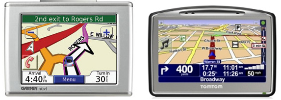
a Garmin and a TomTom GPS.
Garmin YouTube
interface video (2011)
http://www.youtube.com/watch?v=sZjiI1LbfHA&feature=related
Microsoft's
Metro style (2011)
http://www.youtube.com/watch?v=p92QfWOw88I
All major
companies have their own evolving set of guidelines for their
developers that embody their current set of principles.
google’s
material design
https://www.google.com/design/spec/material-design/introduction.html
apple’s design guidelines
https://developer.apple.com/design/
microsoft design guidelines
https://dev.windows.com/en-us/design
As a longer in
class activity I'd like people to form into groups of 2 and
compare the user interfaces from two standalone dedicated
devices that try to solve the same problem. For example:
you will find
quite a few videos on line (including the ones above on this page)
that tour you through these interfaces
compare their effectiveness in terms of:
By the end of class
turn in an email or a link to a webpage with all of your group
member's names and your discussion. Keep these ideas in mind as
you are finalizing the design of your dedicated consumer device
for Project 2.