Application due 2/13 at
8:59 pm Chicago time
Documentation due 2/15 at 8:59 pm Chicago time
Project 1 will be an individual project to
give people practice with writing a web-based application that
visualizes the same data in multiple ways using R and Shiny and
ggplot2 and Shiny Dashboard. In this project everyone will learn
how to import data, use R to manipulate the data, and create an
effective user interface for visualizing and analyzing this data
on a typical laptop / desktop (1920x1080) screen.
This project will focus on using R to
visualize data on electrical power generation in the US, and use
shiny to give people an interactive interface to create those
visualizations.
The original data is available from
https://www.eia.gov/electricity/data/state/ and I have made a csv
file available here. For this assignment you can not make
any changes to the file outside of R. You need to read in the file
as is.
The rows you will be particularly interested
in are those with TYPE OF PRODUCER,ENERGY
SOURCE equal to Total Electric Power Industry,Total. You will very likely
want to convert the GENERATION data from strings to numbers
(as.numeric and gsub are your friends). While the dataset is
pretty clean there are 3 states with missing identifiers to remove
(subset and factor are your friends) and the totals for the entire
US are labelled in two different ways so you will need to unify
those two (toupper is your friend). You should convert the STATE,
TYPE OF PRODUCER, and ENERGY SOURCE to categorical values
(as.factor is your friend). To simplify things we will also remove
any line with a Generation number that is negative (subset again),
and remove any lines with an energy source of Other, Other Gases,
Other Biomass, Pumped Storage (again subset and factor are your
friends). You should also rename some of the Energy Sources to be
a little more compact (e.g. Hydro, Wood, Solar) (levels is your
friend). This should leave you with 10 types of energy sources
with reasonably compact names.
This file contains data from 1990 to 2019 for
all 50 US states plus the District of Columbia plus the total US.
You should use ggplot for your charts, and
usmap for your mapping. If
you use another library without permission you will lose points.
We will use other libraries in later projects but these are
required for this project.
To start with I would take a look at the raw
data file in a text editor to get an idea what it contains, and
then try out different types of manipulations and visualizations
in either R-Studio or Jupyter to work out what you are going to
need to do. Then think about how you are going to lay out the
various visualizations and how you are going to create the user
interface in shiny.
You will be writing your code to run full
screen in a web browser and it should run on all current browsers
(Chrome, Safari, Firefox, Explorer, Edge, etc.). Normally we would
be evaluating this using the touch screen on our classroom wall
which runs the latest stable version of Chrome under Windows 10
with a screen size is 11520 by 3240. This term we will assume the
interface is running on a 1920 x 1080 screen on a 15" monitor. The fonts and visualization
primitives you create should be work effectively at that scale.
The user should never to scroll the window, ever, so you should
experiment with different ways to organize the information and
controls to find the most effective combinations. Users will be
using a mouse / trackpad / touch to interact so make sure your
controls are reachable and at an appropriate size. Remember that
the Browser window itself will be taking up some space on the
screen so you will not have access to the entire 1920 x 1080.
The demonstration project from
week 2 in class should give you a good starting point.
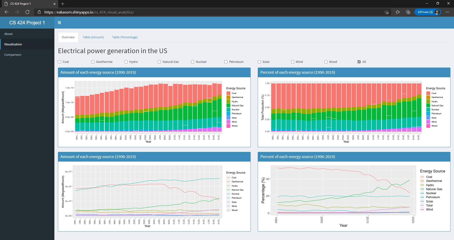
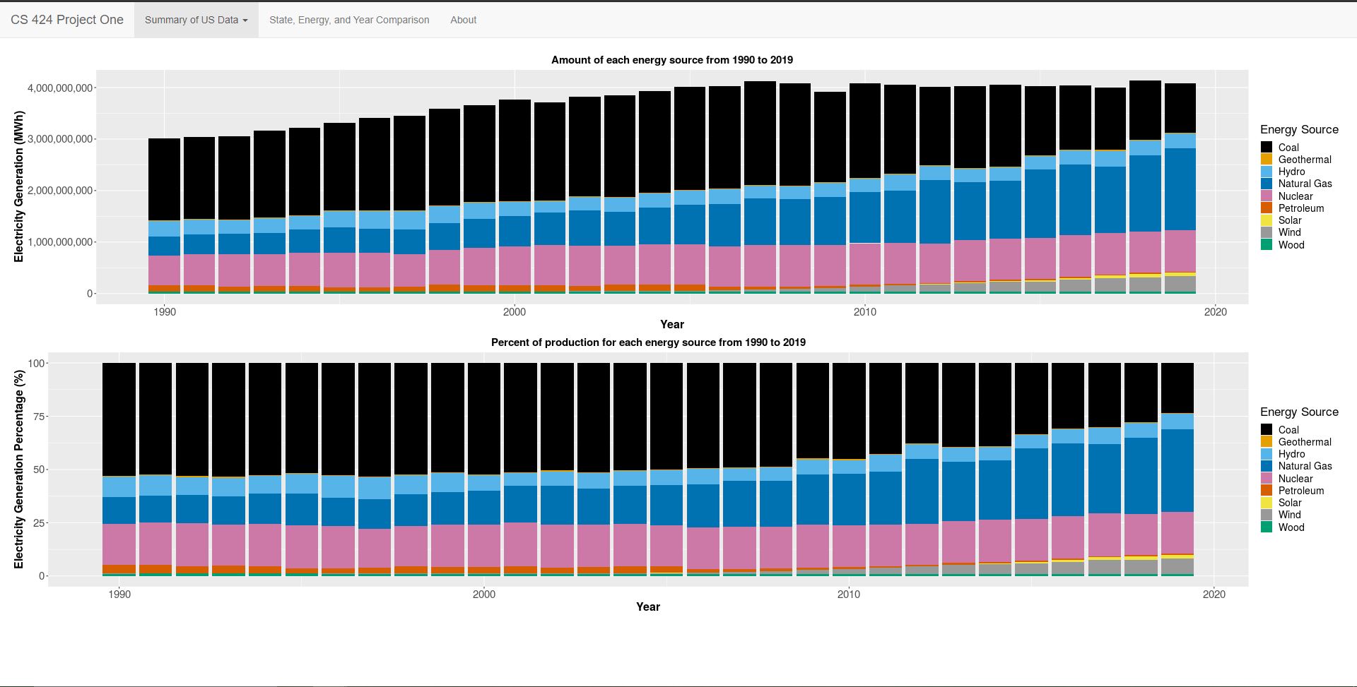
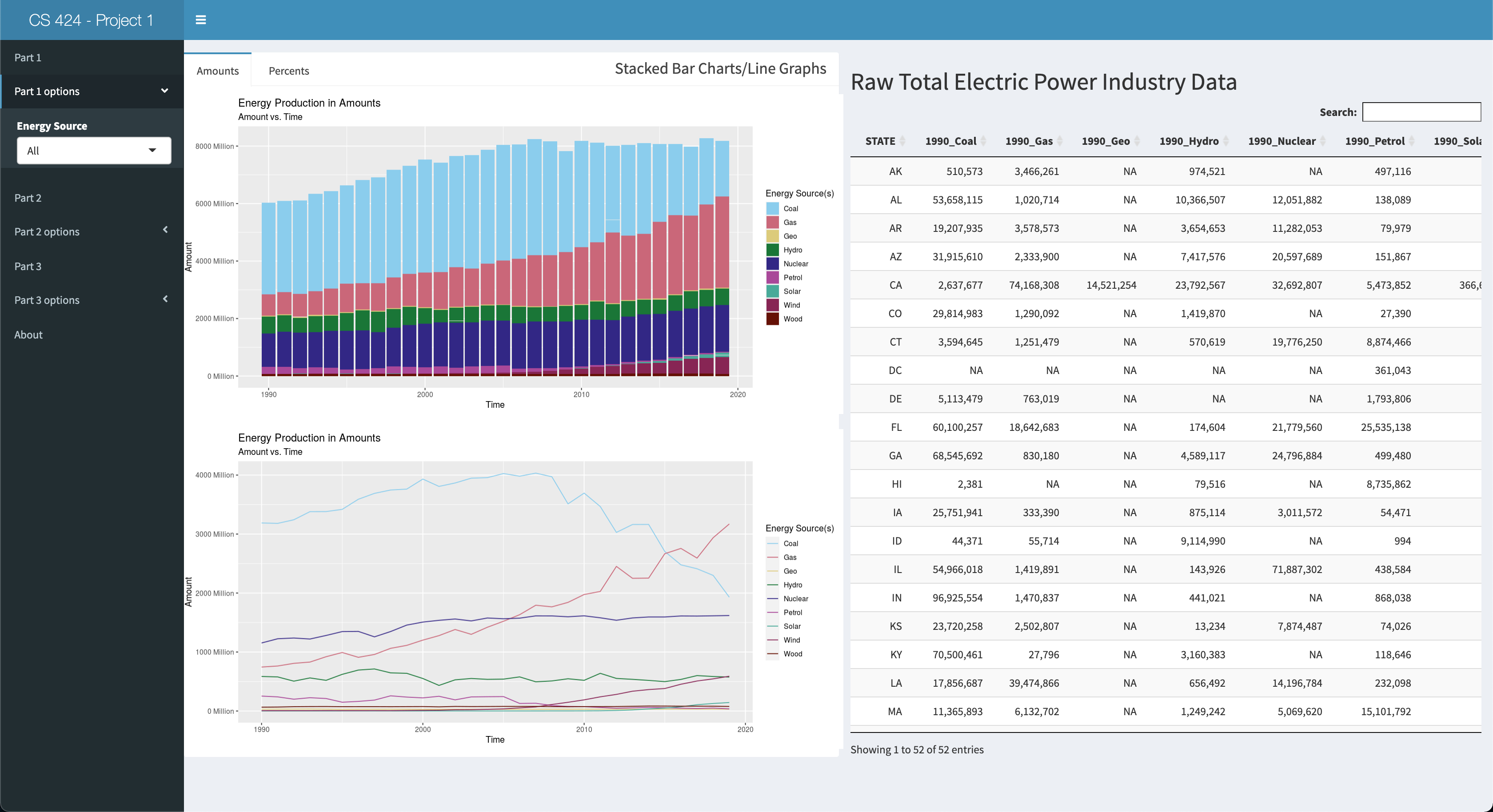
For
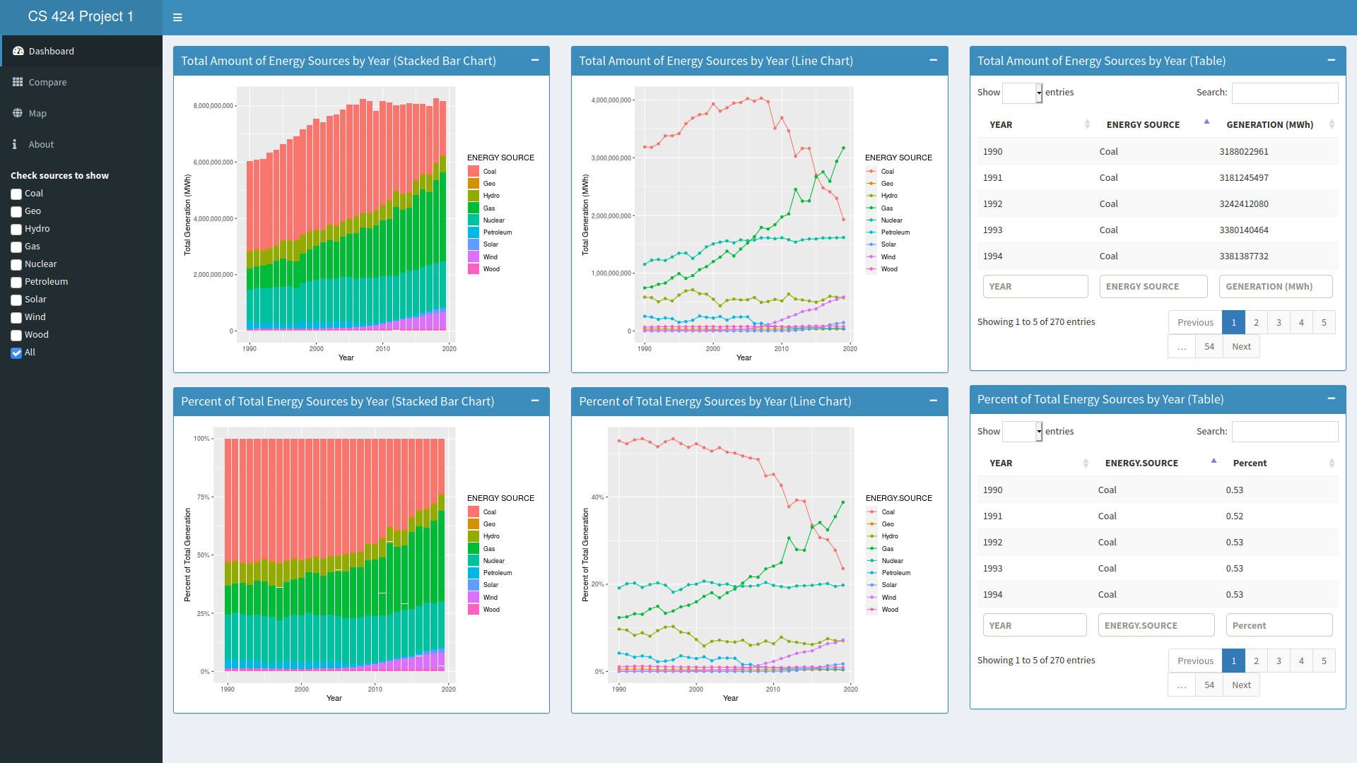
40% you need to:
read in the csv datafile, clean it up in R, and create an
interactive visualization in R and Shiny on Shinyapps.io
that initially shows a summary of the overall data for the
US with:
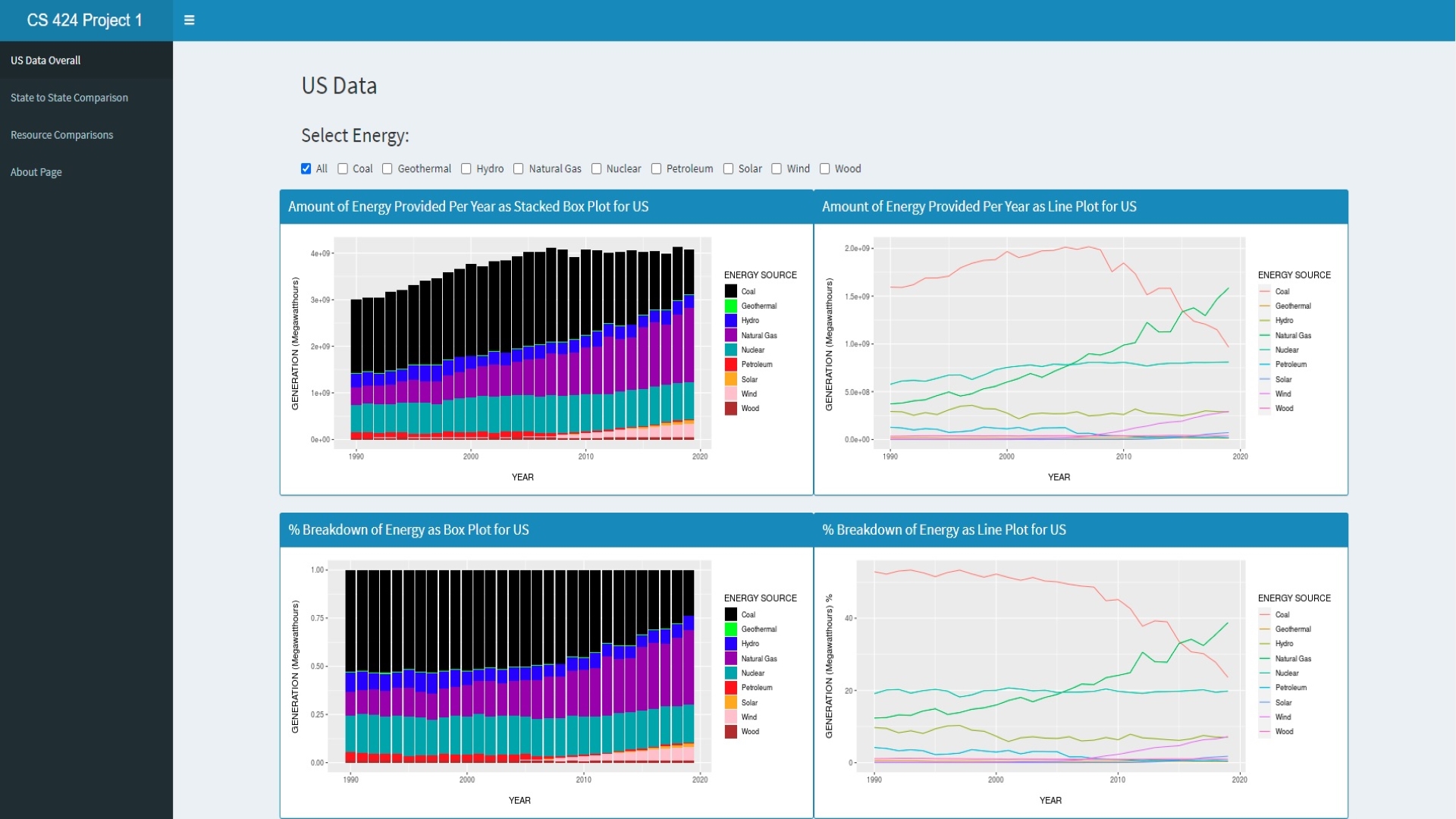
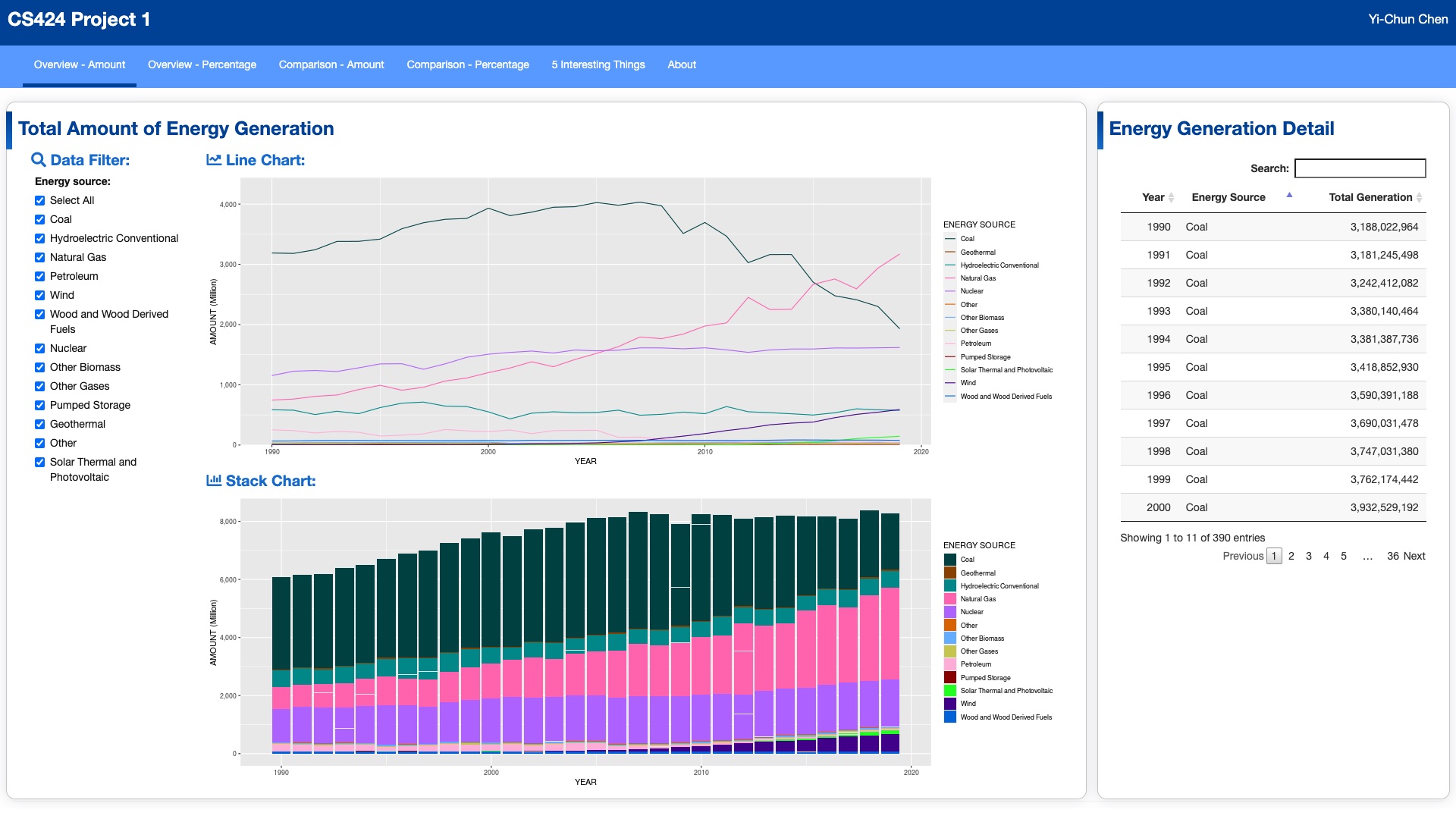
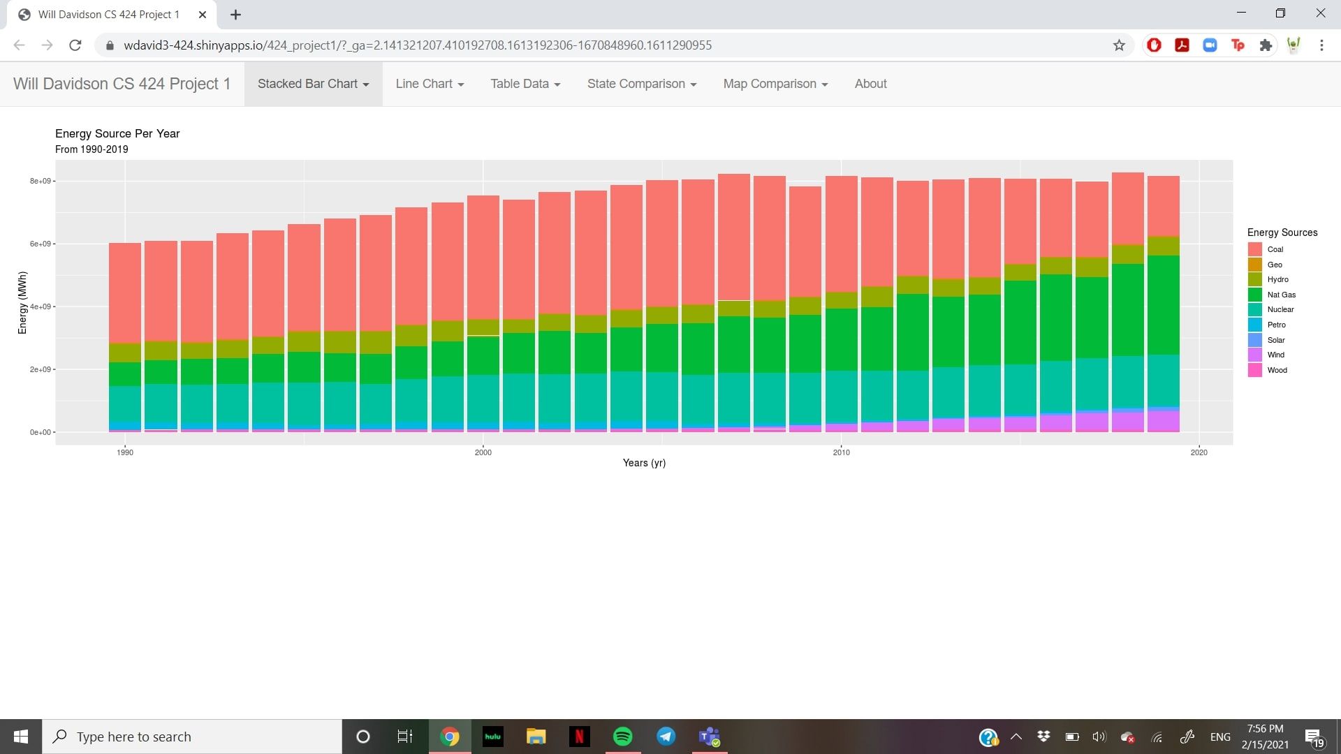
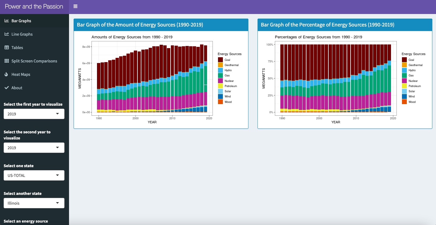
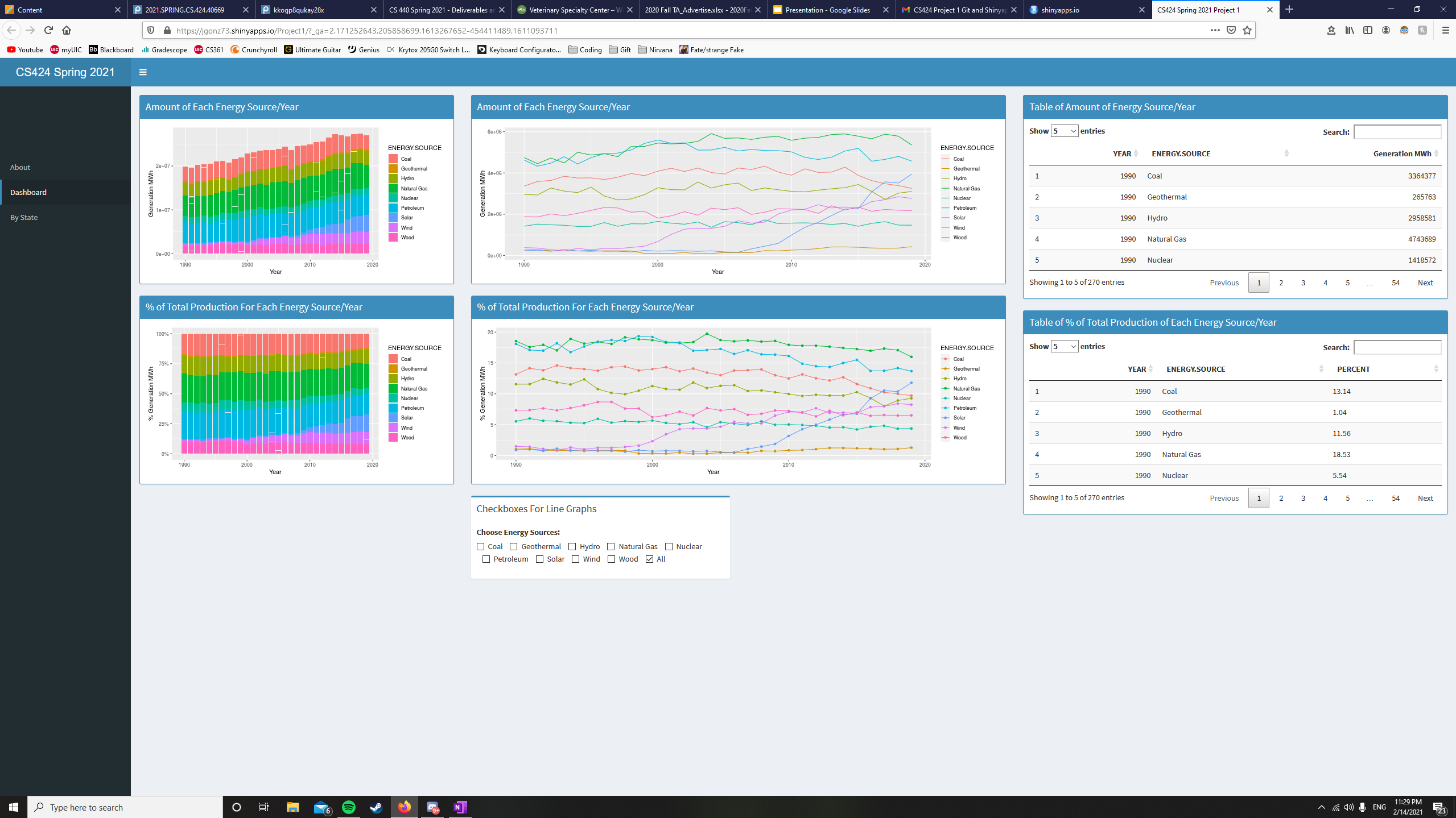
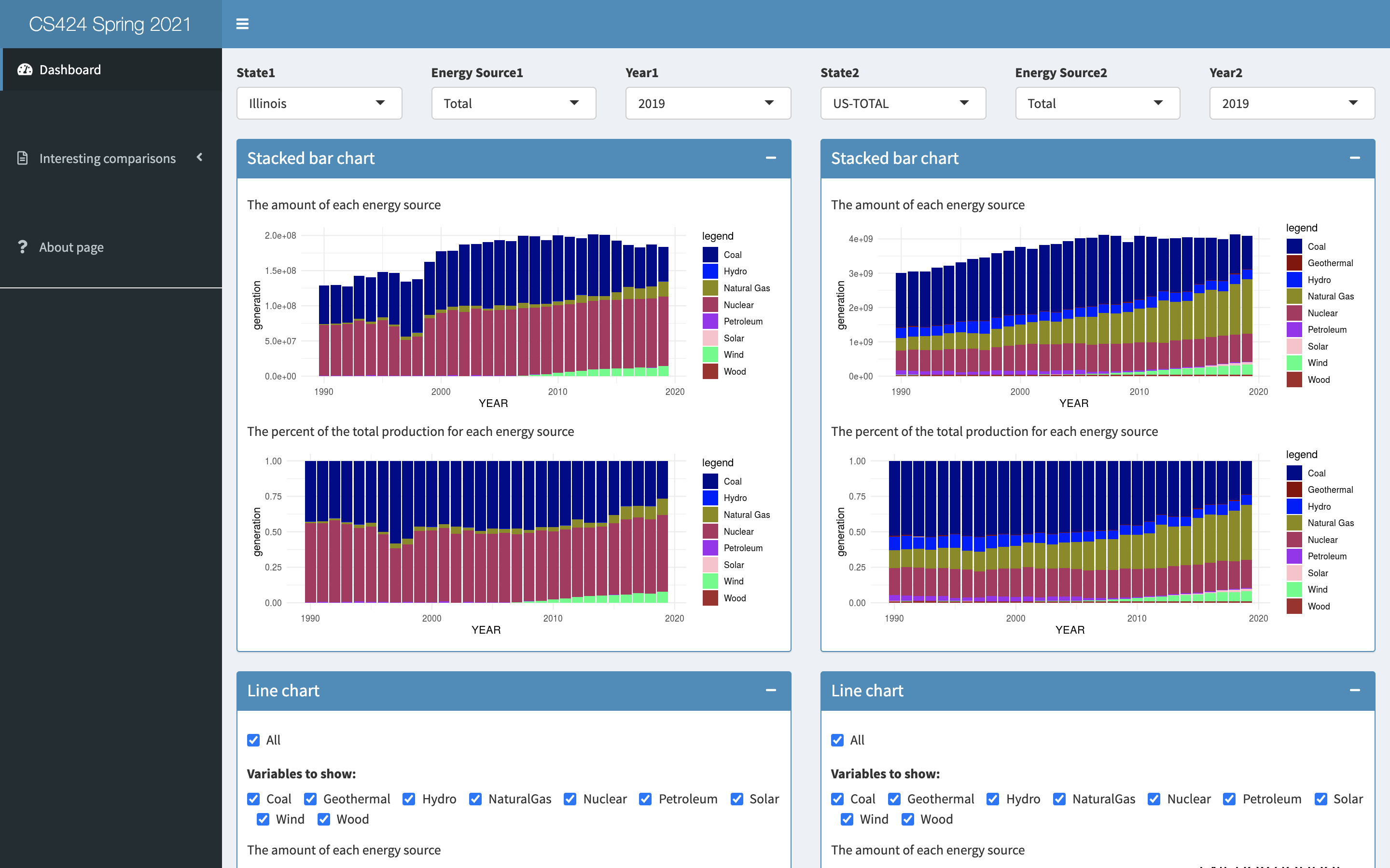
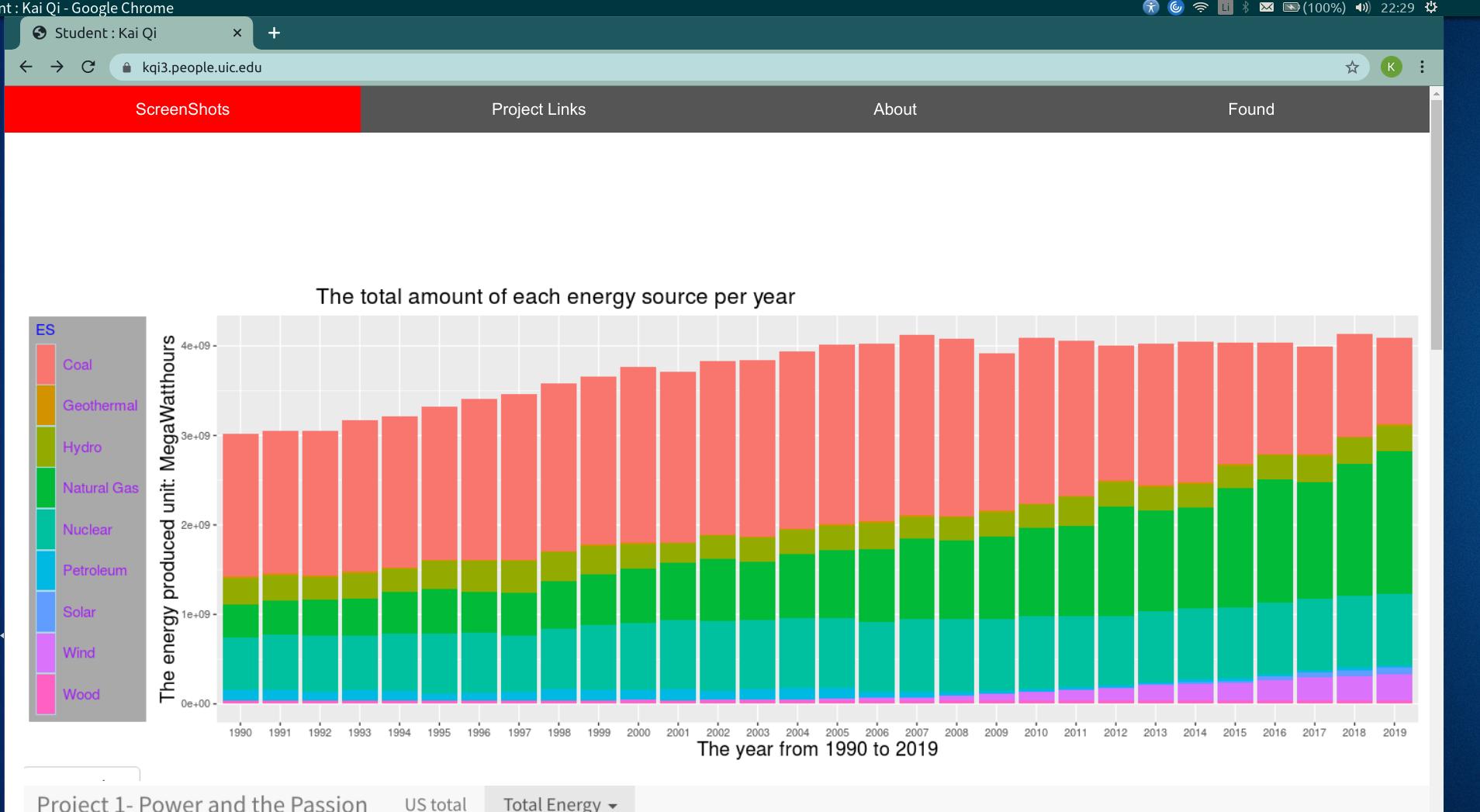
stacked bar chart showing the amount of each energy source per year from
1990 - 2019
stacked bar chart showing percent
of the total production for each energy source per year from
1990 - 2019
line chart showing the amount of each energy source
per year from 1990 - 2019
line chart showing the percent of the total production
for each energy source per year from 1990 - 2019
table of raw numbers for the amount of each energy
source per year from 1990 - 2019
table of raw numbers for the percent of the total
production for each energy source per year from 1990 -
2019
set of check boxes, one for each energy source, plus
'all' (where all is the default selection) allowing the
user to filter which energy sources / lines are shown in
the line graphs.
the color for each energy
source should be consistent across all the
visualizations in your interface
the charts should have good legends
in all of these charts year
should be on the x-axis
you can show these in separate tabs or show multiple
visualizations at once
have an 'about page' in your app with appropriate
credits (where the data is from, who wrote the app,
when, etc.)
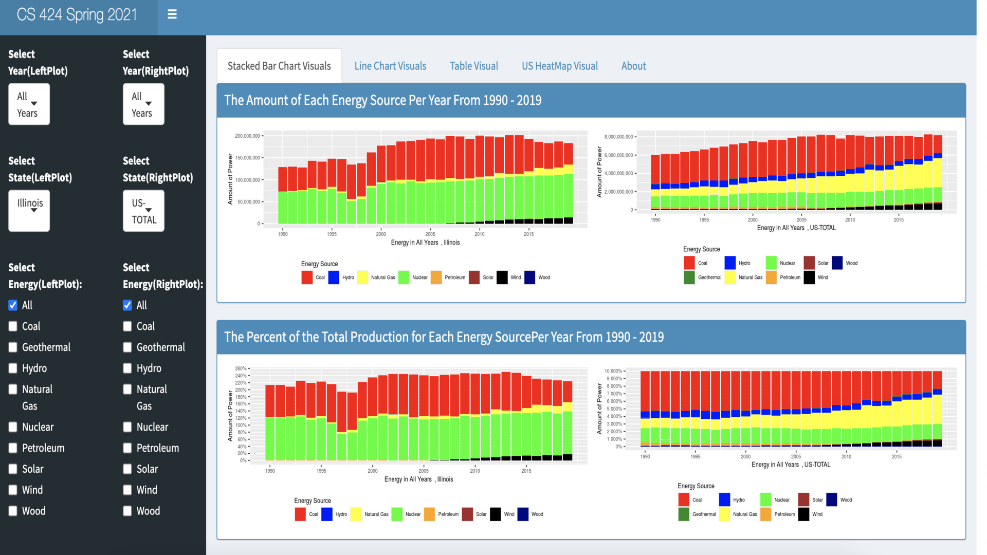
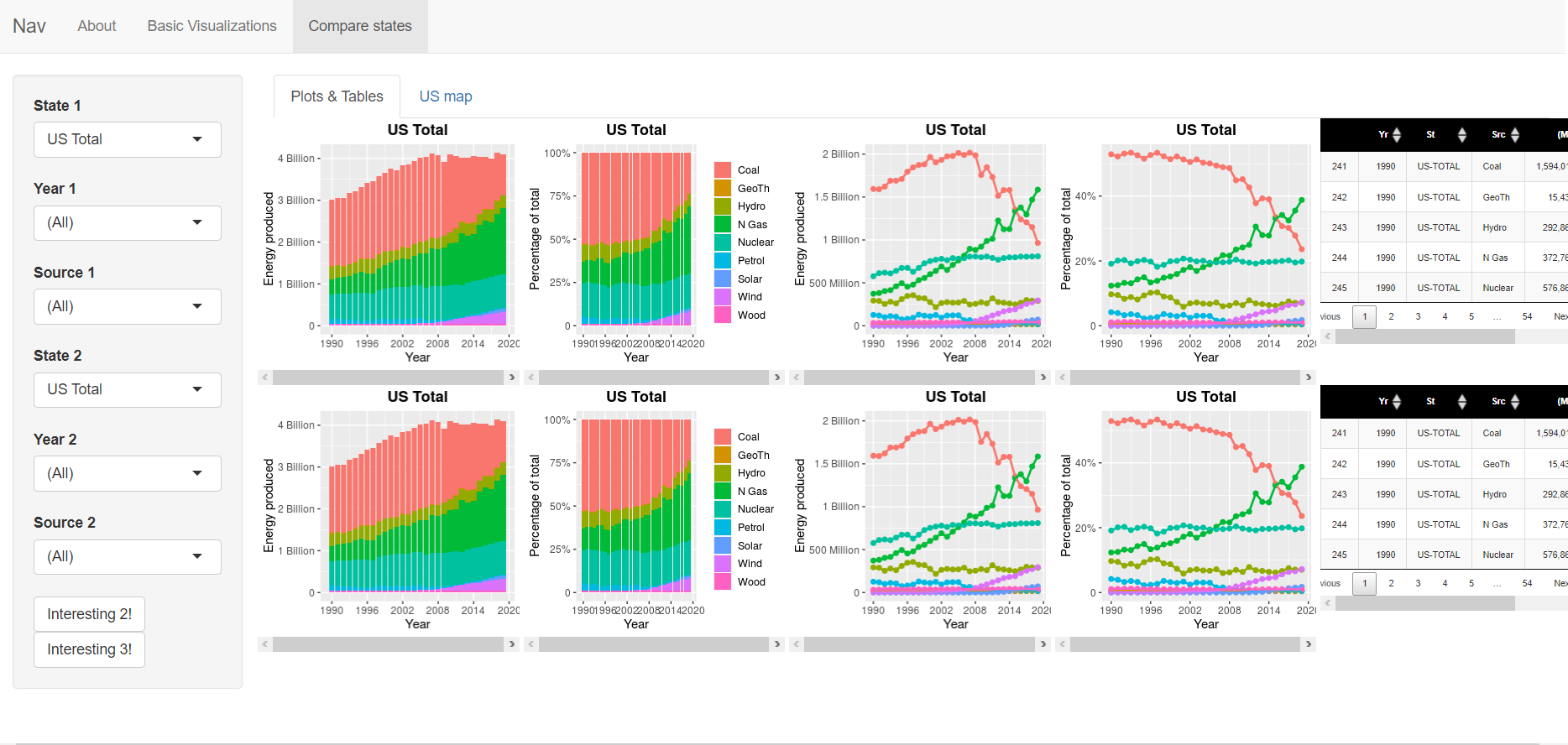
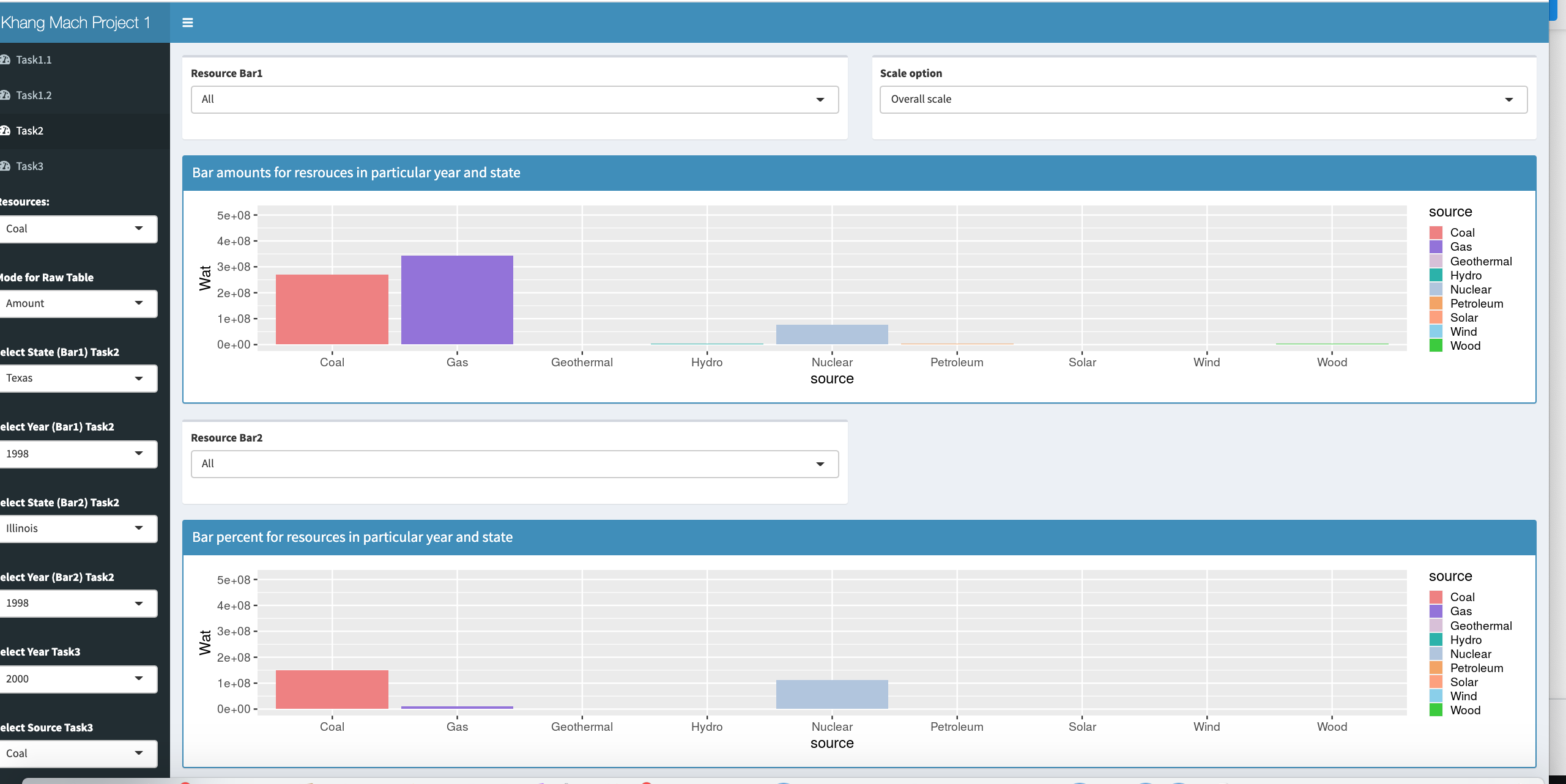
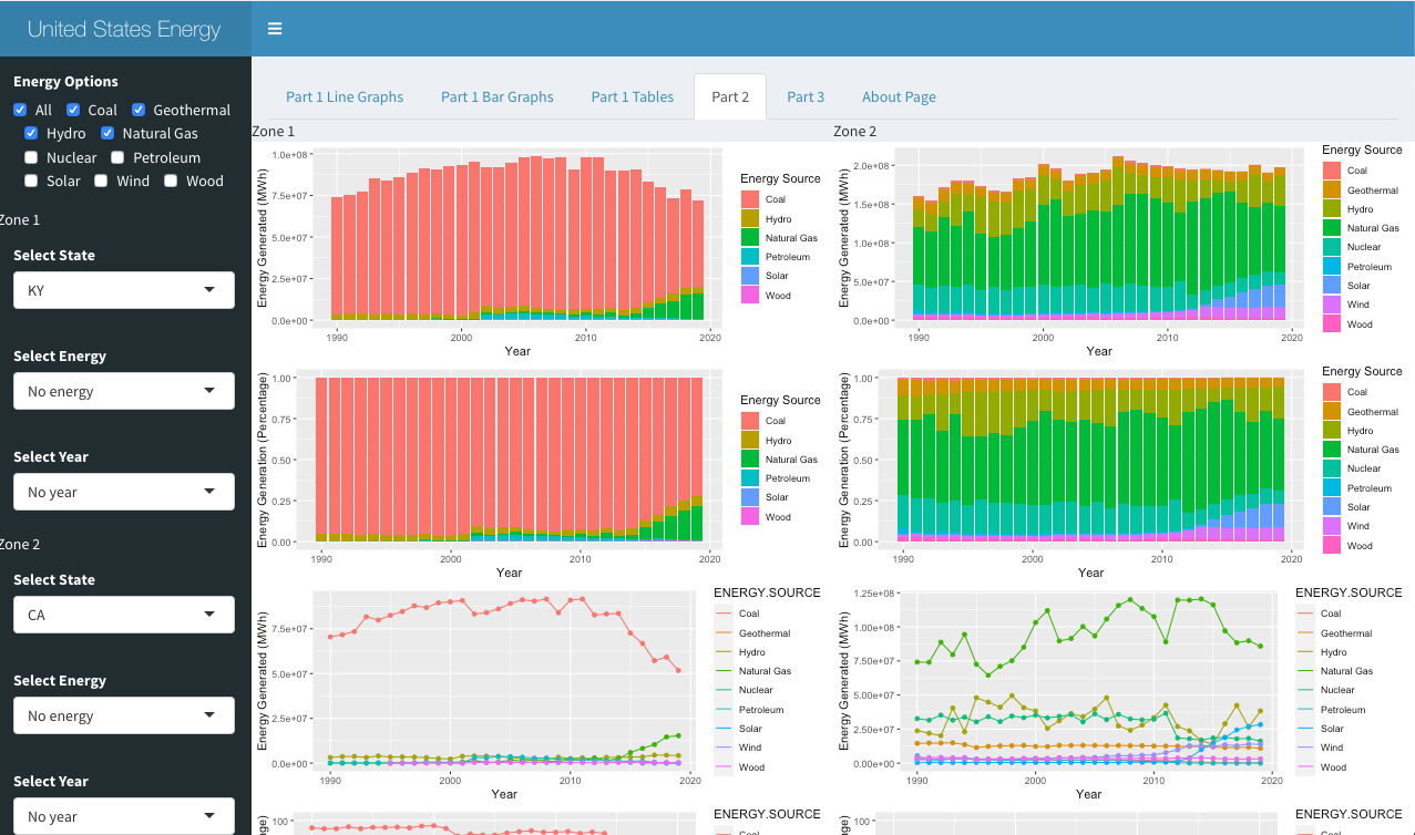
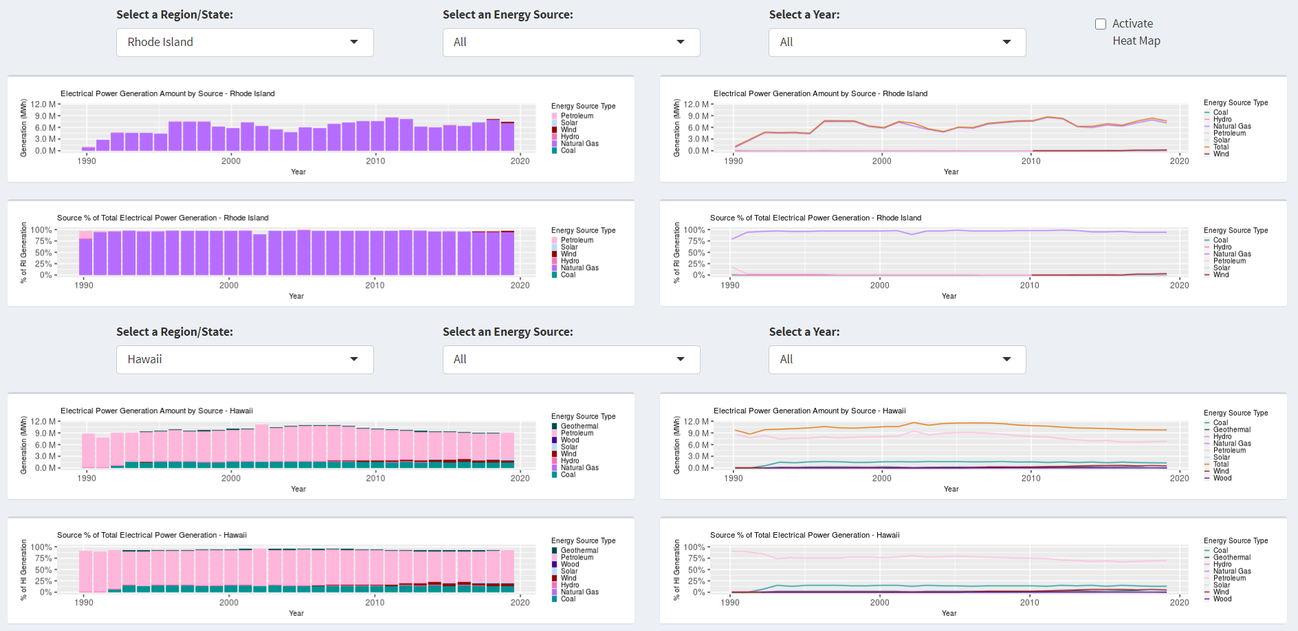
For
an additional 30% you need to add state level data over the
years
break the screen in two regions to allow the user to do a
comparison between any of the 52 entries in the dataset. Give
the user a dropdown menu for each of the two zones allowing
the user to choose from any of the 50 states using the long
names like 'Illinois' rather than IL, plus Washington DC and
the Total US. By default the two regions should show the total
US and Illinois. In each region independently show all of the
visualizations / interactions above from the 40% section.
(state.abb and state.name are your friends)
allow the user to pick an energy source and a year from the
list of available ones (note that this means the user could
compare IL / Coal / 1992 and 1995, or compare IL and Florida /
Coal / 2004, the user can mix and match the year, state, and
energy source in the two regions as they prefer - the two
regions should be completely independent. All of the visualizations should update
appropriately for that subset.
the colors should be consistent across all the
visualizations in your interface
For
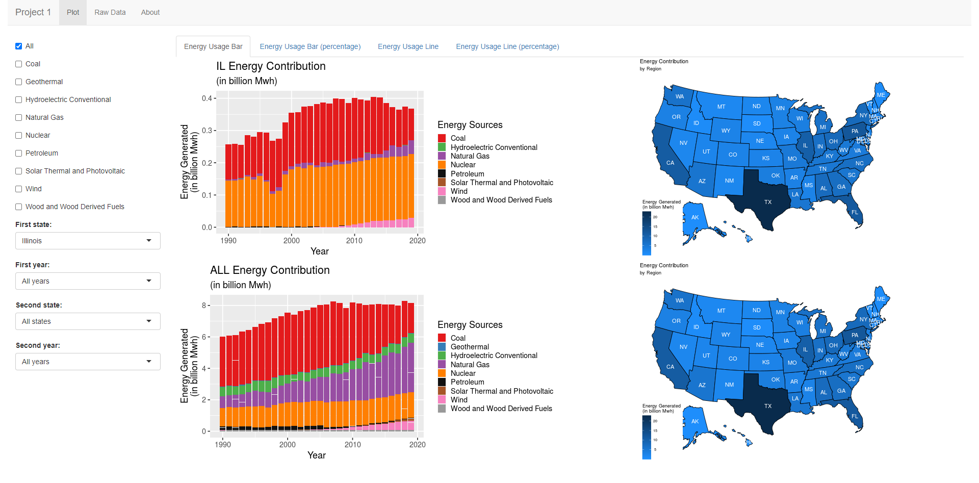
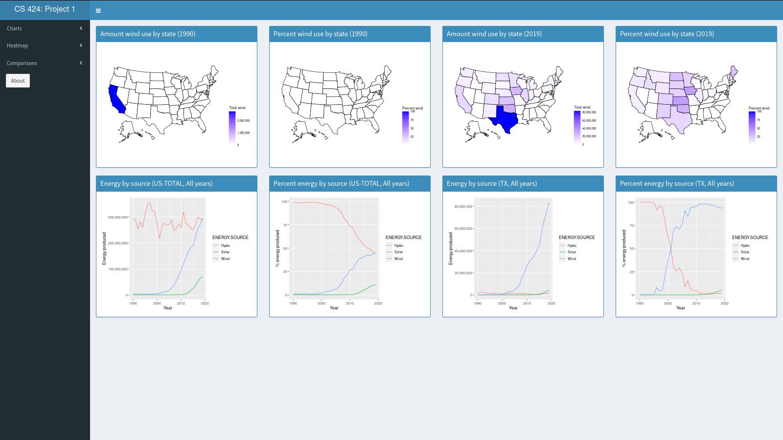
an additional 30% you need to add how geography affects this mix
augment the 'split screen' view above to not just show
changes over time, or differences in amounts of a particular
energy source, but allow the user to do geographic comparisons
(e.g. show coal in 1990 vs coal in 2019 geographically, or
coal in 2019 vs hydro in 2019 geographically)
add a heat map (using the usmap library) to the split
screen view showing the entire US broken up by states
(including Alaska and Hawaii, but not Washington DC) where
each state is shaded by the percentage of that energy source in that state for that year
add a heat map (using the usmap library) to the split
screen view showing the entire US broken up by states
(including Alaska and Hawaii, but not Washington DC) where
each state is shaded by the total amount of that energy source
in that state for that year
Graduate
Students need to add:
add a menu of 5 'interesting comparisons' to your interface
that will allow the user to quickly see the interface shift
itself into the appropriate settings to show each of those 5
interesting comparisons that you have found in the data.
In all of these case you need to make sure that your
visualizations are well constructed with good color and font
choices, proper labeling, fast updates, and that they effectively
reveal the truth about the data to the user.
Note that as part of the web page part of the grade you will need
to use your interface to show your findings, so make sure that the
way your interface displays information is clear.
Turning in the Project
There aretwo due datesfor the project.
The source code and
application are due first.
For this project you should host your
solution using Shinyapps.io. For later projects we may move to a local server. This kind of
deployment is covered in the 'Learn Shiny' tutorials.
Your code should be turned in and made available on GitHub ( https://github.com/)
in a public repository for the project. You can keep the
repository private while doing your development. I would suggest
setting up the GitHub project early and regularly pushing code to
it as a backup.
It is important to note that 'getting it
to work' is just a prerequisite to using the application to find
answers to your questions. It is that usage that will give you
ideas on how to improve your app to make it easier and more
intuitive to find those things. Writing the application at the
last minute pretty much guarantees that you will not come up
with an intuitive interface.
Many of the routines you write for this project will be used
again and expanded upon in the upcoming projects - e.g. all of
the projects will need graphs, so it is a good idea to write
your code in a way that it is reusable so you can modify it
rather than totally rewriting it later.
Chrome's Developer Tools allow you to
emulate screens of different sizes (view / developer / developer
tools / settings / devices).
Before the
application due date&time please send an email to andy and
abeer with the URL of your GitHub site and your Shinyapps
site.
The second deadline is for the
documentation.
You should
create a public web page with visible to at least anyone in
the course for at least the duration of the course that
describes your work on the project. You can host your web page
at UIC(http://people.uic.edu),
GitHub,or the provider of your choice, as
long as it remains available. You can use any publicly
available templates as long as you cite them, or create your
own.
This page should have several
sections including:
link to your visualization solution
1 page worth of text on an introduction and a description
of how to use your application and the things you can do
with it.
1 page worth of text on the data you used, including where
you got it, what you did to it.
link to your project on GitHub giving access to your well
commented source code, any necessary data files, and any
instructions necessary to run it. These instructions should
start from the assumption that the reader has a web browser
on their computer and tells the user everything else he/she
needs to know and do to get it running using R studio,
including installing correct versions of all the required
software.
1 page worth of text on what interesting things you found
about the data using your application.
all of which should have plenty
of screenshots with meaningful captions. Web pages like this
can be very helpful later on in helping you build up a
portfolio of your work when you start looking for a job so
please put some effort into it.
You should also create a 5 minute YouTube video showing the
use of your application including narration with decent
audio quality. That video should be in a very obvious place
on your web page. The easiest way to create the video is to
use a screen-capture tool while interacting with your
application, though you will most likely find its useful to
do some editing afterwards to tighten the video up. If you
do decide to use your phone or tablet to make the video,
then please shoot the video in landscape rather than
portrait orientation. Your video should show the
capabilities of your tool through a set of specific examples
of interesting things you found in the data.
I will be linking your web
page to the course notes so please send andy and the TA a nice
jpg image of your visualization for the web along with the
link to your website before the deadline. The image should be
named p1.<your_last_name>.<your_first_name>.jpg
and be roughly 1920 x 1080
Once you
have your web page done, send the URL to Andy and the TA
before the deadline. We will respond to this email as your
'receipt'.
An important part
of creating these kinds of applications is getting feedback
and using it to improve your design, and learning to give
quality feedback to others.
Normally we would be spending time in class for each person
to show off their work and get feedback. This term we will
be doing this asynchronously. See the course notes for week
5 for more details.
last revision 3/30/2021 - fixed
some grammar issues
2/15/2021 - added in web links, videos, screenshots
2/13/2021 - added in links to the applications and source
2/9/2021 - made the turnin instructions for the application for
obvious
2/1/2021 - made the terminology in the assignment more
consistent