Application due 3/13 at
8:59 pm Chicago time
Documentation due 3/15 at 8:59 pm Chicago time
Project 2 will be an individual project to
give people some more practice with writing a web-based
application that visualizes data in multiple ways using R and
Shiny and ggplot2 and leaflet. In this project we will add
plotting the geographic locations of data based on their latitude
and longitude and displaying that data in different ways on maps.
This project will again focus on using R to
visualize data on electrical power generation in the US, and use
shiny to give people an interactive interface to create those
visualizations. In Project 1 we looked at the US as a whole and at
different states to see how they were different in their energy
mixes. Here we are going to dive inside the state boundaries to
look at the actual locations of the different plants and allow us
to see how geographic as well as political boundaries affect coal
/ gas / solar / hydro / etc energy production in the US.
The original data is available from
https://www.epa.gov/egrid/download-data
in particular this file: eGRID2018v2 Data
File (XLSX)
where we will be looking at data from the
PLNT18 tab.
and we will also be making use of some of the
historical files in:
Download all eGRID historical files
(1996-2016) (ZIP)
such as the eGRID2000_plant.xls file and its
EGRDPLNT00 tab.
For this assignment you can
make changes to the data files before you load them into R, and
you very likely should make some changes to shrink the size of the
data files. You need to clearly document how you modify the files
in your website to the extent that someone following your
instructions could recreate your files from the originals.
The columns from the 2018 data that are most
of interest to us are:
plant state abbreviation
plant name
plant latitude
plant longitude
11 columns showing the annual generation from different sources
(as plants can have more
than one source)
COAL, OIL, GAS, NUCLEAR,
HYDRO, BIOMASS, WIND,
SOLAR, GEOTHERMAL, and
then you can combine the last 2 into OTHER
giving you 10 columns
total
From these columns you can compute the data
for other columns
- total generation
- percent of total for
each of the 10 types
- total renewable (HYDRO,
BIOMASS, WIND, SOLAR, GEOTHERMAL)
- total non-renewable (the
others)
- percent of total that is
renewable
- percent of total that is
non-renewable
Going further into the project you will need
to grab data from 2000 and 2010.
Once you convert the raw data files into the
files you plan to use I would again suggest playing with the data
in RStudio or Jupyter to try out various manipulations and
visualizations before creating the user interface in Shiny.
We will be using Leaflet for the mapping this
time instead of usmap.
Again you will be writing your code to run
full screen in a web browser at 1920 x 1080 resolution and it
should run on all current browsers (Chrome, Safari, Firefox,
Explorer, Edge, etc.). The
fonts and visualization primitives you create should be work
effectively at that scale. The user should never to scroll the
window, ever, so you should experiment with different ways to
organize the information and controls to find the most effective
combinations. Users will be using a mouse / trackpad to interact
so make sure your controls are reachable and at an appropriate
size.
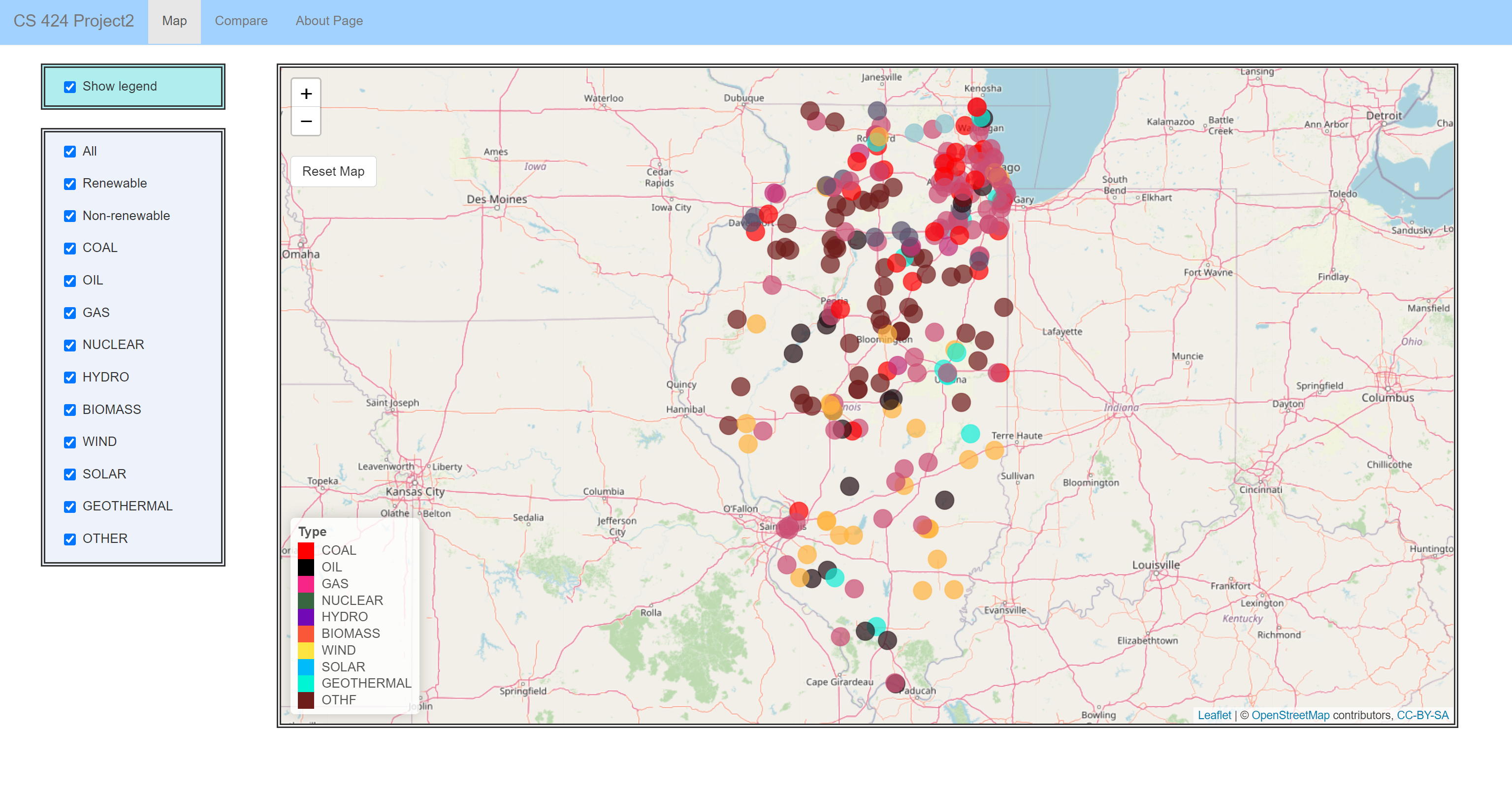
For
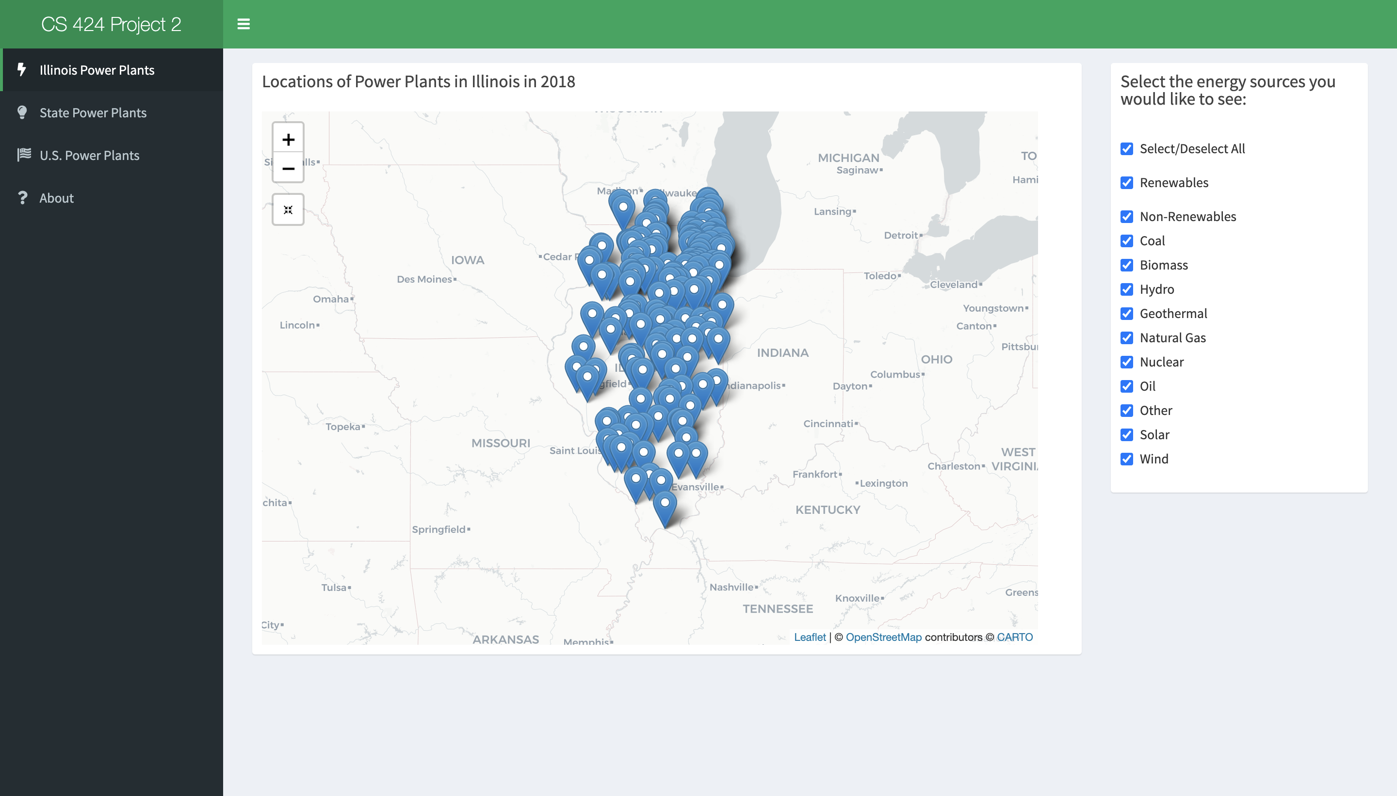
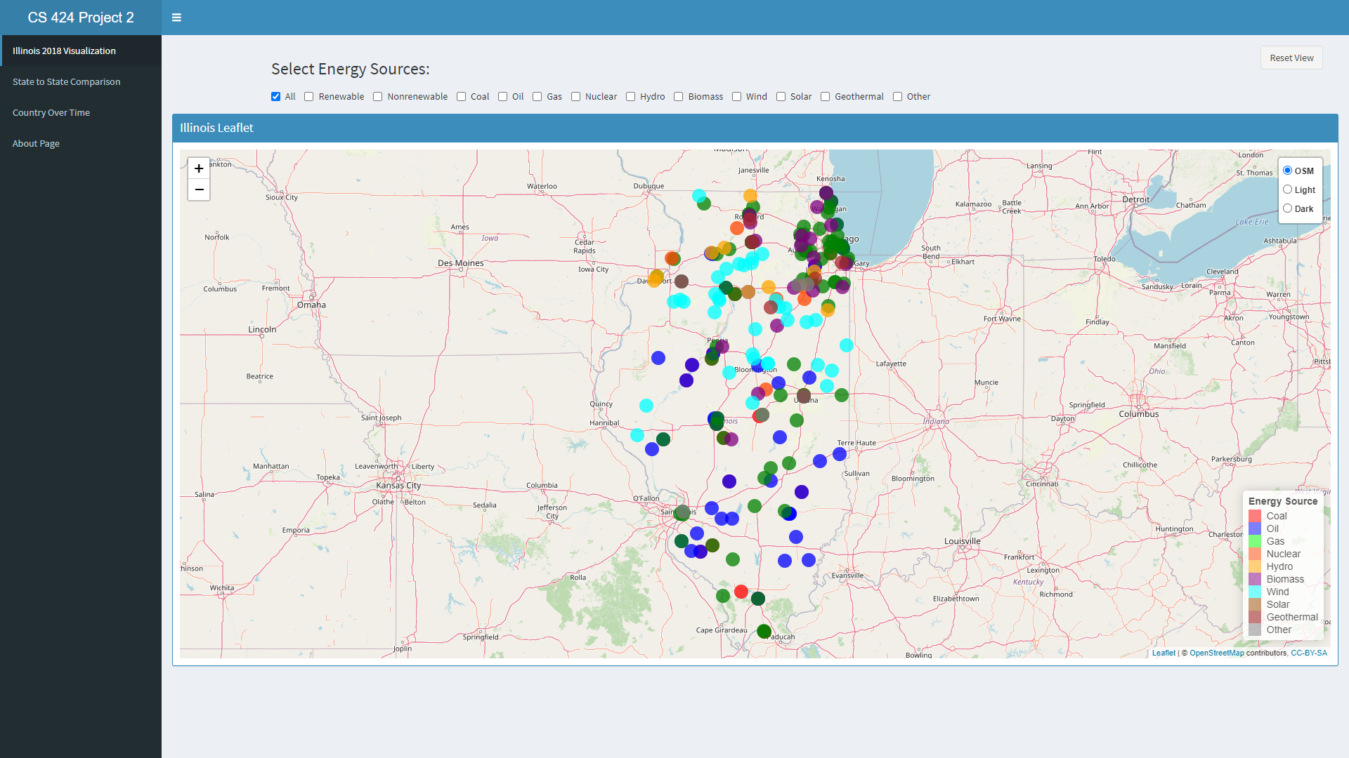
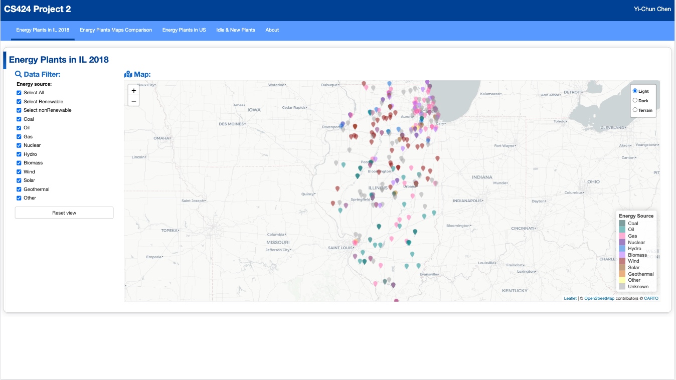
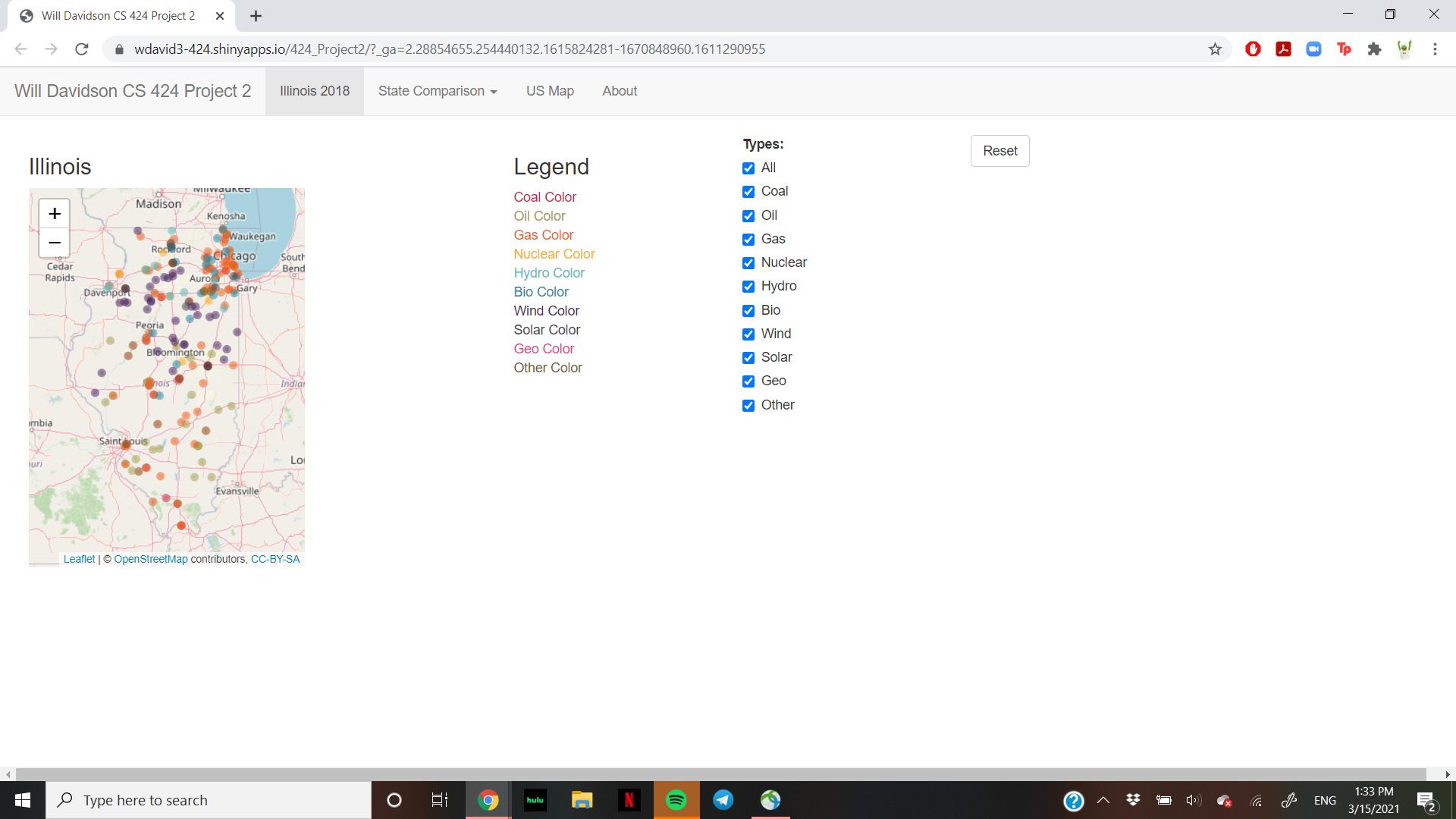
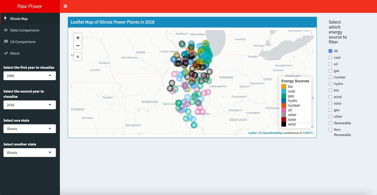
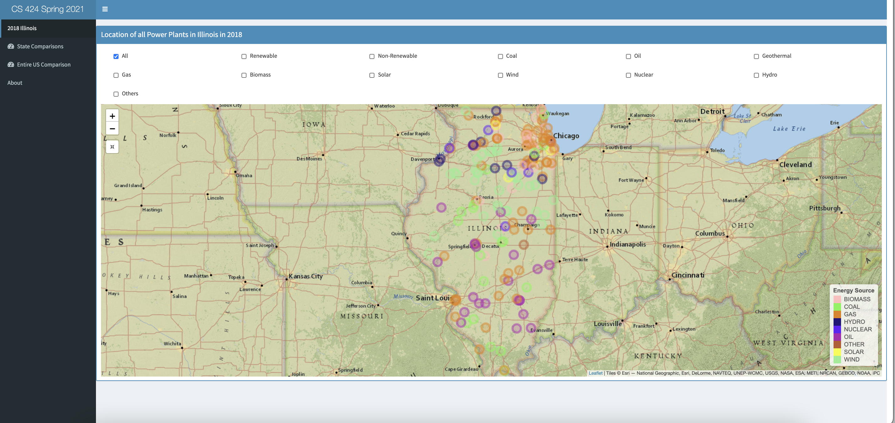
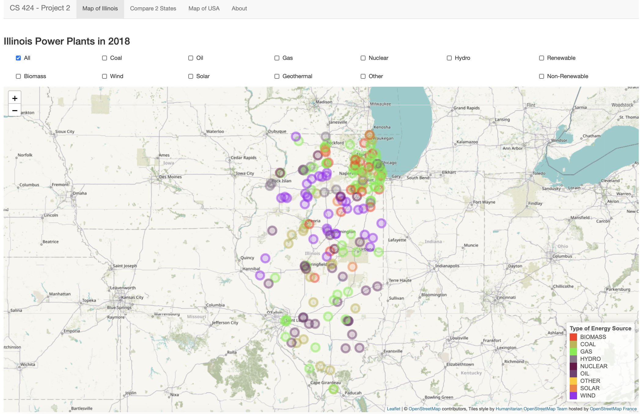
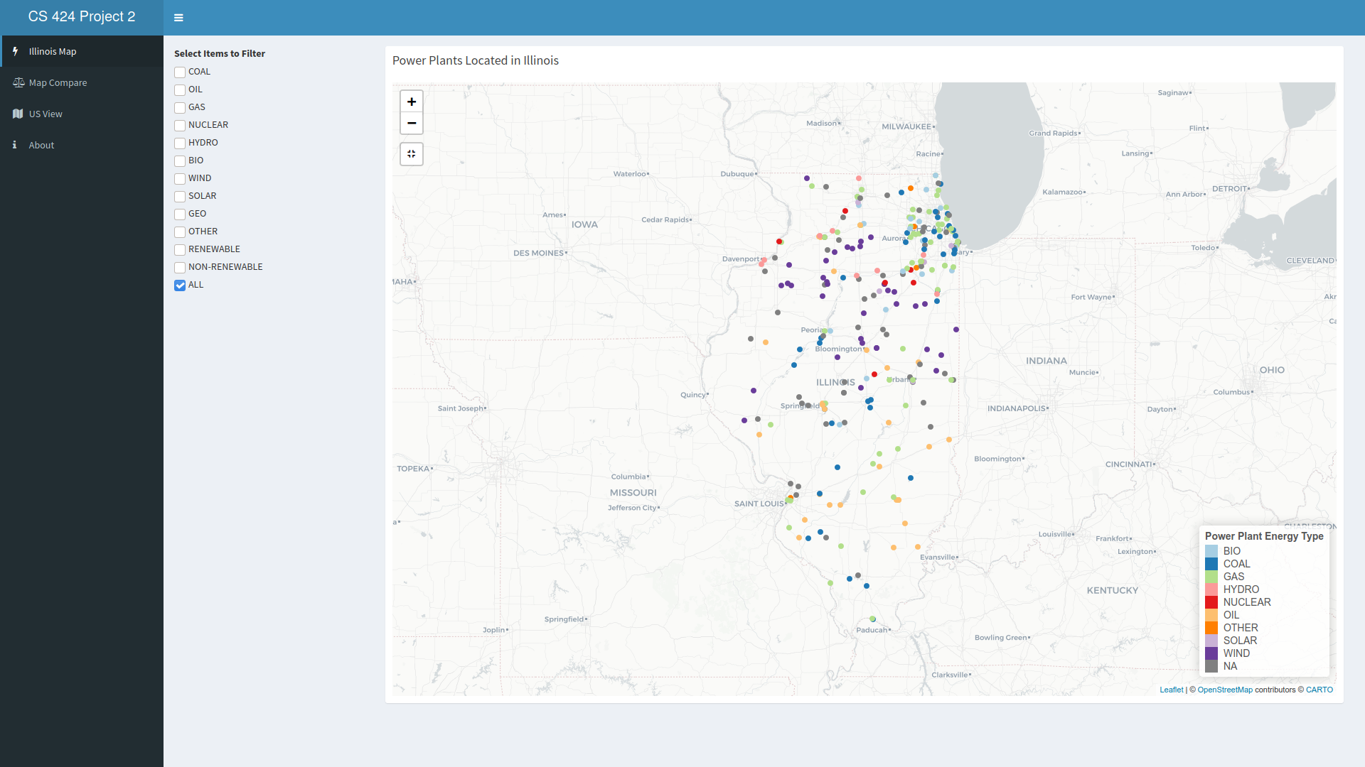
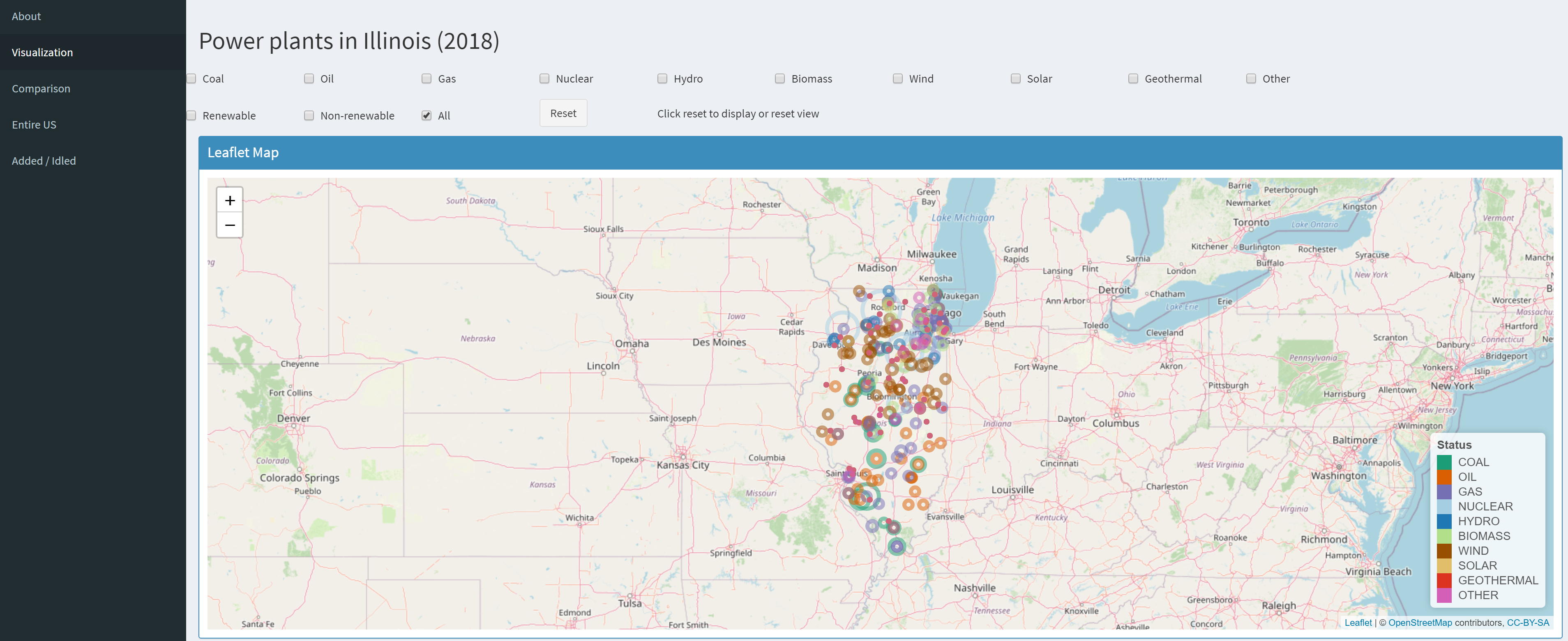
40% you need to:
read in your 2018 data file and create an interactive
visualization in R and Shiny on Shinyapps.io that initially
shows a properly centered and scaled leaflet map of the
state of Illinois showing.
location of all of the power plants in Illinois
colored by type
set of check boxes, one for each energy source, plus
'all' (where all is the default selection), renewables,
and non-renewables, allowing the user to filter which
energy sources are shown on the map
map is pannable and zoomable with the plant locations
updating dynamically
map has a reset button to go back to the original view
be able to handle plants with multiple types of
generation at the same location
legend showing which type of plant is which color
colors are appropriate for the map
have an 'about page' in your app with appropriate
credits
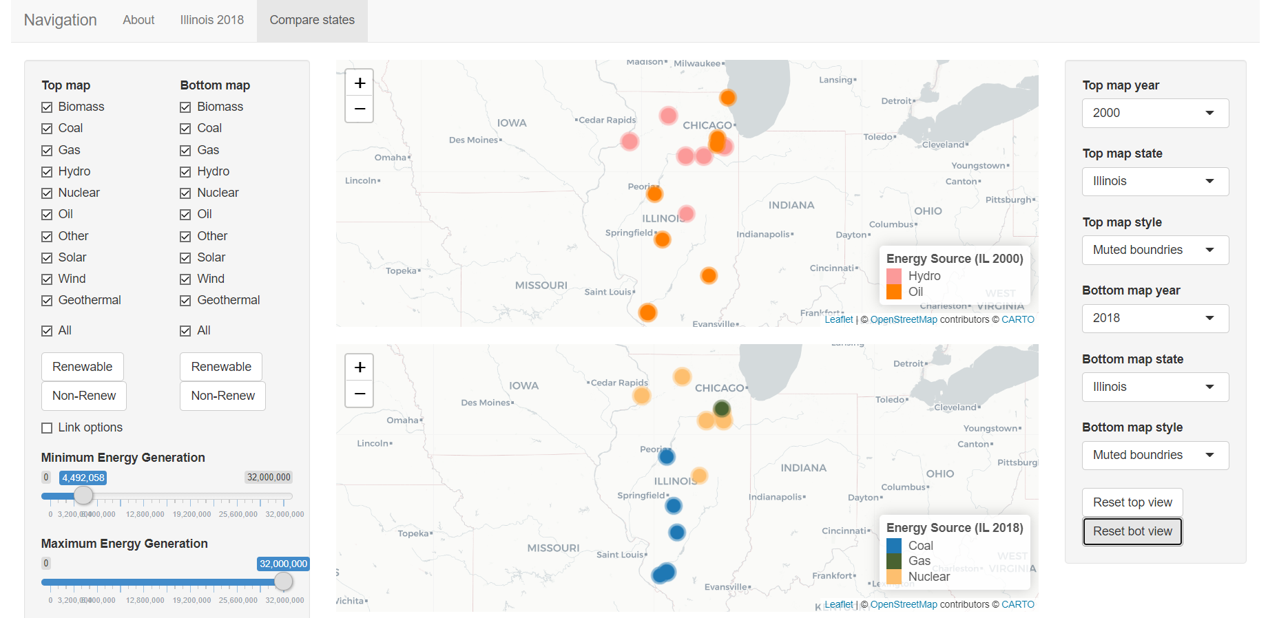
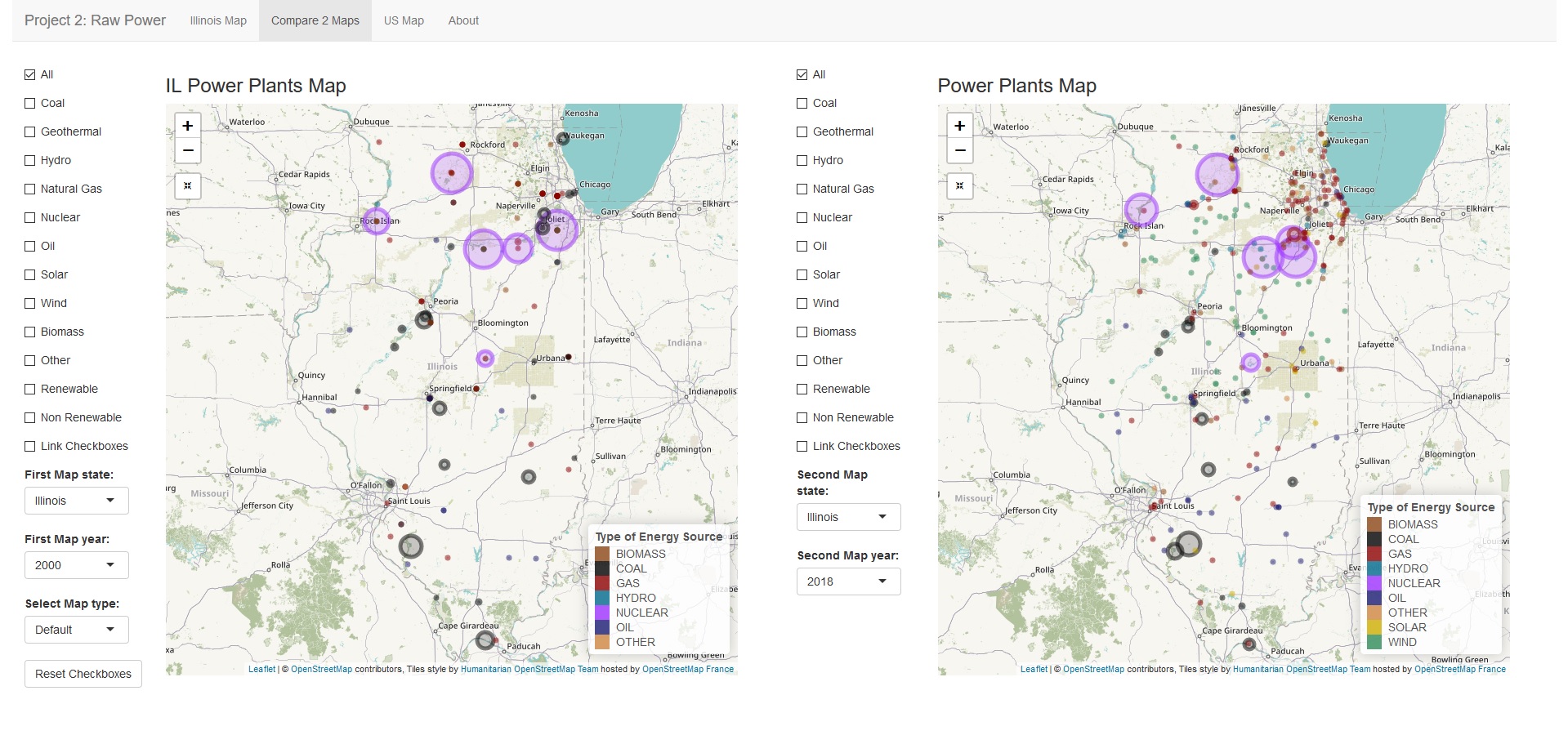
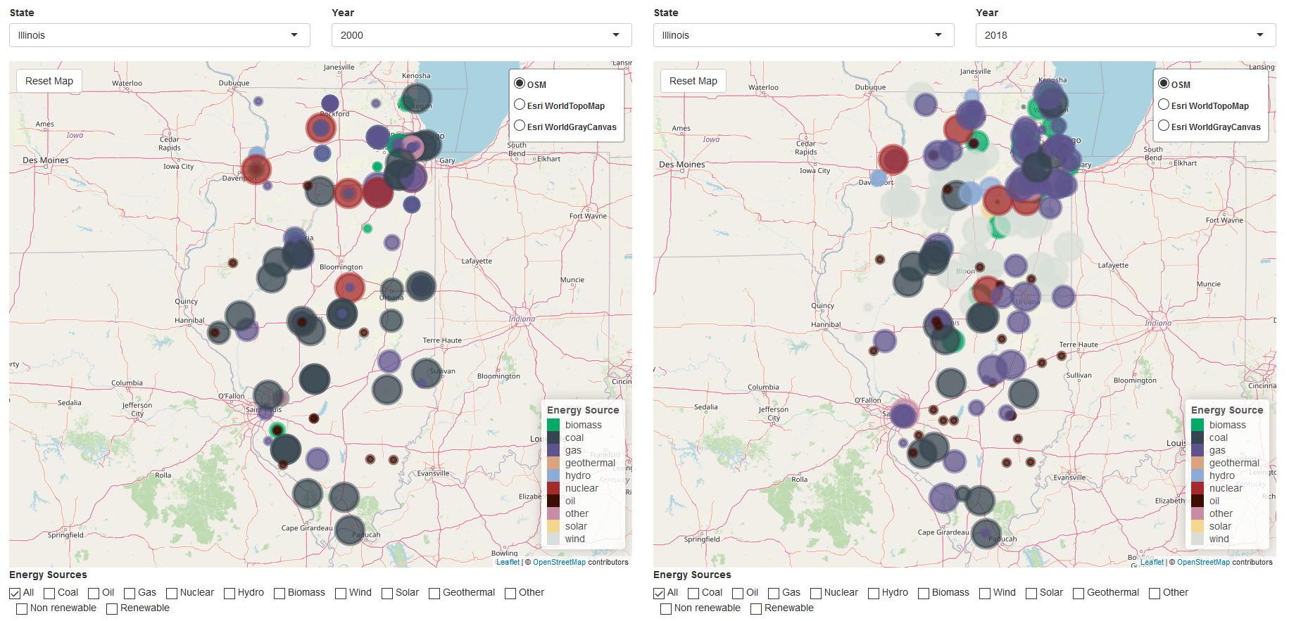
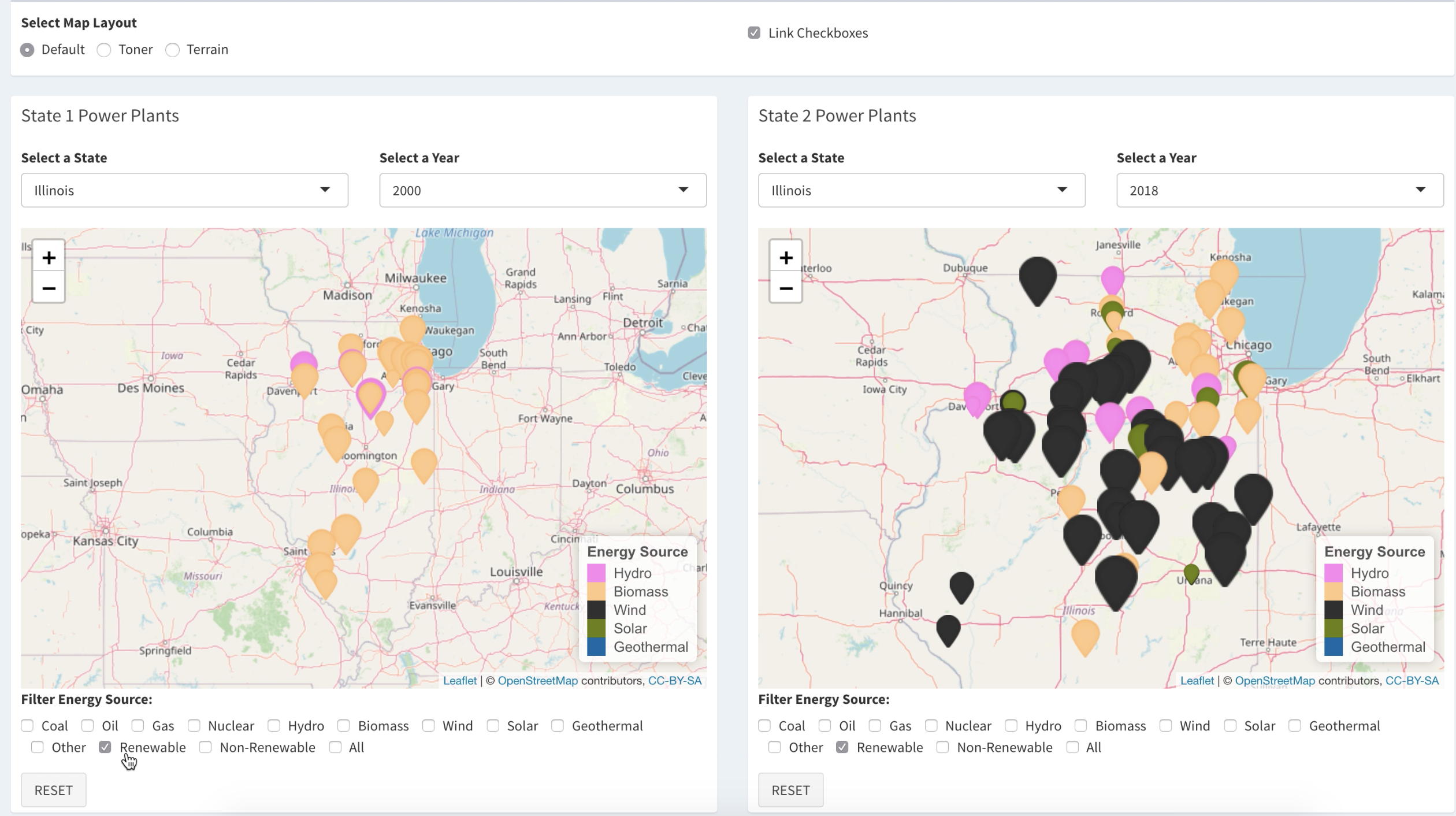
For
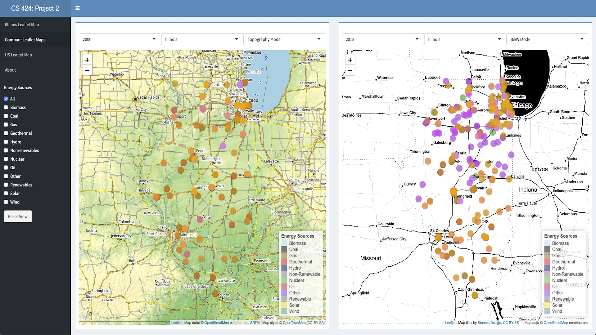
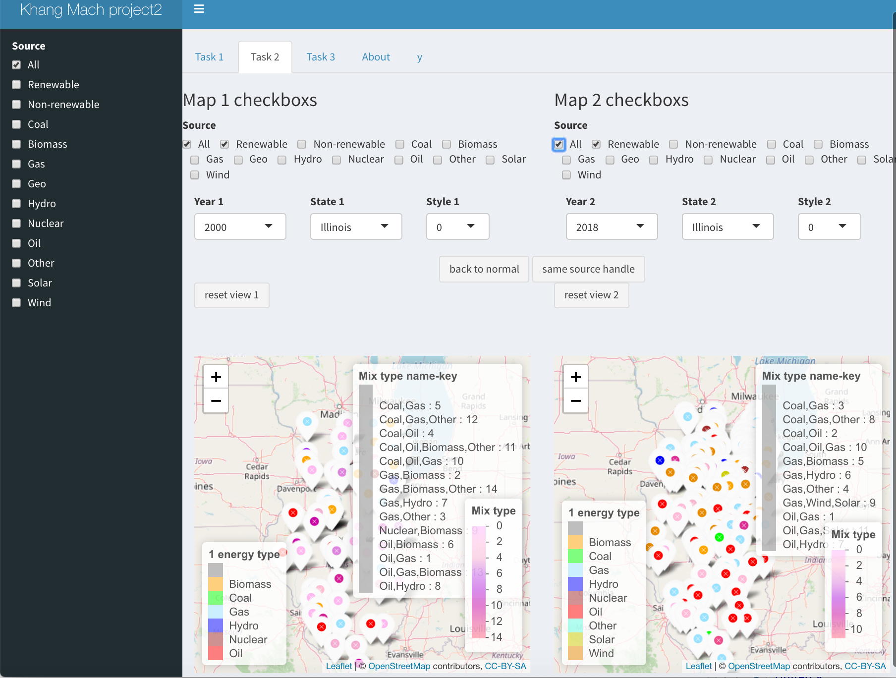
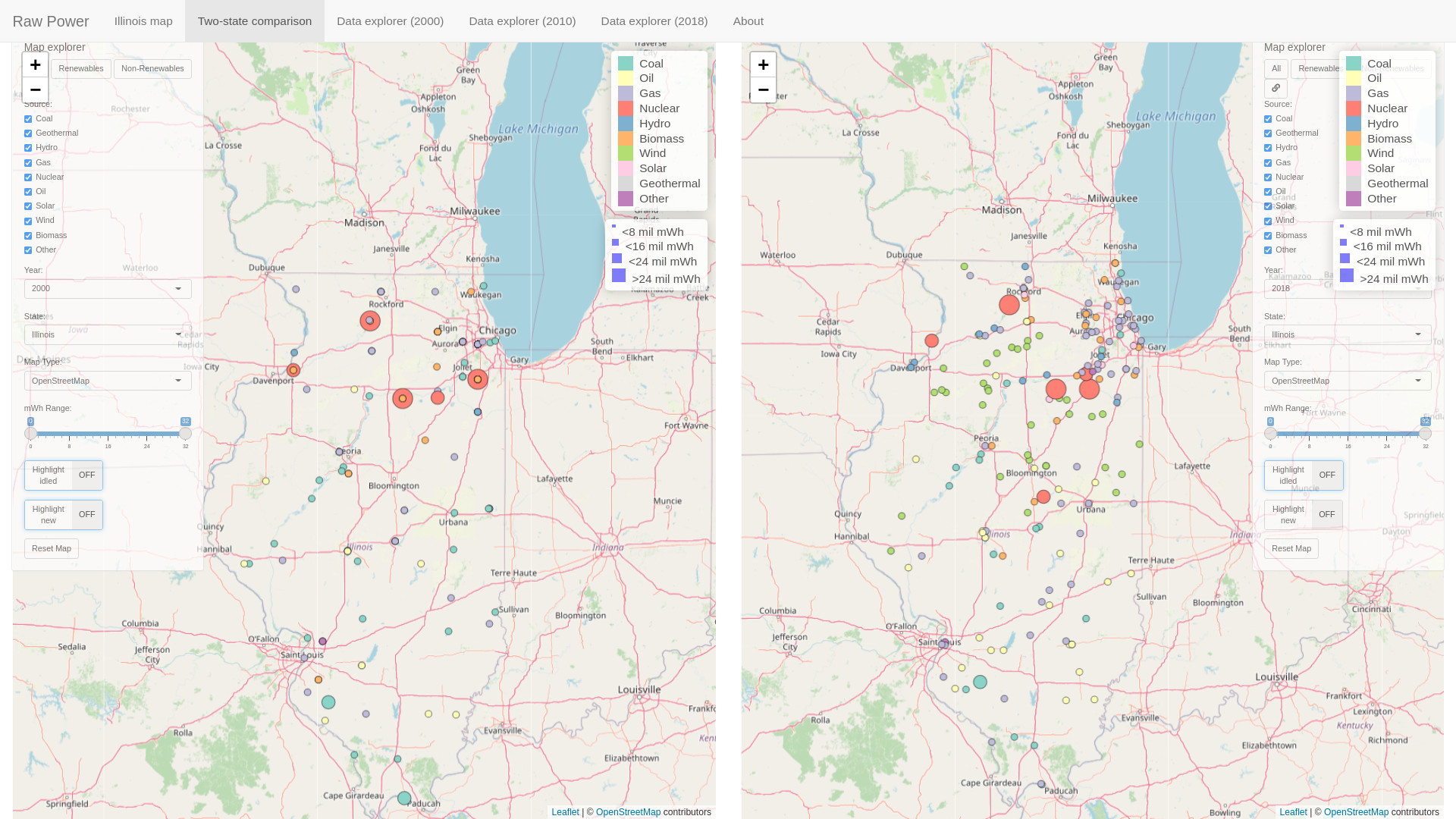
an additional 30% you need to the ability to compare 2 states
over three different years
read in your 2000, 2010, and 2018 files and create a split
screen visualization capable of showing two independent
leaflet maps. The left should initially show the location of
the plants in Illinois in 2000 and the right should show the
location of the plants in Illinois in 2018 (as in the part
above)
identical set of check boxes to independently show the power
sources in each map.
ability to link the check boxes to affect both maps
simultaneously
ability to choose a year (2000, 2010, or 2018) for either
half of the screen
ability to choose a state from a dropdown menu of the 50 US
states (again using the long names like 'Illinois' rather than
IL) for either half of the screen - choosing a state should
automatically pan and zoom the map to show a proper view of
that state.
in addition to showing the location and type of each plant
the size of the marker should show its generation capacity
(larger markers for larger generation capacity)
allow the user to choose from 3 different useful leaflet map
types
clicking on a marker shows the plant name, and its
generation capacity (for the different types it has), the
percent of the total capacity that is renewable, and the
percent of the total capacity that is non-renewable
the color for each power source should be consistent across
all the visualizations in your interface
each map is pannable and zoomable with the plant locations
updating dynamically
each map has a reset button to go back to the original view
For
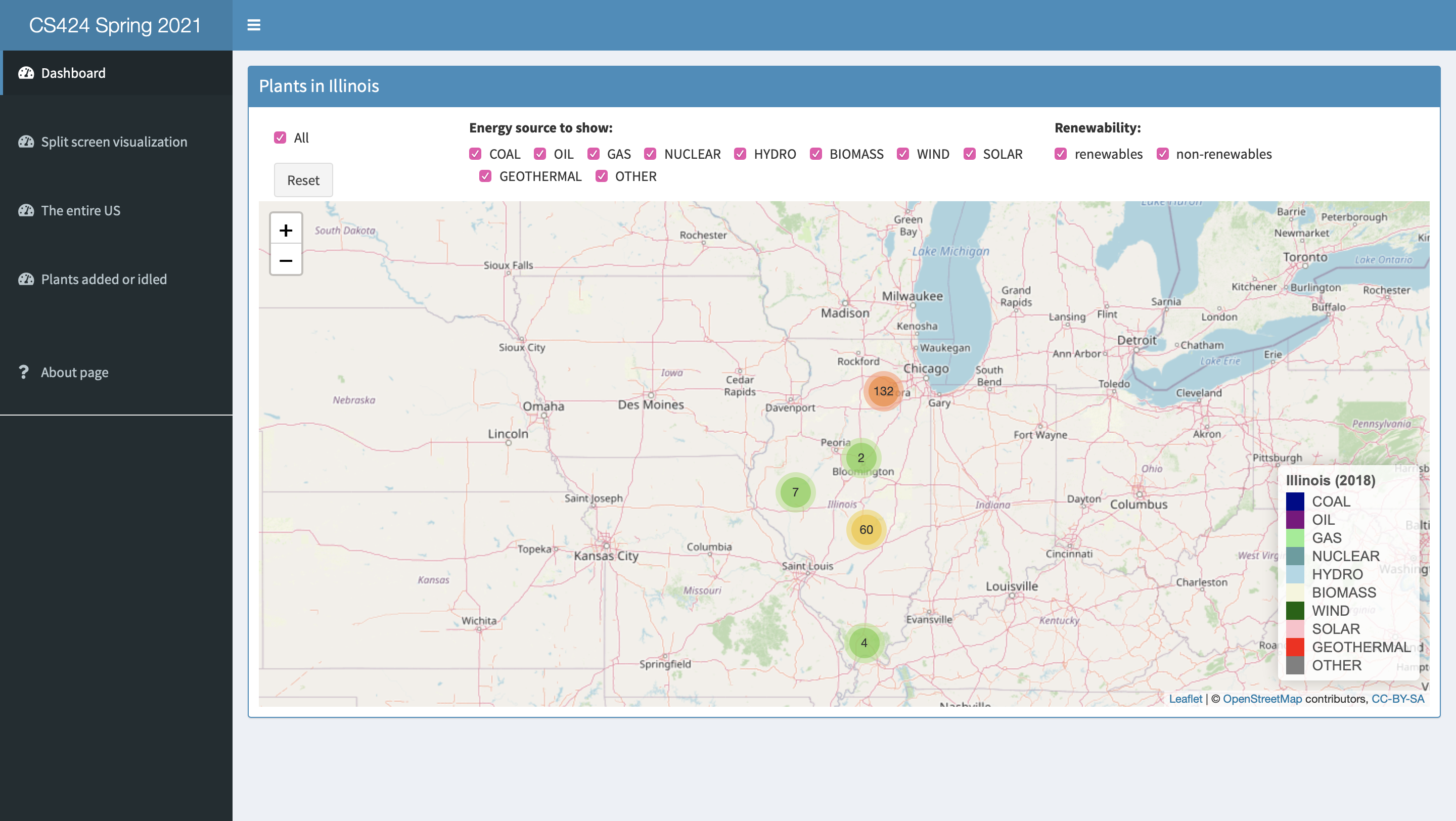
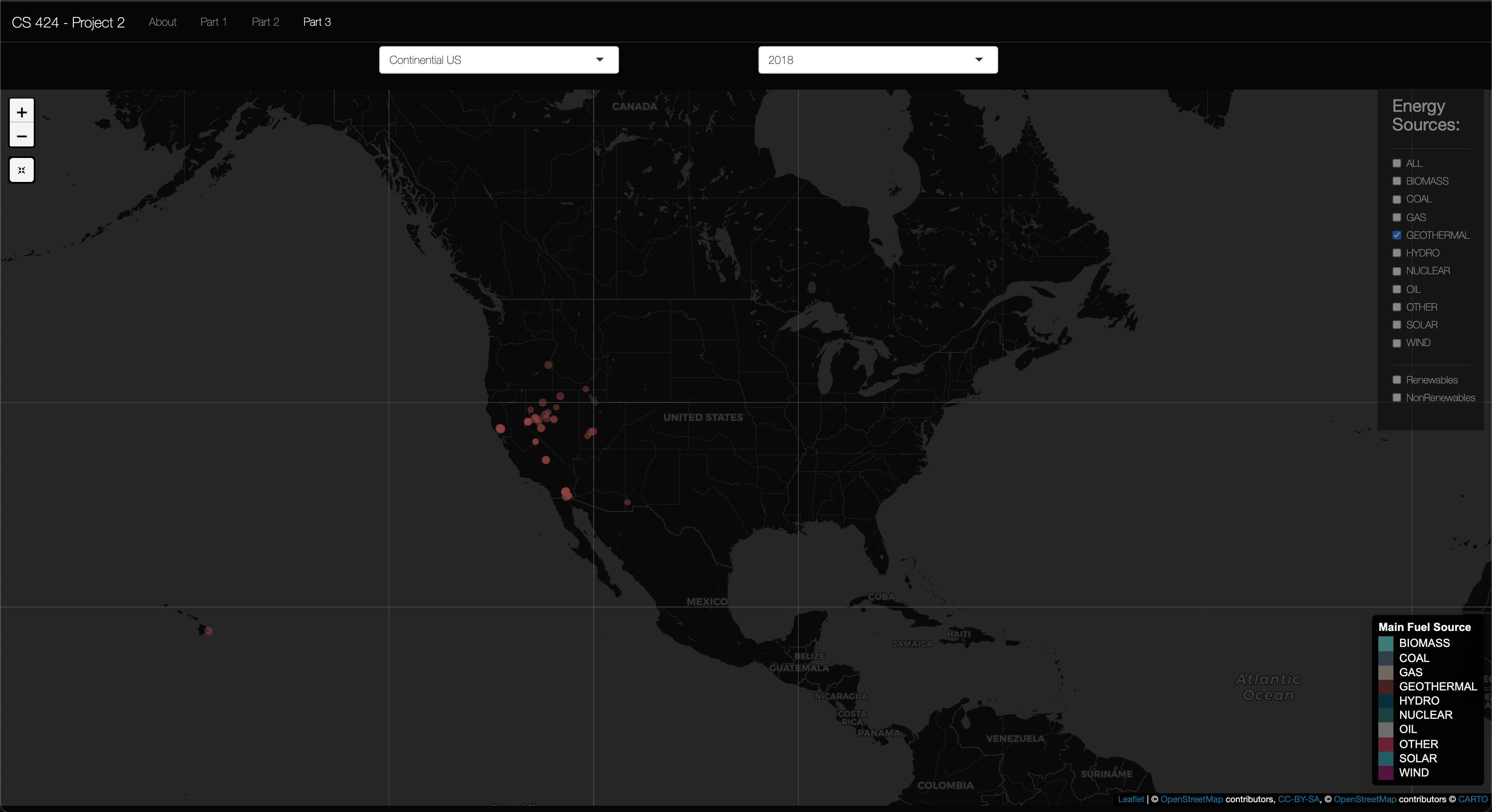
an additional 30% you need to allow the user to see the entire
US at once
in addition to each of the 50 states the user should be able
to pick the entire US and see an appropriately panned and zoom
map showing the continental US by default (i.e. Alaska and
Hawaii can be out of view to start)
the map is pannable and zoomable with the plant locations
updating dynamically
the map has a reset button to go back to the original view
same set of check boxes to independently show the power
sources. This time by default none should be selected.
same ability to show 2000, 2010, or 2018
allow the use to filter by generation amount with two
sliders. The user should be able to use this control to show
the big power plants ( > n MWh), the small ones ( < n
MWh), or a set in between. By default 'all' should be
selected.
This one could show a lot of markers so you will need to do
some optimizing.
Graduate
Students need to add:
Allow the user to display which plants were added or idled
in 2010 and 2018 compared to the previous dataset. The ORIS
facility code will be very helpful.
Note that as the map data is (reasonably)
current it may not exactly match the situation in any of those
three years, especially in terms of what buildings are where.
Whenever the user interacts the interface should respond quickly
and appropriately.
In all of these case you need to make sure that your
visualizations are well constructed with good color and font
choices, proper labeling, and that they effectively reveal the
truth about the data to the user.
Note that as part of the web page part of the grade you will need
to use your interface to show your findings, so make sure that the
way your interface displays information is clear.
Turning in the Project
There aretwo due datesfor the project.
The source code and
application are due first.
For this project you should host your
solution using Shinyapps.io.
Your code should be turned in and made available on GitHub ( https://github.com/)
in a public repository for the project. You can keep the
repository private while doing your development. I would suggest
setting up the GitHub project early and regularly pushing code to
it as a backup.
It is important to note that 'getting it to work' is just a
prerequisite to using the application to find answers to your
questions. It is that usage that will give you ideas on how to
improve your app to make it easier and more intuitive to find
those things. Writing the application at the last minute pretty
much guarantees that you will not come up with an intuitive
interface.
Before the application due date&time
please send an email to andy and abeer with the URL of your
GitHub site and your Shinyapps site.
The second deadline is for the
documentation which should be part of the web page you created
at the beginning of the course.
This page should have several
sections including:
link to your visualization solution
1 page worth of text on an introduction and a description
of how to use your application and the things you can do
with it.
1 page worth of text on the data you used, including where
you got it, what you did to it.
link to your project on GitHub giving access to your well
commented source code, any necessary data files, and any
instructions necessary to run it. These instructions should
start from the assumption that the reader has a web browser
on their computer and tells the user everything else he/she
needs to know and do to get it running using R studio,
including installing correct versions of all the required
software.
1 page worth of text on what interesting things you found
about the data using your application.
all of which should have plenty
of screenshots with meaningful captions. Web pages like this
can be very helpful later on in helping you build up a
portfolio of your work when you start looking for a job so
please put some effort into it.
You should also create a 5 minute YouTube video showing the
use of your application including narration with decent
audio quality. That video should be in a very obvious place
on your web page. The easiest way to create the video is to
use a screen-capture tool while interacting with your
application, though you will most likely find its useful to
do some editing afterwards to tighten the video up. If you
do decide to use your phone or tablet to make the video,
then please shoot the video in landscape rather than
portrait orientation. Your video should show the
capabilities of your tool through a set of specific examples
of interesting things you found in the data.
I will be linking your web
page to the course notes so please send andy and the TA a nice
jpg image of your visualization for the web along with the
link to your website before the deadline. The image should be
named p2.<your_last_name>.<your_first_name>.jpg
and be roughly 1920 x 1080
Once you
have your web page done, send the URL to Andy and the TA
before the deadline. We will respond to this email as your
'receipt'.
An important part
of creating these kinds of applications is getting feedback
and using it to improve your design, and learning to give
quality feedback to others.
Normally we would be spending time in class for each person
to show off their work and get feedback. This term we will
be doing this asynchronously. See the course notes for week
10 for more details.