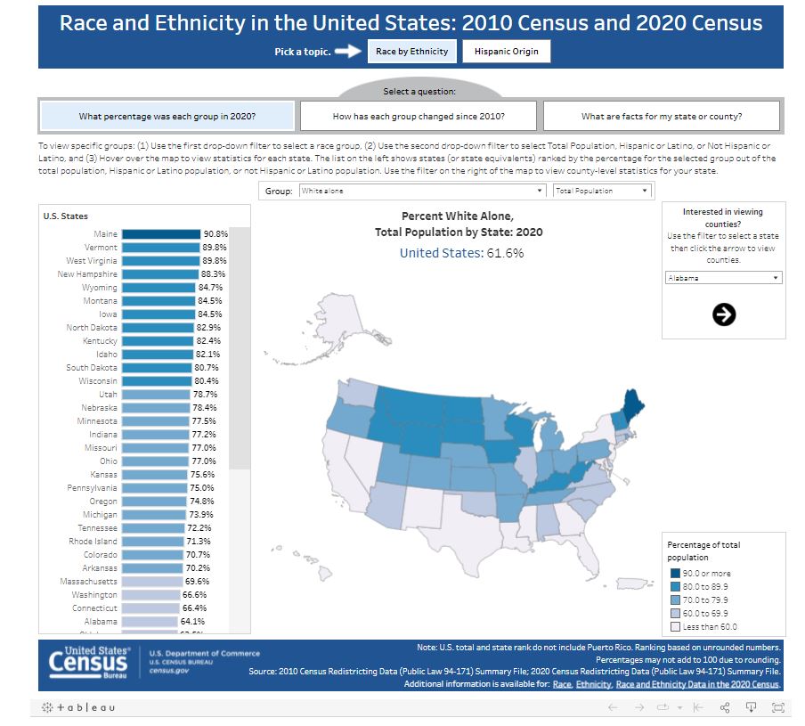
2012 London Olympics -
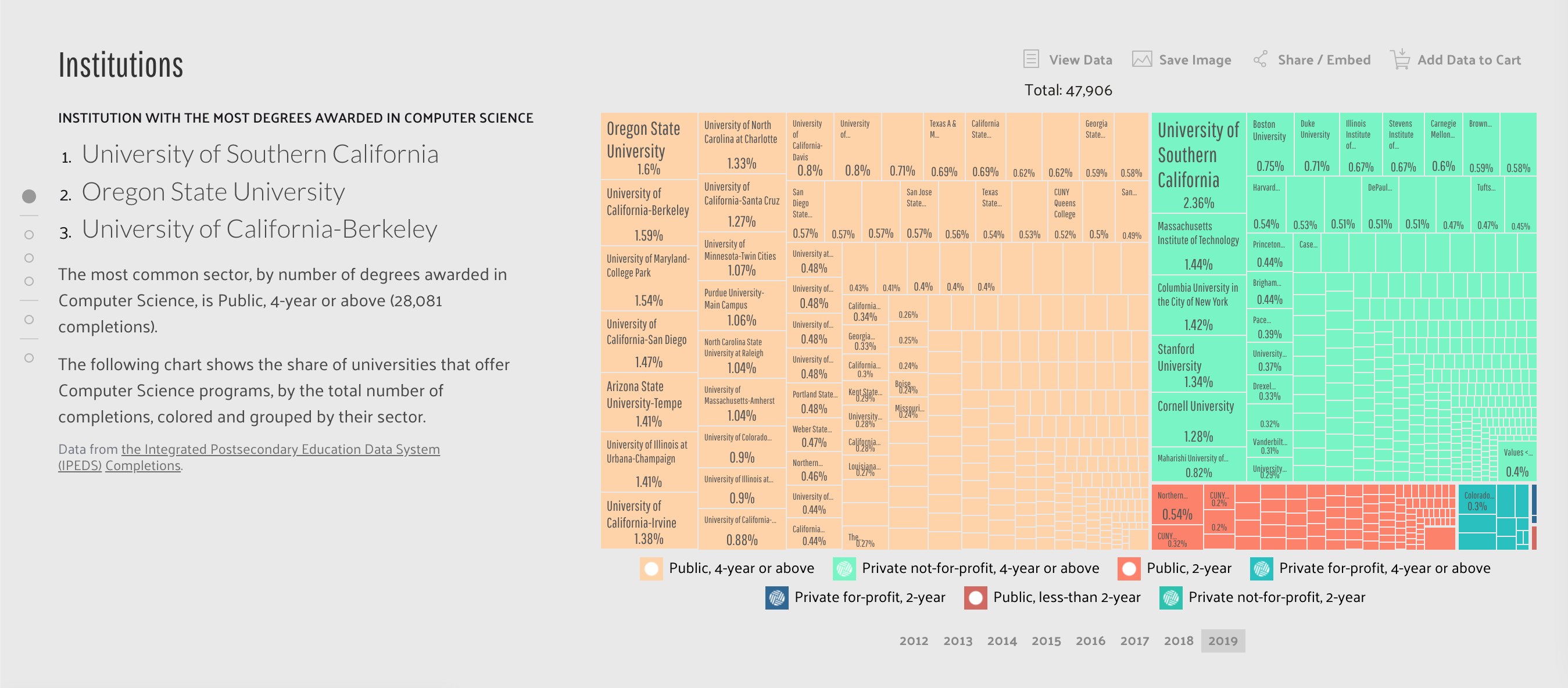
Medals Treemap
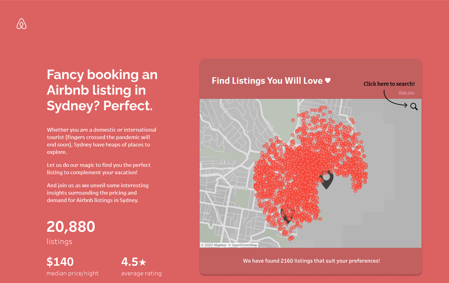
2014 DC Crime Map
35 Years of American Death
4 Letter Words
50 Years of Change
500 Cities Project: Local Data for Better Health
7 billion
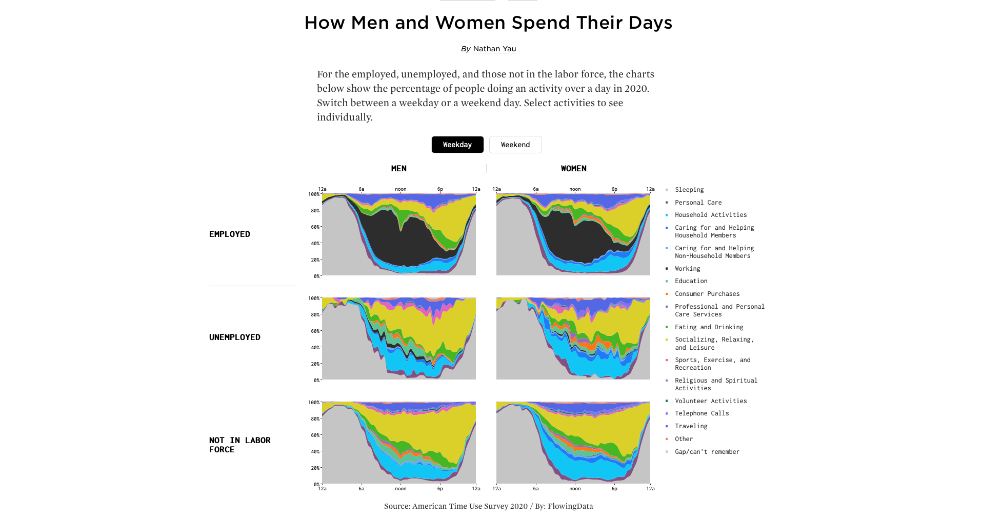
A Day in the Life of
Americans
A Day in the Life of the MBTA
A who's who guide to the Marvel Cinematic Universe
A World of Terror
About the Codex Atlanticus
All CPU Meter
American Migration
American Segregation, mapped at day and night
Animal Trade
Apple Health App
APRILZERO
Atlas of Redistricting
Average Happiness in the US
Based on a True
Story
BBC British History Timeline
Bestiario Research Flow
Big Mac Index
Bloomberg Billionaires
Bloomberg Industry Market Leaders
Buckets
Cancer Today
Cardcaptor Sakura
Child Marriage
China Global Investment Tracker
CLAL Export Spotlight
CMAP Mobility
Coclear Carbon Disclosure Project
Converging Flight Paths
Cook
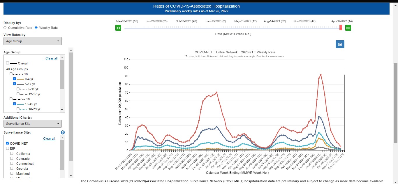
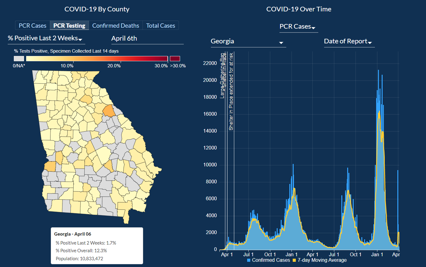
County Public Health COVID-19 Surveillance Data
Counted
Counting the Hours
COVID
Vaccine Market Dashboard
Covid19India
COVID-19 Tracker
CricVis-2015
deaths of children
under 5 years due to diseases
Democrats are Doomed, or How a Big Tent Can Be Too Big
Digital Divide
Dreaming in Numbers
Drug Poisoning Mortality in the United States, 1999-2017
Dumpster
Economy Map
Educational
Opportunity in the US
Educational Services,
Health Care & Social Assistance
Elastic Lists - Nobel Prize Winners
Energy Technology Perspectives
Estimate Electricity Usage and Cost
Every Active Satellite Orbiting Earth
Explore Adventure
Facebook Privacy
over Time
Facebook Stories
fashion's
BLM reckoning was mostly bluster
FCC
Fixed Broadband Deployment
FIFA Development Globe
Financing Global Health
Find everywhere you can go in 15 minutes or less
FlightRadar24
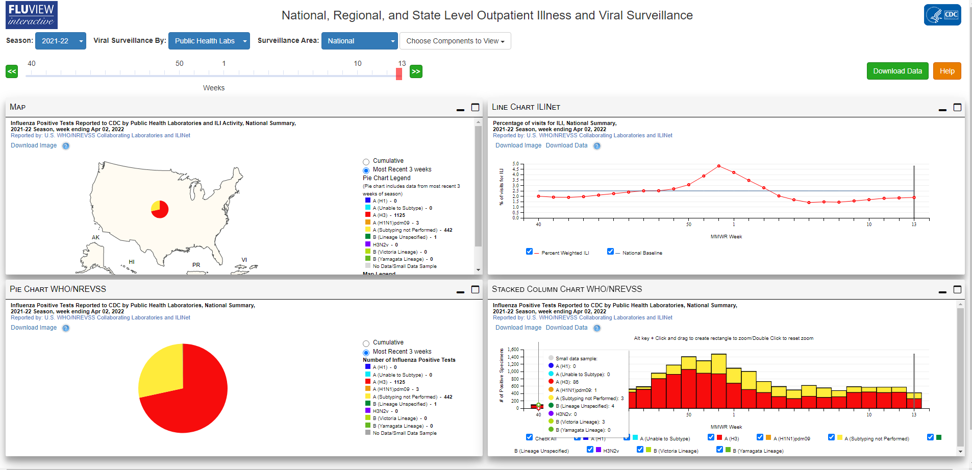
FlightRiskFLUVIEW
Interactive
Foreign-Born Population
Four Ways to Slice Obama's 2013 Budget Proposal
Galaxy of Covers
GitHut.info
Global Commodities
Global COVID-19 Coronavirus Statistics
Global Corruption Barometer
Global Diplomacy Index
Global Economic Dynamics
Global Forest Watch
Globe of Economic
Complexity
Golf Course Ranking Visualization
Good Governments Help People Succeed
Great Escape
Growth of Newspapers Across the US
Hawai'i Campaign
Spending Data
HeathCostsUSA
Hewlett Foundation Grants
Histography
HLTV
HOLLYWOOD IN$IDER
Homicide Rates in Mexico, 2017
Homicides in the District of Columbia
Honolulu City Budget
How Americans Die
How Educated are World leaders
How fast is LAFD where you live?
How much of your body is your own?
How the Recession Reshaped the Economy
Hubway Trip Explorer
Hungry Tech Giants
Idaho
Department of Labor
IDBac: Visualization of
MALDI-TOF Mass Spectrometry data
Immigrants and Migration in Poland
Income Mobility
Income x Education x Race
Indian Election Results (2014)
Innovation Barometer 2012
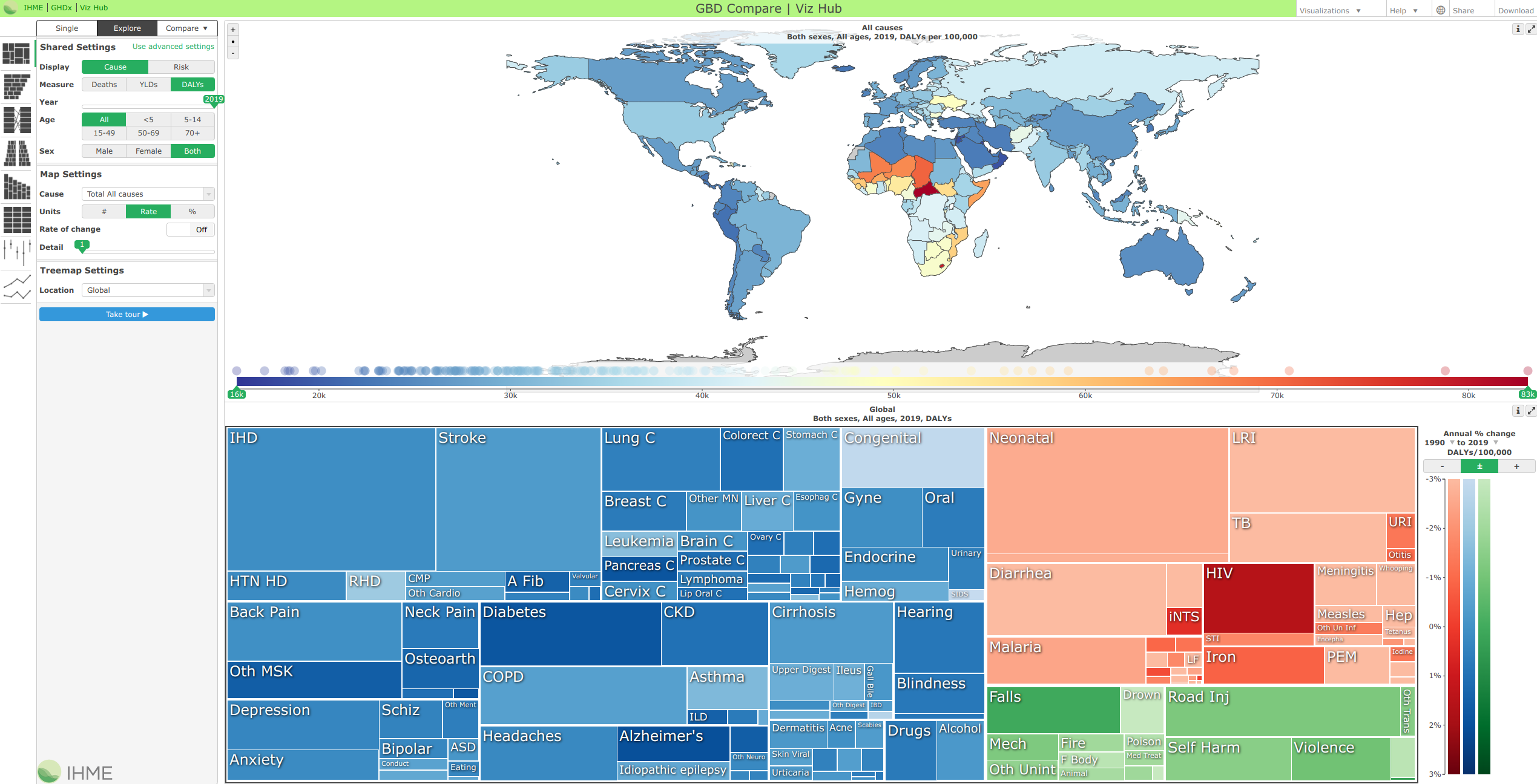
Institute for Health Metrics and Evaluation GBD Heatmap
INTERACTA
Interactive State of the Union
Intercontinental Ballistic Microfinance
Is It Better to Buy or Rent
Japanese-American
Internment in WWII
Jobs Charted by State and Salary
Justice Map
Kindred Britain
language
distribution map
Life Expectancy
Life Expectancy & Probability of Death
Live
Music Analyst
livehoods
liveplasma
Lostalgic
Lowly Institute Asia Power Index
|
Macrometeorites
Mapping Marijuana Sales
Mapping Migration in the United States
Mapping Motor Vehicle Collisions in New York City
Mapping the Nation's Well-Being
MDG Viz
Measure of a Nation
Media Use in the Middle East
Meeting the Demand for Skilled Workers
Minimum
Wage Tracker
Miseducation
Money Chart
Most Common Occupation by
Age
Most Common Use of Time
Most Valuable Players
Music Timeline
Nanocubes
National Unemployment
News Articles about the Mueller Investigation
NBA 3D
NBA
Advanced Stats
NFL Gamecenter
NFL 2013-2014 Season Salaries
NFL Spider - link
NFL Superbowl: A History of NFL Seasons and Champions
NHTSA
Traffic Fatalities in Crashes Involving Speed
nperf 3G/4G/5G coverage
map
NYC FOODIVERSE
Oakland
Crimespotting
Obama's 2012 Budget Proposal
OECD Better Life Index
OECD Regional Statistics
OECD Regional Well-Being
Olympic Games Data
omni-SCI
On Broadway
One Book, Many Readings
One Million Tweet Map
Opportunity Atlas
Oskope
Pain at the Pump
PaleoDB
Polar Bear Populations
Politilines
Population Estimation Service
Power Ranges
Project Ukko
rail rider
RealClear Politics 2016 Republican Polls
Redrafted
Refugee Project
Replay #Worldcup2014 on twitter
Rhythm of Food
riot rumors
road accident in Medellin
Scale of the
Universe
Seeing
CO2
Seeing Music - the Shape of Song
SelfieCity
Sensor
Tower
SEXPERIENCE 1000
Shifts in How
Couples Meet
Small Arms Imports and
Exports
Snake Oil Superfoods?
Social Media
Sputnik Legacy
Stages of Relationships,
Distributed
Startup Universe
Stop, Question and Frisk in New York
Neighborhoods
Super Zips
Superheroes Talent Lab
Tag Galaxy
TalentLab Superheroes
Terrible numbers that grow with each mass shooting
Tobacco Viz
Top Movie Directors
Top World Cup Players on Facebook, Day by Day
Track National Unemployment, Job Gains and Job Losses
Tracking the Oil Spill in the Gulf
Tracking US Drought Severity
TransitCenter
Travel Visa Inequality
Trends in Higher Education
Trends in Innovation
Trip Happy
Trulia Crime Map
Tweet Map
UFC Fighters &
Refs Analytics
UHERO Equal Pay Dashboard
UK 2015 General Election Results
unicef
Immunization coverage estimates
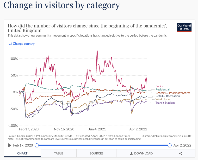
United Kingdom:
Coronavirus Pandemic Country Profile
United States Gross National Happiness
on Facebook
US
Census Small Area Income and Poverty Estimates
US Gun Deaths
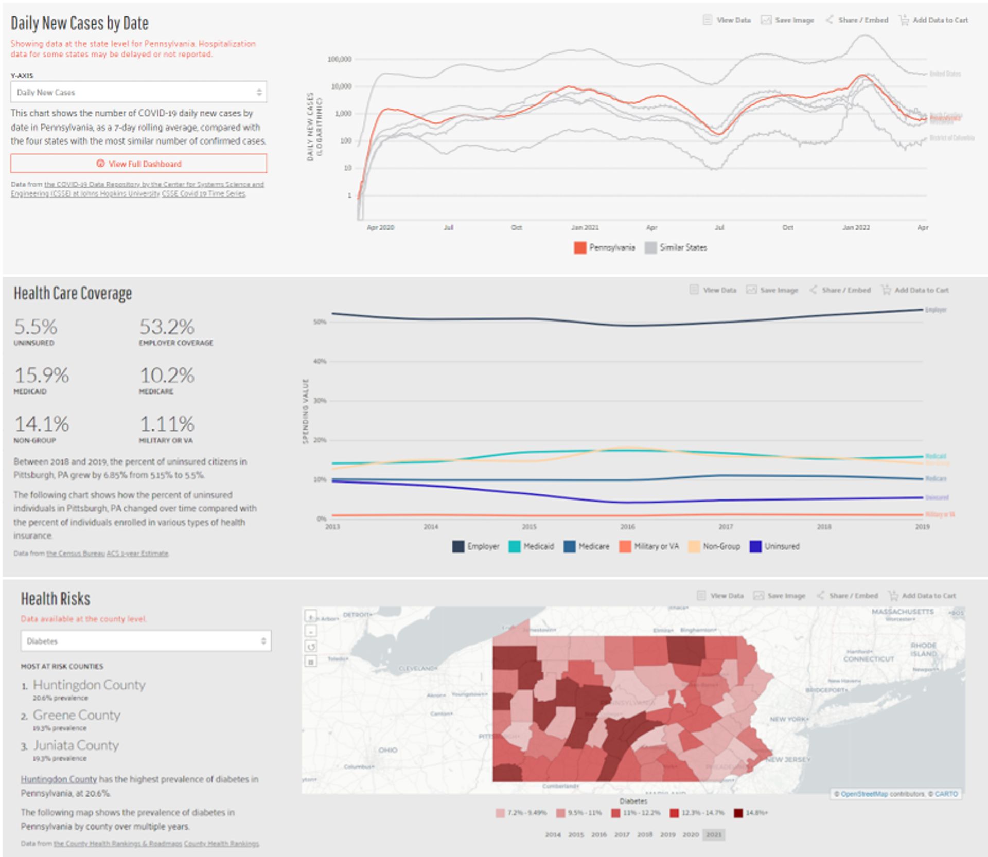
US Health Map
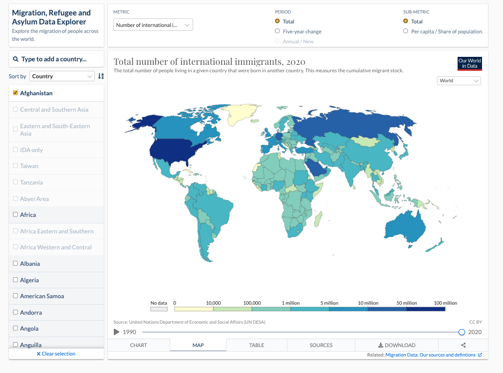
US Migration
US
Wildfires in 2019
USAFACTS
Vinyl
Visualization of the United State debt
Visualization Universe
Visualizing data from the Large Hadron Collider
Visualizing Emancipation
Visualizing How A Population Grows To 7 Billion
Visualizing MBTA Data
Visualizing our Future Selves
Visualizing The U.S. Electric Grid
Visualizing Yahoo Mail
W3schools.com's
Historical Browser Statistics
WATCHDOGS WeareData
Water Quality in the United States
We Feel Fine
Websites of Member Ministries of Education
What Movie Should We Watch Tonight
What the World Eats
What They Know
When Do Americans Leave For Work? and How Americans Get
to Work?
Where Athletes in the Premier League, the N.B.A. and
Other Sports Leagues Come From
Where Do College Graduates Work
Where Does My Money Go
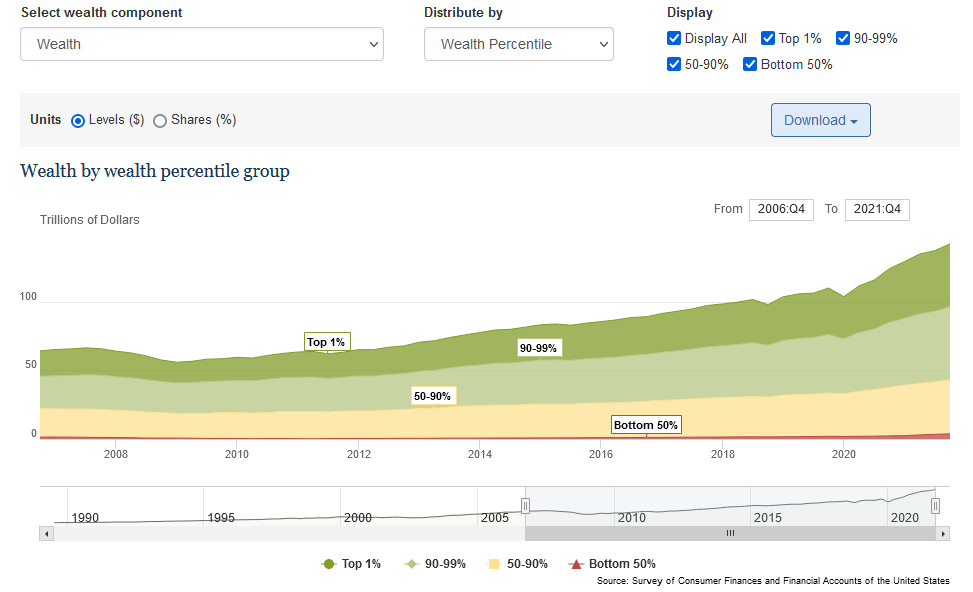
Where is the 1%?
Where
The Latest COVID-19 Models Think We're Headed � And
Why They Disagree
Where we came from and where we went, state by
state
Where Your Job is Most Popular
Who Likes Whom in the Middle East
Who's Been Working in America?
Who Saves the Least Money
Wild Elephants
Wind and Words
Windy.com
World Above Us
World Cup Players
World Obesity
World of Records
World's Biggest Data Breaches
worldshapin
YouTube Trends Map
|