Application due 2/12 at
8:59 pm Chicago time
Documentation due 2/14 at 8:59 pm Chicago time
Project 1 will be an individual project to
give people practice with writing a web-based application that
visualizes the same data in multiple ways using R and Shiny and
ggplot and Shiny Dashboard. In this project everyone will learn
how to import data, use R to manipulate the data, and create an
effective user interface for visualizing and analyzing this data
on the touch screen classroom wall.
This project will focus on using R to
visualize data on riders on the Chicago L over the past 20 years,
and use shiny to give people an interactive interface to create
those visualizations.
The original data is available from the
Chicago Data Portal at:
https://data.cityofchicago.org/Transportation/CTA-Ridership-L-Station-Entries-Daily-Totals/5neh-572f
I would export the TSV for Excel version but the CSV version is
also fine -
CTA_-_Ridership_-__L__Station_Entries_-_Daily_Totals.tsv
The file is 39MB. Data file sizes will increase as the class goes
on, up to about 10Gig in Project 3, so make sure you have enough
free hard drive space to manipulate these data files.
The free web-based version of the Shiny server we are using for
Project 1 has a limit of 5 MB for each data file, so you will need
to break this file up into smaller pieces to be able to upload it.
R itself can be a good way to do this, or you can do it through
shell scripting.
To start with I would take a look at the raw
data file in a text editor or excel to get an idea what kind of
data it contains and what the columns are, and then try out
different types of manipulations and visualizations in either
R-Studio or Jupyter to work out what you are going to need to do.
Then think about how you are going to lay out the various
visualizations and how you are going to create the user interface
in shiny.
The demonstration project from
week 2 in class should give you a good starting point.
You will be
writing your code to run in a web browser and it should run on
all current browsers (Chrome, Safari, Firefox, Explorer, Edge,
etc.) but the main evaluation and demonstration will be done on
our classroom wall which runs the latest stable version of
Chrome under Windows 11. The total screen size is 11,520 by
3,240 but we will assume we are only using an HD aspect ratio
part of it with a size of 5,760 by 3,240 at
200% under windows. Assume some space will be lost for
borders, tool bars etc.The fonts and visualization primitives you create
should be work effectively at that scale. The user should not
need to scroll the window, ever, so you should experiment with
different ways to organize the information and controls to find
the most effective combinations. Users will be using touch to
interact, not a mouse or trackpad, so make sure your controls
are reachable and at an appropriate size for people to use
touch. You can (and should) develop your solution on a typical
laptop / desktop computer, just be sure to test on the classroom
wall regularly before turning your solution in to make sure it
works by default at that scale and resolution. The project will
be graded in terms of how it works on the classroom wall with
touch. Since we are using a flipped classroom model this term
there will be time in class to test on the classroom wall.
You should use ggplot for your charts. If you use another library without
permission you will lose points.
Some potential gotchas:
Note that the entries
for O'Hare Airport have a single quote in it, and that might
cause you to lose data depending on how you try to load the
data file in, so make sure data isn't getting lost when you
read it in.
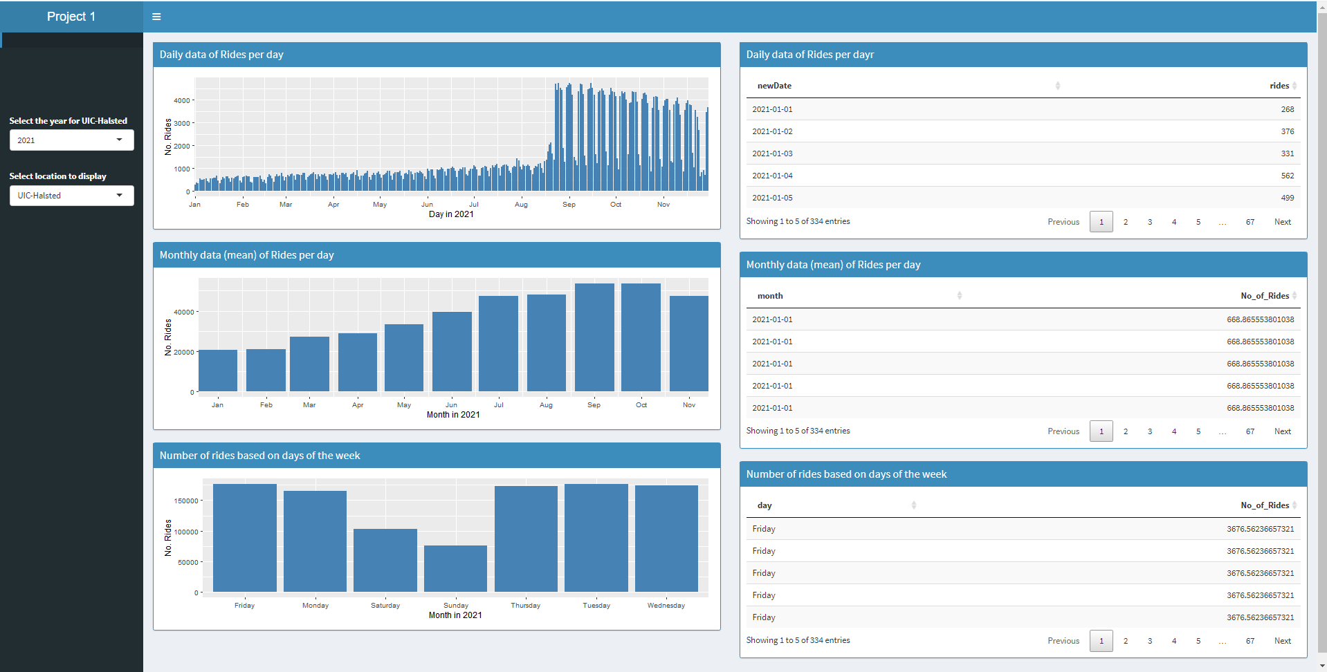
Make your your data is
displayed in a meaningful order, i.e. showing days of the
week or months of the year in alphabetical order is a really
bad idea. The data should be showed in an order that people
are familiar with so its easy to understand.
In addition to getting a
version running on Shinyapps.io quickly, its also good to quickly get
in the habit of pushing the current version of your code and
data files to GitHub so you have proof of parts working
ahead of time, and aren't in a rush to push to GitHub near
the deadline.
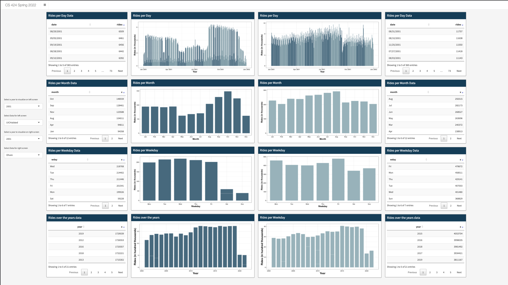
For
60% you need to:
download the data file from the Chicago Data Portal and
break the file into appropriate chunks that are less than 5
MB each
use lubridate to convert the date information into a more
usable form
create an interactive visualization in R and Shiny on
Shinyapps.io
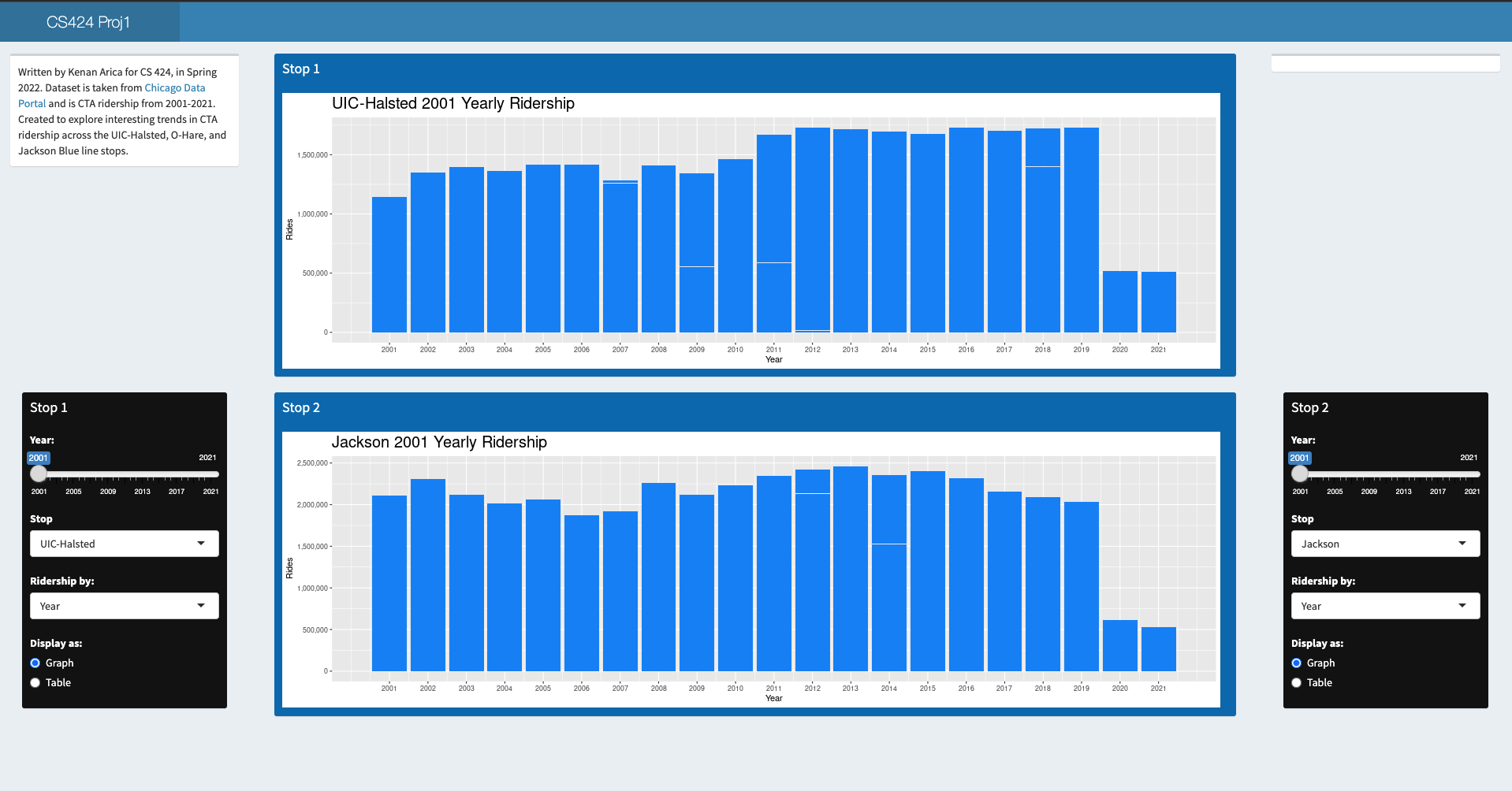
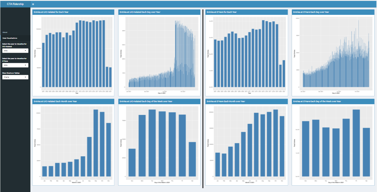
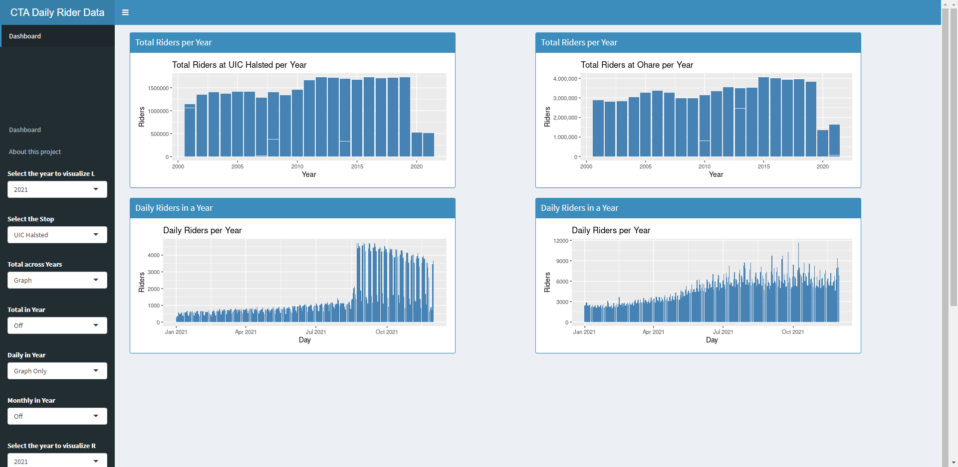
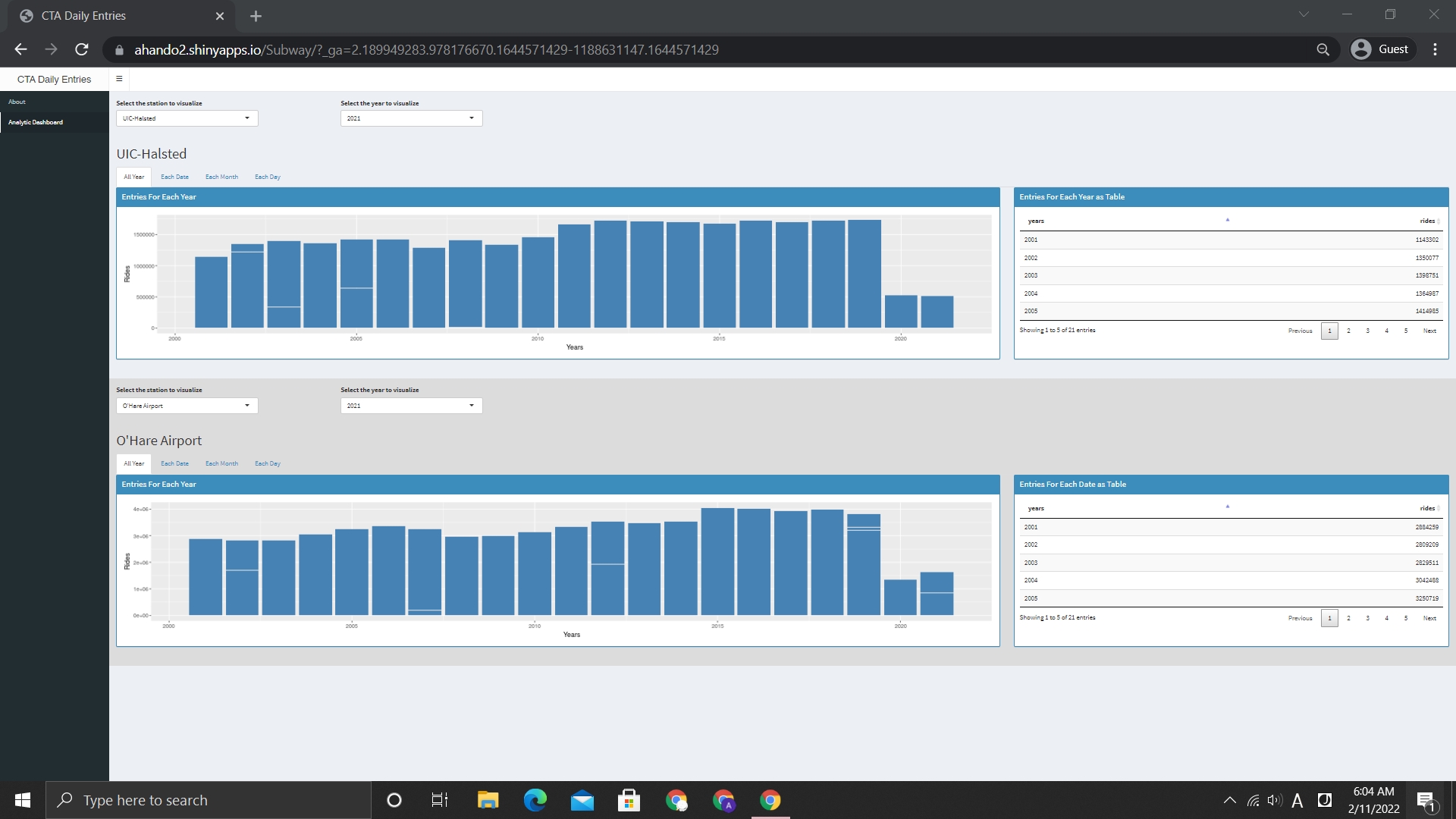
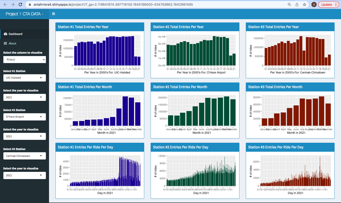
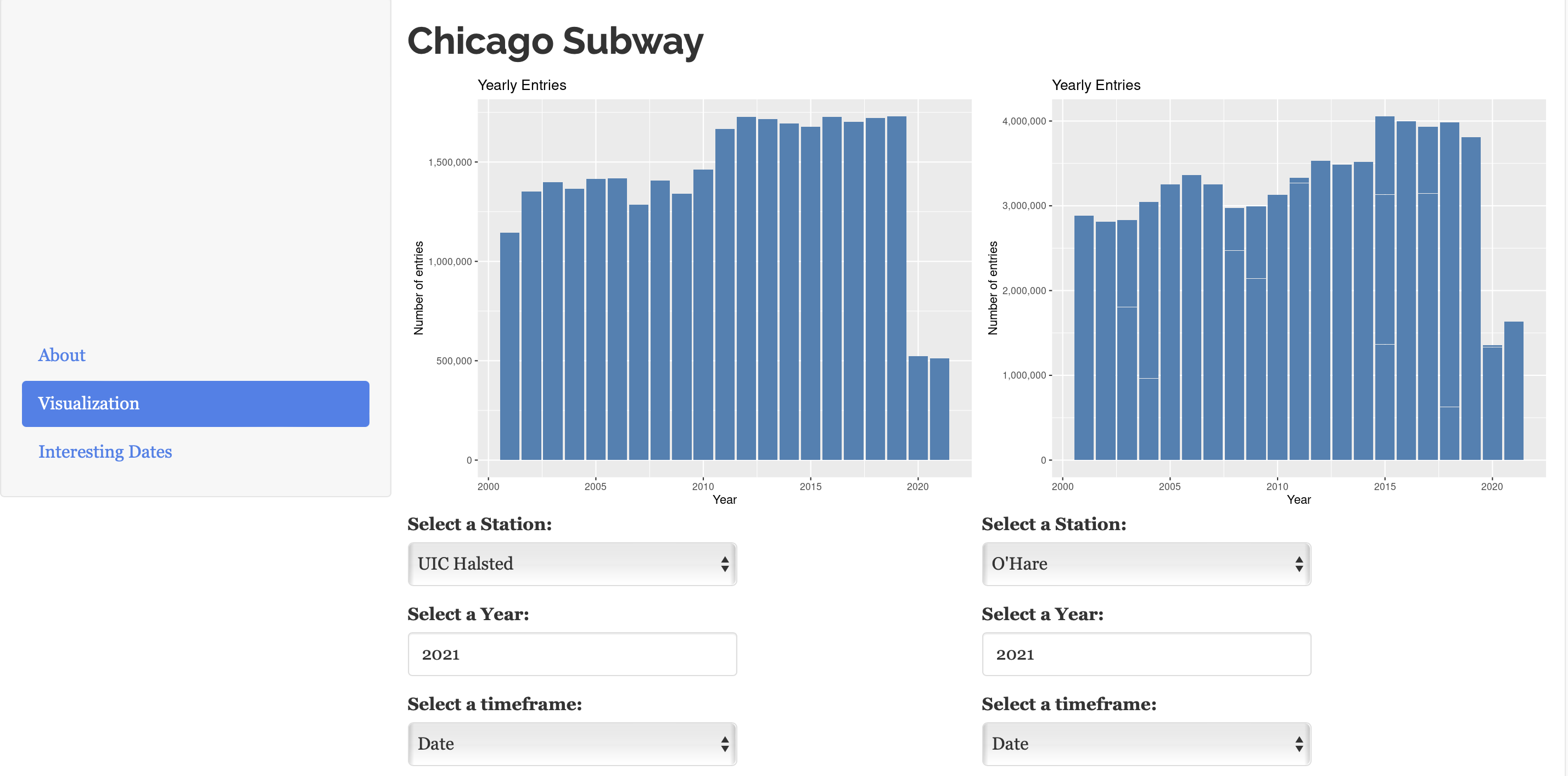
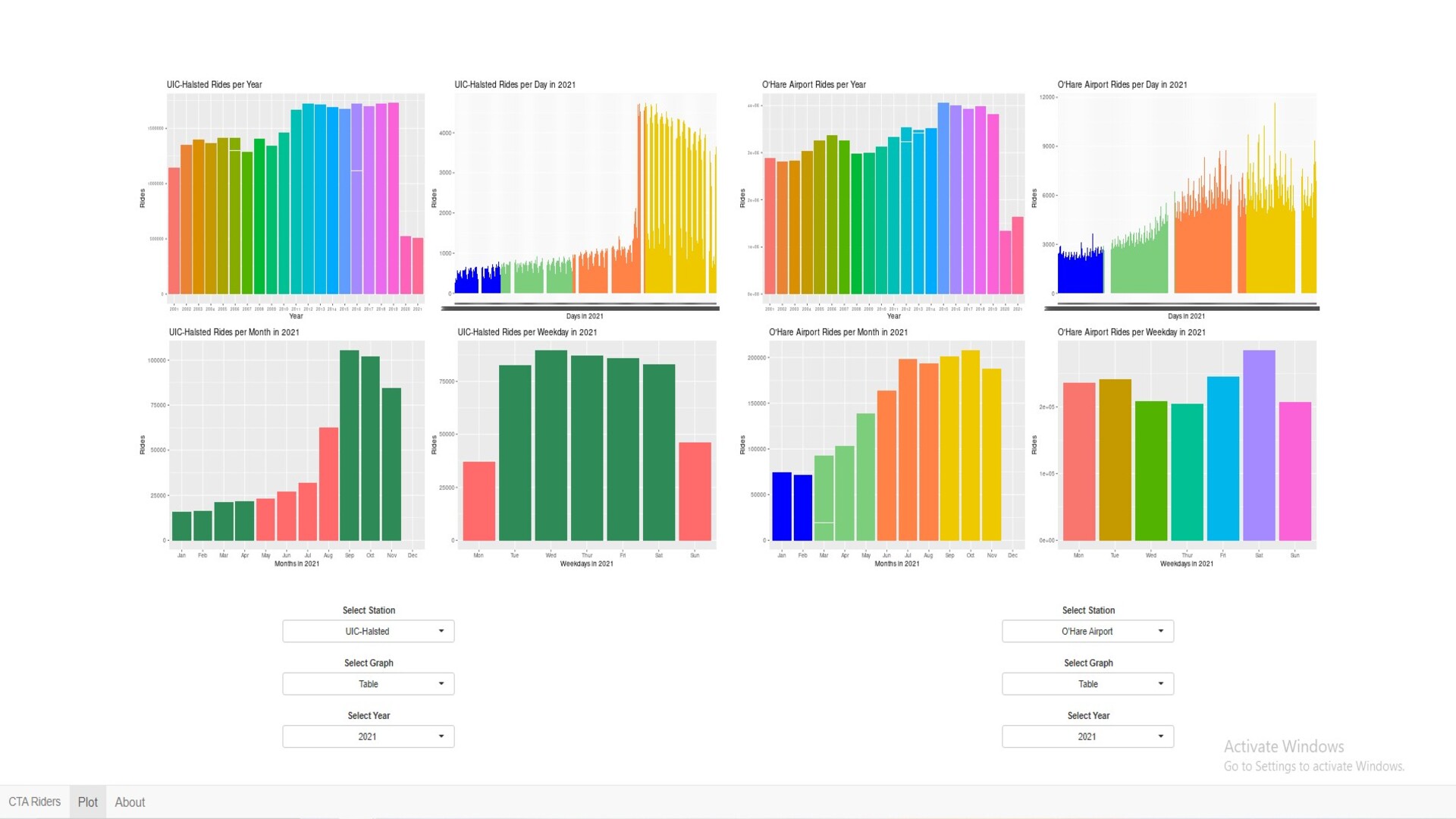
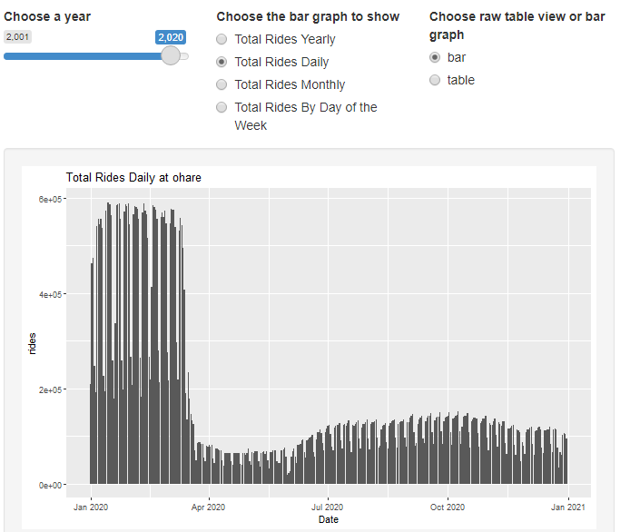
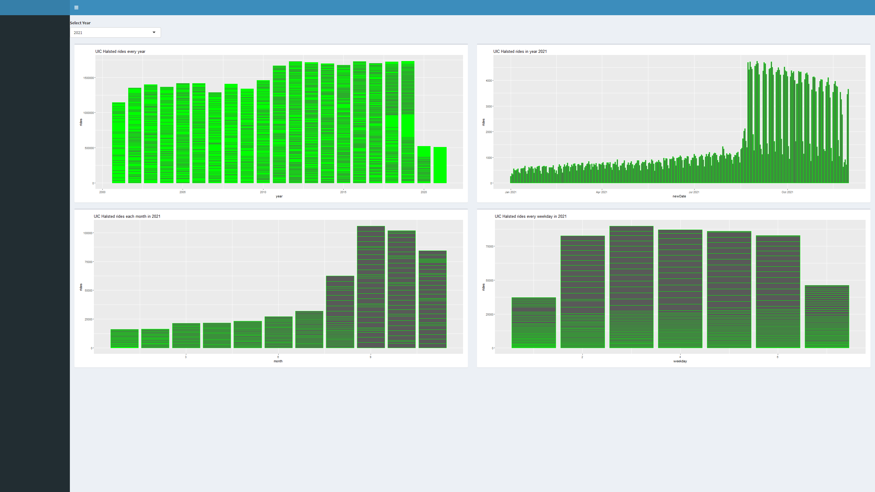
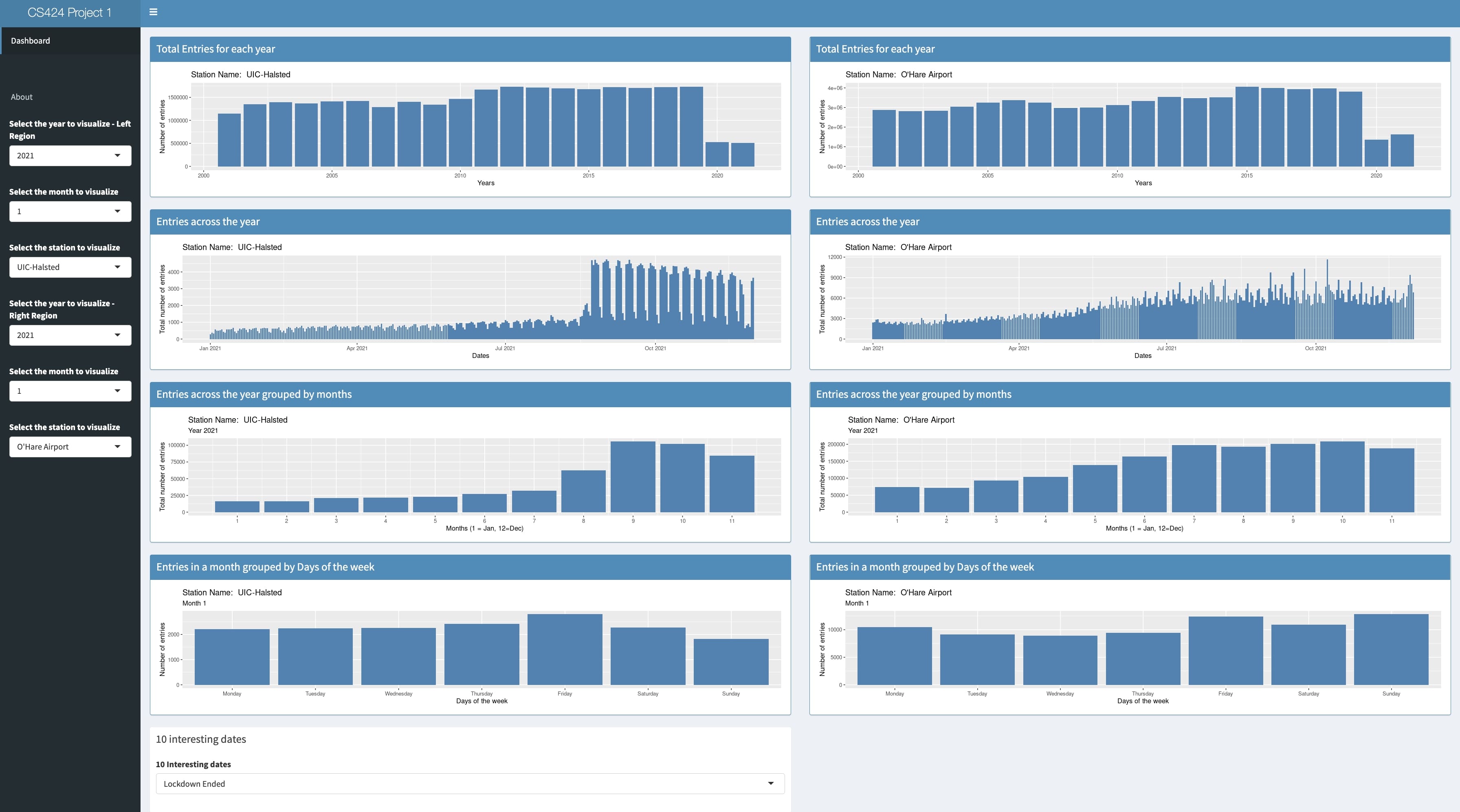
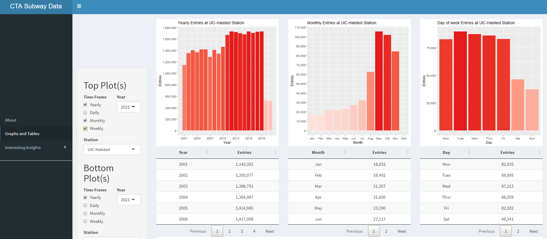
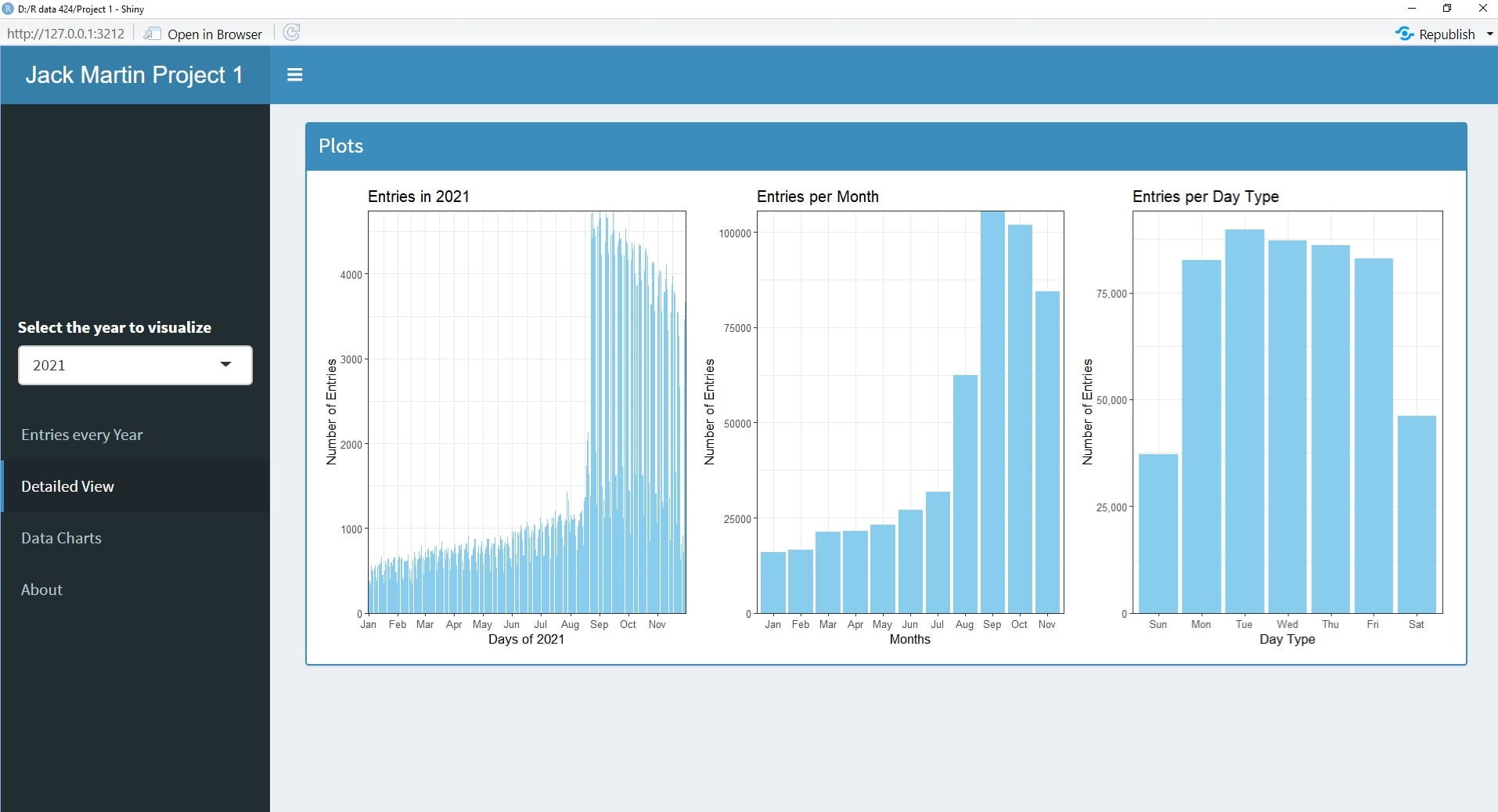
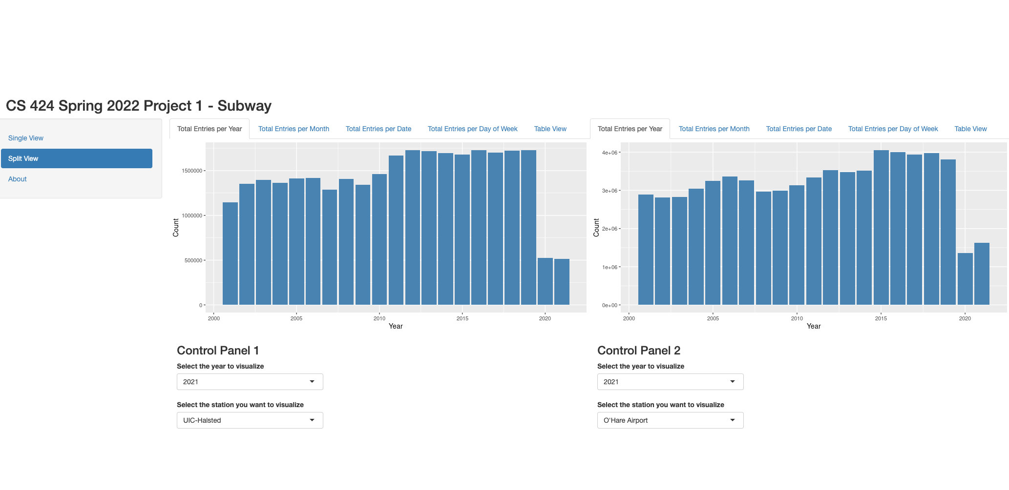
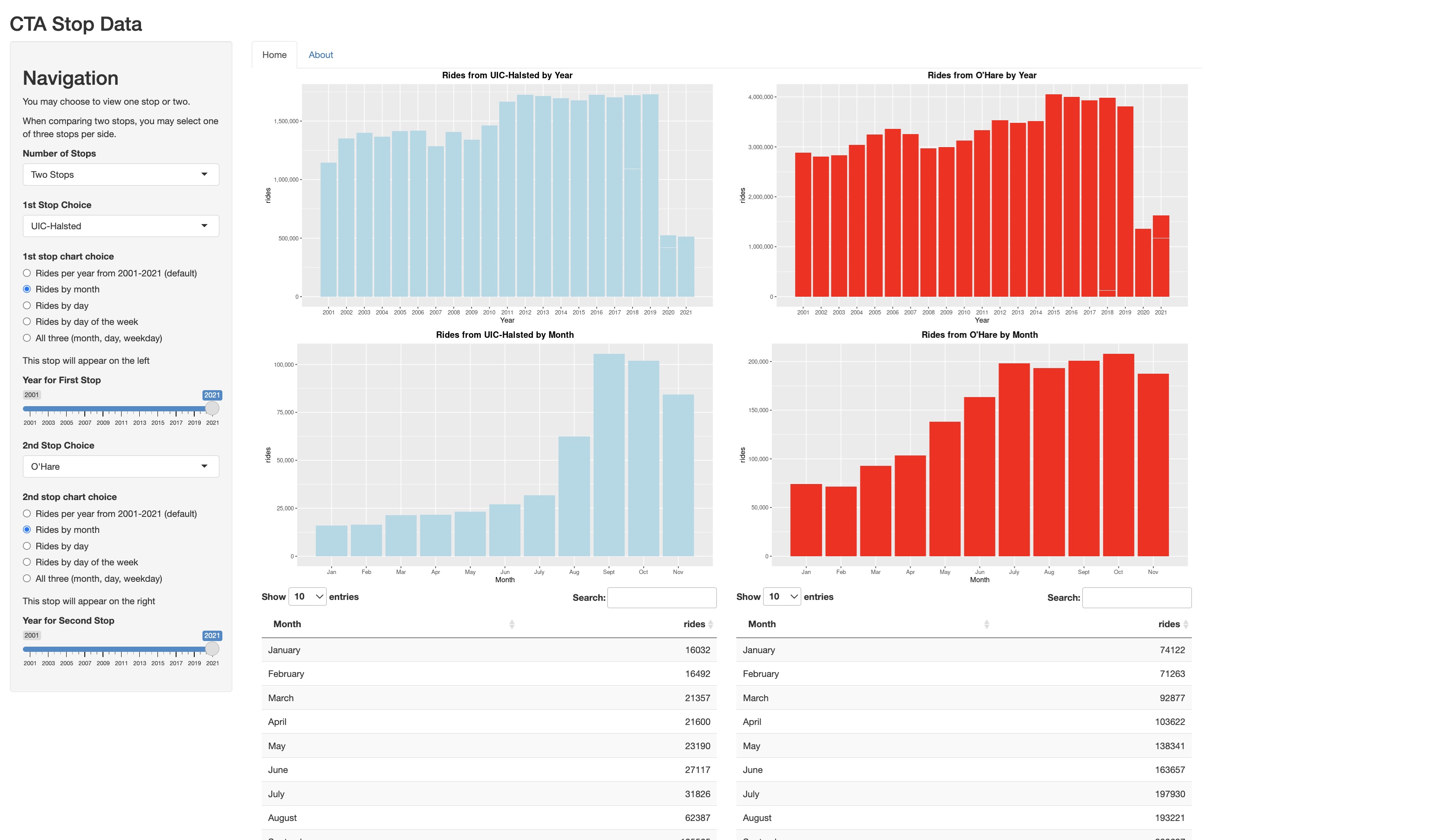
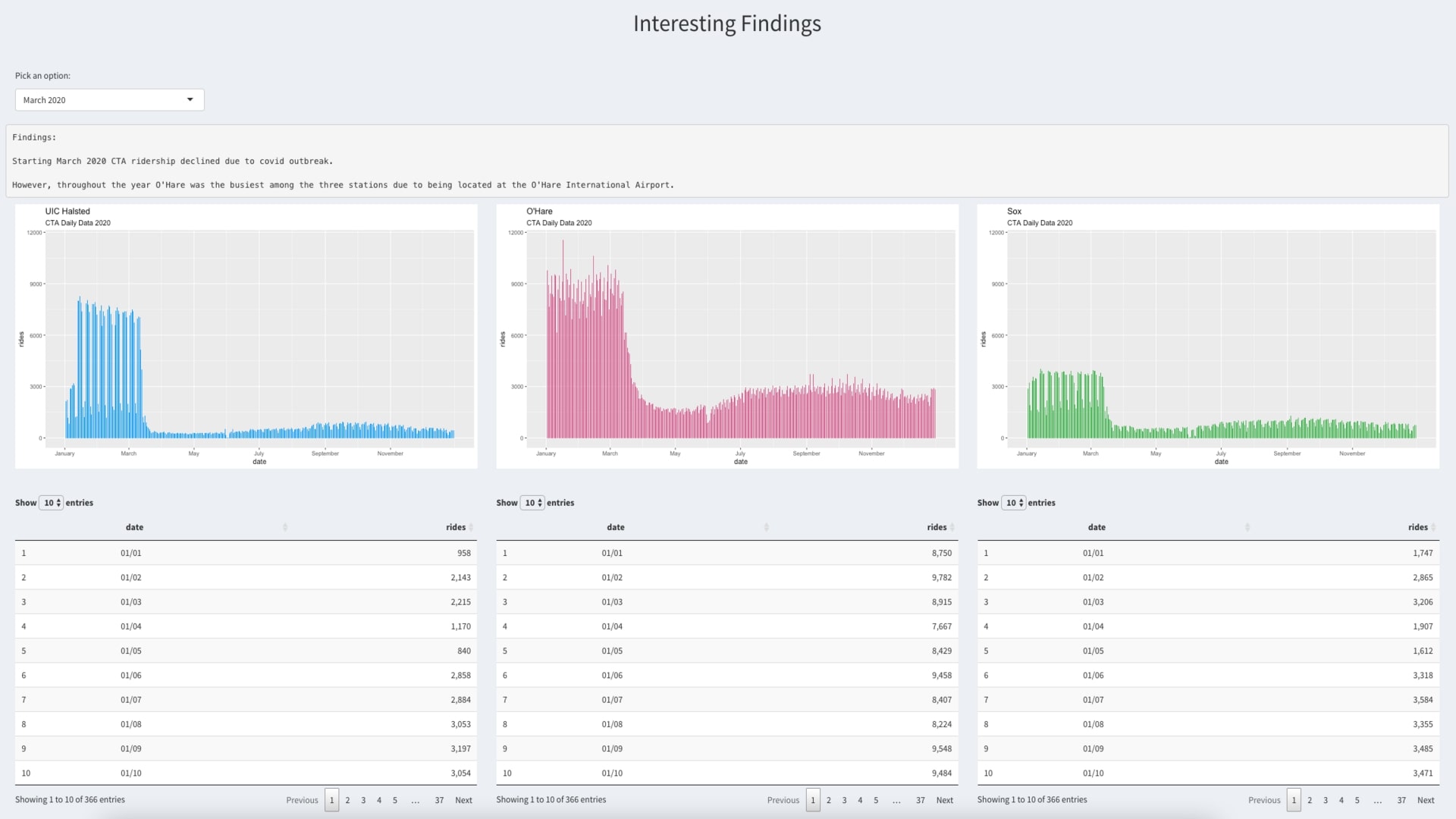
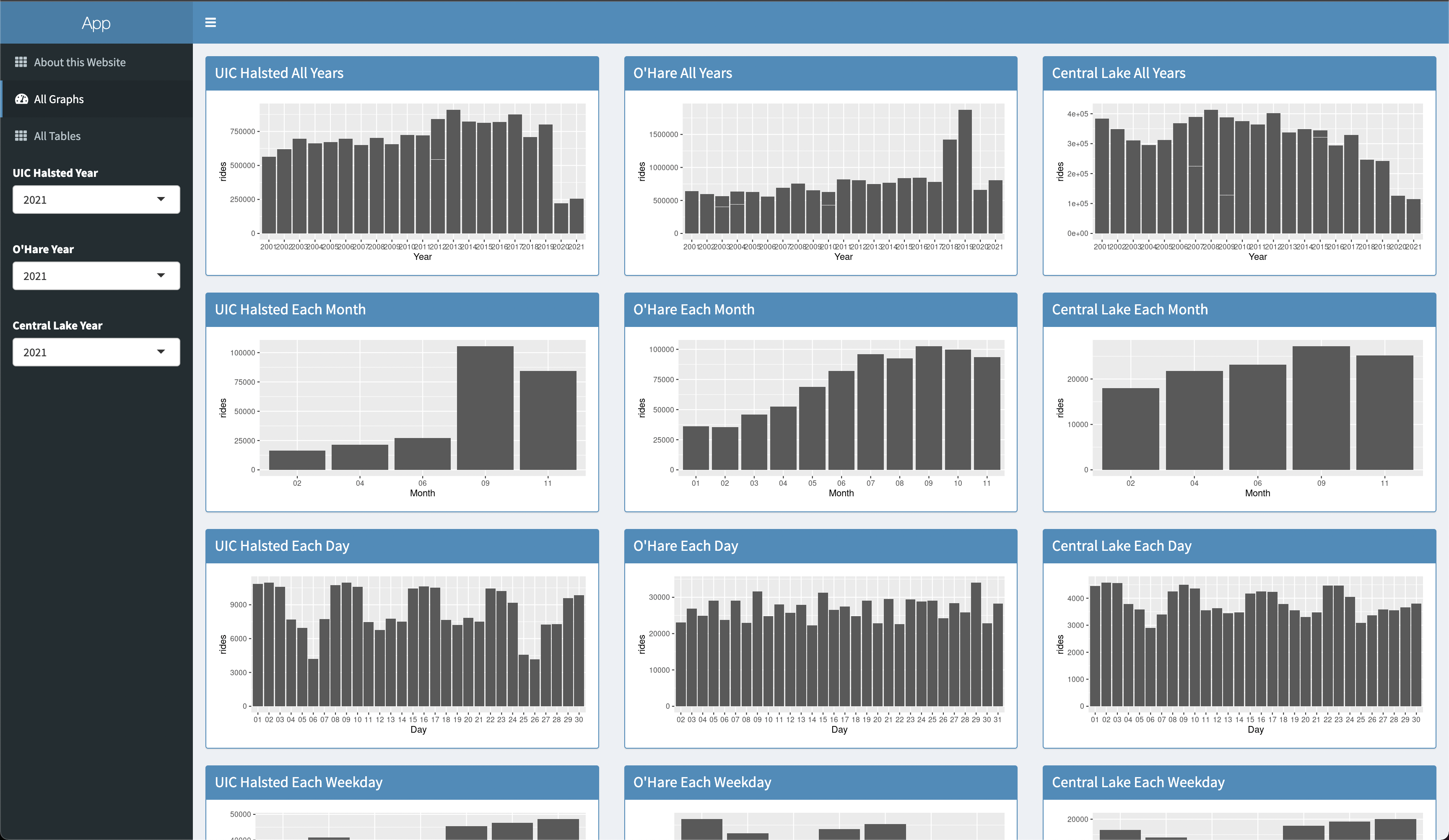
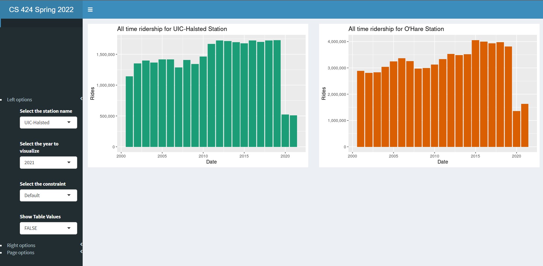
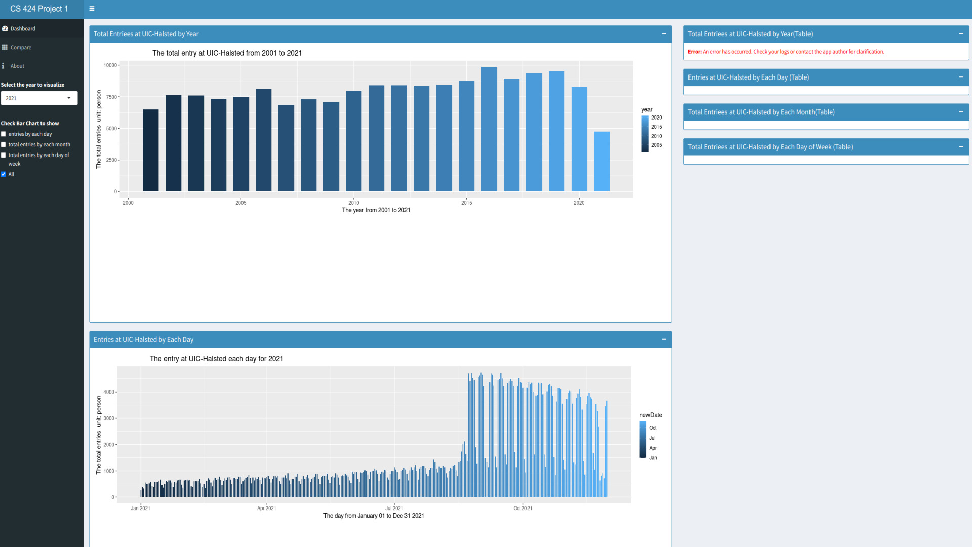
your dashboard should initially show a bar chart showing
total entries at UIC-Halsted for each year (2001, 2002, ...
2021)
allow the user to choose to see each of the following
charts (either individually or all at the same time)
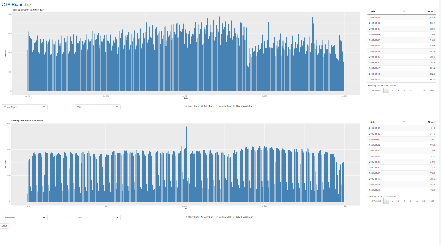
bar chart showing entries at UIC-Halsted each day for
2021 (jan 1, jan 2, ... dec 31)
bar chart showing total entries at UIC-Halsted for each
month for 2021 (jan, feb, ... dec)
bar chart showing total entries at UIC-Halsted for each
day of the week for 2021 (mon, tue, ... sun)
allow the user to use a menu to choose any of the years
from 2001 - 2021 and have all of the UIC-Halsted charts
update for the chosen year
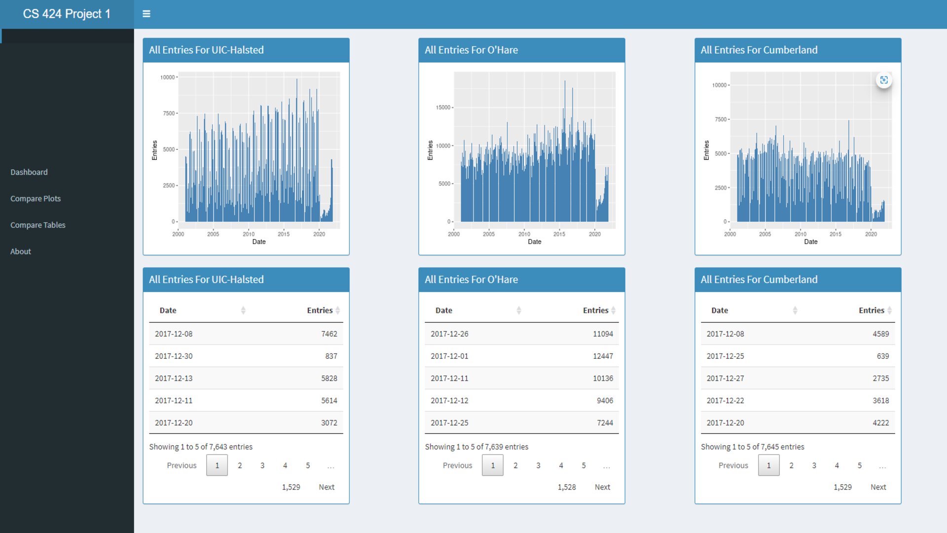
allow the user to see the data for each of the charts as a
table in the same order
have an 'about page' in your app, perhaps as a separate
tab in the shiny interface, with appropriate credits (where
the data is from, who wrote the app, when, why, etc.)
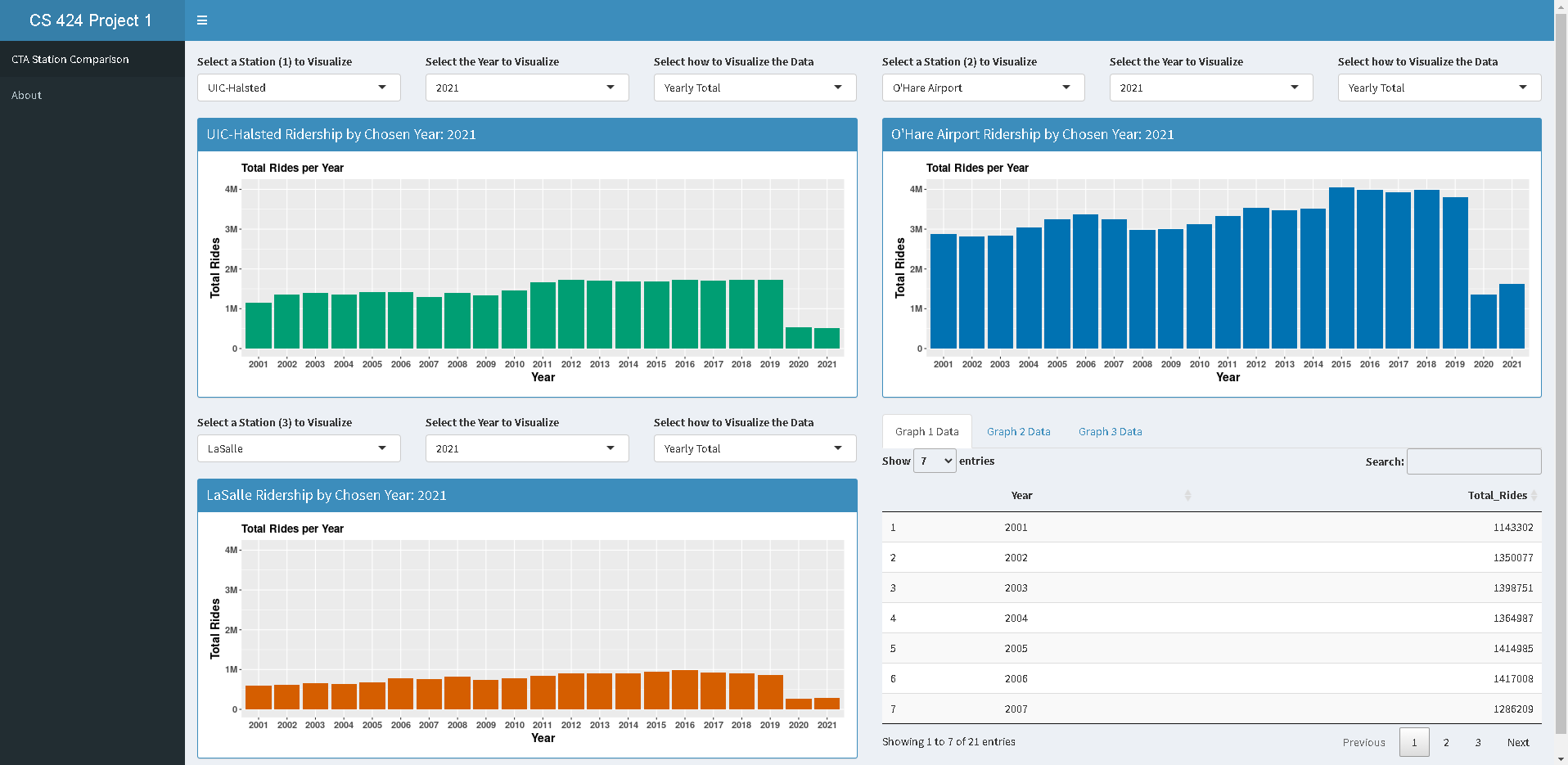
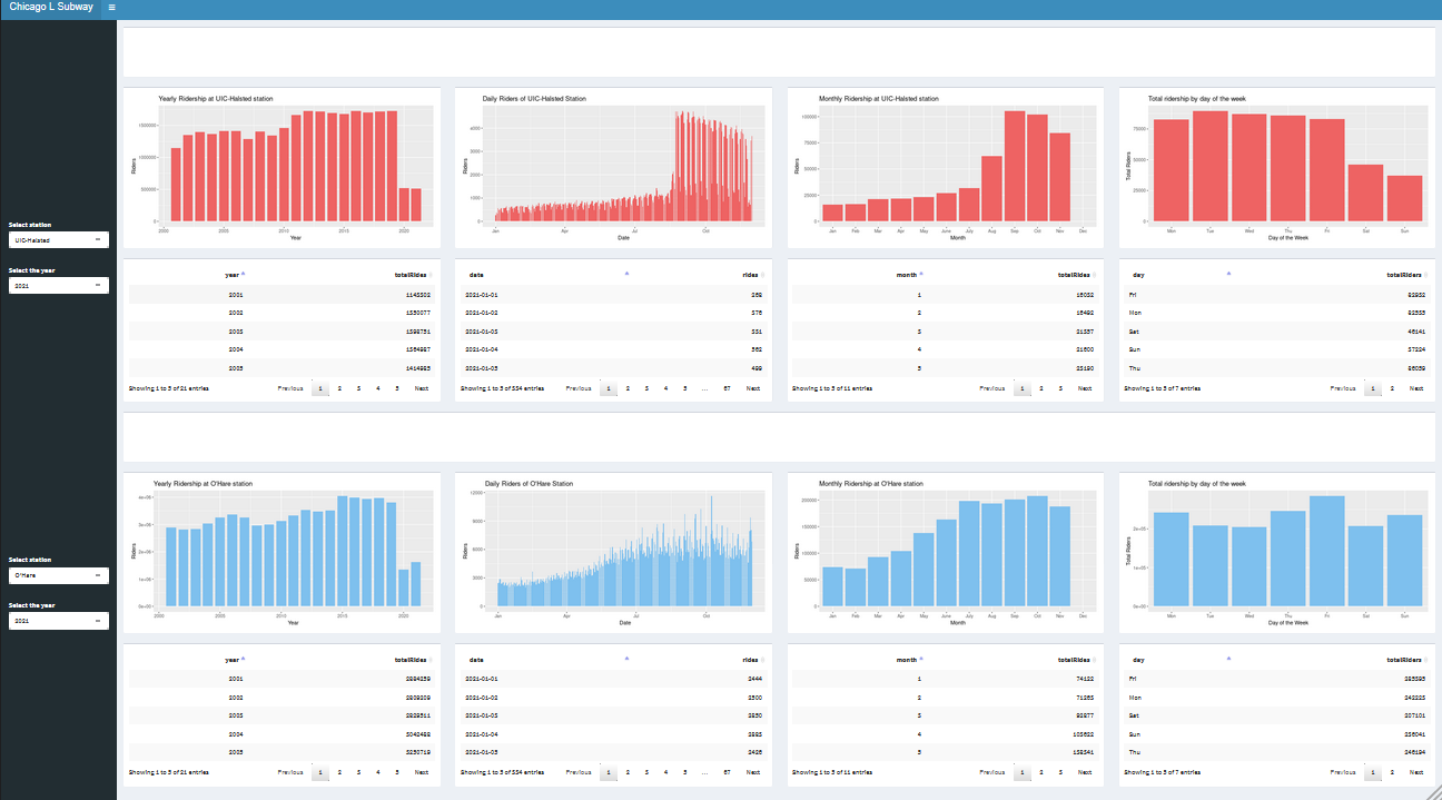
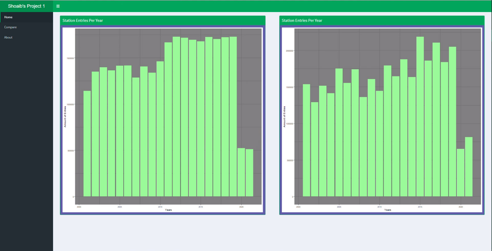
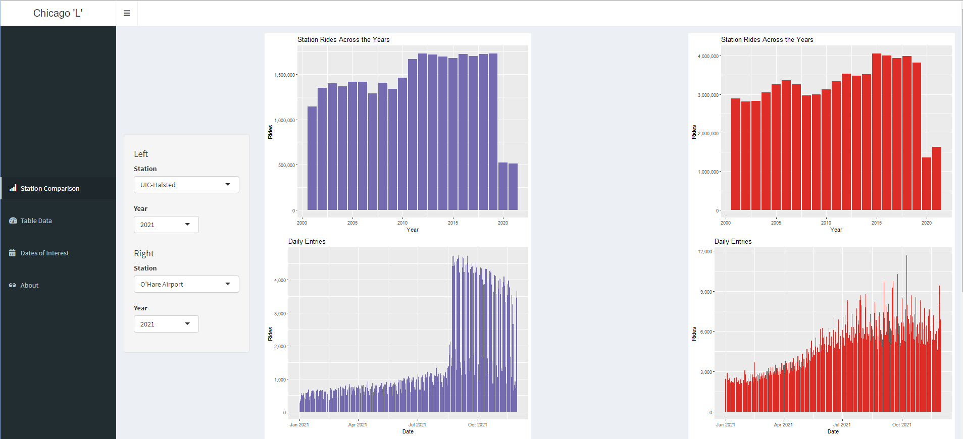
For
an additional 20% you need to
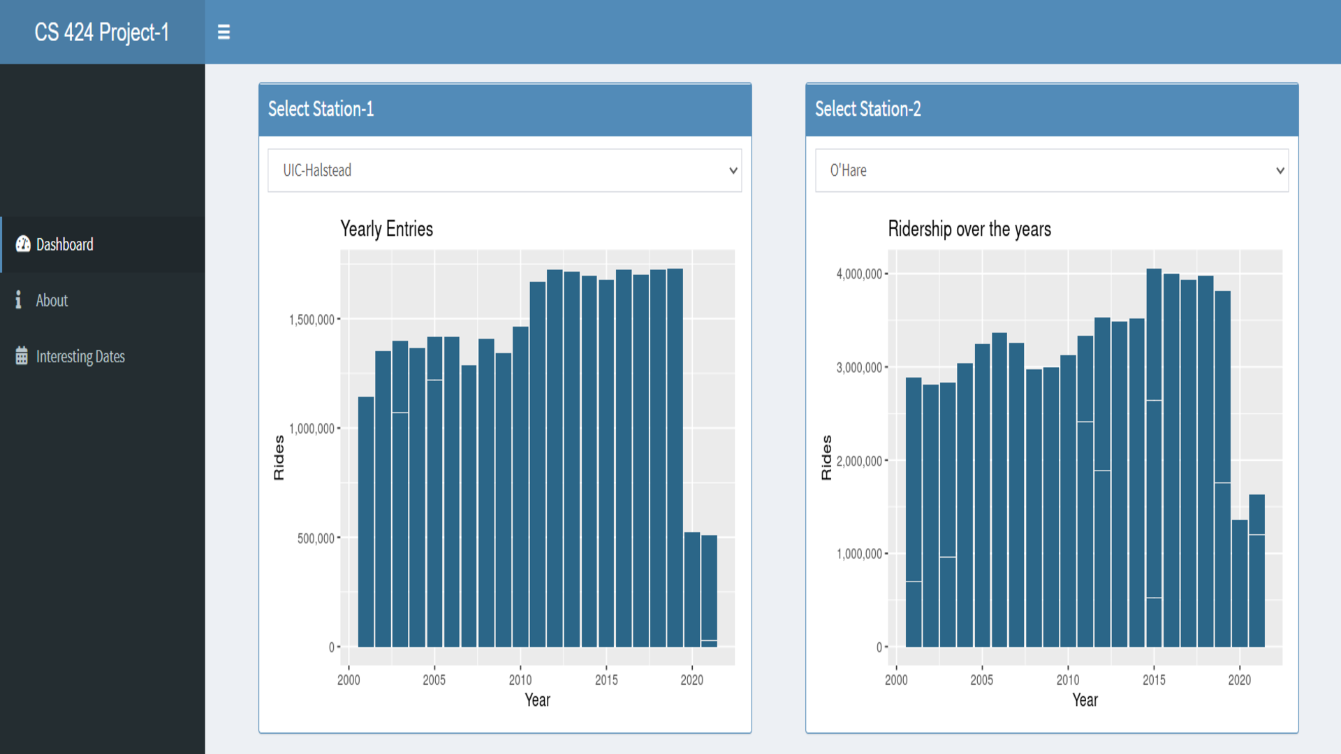
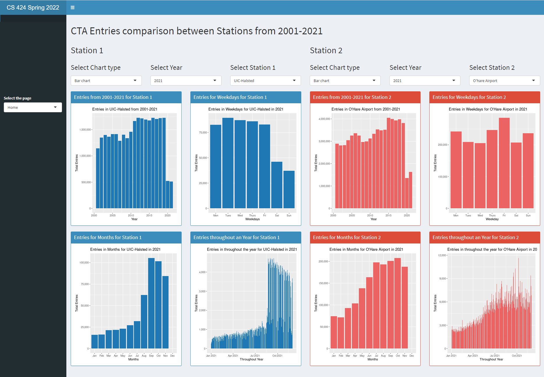
break the screen in two regions, each with their own set of
controls. This should initially show a bar chart showing total
entries at UIC-Halsted for each year (2001, 2002, ... 2021) on
the left and a bar chart showing total entries at O'Hare for
each year (2001, 2002, ... 2021) on the right
all of the charts made for UIC-Halsed above should be made
available for the O'Hare data
each region of the screen should have independent controls
and each region can be set to either UIC-Halsted or O'Hare,
and to any year in the dataset, e.g. allowing the user to
compare monthly data for UIC-Halsted in 2001 to monthly data
for UIC-Halsted in 2019, or to compare daily data at
UIC-Halsted in 2010 to daily data at O'Hare in 2012, etc. All
of the graphs should be available for UIC-Halsted and O'Hare
in either region of the screen and the user can mix and match
which two they want to see at the same time.
allow the user to see the data for each of the charts as a
table in the same order
the colors should be consistent across all the
visualizations in your interface
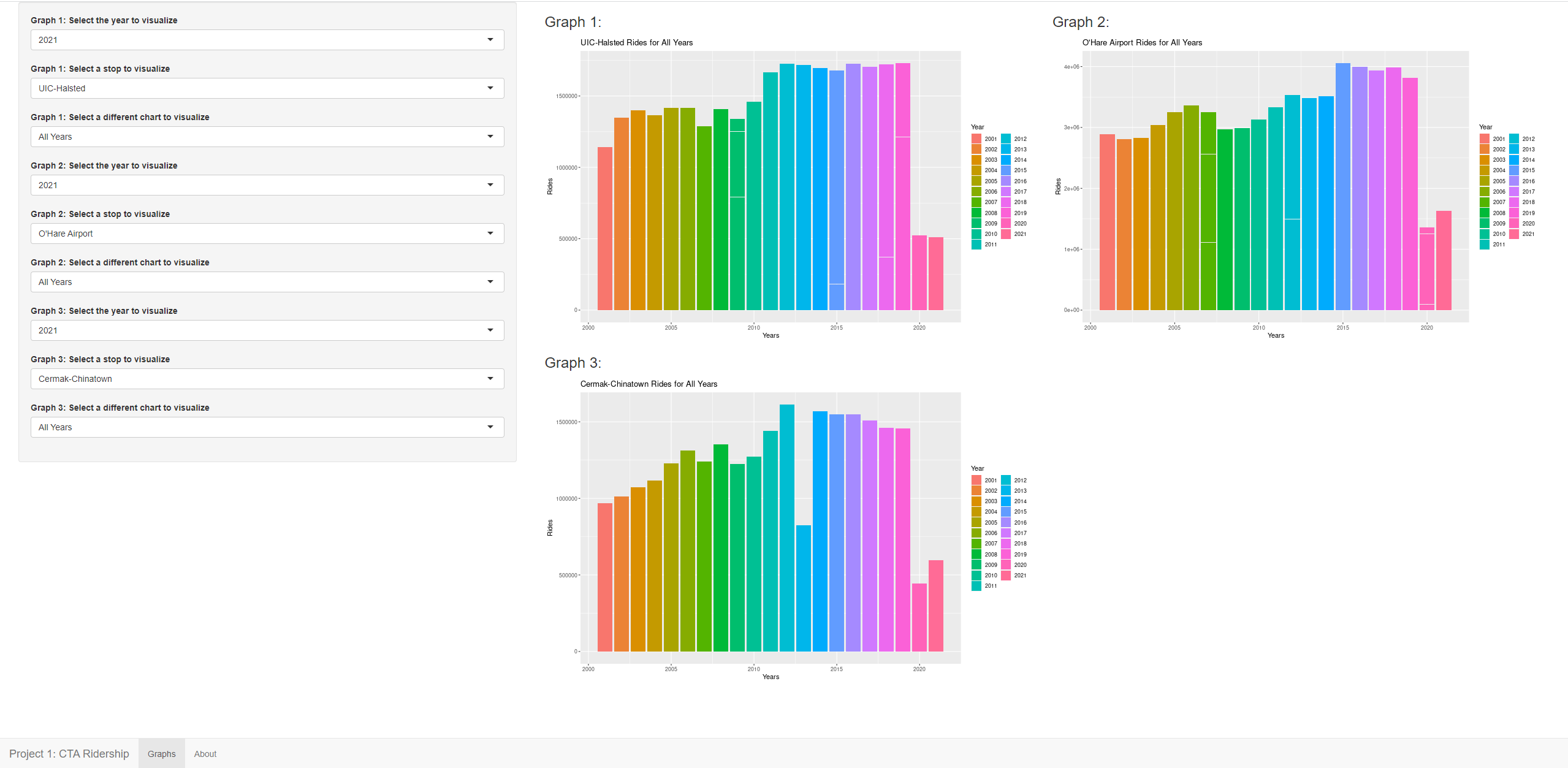
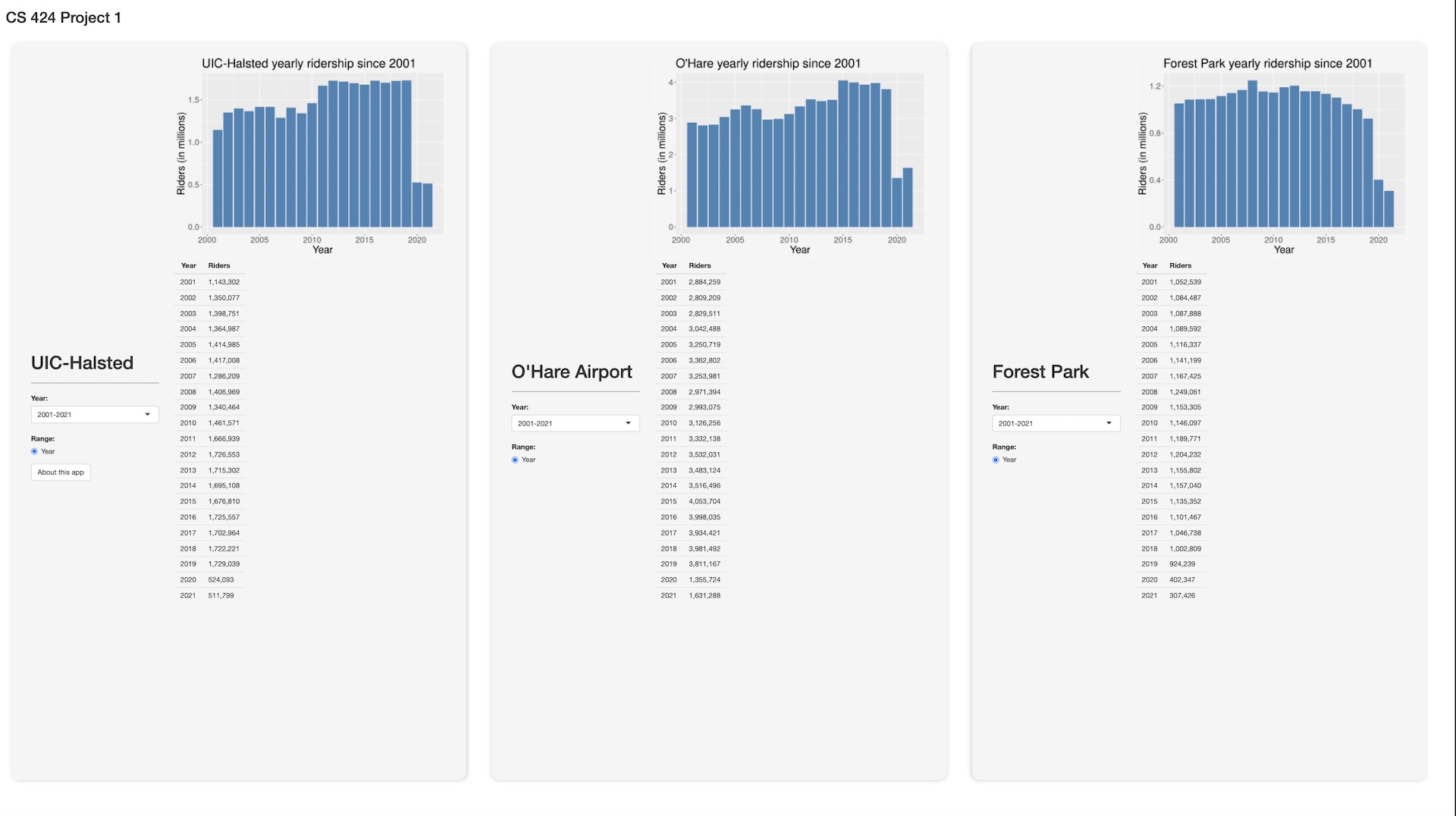
For
an additional 20% you need to
pick a third station that you are interested in
investigating, read in and convert the data for that station,
and add it to the menu along with UIC-Halsted and O'Hare and
allow the user to do all the same various comparisons as
above.
Graduate
Students need to add:
add a menu of 10 'interesting dates' to your interface that
will allow the user to quickly see the interface shift itself
into the appropriate settings to show each of those 10
interesting comparisons that you have found in the data. For
example maybe the user can investigate if there was a
noticeable change in people using the CTA because of 9/11,
thanksgiving, COVID, Obama's election, cubs winning the world
series, etc). Note that you will need to defend these choices
in your writeup.
In all of these case you need to make sure that your visualizations
are well constructed with good color and font choices, proper
labeling, fast updates, and that they effectively reveal the truth
about the data to the user. The application should load within
30 seconds, and definitively not time out.
Note that as part of the web page part of the grade you will need
to use your interface to show your findings, so make sure that the
way your interface displays information is clear.
One way to shrink the initial data file size is to create 3
separate data files for the 3 stations you are interested in
looking at.
Turning in the Project
There aretwo due datesfor the project.
The source code and
application are due first.
For this project you should host your
solution using Shinyapps.io. For Project 3 we may move to a local
server. This kind of deployment is covered in the 'Learn Shiny'
tutorials.
Your code should be turned in and made available on GitHub in a
public repository for the project. You can keep the repository
private while doing your development. I would suggest setting up
the GitHub project early and regularly pushing code to it as a
backup.
It is important to note that 'getting it
to work' is just a prerequisite to using the application to find
answers to your questions. It is that usage that will give you
ideas on how to improve your app to make it easier and more
intuitive to find those things. Writing the application at the
last minute pretty much guarantees that you will not come up
with an intuitive interface.
Many of the routines you write for this project will be used
again and expanded upon in the upcoming projects - e.g. all of
the projects will need graphs and tables, so it is a good idea
to write your code in a way that it is reusable so you can
modify it rather than totally rewriting it later.
Chrome's Developer Tools allow you to
emulate screens of different sizes (view / developer / developer
tools / settings / devices). The
appropriate setting to simulate half the classroom wall seems
to be 2,880 be 1620.
Before the application due date&time
please send an email to andy and the TA with the URL of your
GitHub site and your Shinyapps site.
The second deadline is for the
documentation.
You should
create a public web page with multiple sections (visible to
anyone for at least the duration of the course) that describes
your work on the project. You can host your web page at UIC(http://people.uic.edu), GitHub,or the
provider of your choice, as long as it remains publicly
available to all. You can use any publicly available templates
as long as you cite them, or create your own.
This page should have several sections including:
link to your visualization solution on Shinyapps.io
1+ page worth of text of an introduction and a description
of how to use your application and the things you can do
with it. This should be written for someone who knows
nothing about this course or this assignment.
1+ page worth of text on the data you used, including
where you got it, what manipulations you did to it. This
should be detailed enough to allow any reasonably computer
literate person to reproduce what you did
link to your project on GitHub giving access to your well
commented source code, any necessary data files, and any
instructions necessary to run it. These instructions should
start from the assumption that the reader has a web browser
on their computer and tells the user everything else he/she
needs to know and do to get it running using R-studio,
including installing correct versions of all the required
software.
1+ page worth of text on what interesting things you found
about the data using your application. Grad students should
focus on their 10 interesting sites, but undergrad students
are also expected to be able to use their interface to find
interesting things in the dataset.
all of which should have plenty
of screenshots with meaningful captions. Web pages like this
can be very helpful later on in helping you build up a
portfolio of your work when you start looking for a job so
please put some effort into it.
You should also create a 5 minute YouTube video showing the
use of your application including narration with decent
audio quality. That video should be in a very obvious place
on your web page. The easiest way to create the video is to
use a screen-capture tool while interacting with your
application, though you will most likely find its useful to
do some editing afterwards to tighten the video up. If you
do decide to use your phone or tablet to make the video in
the classroom, then please shoot the video in landscape
rather than portrait orientation. Your video should show the
capabilities of your tool through a set of specific examples
of interesting things you found in the data.
I will be linking your web
page to the course notes so please send andy and the TA a nice
jpg image of your visualization solution for the web along
with the link to your website before the deadline. The image
should be named
p1.<your_last_name>.<your_first_name>.jpg and be
roughly 1920 x 1080 pixels.
Once you
have your web page done, send the URL to Andy and the TA
before the deadline. We will respond to this email as your
'receipt'.
An important part
of creating these kinds of applications is getting feedback
and using it to improve your design, and learning to give
quality feedback to others.
See the course notes for week 6 for more details on the
presentations.
(I tried to name everyone by
their family name; if I made a mistake please let me know
and I will correct it)
last revision 2/19/2022 - updated
project links
2/10/2022 - updated the most appropriate screen size to give the
chrome developer tools to simulate 1/2 of the classroom wall is
2,880 be
1620