Group membership due 2/22 at
8:59 pm Chicago time Application due 3/12 at 8:59 pm Chicago time
Documentation due 3/14 at 8:59 pm Chicago time
Project 2 can be either an individual project
or a 2-person group project. The project will give people more
practice with writing a web-based application that visualizes the
data in multiple ways using R and Shiny and leaflet.
This project will focus on using R to expand
on the visualizations in Project 1 to add in a geographic
component, so we can see how the location of the stations in the
city may affect what we were seeing in Project 1.
The original data is available from the same
location as in Project 1, though the City of Chicago may have
added more 2021 data by this point, so be sure to download the
latest version. For this project we will be using the data from
all of the L stops not just the 3 from Project 1.
The Chicago Data Portal also has a file on CTA L stations
including their latitude and longitude:
https://data.cityofchicago.org/Transportation/CTA-System-Information-List-of-L-Stops/8pix-ypme
as a 48KB file called
CTA_-_System_Information_-_List_of__L__Stops.csv
As usual I would suggest first taking a look at the raw data file
in a text editor to get an idea what it contains, and then try out
different types of manipulations and visualizations in either
R-Studio or Jupyter to work out what you are going to need to do
to integrate this data with your data on L ridership.
For this project you can also use plotly for
your charts, but be aware that adding more controls is not always
a good thing and can be a complexity trap for your users. You
should use leaflet for your mapping. If you use another library without permission you will
lose points.
Again, you will be writing your code to be served from shinyapps.io and this time it
should run full screen (i.e. 2x as wide
as Project 1) as a touch screen application through
google chrome on the classroom wall with no scrolling.
Be sure to make a copy of your Project 1 code before you make
any changes, upload it to a new shiny location, and upload it to
a new GitHub location so you are not writing over any of your
work from Project 1.
Some
potential gotchas:
- The main information we need from the
System Information file is the latitude and longitude data and
both files do have an ID field in common.
- CTA stations do open / close / combine over time and you
will find that a handful of stations have closed over the
years and are not listed in the latest set of lat/lon
locations. These stations (Randolph/Wabash, Madison/Wabash,
Washington/State, Homan) do however have Wikipedia pages that
give their latitude and longitude as well as other useful
information about the stations.
For
50% you need to:
download the two data files from the Chicago Data Portal
and break the files into appropriate chunks that are less
than 5 MB each
use lubridate to convert the date information into a more
usable form
integrate the latitude / longitude data from the L stops
file into your list of L stops with ridership information
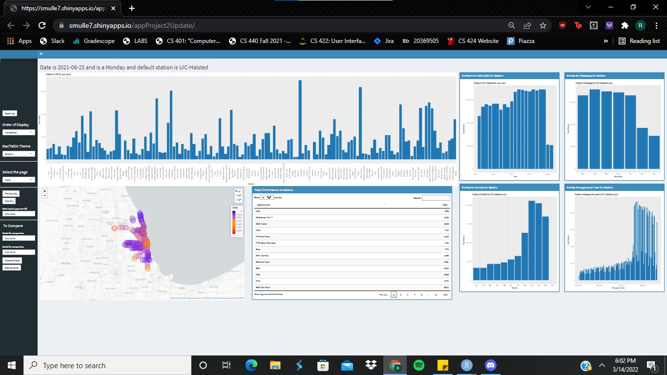
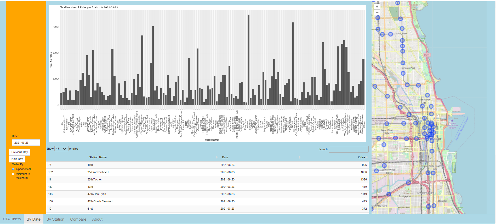
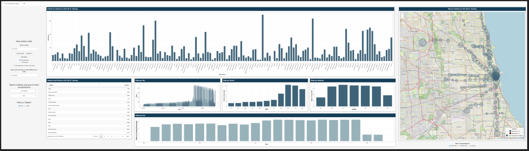
create an interactive visualization in R and Shiny on
shinyapps.io
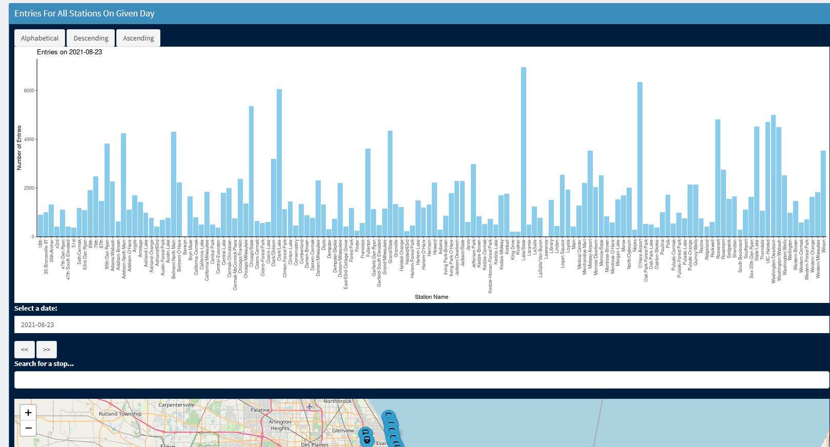
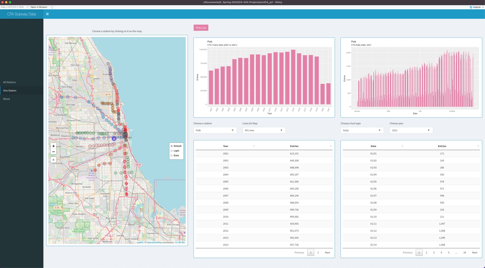
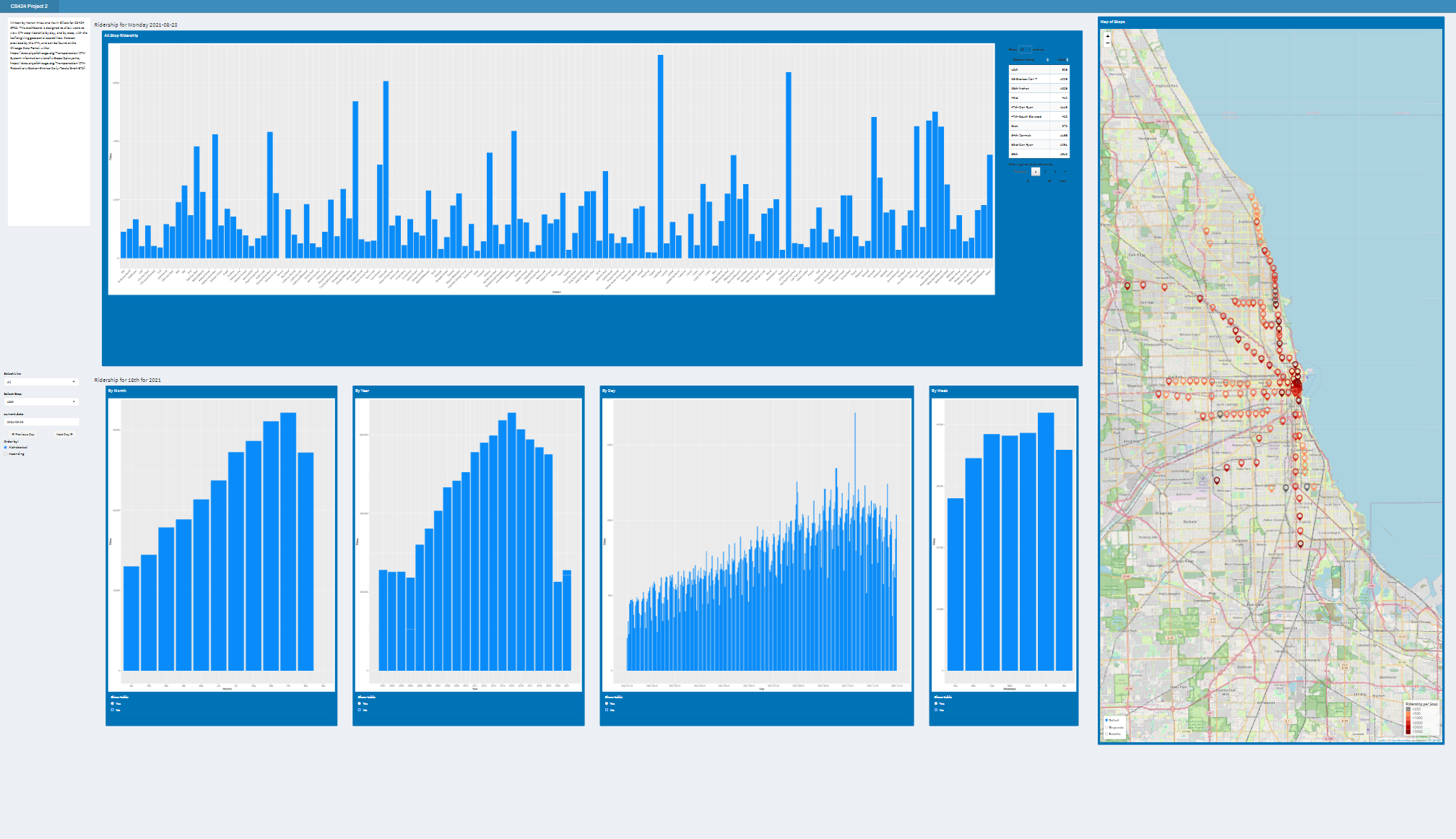
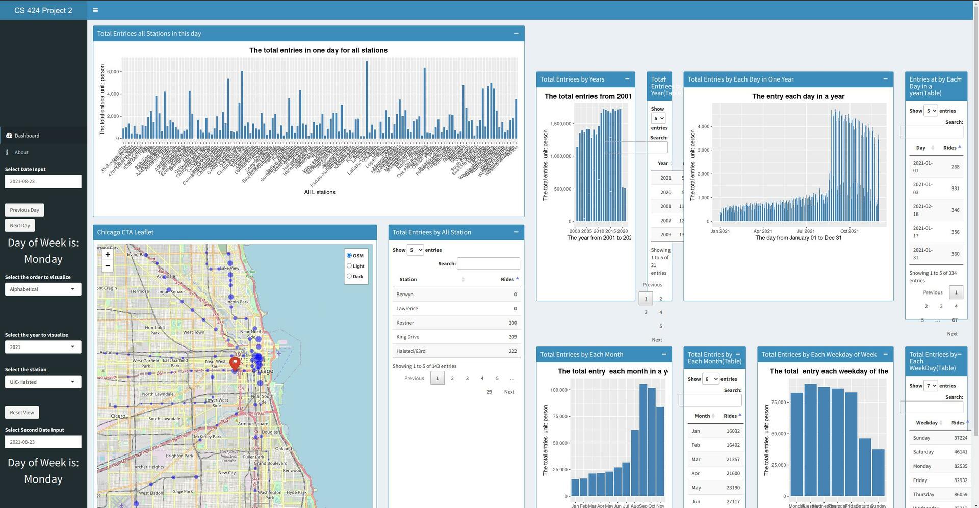
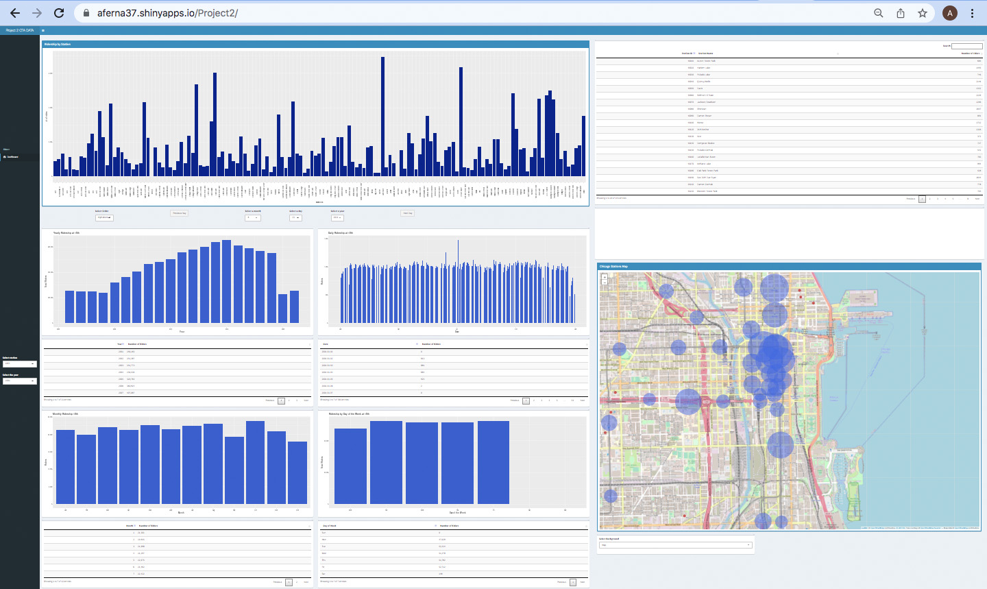
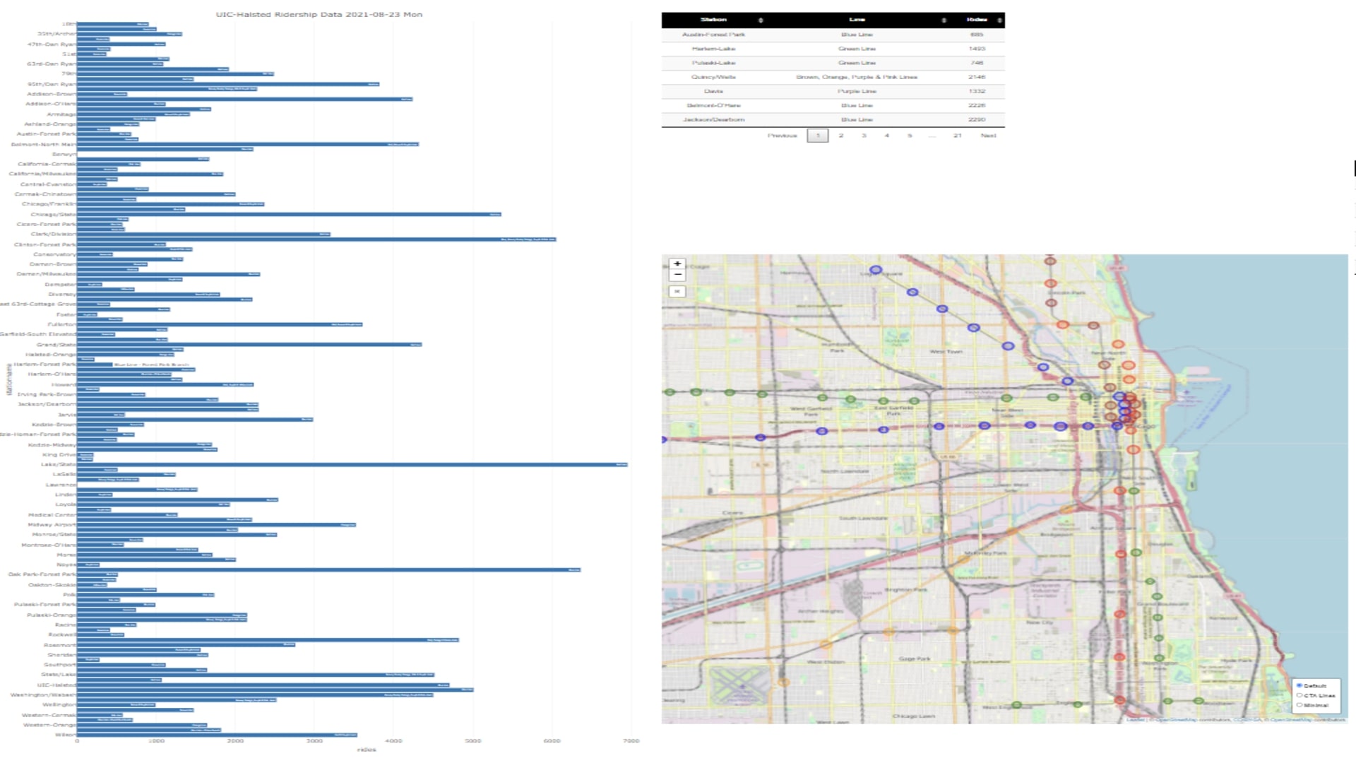
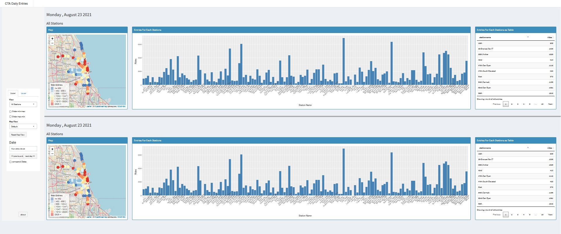
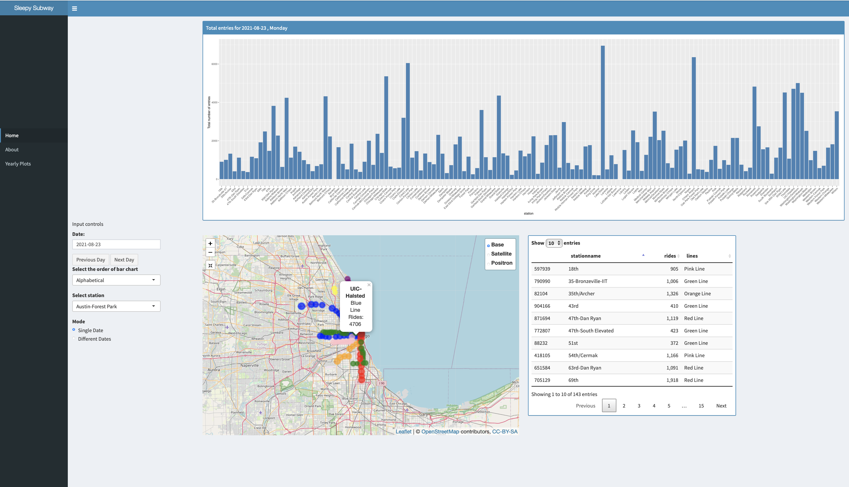
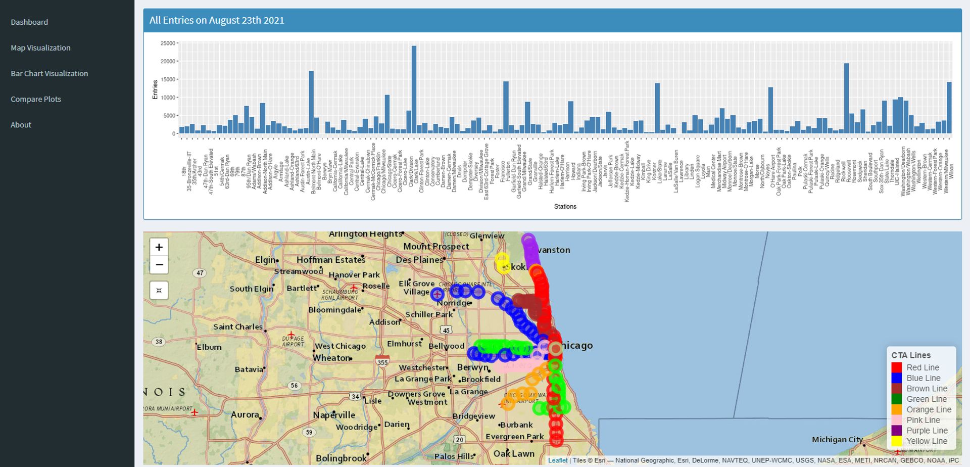
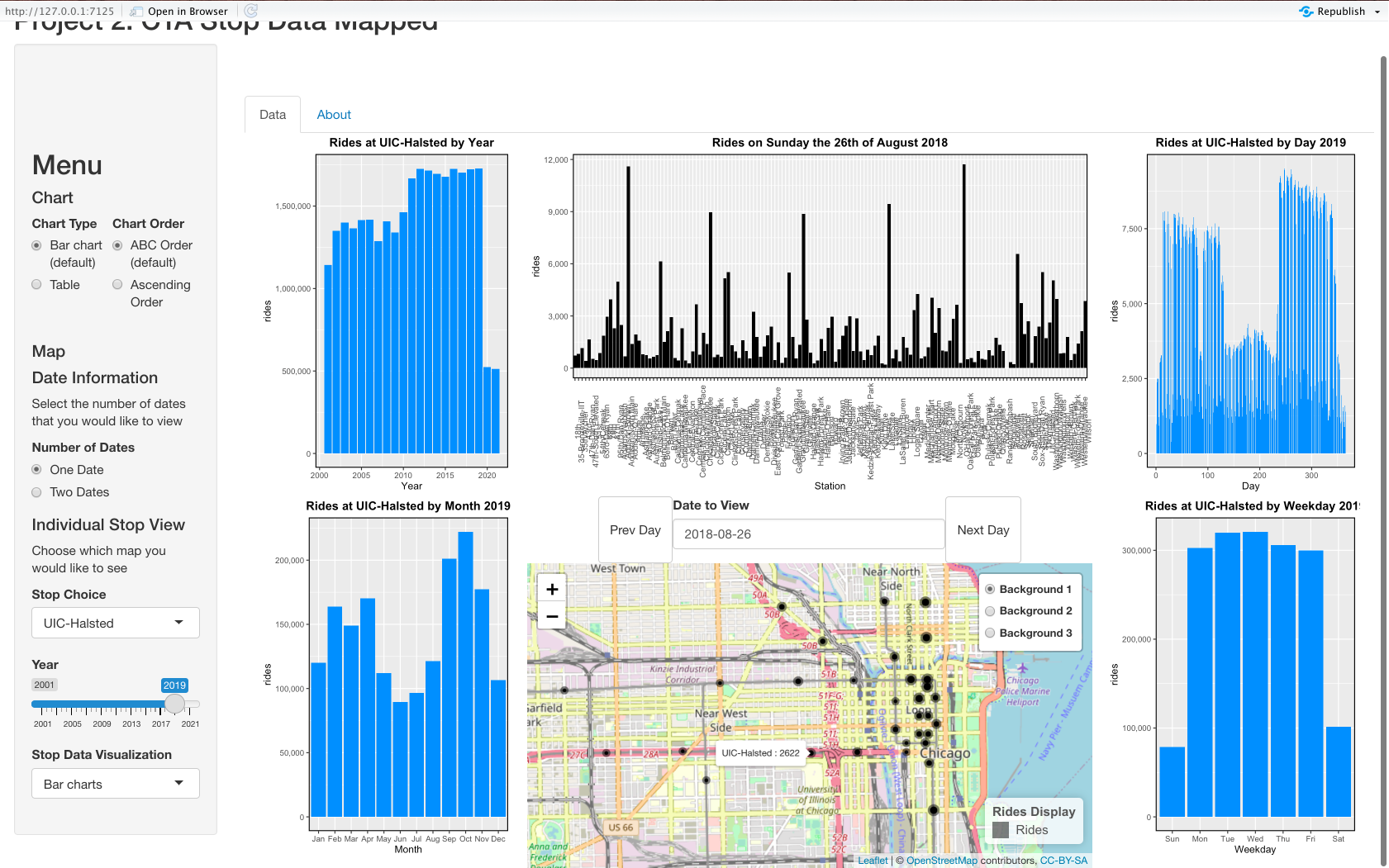
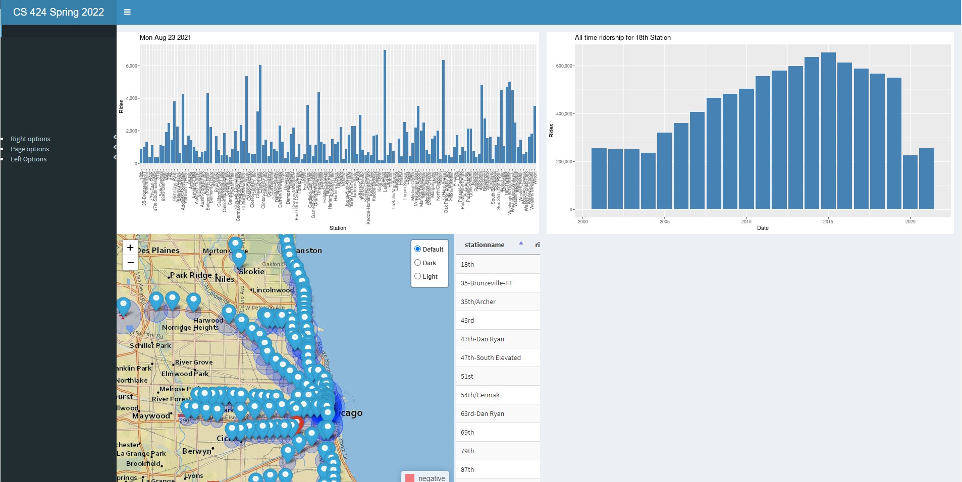
your dashboard should initially show a bar chart showing
total entries for all of the L stations in alphabetical
order for August 23, 2021 (the start of classes at UIC for
Fall 2021)
your dashboard should also initially show a pannable /
zoomable / resettable leaflet map of Chicago at an
appropriate scale with an appropriate background that
clearly shows all of the L stations and their total entries
for the date above in graphical form with an appropriate
legend
allow the user to shift between 3 different usable map
backgrounds for the leaflet map
allow the user to easily pick any date from all of the
available dates in the file and have the map and bar chart
update appropriately. The date should be clearly displayed
along with what day of the week it was.
give the user a 'previous day' button and a 'next day'
button to allow the user to see all of the the data
visualizations move forward and backward through time
allow the user to change the bar chart view from
alphabetical order to minimum - maximum order
allow the user to see the bar chart as a table that can
also be ordered in alphabetical or min/max order
have an 'about page' in your app, perhaps as a separate
tab in the shiny interface, with appropriate credits (where
the data is from, who wrote the app, when, why, etc.)
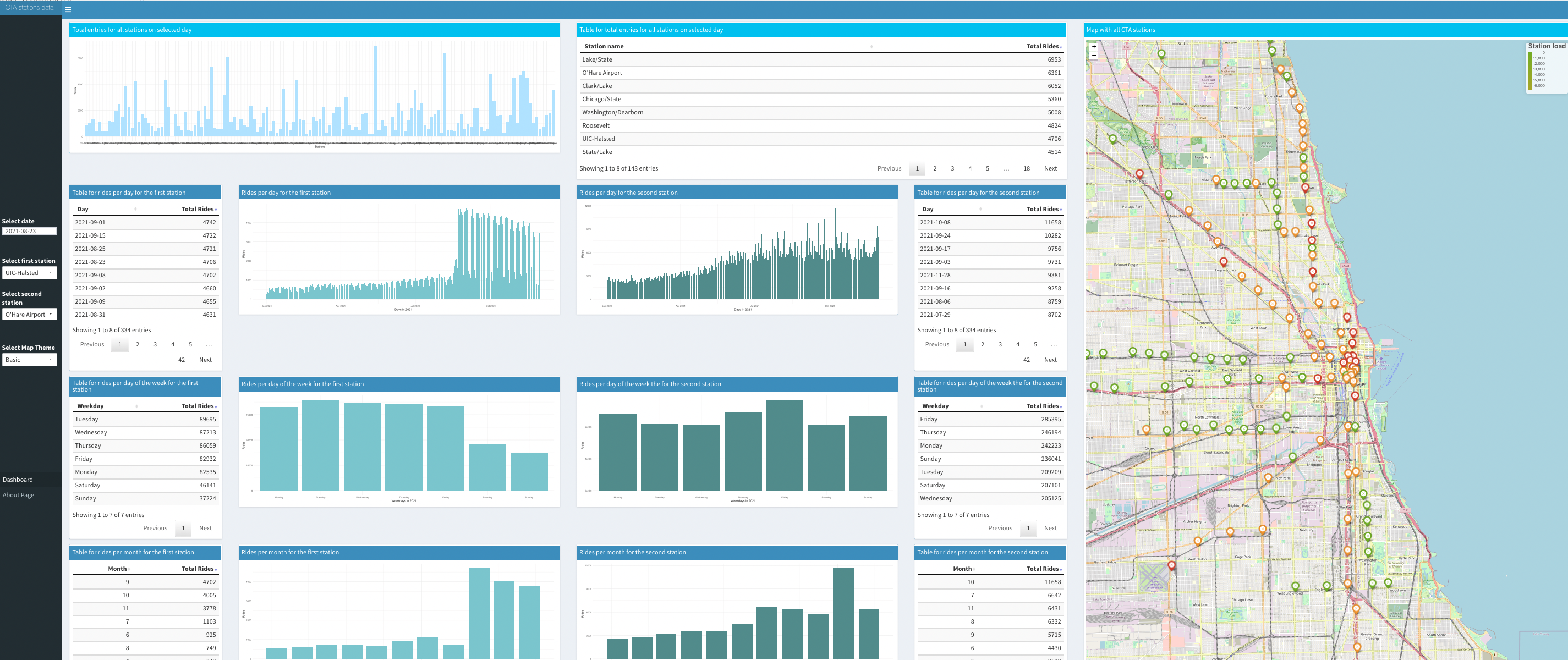
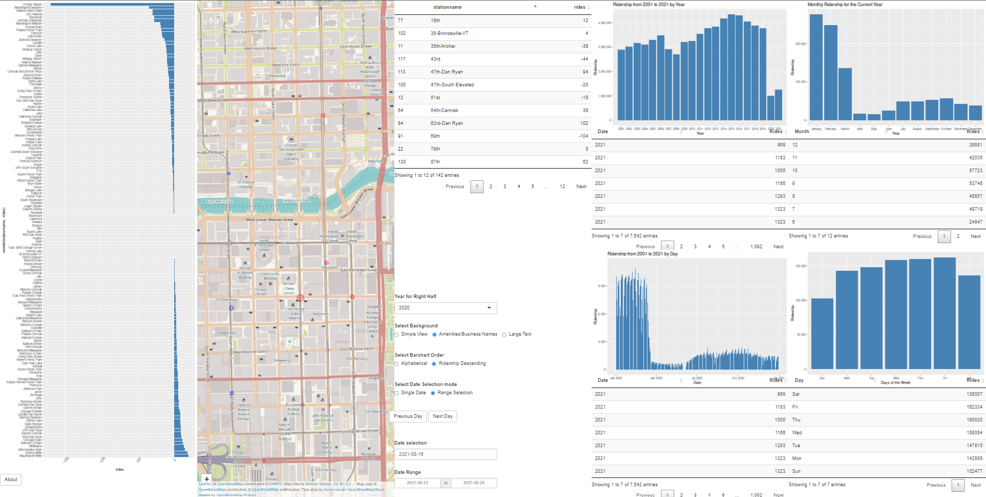
For
an additional 30% you need to also
allow the user to select a station from an alphabetical list
of all the stations (note that this may require some thought
given the number of stations) or select a station by tapping
on a station on the map and see that stop highlighted on the
map and bring up the data shown in the 60% part of Project 1.
The user should also be given all of the controls from that
part as well. Note that if you didn't finish the 60% part of
Project 1 as part of Project 1 then you will need to finish it
for this and then expand it to work for all of the stations in
the data file.
For
an additional 20% you need to also
allow the user to specify two dates from a menu and the map
and bar charts should show the change in entries between those
two days using a divergent color scheme. The table should also
show the change between those two days for each station.
Graduate
Students need to add:
use the line data from the System Information file to allow
the user to color code the various stations by which line they
are on. Note that some stations are on more than one line.
when showing data for a particular station in the 30% part
above, display the list of lines that station serves. Note
that with the addition of the Pink Line in 2006 some stations
changed their color, so be sure to take this into account.
In all of these case you need to make sure that your
visualizations are well constructed with good color and font
choices, proper labeling, fast updates, and that they effectively
reveal the truth about the data to the user. The application
should load within 30 seconds, and definitively not time out.
Note that as part of the web page part of the grade you will need
to use your interface to show your findings, so make sure that the
way your interface displays information is clear.
Turning in the Project
There arethree due datesfor the project.
The first date is to tell andy that you want to be in a 2 person
group for the project.
Then the source code
and application are due.
For this project you should host your
solution using shinyapps.io. For Project 3 we may move to a local
server.
Your code should be turned in and made available on GitHub in a
public repository for the project. You can keep the repository
private while doing your development. I would suggest setting up
the GitHub project early and regularly pushing code to it as a
backup.
It is important to note that 'getting it
to work' is just a prerequisite to using the application to find
answers to your questions. It is that usage that will give you
ideas on how to improve your app to make it easier and more
intuitive to find those things. Writing the application at the
last minute pretty much guarantees that you will not come up
with an intuitive interface.
Many of the routines you write for this project will be used
again and expanded upon in the upcoming projects - e.g. all of
the projects will need graphs, so it is a good idea to write
your code in a way that it is reusable so you can modify it
rather than totally rewriting it later.
Chrome's Developer Tools allow you to
emulate screens of different sizes (view / developer / developer
tools / settings / devices).
Before the application due date&time
please send an email to andy with the URL of your GitHub site
and your shinyapps site.
The second deadline is for the
documentation.
You should
create a public web page with multiple sections (visible to
anyone for at least the duration of the course) that describes
your work on the project. You can host your web page at UIC(http://people.uic.edu), GitHub,or the
provider of your choice, as long as it remains publicly
available to all. You can use any publicly available templates
as long as you cite them, or create your own.
Note that the documentation requirements
are per project, not per person. The documentation
requirements are the same for a 2 person project as a 1
person project.
This page should have several sections including:
link to your visualization solution on shinyapps.io
1+ page worth of text of an introduction and a
description of how to use your application and the things
you can do with it. This should be written for someone who
knows nothing about this course or this assignment.
1+ page worth of text on the data you used, including
where you got it, what manipulations you did to it. This
should be detailed enough to allow any reasonably computer
literate person to reproduce what you did
link to your project on GitHub giving access to your
well commented source code, any necessary data files, and
any instructions necessary to run it. These instructions
should start from the assumption that the reader has a web
browser on their computer and tells the user everything
else he/she needs to know and do to get it running using
R-studio, including installing correct versions of all the
required software.
1+ page worth of text on what interesting things you
found about the data using your application with a focus
on station location.
all of which should have plenty
of screenshots with meaningful captions. Web pages like this
can be very helpful later on in helping you build up a
portfolio of your work when you start looking for a job so
please put some effort into it.
You should also create a 5
minute YouTube video showing the use of your application
including narration with decent audio quality. That video
should be in a very obvious place on your web page. The
easiest way to create the video is to use a screen-capture
tool while interacting with your application, though you
will most likely find its useful to do some editing
afterwards to tighten the video up. If you do decide to use
your phone or tablet to make the video in the classroom,
then please shoot the video in landscape rather than
portrait orientation. Your video should show the
capabilities of your tool through a set of specific examples
of interesting things you found in the data.
I will be linking your web
page to the course notes so please send andy a nice jpg image
of your visualization for the web along with the link to your
website before the deadline. The image should be named
p2.<your_last_name>.<your_first_name>.jpg and be
roughly 1920 pixels wide
Once you
have your web page done, send the URL to Andy before the
deadline. We will respond to this email as your 'receipt'.
An important part
of creating these kinds of applications is getting feedback
and using it to improve your design, and learning to give
quality feedback to others.
See the course notes for week 10 for more details on the
presentations.
last revision 3/14/2022 - added in
project links
3/9/2022 - updated project groups
2/24/2022 - added more info on closed CTA stations
2/23/2022 - added more groups
2/18/2022 - clarified documentation requirements are the same
for individual projects and group projects
2/16/2022 - more clear what 'full screen' on the classroom wall
means