Group membership due 3/19
at 8:59 pm Chicago time Application due 4/23 at 8:59 pm Chicago time
Documentation due 4/25 at 8:59 pm Chicago time
Project 3 can be either an individual project
or a 2-person group project to give people more practice with
wrangling data and then visualizing it in a web-based application
that visualizes data in multiple ways using R and Shiny and
leaflet and Shiny Dashboard. Please let andy know your group
members even if it is the same group as Project 2 by the Group
membership due date above.
This project will focus on using R to
visualize data on Taxi rides in Chicago, and use shiny to give
people an interactive interface to create those visualizations.
The original data is available from the
Chicago Data Portal. The 2019 data is available at:
https://data.cityofchicago.org/Transportation/Taxi-Trips-2019/h4cq-z3dy
It is about 7 GB and contains 16.5 million rows. I will make a USB
stick version of the data available in class, and there will be a
tsv and csv version on the evl shiny server.
Since the 2019 data is pre-COVID it is more representative of a
'typical' year.
As always I would start by taking a look at the raw data file in a
text editor to get an idea what it contains, quickly try to reduce
the file size and then try out different types of manipulations
and visualizations in either R-Studio or Jupyter to work out what
you are going to need to do. Then think about how you are going to
lay out the various visualizations and how you are going to create
the user interface in shiny.
Again we will be running your dashboard full screen on the touch
screen classroom wall with the same resolution as in Project 2.
For this project we are going to switch over to running the code
on evl's shiny server at shiny.evl.uic.edu to avoid the hard
limits on file sizes, but you are still going to need to
dramatically reduce the data file size to under 500 MB in order to
have your application start up quickly. Note that we are using the
free version of the shiny server so there are limits to the
parameters that we can tweak, but this gives you some idea of how
you could set up your own server to serve these kinds of
dashboards.
You will only need a subset of the 23 columns in the data file
3.Trip Start Timestamp (string -> date and time)
5. Trip Seconds (int)
6. Trip Miles (float)
9. Pickup Community Area (int)
10. Drop-off community Area (int)
17. Company (string)
You should also remove all trips less than 0.5 miles, and more
than 100 miles, and less than 60 seconds, and greater than 5
hours, and all trips that either start or end outside of a Chicago
community area. We also will only be using looking at trips down
to a resolution of the starting hour rather than the 15 minute
intervals in the data. The command line (sed, grep, etc) can be
your friend doing these manipulations or you can write a program
to do it, or use R itself if you have enough memory, but you must
document these manipulations so they are reproducible. That should
get you down to about 12 million rides and around 300 MB.
Some potential gotchas:
community areas can be
blank or NA if its not Chicago
the quote in "Taxicab
Insurance Agency needs to be dealt with or you can lose a
lot of data
you should make the cab
company names more readable (e.g. remove the "s for those that have it) and very
likely you should convert the taxi company names into some
kind of short code in the data file since that text can take
up a lot of space
the file might have some
carriage return / line feed issues so you should make sure
the entire file has one set of line endings
you can find information
on Chicago community areas at:
https://www.chicago.gov/content/dam/city/depts/doit/general/GIS/Chicago_Maps/Citywide_Maps/Community_Areas_W_Numbers.pdf
and https://en.wikipedia.org/wiki/Community_areas_in_Chicago
Community area
boundaries are also available on the Chicago data portal -
https://data.cityofchicago.org/Facilities-Geographic-Boundaries/Boundaries-Community-Areas-current-/cauq-8yn6
GitHub has a file size
limit of 100 MB and prefers files less than 50MB, so create
a set of appropriate files so GitHub is happy without having
to use LFS.
This link should show my evl weather app running on the evl
shiny server as an example -
http://shiny.evl.uic.edu:3838/aej/evlweather
Each individual or group will get an account on shiny.evl.uic.edu
named g0, g1, g2, ...
you should be able to ssh into shiny.evl.uic.edu as user gX where
X is your group number. We will talk about the passwords in class.
Please change the password ASAP. We will also talk about the port
number to use to ssh in.
You will also find that you have the directory
/srv/shiny-server/gX where you can create a subdirectory with your
app_name and then you can then place your files in the app_name
directory. Be sure your R code is named app.R
Your /srv/shiny-server/gX directory will be RWX only to you and X
to everyone else. Your /srv/shiny-server/gX/app_name directory
will be readable and executable to all so that shiny can read data
files from it while its running, and all of your files in the
/srv/shiny-server/gX/app_name directory should be readable to all.
and then you should be able to see the app running as
http://shiny.evl.uic.edu:3838/gX/app_name
error logs for everyone can be found in /var/log/shiny-server/
as all the error logs are in one place it can be really helpful to
name your project something more unique than Project3 to make your
log files easier to find.
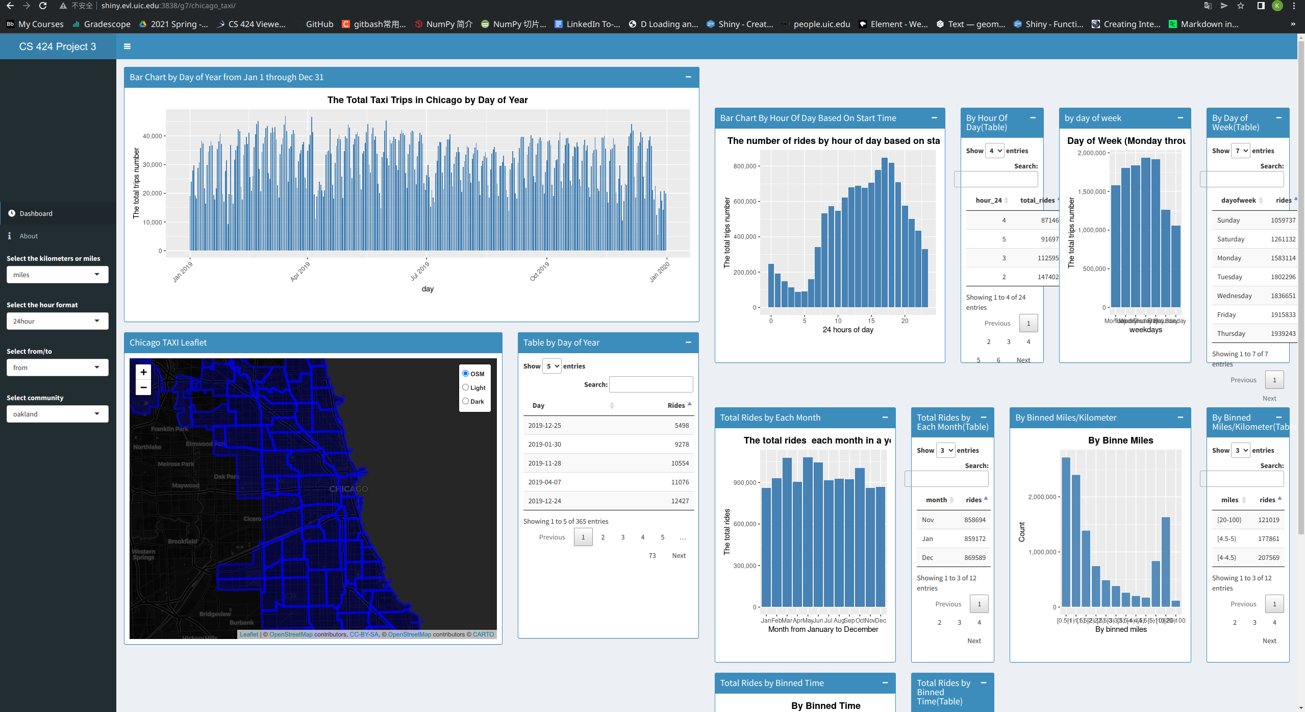
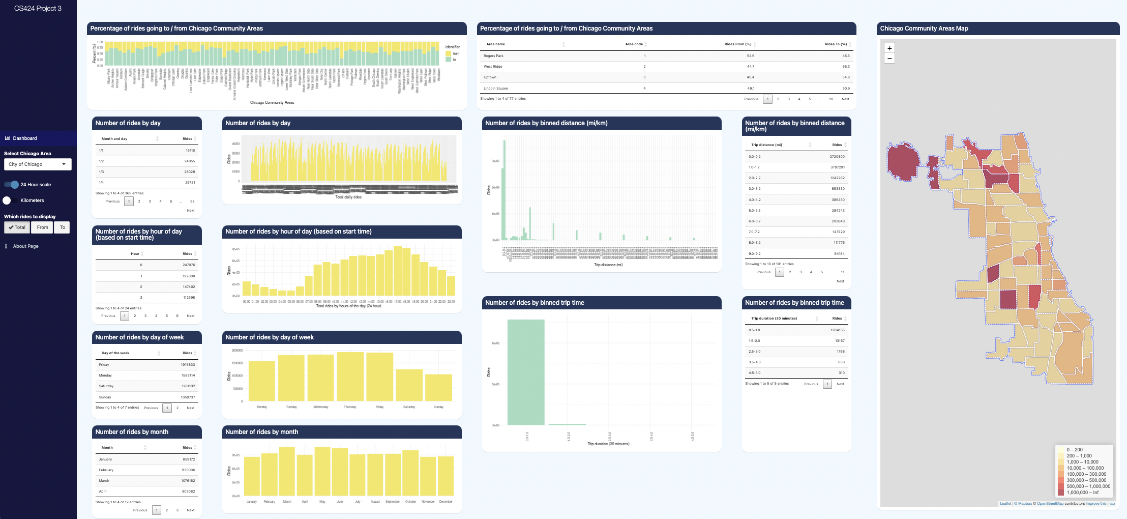
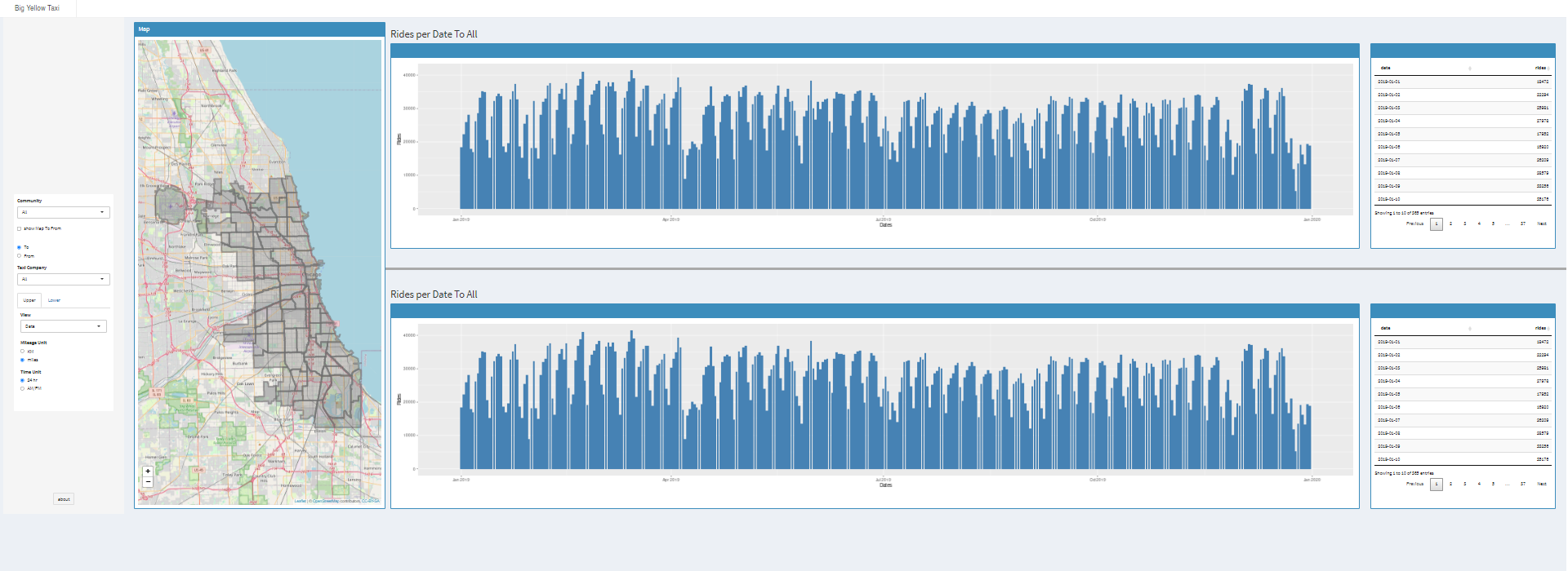
For
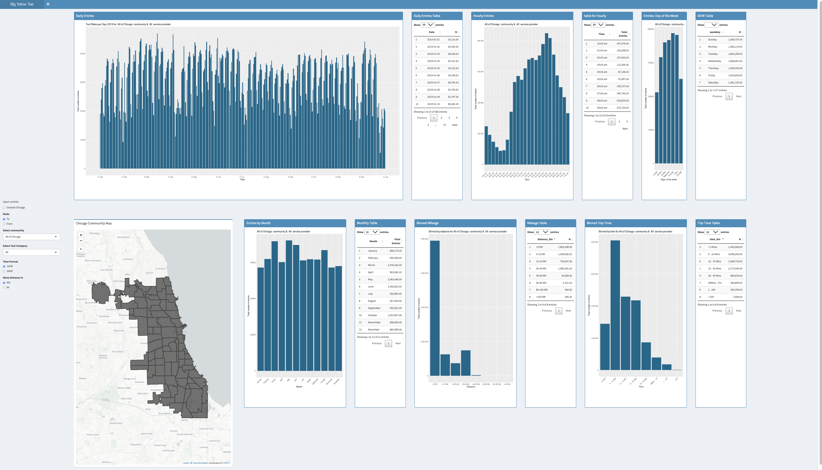
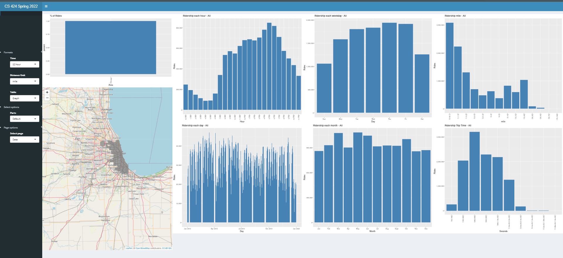
40% you need to:
create a new smaller set of data files and document those
steps so they are reproducible. use those data files to
create an interactive visualization in R and Shiny on the
evl shiny server that shows data about taxi rides in the
entire city of Chicago
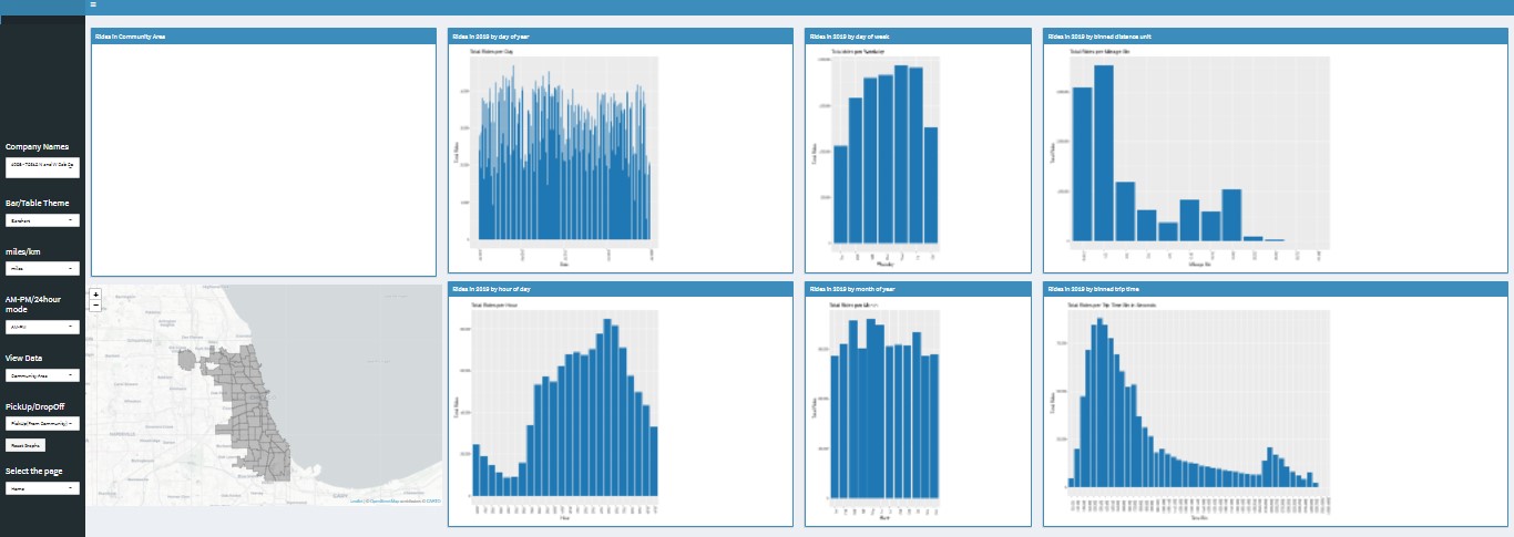
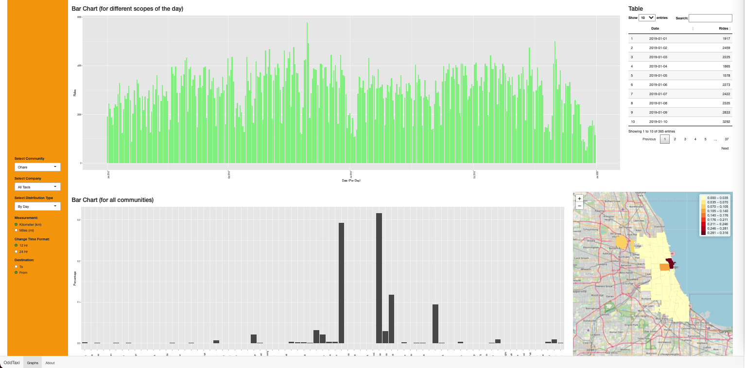
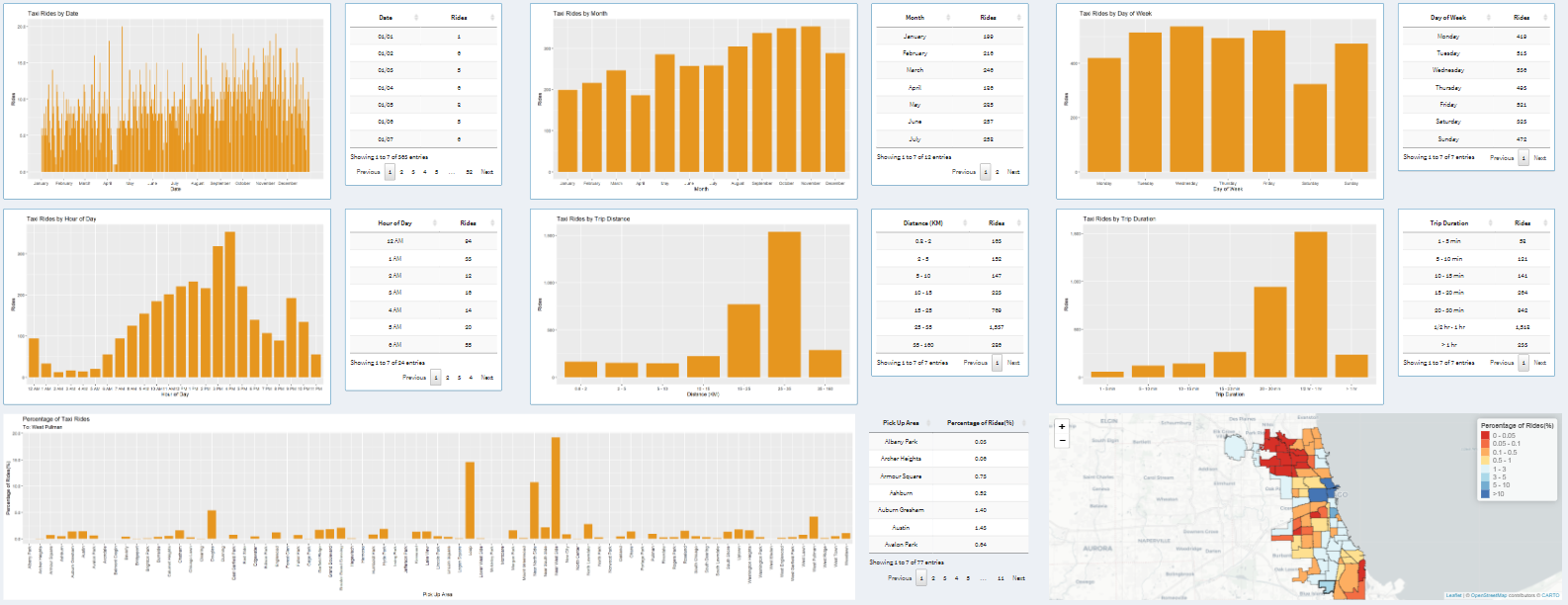
bar chart showing the distribution of the number of
rides by day of year (Jan 1 through Dec 31)
bar chart showing the distribution of the number of
rides by hour of day based on start time (midnight through
11pm)
bar chart showing the distribution of the number of
rides by day of week (Monday through Sunday)
bar chart showing the distribution of the number of
rides by month of year (Jan through Dec)
bar chart showing the distribution of the number of
rides by binned mileage (with an appropriate number of
bins)
bar chart showing the distribution of the number of
rides by binned trip time (with an appropriate number of
bins)
allow the user to see all of the data in those
visualizations in tabular form, ordered appropriately
allow the user to choose see the data in kilometers or
miles
allow the user to choose to see the time in either 12 hr
am/pm or 24 hour modes
have an 'about page' in your app, perhaps as a separate
tab in the shiny interface, with appropriate credits (where
the data is from, who wrote the app, when, why, etc.)
For
an additional 30% you need to
add a map showing the Chicago Community Areas
allow the user to choose a Chicago Community Area from an
alphabetical menu of their names or by clicking on the map,
which will highlight the selected community area, and allow
the user to choose whether to see rides starting or ending in
that community area, and then show:
percentage of rides going to / from each of the community
areas as color coded heat map on the map (note that a ride
can go to / from the same community area and rides within
the community area should be shown in both the ‘to’ and the
‘from’ visualizations)
percentage of rides going to / from each of the community
areas as bar chart with the community areas listed
alphabetically
the same charts from the 40% range above but just for the
chosen community area:
bar chart distribution of the number of rides to /
from this community area by day of year (Jan 1 through
Dec 31)
bar chart distribution of the number of rides to
/ from this community area by hour of day based on start
time (midnight through 11pm)
bar chart distribution of the number of rides to
/ from this community area by day of week (Monday
through Sunday)
bar chart distribution of the number of rides to
/ from this community area by month of year (Jan through
Dec)
bar chart distribution of the number of rides to
/ from this community area by binned mileage
bar chart distribution of the number of rides to
/ from this community area by binned trip time
allow the user to see all of the data in those
visualizations in tabular form, ordered appropriately
allow the user to see the data in kilometers or miles
allow the user to see the time in either 12 hr am/pm
or 24 hour modes
allow the user to choose the City of Chicago from the
menu of Community Areas to see the charts from the 40%
range above
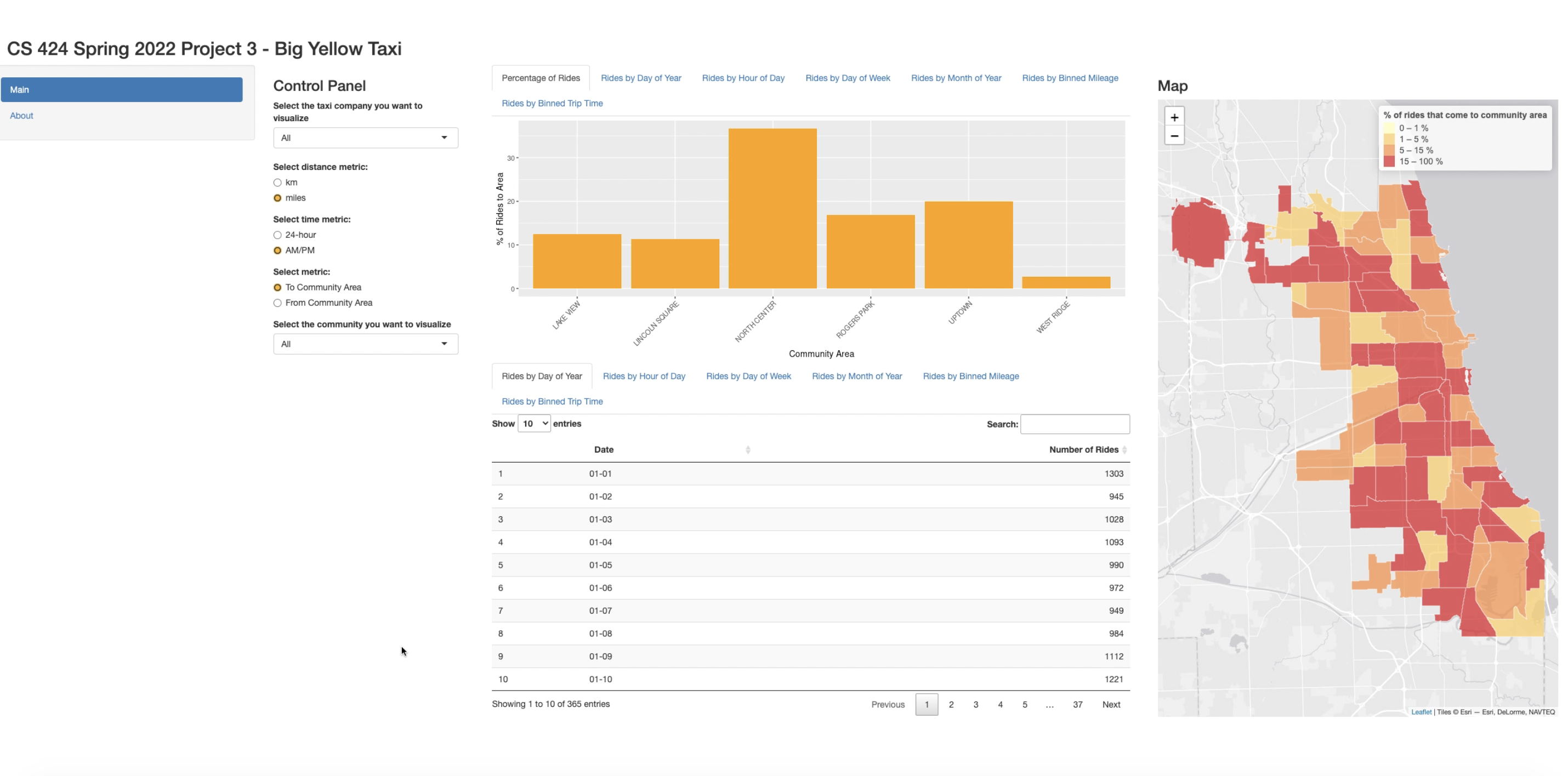
For
an additional 30% you need to
add in a menu containing an alphabetical listing of the
cleaned up taxi company names, and allow the user to choose
one of those taxi companies and then show
a color coded heat map on the map of community areas showing
the percentage of rides given to / from each community area by
that taxi company. As with part 2 the user should be able to
choose whether to show the 'to’ data or the ‘from’ data and
rides within the community area should be shown in both the
‘to’ and the ‘from’ visualizations.
and similar to the earlier parts of the project but for the
chosen taxi company:
bar chart distribution of the number of rides by this
company by day of year (Jan 1 through Dec 31)
bar chart distribution of the number of rides by this
company by hour of day based on start time (midnight
through 11pm)
bar chart distribution of the number of rides by this
company by day of week (Monday through Sunday)
bar chart distribution of the number of rides by this
company by month of year (Jan through Dec)
bar chart distribution of the number of rides by this
company by binned mileage
bar chart distribution of the number of rides by this
company by binned trip time
allow the user to see all of the data in those
visualizations in tabular form, ordered appropriately
allow the user to see the data in kilometers or miles
allow the user to see the time in either 12 hr am/pm or
24 hour modes
allow the user to choose All Taxi Companies from the
menu of Taxi Companies to see the charts from the ranges
above
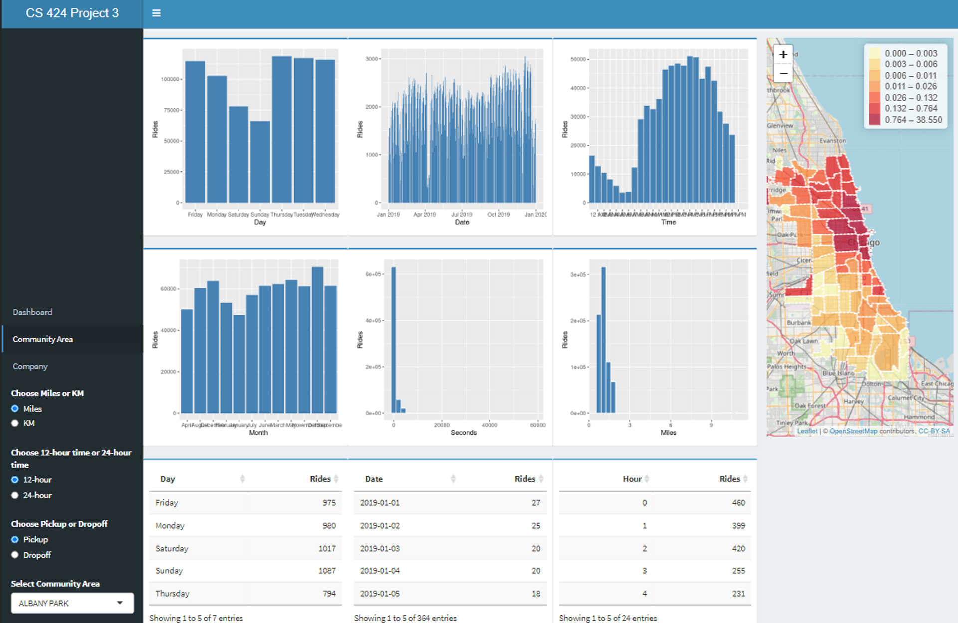
Graduate
Students need:
allow the users to investigate rides that either started or
ended outside the City of Chicago by adding in a new Community
Area for outside the city. Provide the user with a menu option
to enable or disable viewing this data. When enabled all of
the visualizations created above should then take this new
area into account, and these rides should be included in the
totals for the city as a whole. This will also require
re-preprocessing the data to include this additional data
In all of these case you need to make sure that your
visualizations are well constructed with good color and font
choices, proper labeling, fast updates, and that they effectively
reveal the truth about the data to the user. The application
should load within 30 seconds, and definitively not time out.
Note that as part of the web page part of the grade you will need
to use your interface to show your findings, so make sure that the
way your interface displays information is clear.
Turning in the Project
There aretwo due datesfor the project.
The source code and
application are due first.
For this project you should host your
solution on the evl shiny site.
Your code should be turned in and made available on GitHub in a
public repository for the project. You can keep the repository
private while doing your development. I would suggest setting up
the GitHub project early and regularly pushing code to it as a
backup. Also keep in mind the limits on file sizes in GitHub.
It is important to note that 'getting it
to work' is just a prerequisite to using the application to find
answers to your questions. It is that usage that will give you
ideas on how to improve your app to make it easier and more
intuitive to find those things. Writing the application at the
last minute pretty much guarantees that you will not come up
with an intuitive interface.
Chrome's Developer Tools allow you to
emulate screens of different sizes (view / developer / developer
tools / settings / devices).
Before the application due date&time
please send an email to andy with the URL of your GitHub site
and your Shinyapps or evl shiny server site.
The second deadline is for the
documentation.
You should
create a public web page with multiple sections (visible to
anyone for at least the duration of the course) that describes
your work on the project. You can host your web page at UIC(http://people.uic.edu), GitHub,or the
provider of your choice, as long as it remains publicly
available to all. You can use any publicly available templates
as long as you cite them, or create your own.
This page should have several sections including:
link to your visualization solution
1 page worth of text on an introduction and a description
of how to use your application and the things you can do
with it.
1 page worth of text on the data you used, including where
you got it, what you did to it so a person could re-create
your data files starting from the files on the Chicago Data
Portal.
link to your project on GitHub giving access to your well
commented source code, any necessary data files, and any
instructions necessary to run it. These instructions should
start from the assumption that the reader has a web browser
on their computer and tells the user everything else he/she
needs to know and do to get it running using R studio,
including installing correct versions of all the required
software.
1 page worth of text on what interesting things you found
about the data using your application.
all of which should have plenty
of screenshots with meaningful captions. Web pages like this
can be very helpful later on in helping you build up a
portfolio of your work when you start looking for a job so
please put some effort into it.
You should also create a 5 minute YouTube video showing the
use of your application including narration with decent
audio quality. That video should be in a very obvious place
on your web page. The easiest way to create the video is to
use a screen-capture tool while interacting with your
application, though you will most likely find its useful to
do some editing afterwards to tighten the video up. If you
do decide to use your phone or tablet to make the video,
then please shoot the video in landscape rather than
portrait orientation. Your video should show the
capabilities of your tool through a set of specific examples
of interesting things you found in the data.
I will be linking your web
page to the course notes so please send andy a nice jpg image
of your visualization for the web along with the link to your
website before the deadline. The image should be named
p3.<your_last_name>.<your_first_name>.jpg and be
roughly 1920 pixels wide.
Once you
have your web page done, send the URL to andy before the
deadline. We will respond to this email as your 'receipt'.
An important part
of creating these kinds of applications is getting feedback
and using it to improve your design, and learning to give
quality feedback to others.
See the course notes for week 15 for more details on the
presentations.