developing
interactive head and hand tracked experiences
Some goals for this
course:
be able to
critically interpret visualizations
take data and
create meaningful interactive visualizations based on user
needs
understand how to
use and combine different modern libraries and tools for
data visualization
learn to work
better with others on teams
learn to better
present your work to others in person, on video, and on the
web
Visualization
Webster defines Visualization as:
formation of mental visual images
the act or process of
interpreting in visual terms or of putting into visible form
Hamming: "The purpose of computing is insight not
numbers"
What are the advantages? (adapted from [Ware 2000])
ability to comprehend vast
amounts of data
allows the perception of
unanticipated emergent features
problems with the data itself can
often be quickly recognized
helps to see both large-scale and
small-scale features of the data
facilitates hypothesis formation
How do we make good visualizations? (adapted from [Tufte 1983])
show the data
allow the viewer to focus on the
substance rather than the methodology, graphic design,
technology of the production, etc.
avoid distorting what the data
present many numbers in a small
space
encourage the eye to compare different pieces
of data
reveal
the data at several levels of detail, from a broad
overview to the fine structure
serve a
clear purpose: description, exploration, tabulation, or
decoration
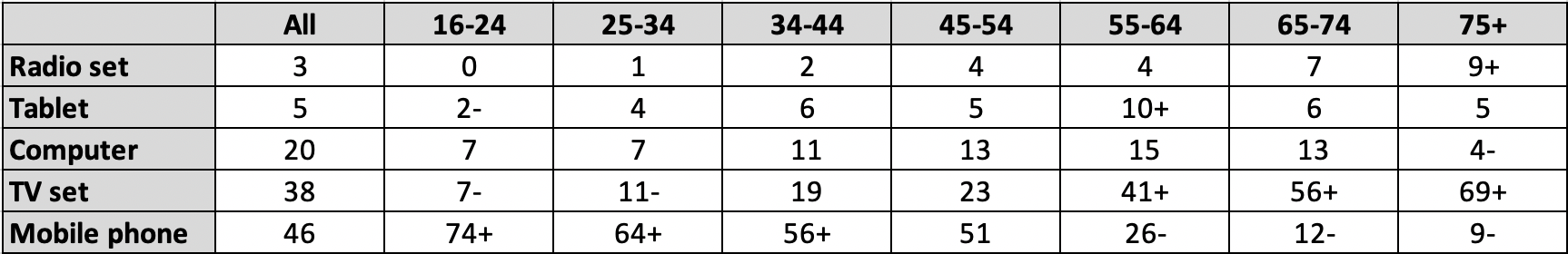
Lets start off with a recent comparison. We
can show the same information in text, in a table (itself a
visualization), and in a chart.
Among all adults in the UK, when asked which one of these
things (Radio set, Tablet, Computer, TV set, or Mobile phone)
they would miss most if it was taken away, the overall
rankings were 3% for Radio, 5% for Tablet, 20% for Computer,
38% for TV, and 46% for Mobile phone. However, among ages 16
to 24 the rankings were 0%
for Radio, 2% for Tablet, 7% for Computer, 7% for TV, and 74%
for Mobile phone. Among ages 75+ the rankings were
9% for Radio, 5% for Tablet, 4% for
Computer, 69% for TV, and 9% for Mobile
phone. ...
and the newer
https://www.ofcom.org.uk/__data/assets/pdf_file/0033/196458/adults-media-use-and-attitudes-2020-full-chart-pack.pdf
Even within the table and the stacked bar charts, while the data
for 'All adults' gives an accurate summary of the entire data
set, breaking the data down by age groups shows a much more
interesting story.
This course will also deal with Visual Analytics
- using interactive visualizations to enhance the analysis
of large amounts of data - that is, the visualization is not the
end-product but rather it is the means by which people can
understand complex phenomena
Many analytical reasoning tasks follow this process
information gathering
re-representation of the
information in a form that aids analysis
development of insight
through the manipulation of this representation
creation of some
knowledge product or direct action based on the knowledge
insight
We are going to start by looking at some early
visualizations.
William Playfair invented
modern bar charts, as well as line and area charts in ' The
Commercial and Political Atlas' in 1786 (though they built on
earlier work from Joseph Priestly in the mid 1700ds), and pie
charts in 'Statistical Breviary' in 1801.
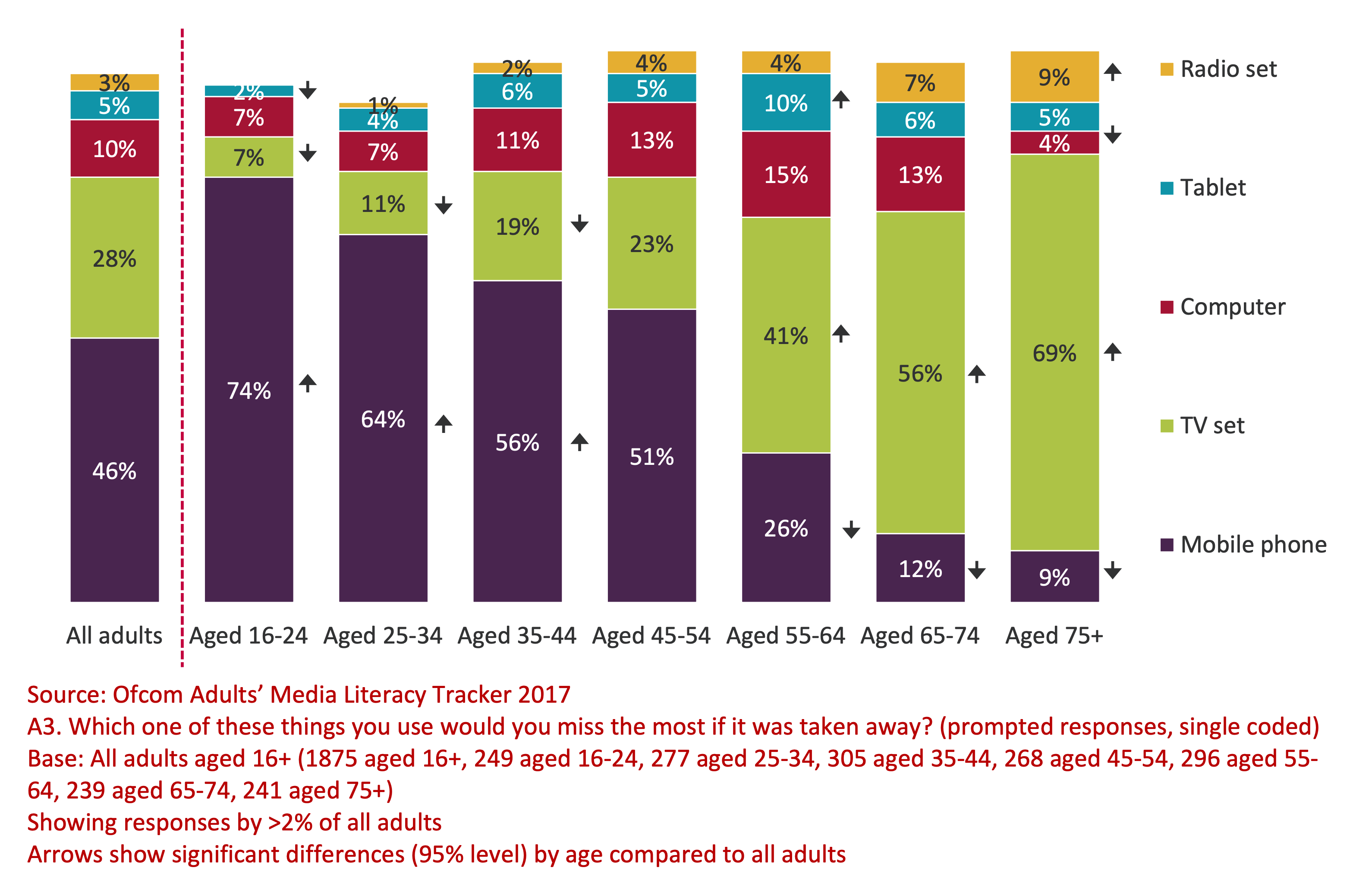
We start off
talking about Charles Joseph Minard's 1861 graphic showing
Napoleon's losses during his 1812 march to and from Moscow -
regarded as one of the best statistical graph ever drawn ... why?
The image is discussed in detail on p41 of The Visual Display of
Quantitative Information
Like many analytical visualizations this one gives us a way to
see relationships between different types of related data that
help explain what we are seeing after the events.
Today we have the ability to
make dynamic visualizations that encourage active exploration
beyond just looking. How would you enhance this visualization if
it was software-based?
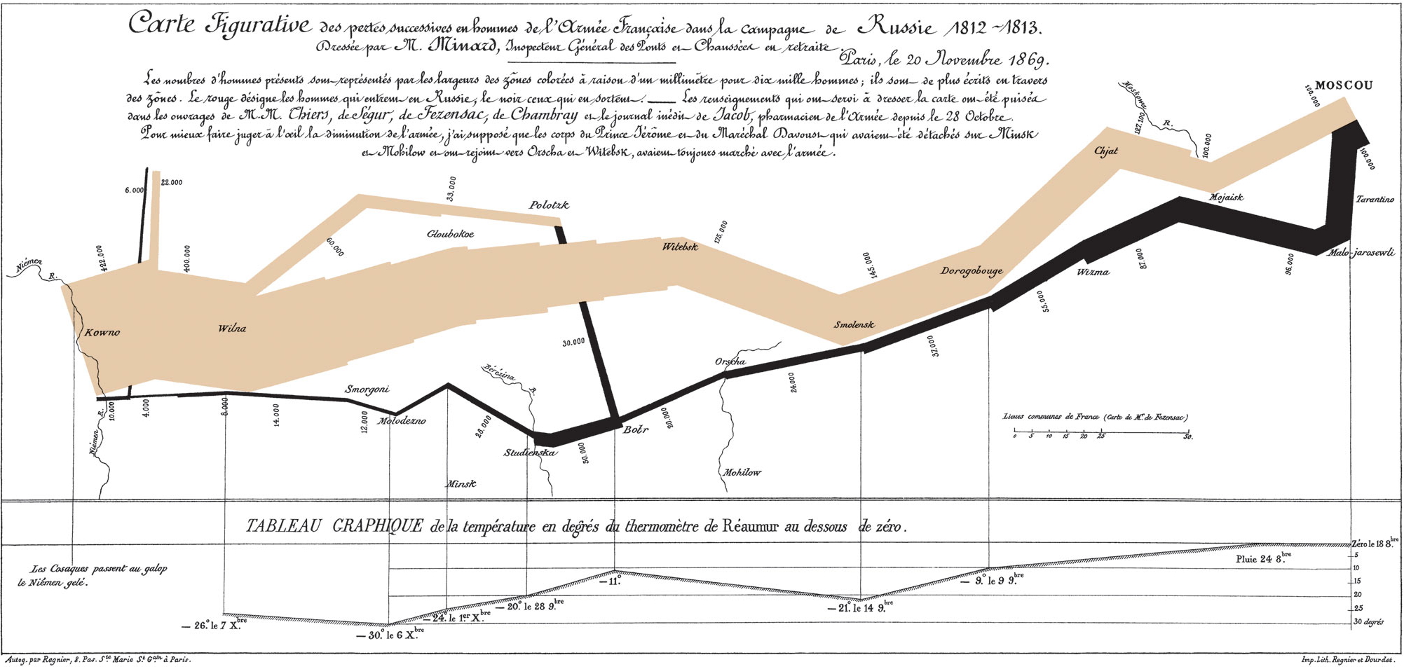
One in particular worth looking at was this 'coxcomb' done by
Florence Nightingale in 1858 during the Crimean War showing deaths
from wounds, other causes, and preventable disease as a way to
encourage better hygiene to avoid cholera, typhus, dysentery, etc.
In March 1855 the Sanitary Commission arrived in
Turkey, improving the water supply, sewage removal, and
ventilation. Deaths from preventable diseases immediately drop
dramatically. Returning from Turkey, Nightingale wanted to show
the importance of hygiene, and while tables show the data, a
graphic could have more immediate impact on the reader and
motivate people to action quicker.
There are good things here and things that could be
improved. Again, how
would you enhance this visualization if it was software-based?
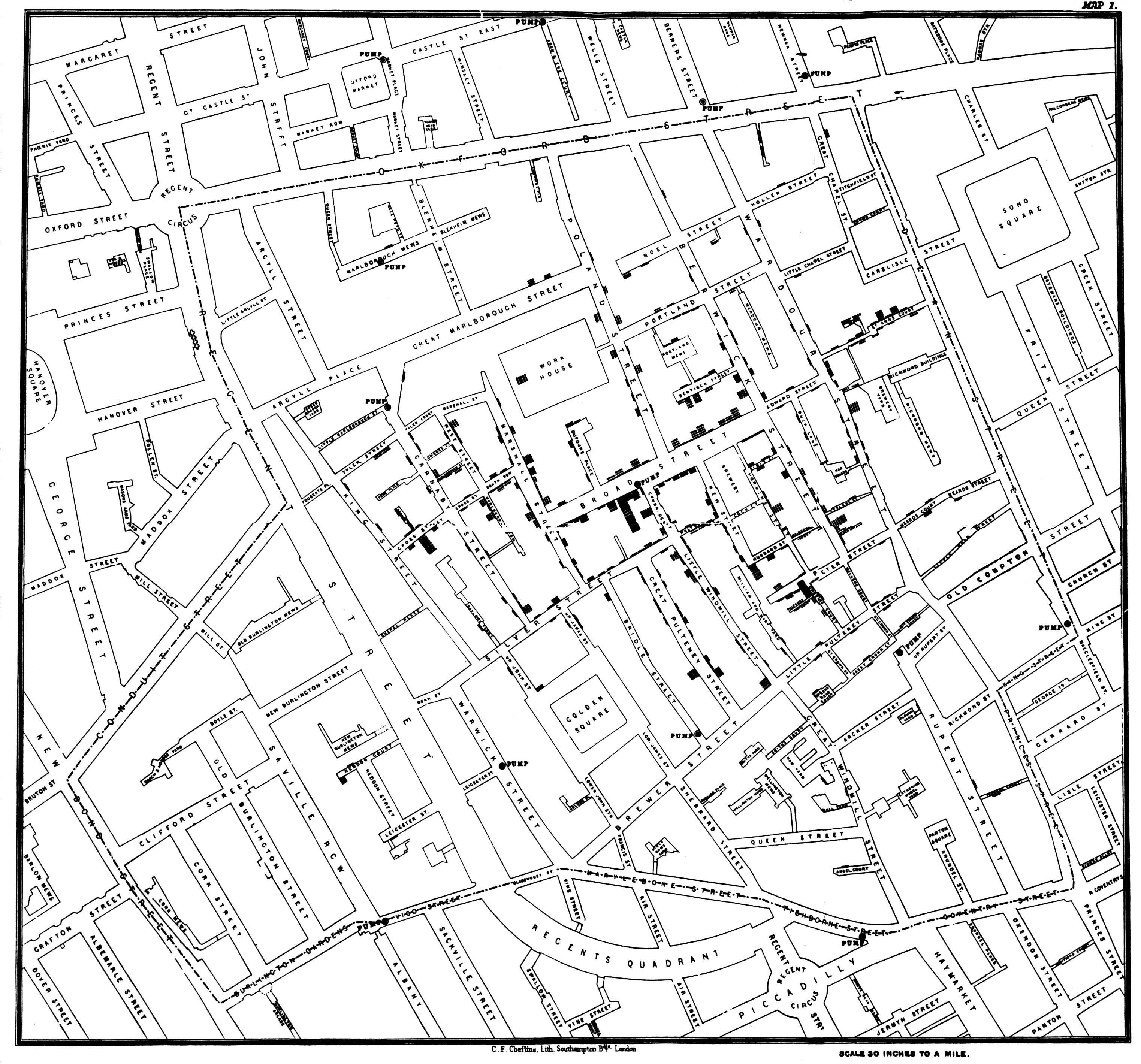
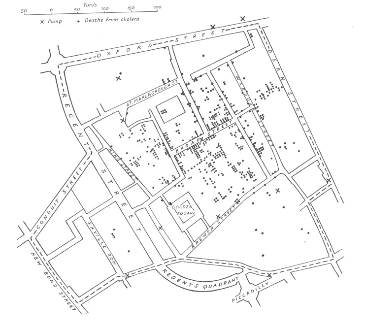
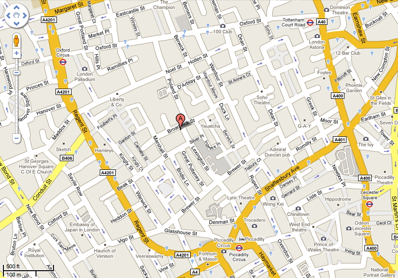
Another very famous one was created by Dr. John Snow(1813-1858)
a distinguished British Anesthesiologist who plotted over 500
deaths in central London from Cholera in September 1854 with the
help of Reverend Henry Whitehead.
A really good book to read if you are interested in this is 'The
Ghost Map' by Steven Johnson, published in 2006. If you prefer,
there is his 10 minute TED talk here: https://www.youtube.com/watch?v=39X_qKkX8eI
Deaths are marked by dots and the location of
the 11 water pumps in the area are marked with Xs. The deaths
seemed centered around the Broad St. pump. Note that at the time
the infectious theory of disease was not generally accepted.
Disease was believed to be caused by morbid poisons coming from
dead bodies and decaying organic matter, and spread through the
air. Snow thought that water was involved in the transmission of
Cholera so he already had an idea what to look for.
Here is some of his own
text:
"Very few of the fifty-six
attacks placed in the table to the 31st August occurred till
late in the evening of that day. The eruption was extremely
sudden, as I learn from the medical men living in the midst of
the district, and commenced in the night between the 31st August
and 1st September."
"The greatest number
of attacks in any one day occurred on the 1st of September,
immediately after the outbreak commenced. The following day the
attacks fell from one hundred and forty-three to one hundred and
sixteen, and the day afterwards to fifty-four. A glance at the
above table will show that the fresh attacks continued to become
less numerous every day. On September the 8th - the day when the
handle of the pump was removed - there were twelve attacks; on
the 9th, eleven: on the 10th, five: on the 11th, five; on the
12th, only one: and after this time, there were never more than
four attacks on one day. During the decline of the epidemic the
deaths were more numerous than the attacks, owing to the decease
of many persons who had lingered for several days in consecutive
fever.
"There is no doubt that the
mortality was much diminished, as I said before, by the flight
of the population, which commenced soon after the outbreak,- but
the attacks had so far diminished before the use of the water
was stopped, that it is impossible to decide whether the well
still contained the cholera poison in an active state, or
whether, from some cause, the water had become free from it."
The last sentence above is important to note. Snow
himself can not state that removing the pump handle definitively
stopped the outbreak.
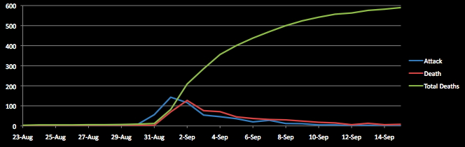
Here is some of the actual data from John Snow. Note
that about 4000 people live in the area.
Date
# of Fatal Attacks
Deaths
Significant Events
Date
# of Fatal Attacks
Deaths
Significant Events
8/19
1
1
9/09
11
24
8/20
1
0
9/10
5
18
8/21
1
2
9/11
5
15
8/22
0
0
9/12
1
6
8/23
1
0
9/13
3
13
8/24
1
2
9/14
0
6
8/25
0
0
9/15
1
8
8/26
1
0
9/16
4
6
8/27
1
1
9/17
2
5
8/28
1
0
9/18
3
2
8/29
1
1
9/19
0
3
8/30
8
2
9/20
0
0
8/31
56
3
9/21
2
0
9/01
143
70
9/22
1
2
9/02
116
127
9/23
1
3
9/03
54
76
9/24
1
0
9/04
46
71
9/25
1
0
9/05
36
45
10% of
neighborhood now dead within 1 week
9/26
1
2
9/06
20
37
9/27
1
0
9/07
28
32
75%
of population had left the area
9/28
0
2
9/08
12
30
pump handle removed
9/29
0
1
and a chart of that data:
John Snow's visualization has a number of good features that you
should strive for:
1. Place data in the appropriate context for
assessing cause and effect
2. Allow the viewer to make quantitative comparisons
3. Encourage search for alternative explanations and
contrary cases
4. Indicate level of certainty and possible errors in the data
#3 is particularly
interesting. There are areas near the Broad Street pump with
no/few fatalities and there are a few fatalities far from the
pump. Those suggest that maybe his hypothesis is wrong.
John Snow (with help from
the local Reverend Henry Whitehead)
visited families of the deceased that lived far from the
pump. Some preferred the taste of the water at Broad Street as
it was usually more clear than the others. Some had children
that went to school near the Broad Street Pump and brought water
back from that pump on the way home.
What about the areas near
the pump with no fatalities? One was a brewery employing 70 men.
The other was a work house with over 500 inmates that had only 5
deaths from cholera, and it had its own water pump.
We do not have data on
deaths based on age or sex from this outbreak, but we do have
that data from a cholera outbreak in Naples around the same
time, showing the percentage of people in those groups that
died. Any hypotheses made based on the geographic data should
also match this data.
age
male
female
0-1
8.2
8.9
2-5
14.0
14.7
6-10
12.1
11.2
11-15
7.8
7.1
16-20
7.2
7.2
21-40
12.1
11.8
41-60
13.7
12.9
61-80
20.5
20.5
over-80
39.6
37.8
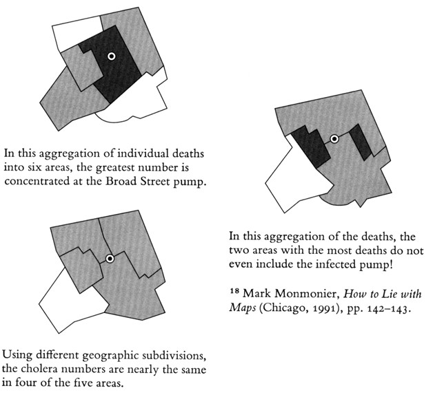
but its not just about making a graphic, but making
a good
graphic. A bad graphic may hide the truth depending on how you
cluster the data.
As a result of John Snow's
work this was the last great cholera outbreak in London.
If you want to look at this
area now, you can tell Google earth to go to 'Golden
Square, London, Greater London, W1F, UK'
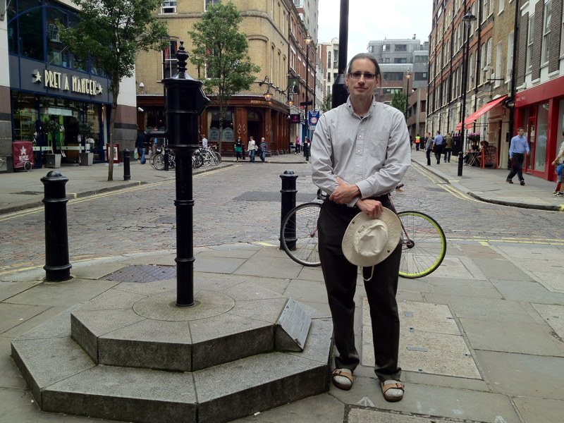
Here
is a photo of me from the summer of 2012 standing at the
commemorative pump in what is now called Broadwick st. The
John Snow pub is visible in the background.
There
is an urban legend that Chicago had 80,000+ fatalities from
cholera when in August 1885 a rainstorm dropped 7" of rain on
Chicago in one day, overflowing the drainage systems and causing
raw sewage to flow into the lake and back into the city's
drinking water. The storm happened, the fatalities did not,
thanks to a shift in the winds.
Since
there is already a lot of life and death in these examples lets
look at one more famous one. There is a lot of data on the
Titanic with very detailed datasets available. At the highest
level one can count the number of survivors and victims (approx
499 passengers surviving out of 1316, and 212 crew members
surviving out of 885) which tells one story, and then you can go
deeper into the data and see other stories. Some of these
stories are more obvious with raw numbers, and some are more
obvious with percentages. Often we need both to tell a more
complete story.
Instead
of looking at overall numbers we can look at some overall
percentages.
Survival Rate
male
female
21%
73%
Survival Rate
adult
child
31%
52%
Survival Rate
passengers
crew
38%
24%
of the SURVIVORS
what percent were
male
female
52%
48%
of the VICTIMS
what percent were
male
female
92%
8%
At a reasonably
high level there is a list of passengers and crew members and
for each we know 1) male or female, 2) child or adult, 3)
class (1st, 2nd, 3rd, or crew) and 4) whether they survived,
and that 4 dimensional data set already lets us see patterns.
The full data set contains ages, where people embarked, what
cabin they stayed in, etc.
Putting the data in a
simple table gets us an initial visualization that can help us
see some trends, but already with 4 attributes its getting
tricky to summarize the data in a single table, so we have to
make some choices about what we are going to focus on.
SURVIVED
Class
male adult
male child
female adult
female child
1
57
5
140
1
2
14
11
80
13
3
75
13
76
14
crew
192
0
20
0
PERISHED
Class
male adult
male child
female adult
female child
1
118
0
4
0
2
154
0
13
0
3
387
35
89
17
crew
670
0
3
0
Converting
the data to percentages focusing on survival can give us some
more insight, again starting at a high level, and then going a
little deeper.
SURVIVAL
RATE
Class
male adult
male child
female adult
female child
1
33%
100%
97%
100%
2
8%
100%
86%
100%
3
16%
27%
46%
45%
crew
22%
87%
And then we can take this
data and convert it into simple visualizations like bar charts,
stacked bar charts, or pie charts.
I'd like you to take 10 minutes and create
some quick visualizations from this data by drawing, either
using pencil and paper or using your finger on a screen. The
idea is to draw some rough visualizations, simple pie charts,
bar charts, etc. quickly that you can turn in by taking photos
of them or screen shots of them.
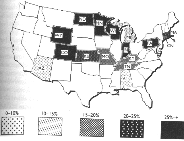
Now lets look at some common
mistakes with showing data on maps
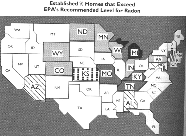
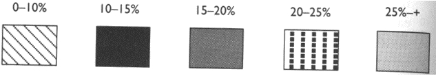
Here is a
comparison of a good graphic and a bad graphic, making use of a
choropleth map dealing with radon from Things that Make Us Smart,
p70-71.
Why is the
first version bad:
- scale of black lines, black,
dark grey, black squares, light grey is not an ordered additive
sequence - the viewer must keep referring back to the legend to
try and figure out which is more - 'white' states are assumed to
have low levels of radon when they are actually not part of the
data
Now you may be thinking, hey that was back in the 80s, desktop
publishing software was new, people wouldn't do something like
that today ...
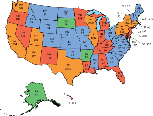
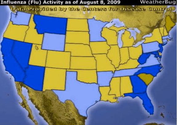
Here is a graphic from 2016 showing the spread of H1N1. What
states are the hardest hit? What is the order of the colours?
Here is the legend:
aside form the poor color choices that are more suited
for categorical data, one thing to note is that the colour
scheme is based on number of cases in each state, so more
populous states and less populous states are treated equally.
Since the most populated state (California) with 38 million
people has 65 times the population of the least populated state
(Wyoming) with only 576,000 people, a chart based on the
percentage of the population with H1N1 could look very
different. Both ways are useful and legitimate, but you want to
make sure your audience is drawing the correct conclusions.
here is the actual data:
STATE
POPULATION
H1N1
%
Wisconsin
5,822,434
3,008
0.052
Utah
3,205,958
688
0.021
Delaware
973,764
187
0.019
Connecticut
3,565,287
637
0.018
Illinois
12,671,821
1,983
0.016
Massachusetts
6,949,503
1,078
0.016
Hawaii
1,415,872
198
0.014
Wyoming
578,759
50
0.009
Arizona
7,278,717
597
0.008
Washington
7,614,893
584
0.008
New Mexico
2,096,829
155
0.007
Texas
28,995,881
2,049
0.007
New Hampshire
1,359,711
92
0.007
New York
19,453,561
1,160
0.006
Rhode Island
1,059,361
62
0.006
Nevada
3,080,156
162
0.005
Vermont
623,989
32
0.005
Pennsylvania
12,801,989
626
0.005
Oregon
4,217,737
189
0.004
Michigan
9,986,857
419
0.004
New Jersey
8,882,190
348
0.004
Nebraska
1,934,408
71
0.004
Kansas
2,913,314
97
0.003
North Dakota
762,062
23
0.003
Indiana
6,732,219
201
0.003
Iowa
3,155,070
92
0.003
Louisiana
4,648,794
134
0.003
California
39,512,223
1,094
0.003
Minnesota
5,639,632
153
0.003
Montana
1,068,778
27
0.003
Alabama
4,903,185
123
0.003
Maine
1,344,212
33
0.002
Kentucky
4,467,673
106
0.002
Oklahoma
3,956,971
93
0.002
Maryland
6,045,680
139
0.002
West Virginia
1,787,147
40
0.002
Mississippi
2,976,149
59
0.002
Florida
21,477,737
417
0.002
Idaho
1,792,065
29
0.002
Tennessee
6,833,174
110
0.002
South Dakota
884,659
14
0.002
Alaska
731,545
11
0.002
Colorado
5,758,736
75
0.001
South Carolina
5,148,714
60
0.001
Virginia
8,535,519
90
0.001
Missouri
6,137,428
46
0.001
Ohio
11,689,100
53
0.000
Arkansas
3,017,825
13
0.000
Georgia
10,617,423
39
0.000
North Carolina
10,488,084
31
0.000
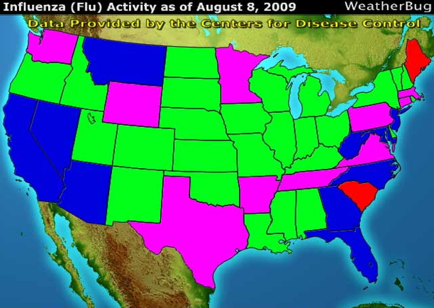
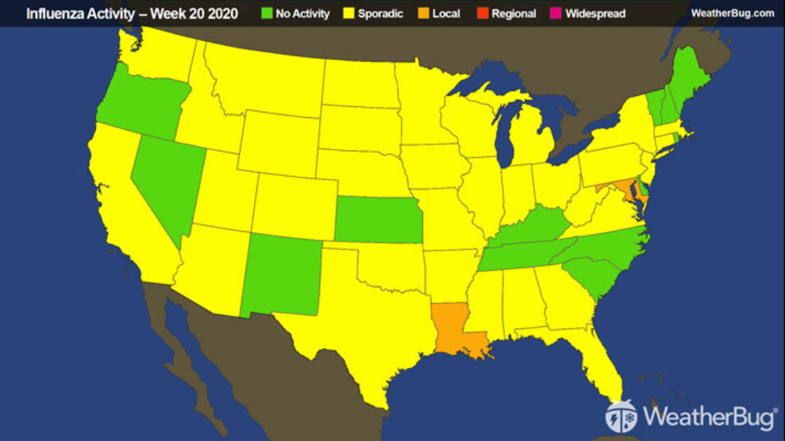
Here is the colour scheme
that WeatherBug used back in 2009:
What states are the hardest hit?
What is the order of the colours?
Green is usually good and red is usually bad, but blue and pink?
as we will see next week this
kind of color scheme is not very good for quantitative values.
and here is what that same image
looks like to someone who is color blind:
and again, how would you enhance this
visualization if it was software-based rather than static?
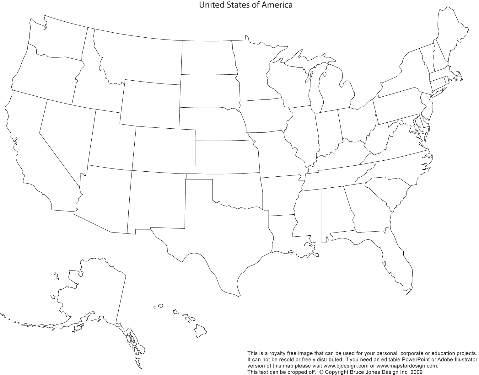
Here is a blank map of the US showing the state
borders, Use the H1N1 percentage data above to come up with a
better map. You can use software to fill in the states or
print it out and color it in by hand. Again you will be
turning this in either by taking a photo of your drawing or a
screen snapshot.
Some basic principles from Norman:
Appropriateness
Principle- The visual representation
should provide neither more nor less information than that
needed for the task at hand. Additional information may be
distracting and makes the task more difficult.
Naturalness Principle
- Experiential cognition is most effective when the properties
of the visual representation most closely match the
information being represented. New visual metaphors are only
useful for representing information when they match the user's
cognitive model of the information; purely artificial visual
metaphors can actually hinder understanding.
Representations that make use
of spatial and perceptual relationships make more effective
use of our brains. If these representations use arbitrary
symbols then we need to use mental transformations, mental
comparisons and other mental processes, forcing us to think
reflectively.
In experiential cognition we perceive and react efficiently.
In reflective cognition we take time to use our decision
making skills.
Matching Principle
- Representations of information are most effective when they
match the task to be performed by the user.
How big is
an acre
43,560 square feet - not very helpful
6,272,640 square inches - even worse
American football field without the end zone - helpful for
people from the US
about half the size of a football pitch - helpful for most of
the rest of the world
People understand new
information relative to what is already understood
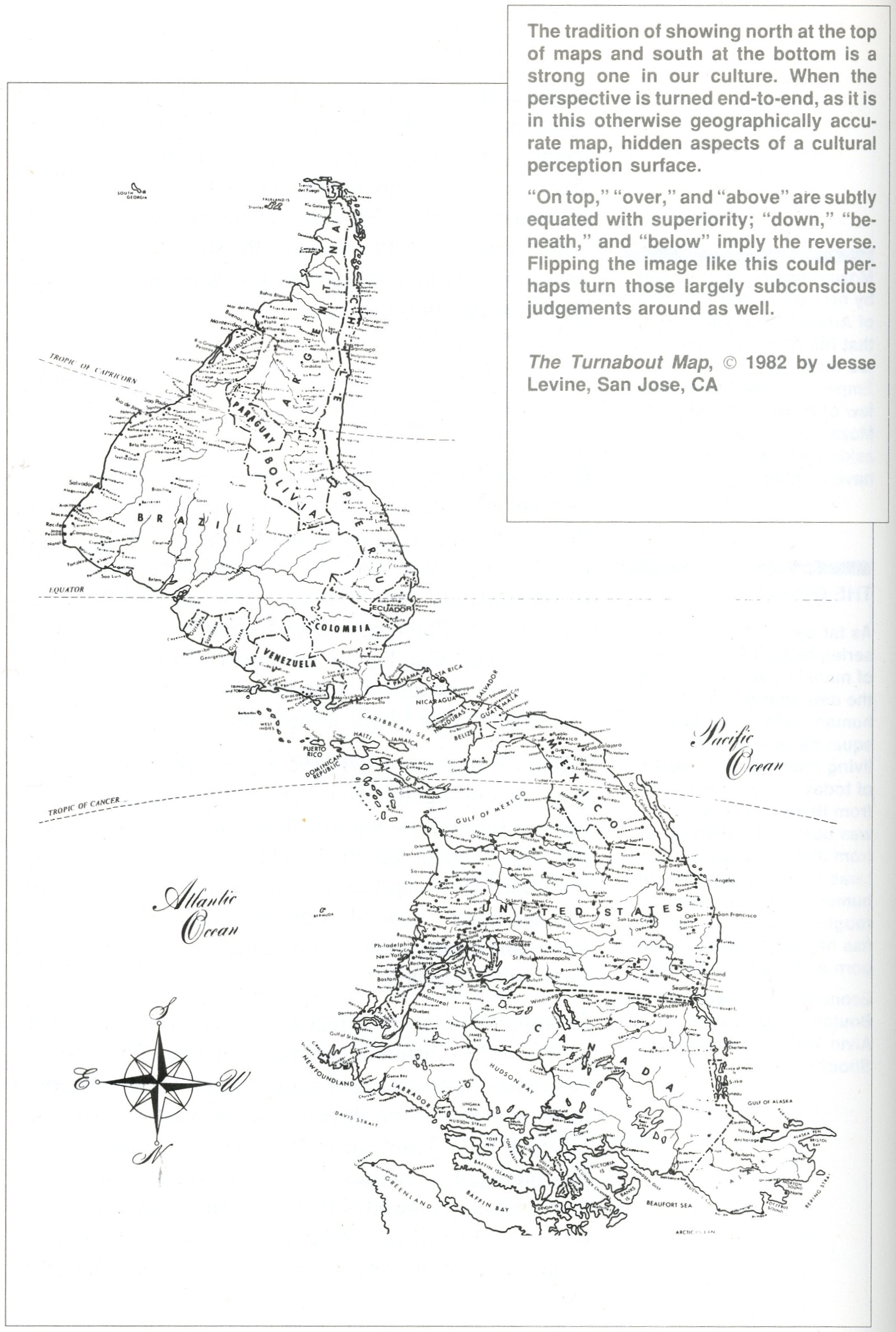
Here is a
familiar image in an unfamiliar orientation.
When
information is first presented, the user should be able to quickly
orient themselves.
When a map
program starts up it should start up with a view that makes it
obvious what the map is showing. Maybe that is using your current
location with your position clearly labelled, or maybe its a view
the country or city that you are accessing the map program from.
The zoom factor should also be appropriate enough - if you are
initially zoomed in too far you may not see enough landmarks to
judge the scale of the map. If you start out looking at the entire
planet that may not be helpful to you either.
One of the most cited data
visualization mantras which is a pretty good starting point for
most visualizations: Schneiderman: "Overview first, zoom and
filter, details on demand"
But as datasets get bigger
and bigger with more and more dimensions and it becomes harder
to even know what an overview would be, other mantras are
starting to appear such as Van Ham and Perer: "Search, show
context, expand on demand".
Principles of graphical excellence from Tufte (a slightly longer
list now that you've seen some examples):
well-designed presentation of
interesting data - a matter of substance, statistics and design
complex ideas communicated with
clarity, precision, and efficiency
gives to the viewer the greatest
number of ideas on the shortest time with the least ink in the
smallest space
requires telling the truth about
the data
the representation of numbers,
as physically measured on the surface of the graphic itself,
should be directly proportional to the numerical quantities
represented
lie factor = size of effect shown in graphic vs size of effect
in data
clear, detailed, and thorough
labeling should be used to defeat graphical distortion and
ambiguity. Write out explanations of the data on the graphic
itself. Label important events in the data
show data variation not design
variation
the number of information
carrying dimensions depicted should not exceed the number of
dimensions in the data
graphics should not quote
data out of context
Here are some
examples for class discussion:
and now, for
the weather, which is a common analysis task that we all
undertake. We look at temperature data, precipitation data and
make decisions on how to dress and/or how to get to/from work. We
need to know what the weather is before we go out in the morning,
depending on our job what the weather will be during the day, and
what the weather will be like when we try to get home.
For everyday
activities we usually aren't looking for really specific
information (is it going to be 84 degrees F or 83 degrees F, is it
going to rain 0.2 inches or 0.3 inches) but rather ranges of
temperature (cold, mild, hot, really hot) or rainfall
(cloudy, light rain, thunderstorms, tornado, hurricane.) There is
also the general unpredictability of the weather, so we are used
to predictions having some variability.
Normally we
just care about the weather where we live and work, and our apps
focus on that. If we are traveling we will need to look wider, or
if we are interested in the weather where friends/family are
living, or where some sporting event is talking place, or where a
newsworthy event is taking place.
We normally
only care about the weather near the surface but if you're
involved in the airline industry, especially as a pilot, you care
about a much larger volume of weather.
If you job is
to predict the weather or study the climate then you need much
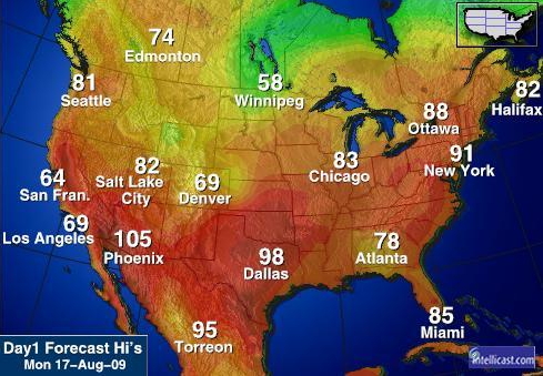
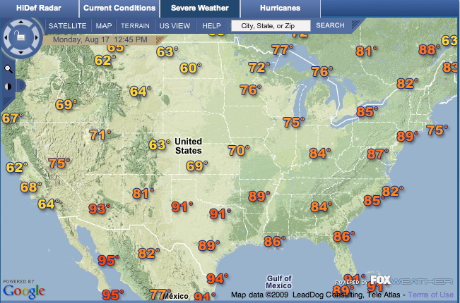
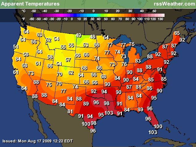
more accurate data over larger areas and longer ranges of time.
How much data
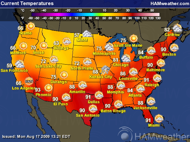
is just enough for your purposes and how easy is it to understand:
what are the
steps you need to go through to figure out what the temperature in
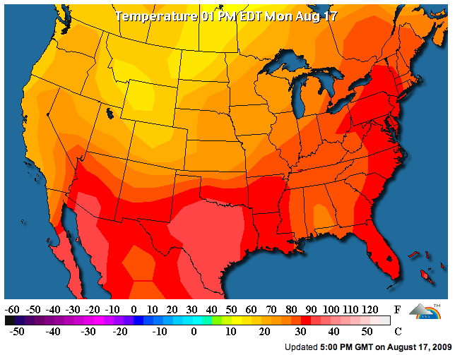
Chicago IL, or Las Vegas, NV?
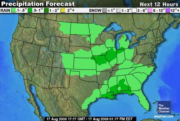
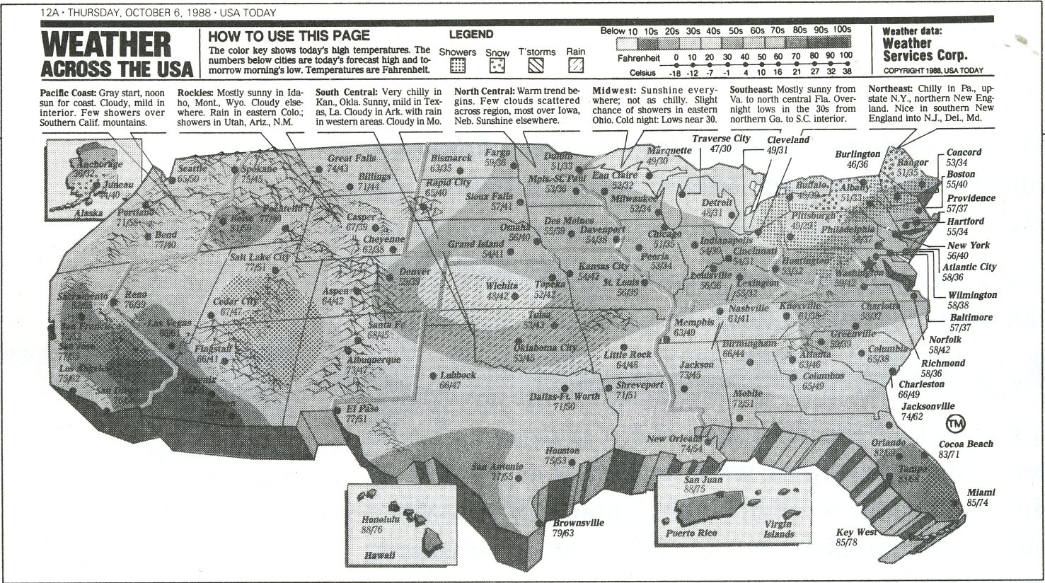
For a slight change here is a precipitation forecast map:
And again, same question, how
would you enhance these visualizations if they were
software-based?
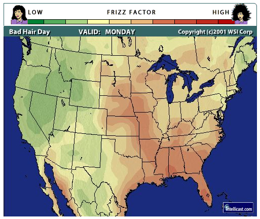
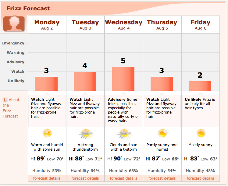
You can also get maps for air
quality, pollen, etc.
Some sites are also converting the raw statistics into
something more personalized like the following 'Frizz Factor'
map from intellicast and the corresponding "Frizz
Forecast" from Accuweather.
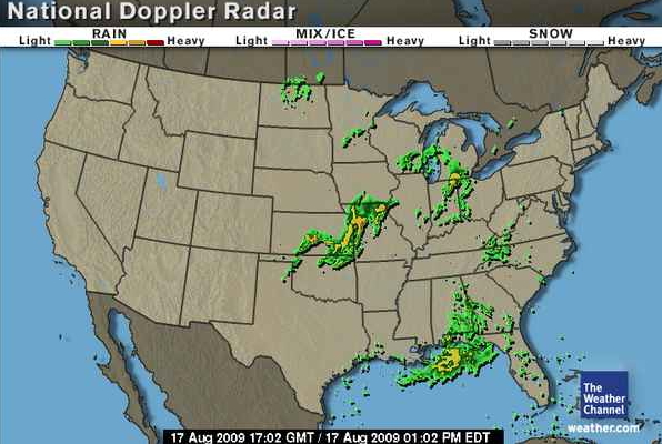
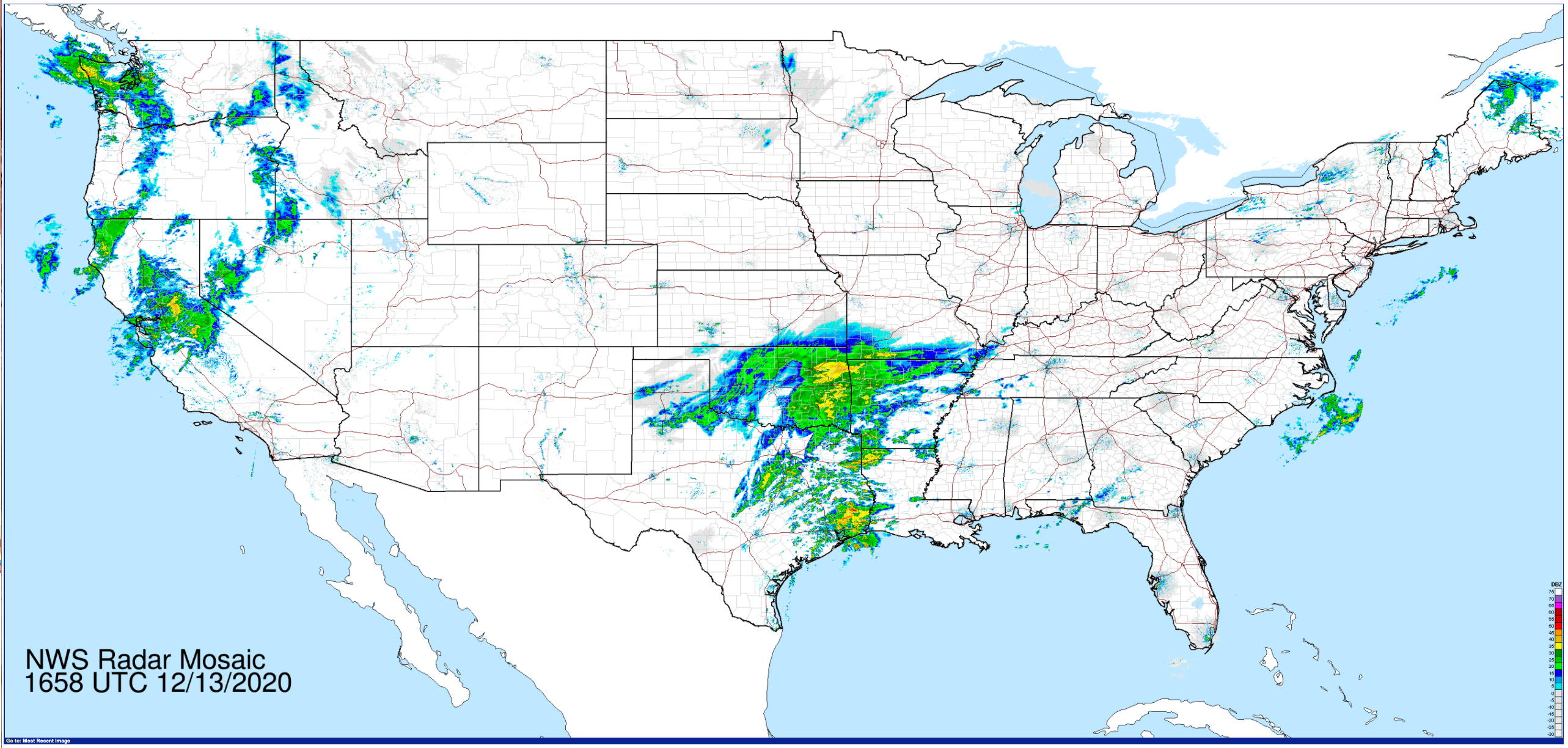
Radar images
are nice for knowing where the storms are right now - moving
(animated) radar images are better for knowing where they have
been and predicting where they are heading and when they will get
there.
Here is an
image from Information Anxiety, P286. Here the problem is over
designing the graphic. Trying to make the graphic 'exciting' makes
it harder to get information from it.
Today its easy to make things look '3D' with software.
We need to be careful what view we choose, even of a familiar
object.
The projects in the class are going to be
written using R and
Shiny, so you should start taking a look at:
Please
check the Homework tab under assignments in the top menu bar
each week as there will generally be 'in class' assignments
and after class assignments each week, including this one.