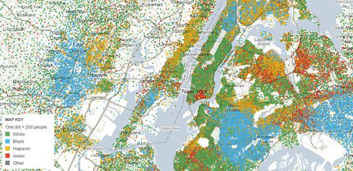
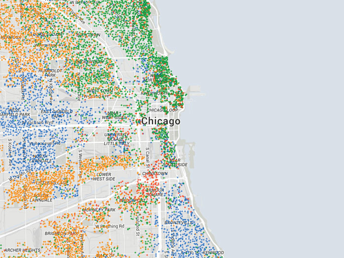
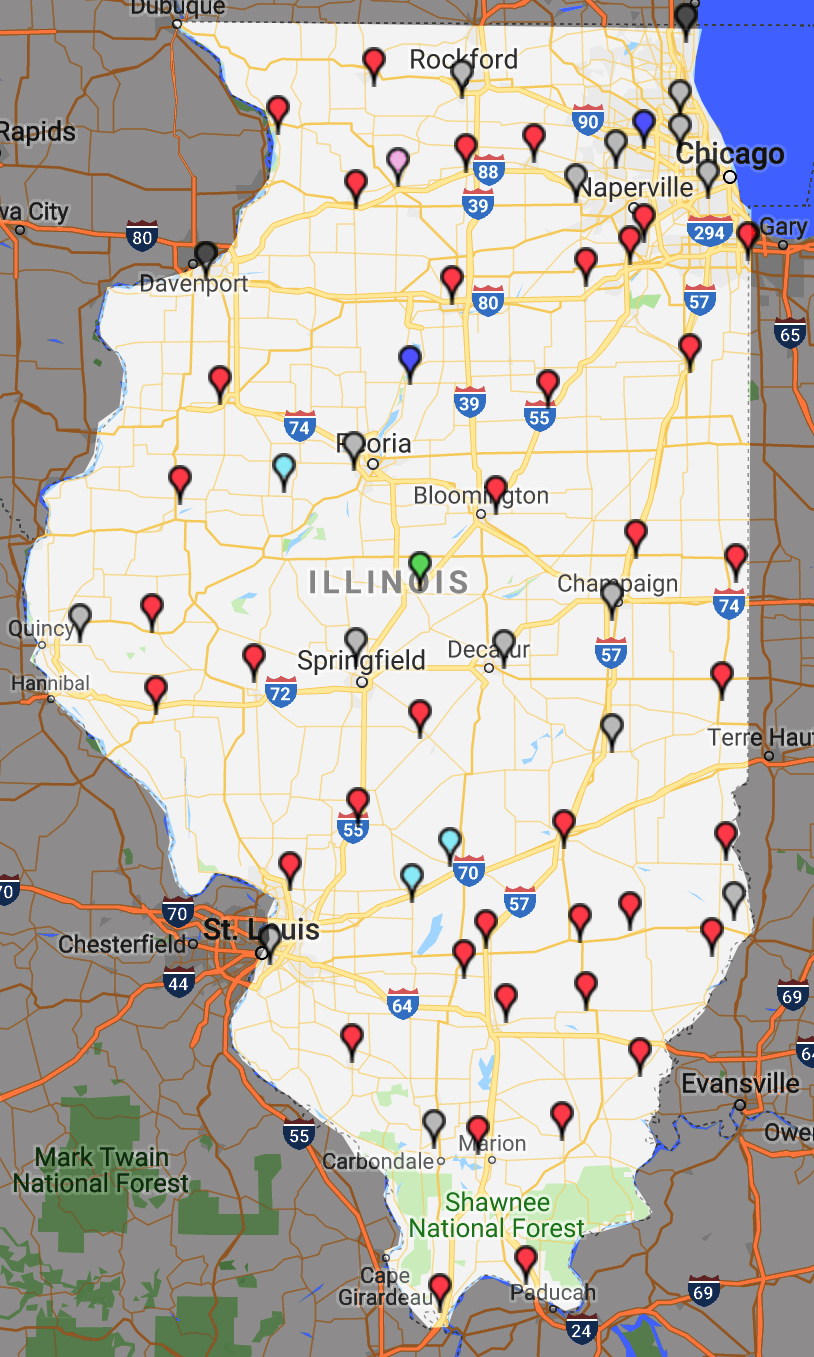
What can we say about the
people in an area - you can enter a zip code to explore an area
using their tool.
https://www.esri.com/en-us/arcgis/products/tapestry-segmentation/zip-lookup
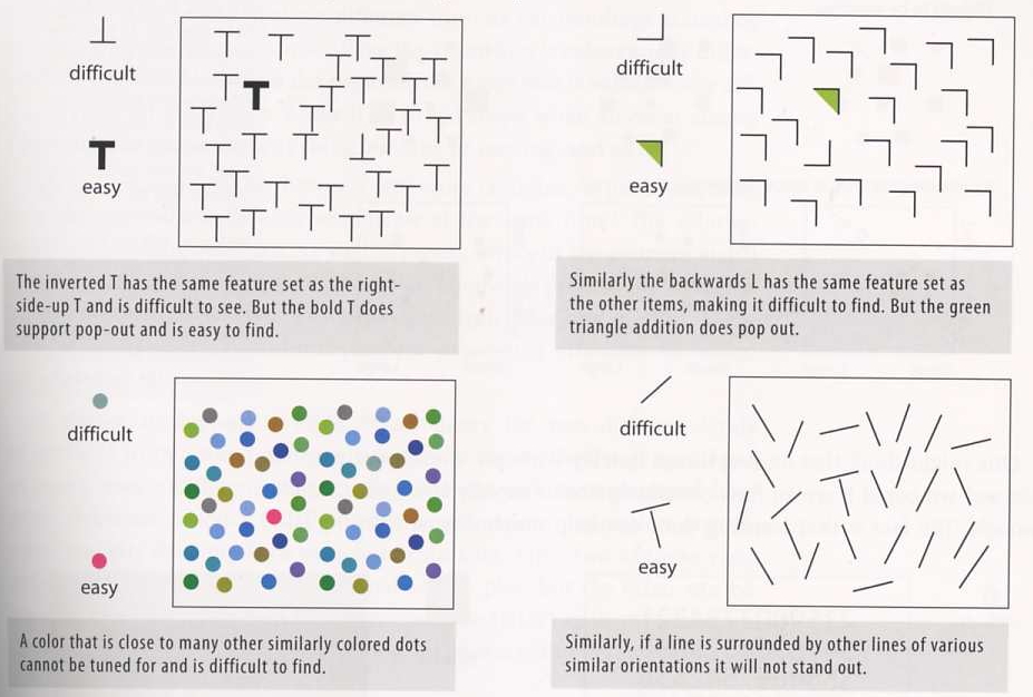
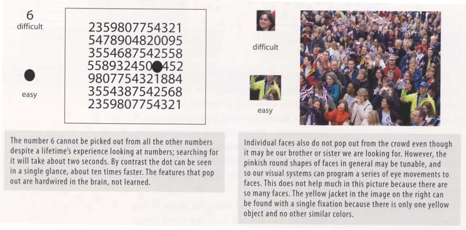
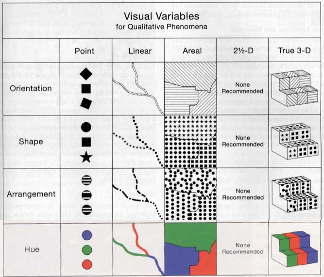
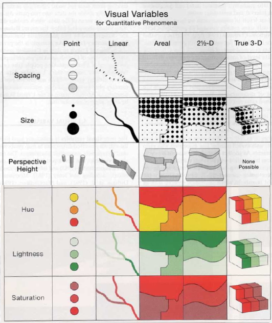
Visual contrasts established by manipulating perceptual qualities
the following are retinal variables - perceived immediately and effortlessly - fundamental units of visual communication
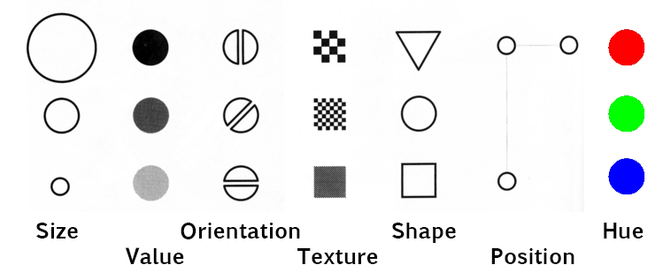
Information represented in a visual display is characterized by
Lets do an example. For each of the two projects below write what you think the length and scale are for each dimension in a word processing file. Print the file and add it to your gradescope submission for the week. Note that for many data visualization tasks the data will constantly be increasing as more is collected, so its important not only to think of the values currently in the dataset, but the values that are likely to be in the dataset as it grows.
The data
from Project 1 in 2020, which can be found at https://www.evl.uic.edu/aej/424/litterati
challenge-65.csv , included the following 11
dimensions. Take a few
minutes and decide on the length and scale of each of these
dimensions.
The data from Project 1 in 2019, available at https://aqs.epa.gov/aqsweb/airdata/annual_aqi_by_county_2019.zip , included the following 19 dimensions. Take a few minutes and decide on the length and scale of each of these dimensions.
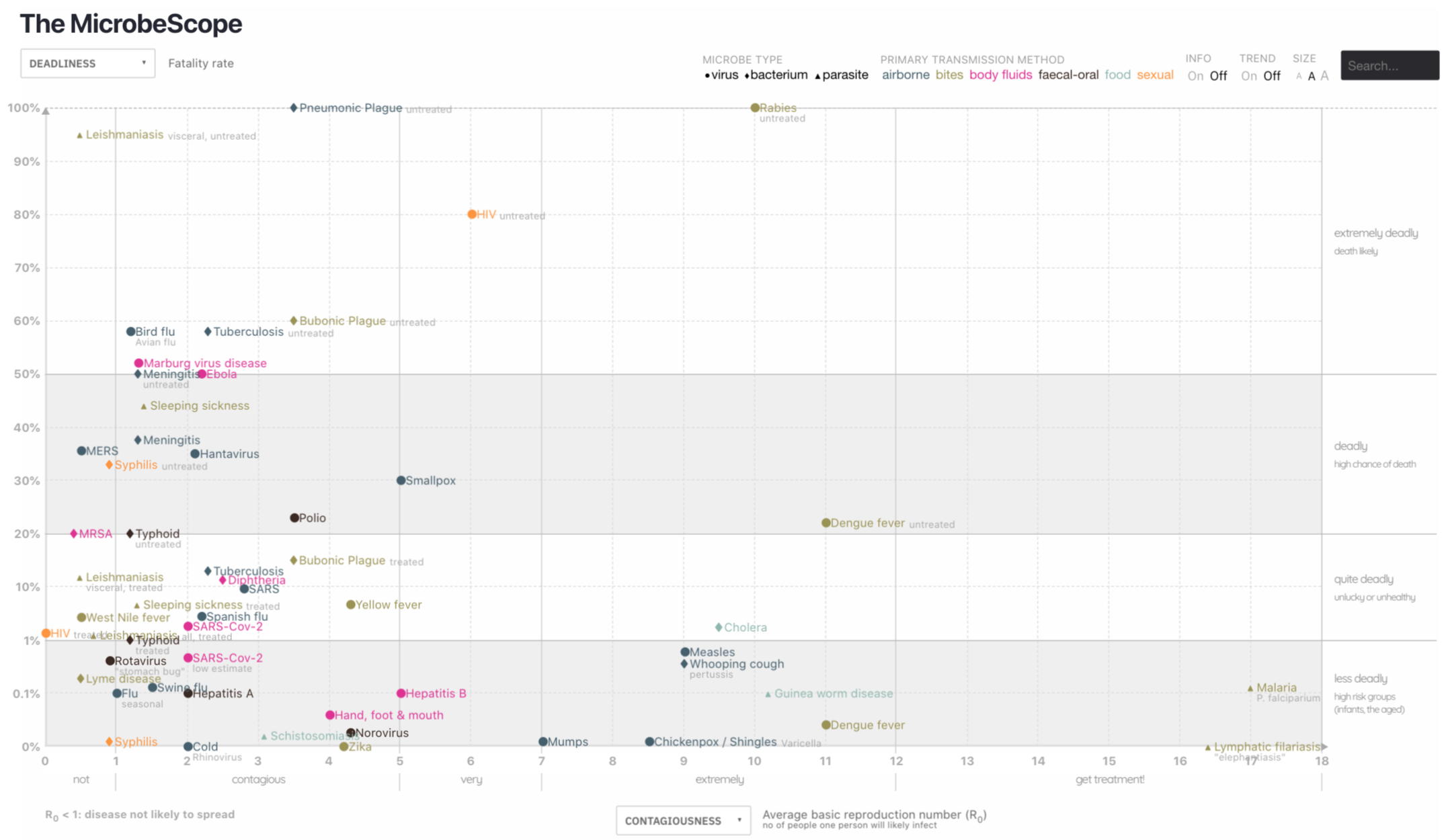
We can look back at the MicrobeScope example. Here all of the
points have the same Size, but there are different Shapes
(circles, diamonds, triangles) and different Hues (dark blue,
light blue, pink, etc.) and they are in different Positions in the
chart.
Here microbe
type (shape) and primary transmission method (hue) are nominal /
categorical.
Deadliness, Contagiousness, and the other X and Y axis options are
quantitative
Nominal - User interested in categorizing
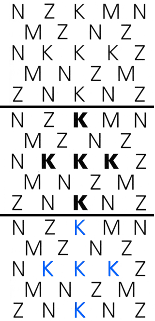
An associative variable does not affect the visibility of other dimensions (e.g. we can recognize hue regardless of orientation.) A variable is dissociative if visibility is significantly reduced for some values along that dimension (e.g. its hard to determine hue of a very thin line or small dot)
Orientation, Texture, Shape, Position, Hue are associative
Size and Value are dissociative - they dominate perception and
disrupt processing of other correlated dimensions
In selective perception
viewer attempts to isolate all instances of a given category and
perceptually group them into a single image. The task is to
ignore everything but the target value on the dimension of
interest - to see at a glance where all the targets are within
the display
All the variables except shape are selective
- it can be vary hard to pick out different shapes, as we saw
with the yes / no table.
In ordered perception
the viewer must determine the relative ordering of values along a
perceptual dimension. Given any two visual elements, a natural
ordering must be clearly apparent so the element representing
'more' of the corresponding quality is immediately obvious
In quantitative perception the viewer must determine the amount of difference between two ordered values. The user does not need to refer to an index or key - the relative magnitudes must be immediately apparent
Visual variables differ substantially in length:
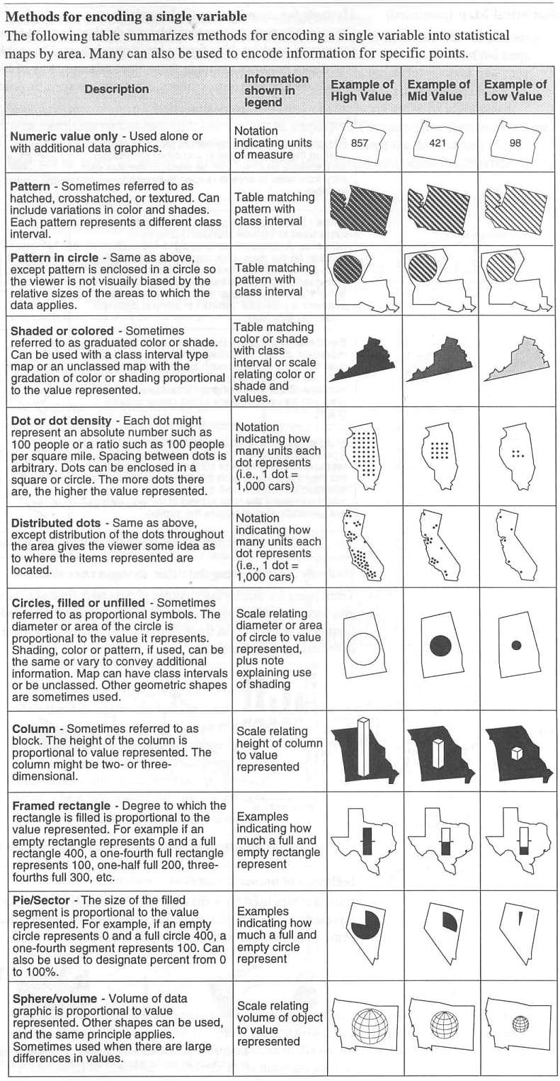
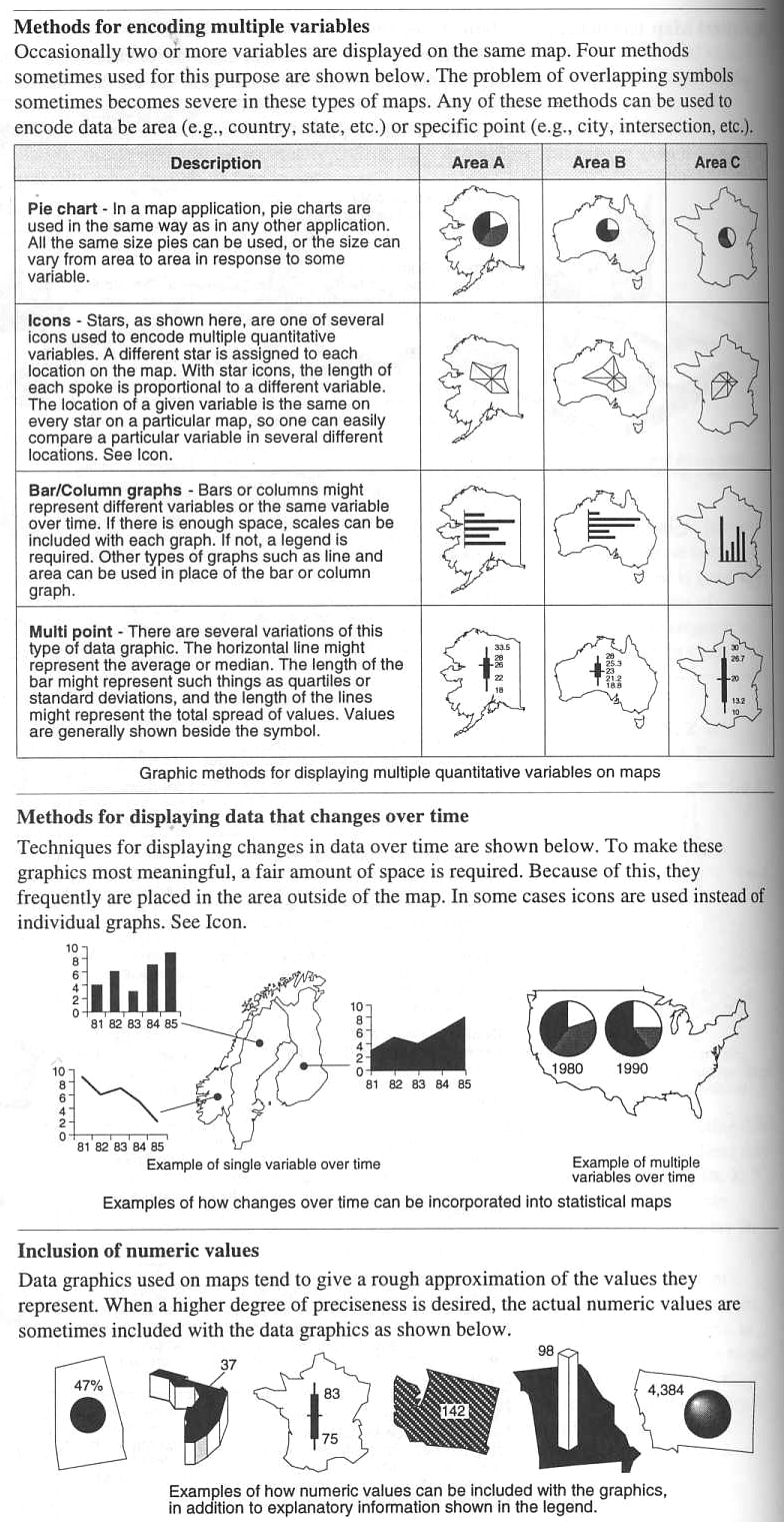
The Principles of Symbolization chapter from Thematic Cartography and Geovisualization, 3rd ed. by Slocum, McMaster, Kessler, and Howard gives a nice introduction on mapping data to symbols so we will use several examples from it below.
Type of visualization used depends both on the nature of the underlying phenomenon and the purpose of the map
We often deal with continuous
data represented by discrete sampling
A familiar example is a weather map showing the current
temperature across the state or country, but the data is only
sampled at certain scattered stations which is then
interpolated. You can click on the map to gain access to the
data files and to see how the data is interpolated across the
state. Here are the FAA sites in Illinois https://www.faa.gov/air_traffic/weather/asos/?state=IL
 |
 |
Interpolation is then used to predict the values in between, with a variety of possible methods.
shepards method is one way to
perform that interpolation - https://en.wikipedia.org/wiki/Inverse_distance_weighting
Air quality data usually
changes slowly but if you live in Hawaii near a volcano or live
in an area prone to forest fires, the values may change much
faster and may regularly impact your life, so dashboards that
show the value now and predict it into the future, like we
typically predict rain on maps, can be very useful.
This map is nice as you can
see the values for the individual stations and the contours
generated from that data, which also helps to see how the
contours are generated from the individual data locations.
https://gispub.epa.gov/airnow/
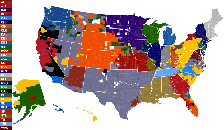
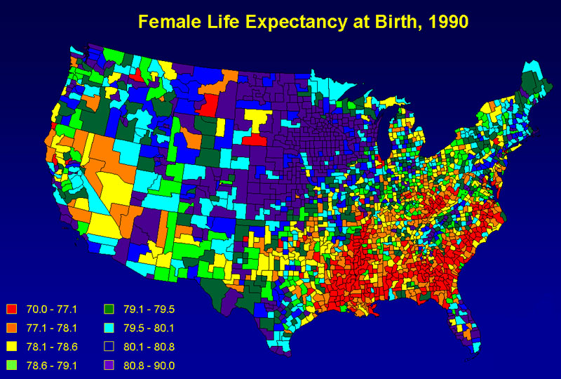
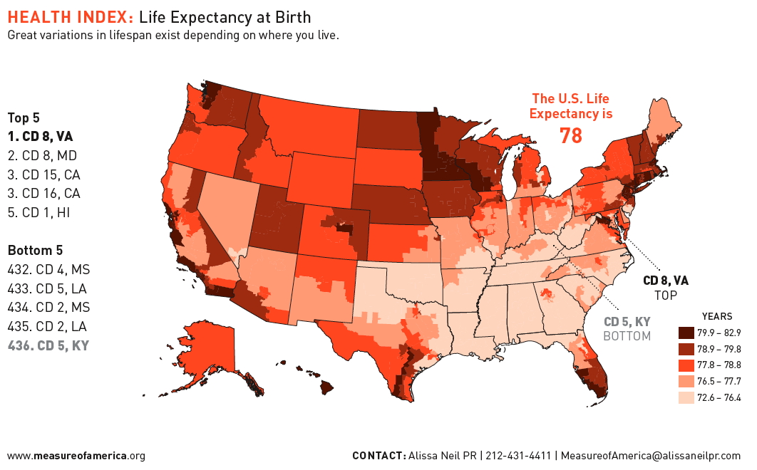
here is an example of different ways of using colour to map life expectancy in the US which is quantitative. Which is more readable? the first from mapoftheunitedstates.org or the second from www.measureofamerica.org
 |
 |
So, lets try an in class activity to make this more clear, and for that we will take a look at mapping the data for the winning countries of the Eurovision Song Contest from 1956 to the present - https://en.wikipedia.org/wiki/Eurovision_Song_Contest
Here are the totals:
| Wins | Countries |
| 7 | Ireland |
| 6 | Sweden |
| 5 | France, Luxembourg,
United Kingdom, Netherlands |
| 4 | Israel |
| 3 | Norway, Denmark, Italy |
| 2 | Spain, Switzerland, Germany, Austria, Ukraine |
| 1 | Monaco, Belgium, Yugoslavia, Estonia, Latvia, Turkey, Greece, Finland, Serbia, Russia, Azerbaijan, Portugal |
and there is a current map
of Europe available here:
You can use a computer/tablet to create a
visualization with the map, or print out the map and use
colored pencils, or some other visualization primitives and
then take a photo of the map, convert it to pdf and add it to
your gradescope submission for the week.
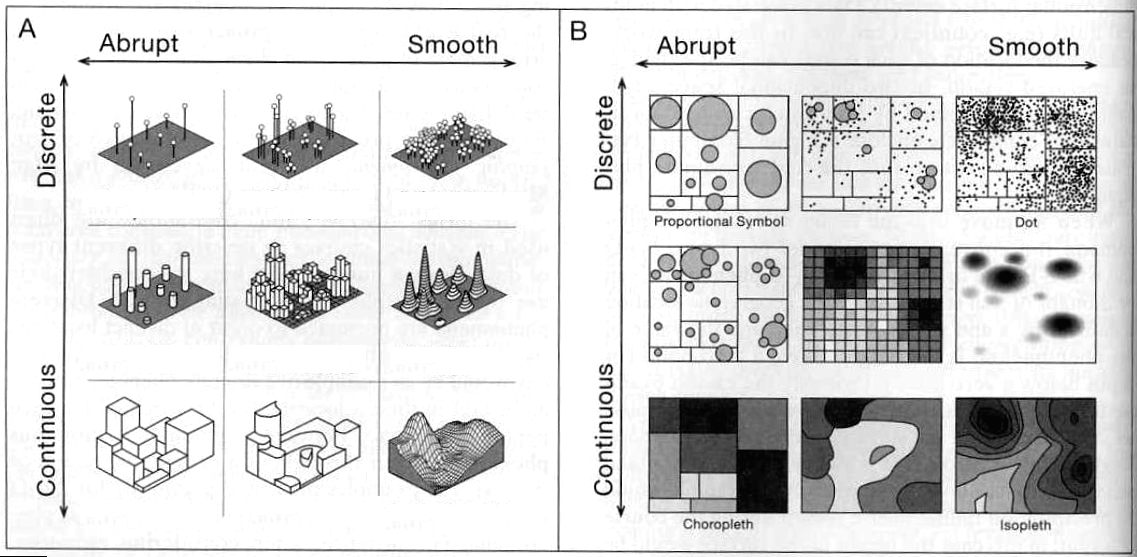
Comparison of choropleth, proportional symbol, isopleth, and dot mapping:
choropleth
isopleth (contour map)
proportional symbol
dot mapping
|
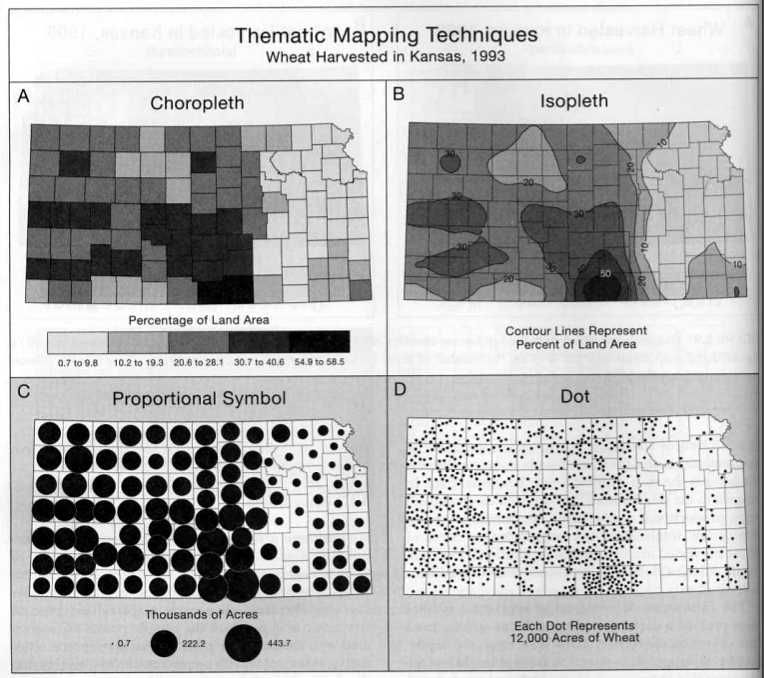 Figure 5.10 from Thematic Cartography |
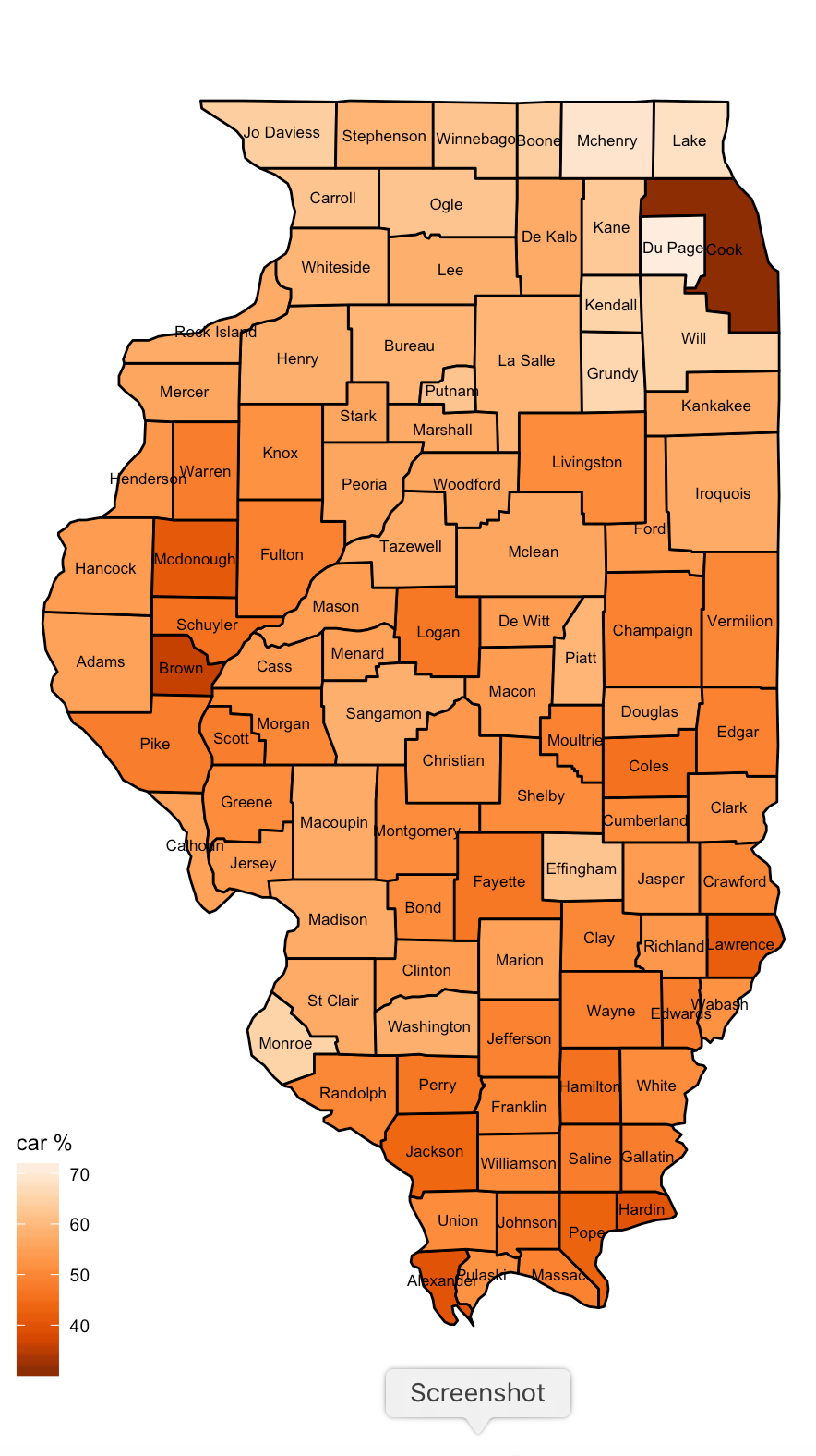
R has variety of nice libraries and available data to help with this kind of thing. The following code reads in data on counties in the US as well as a file of data to map onto those counties (in this case number of electric vehicles, population, and number of passenger cars registered in each Illinois county). Since the county names match in both files its pretty simple to join them together and then display the results as a couple different choropleth maps.
Create a new Jupyter notebook for this
activity and when you are done print out that notebook and add
it to your gradescope submission for the week.
conda install -c conda-forge r-ggmap
conda install -c conda-forge r-mapdata
conda install -c conda-forge r-ggthemes
conda install -c conda-forge r-sp
usually these commands have worked for me, but I
have found that if I have loaded in some other odd packages into
anaconda that conda hits some incompatibilities and has a hard
time dealing with them. In those cases I have found it simpler to
start over with a new R environment (the notes from week 2) and
then install the packages above.
#
# example of mapping data onto Illinois counties
# based on example from
https://people.ohio.edu/ruhil/Rbook/maps-in-r.html
library(ggplot2)
library(ggmap)
library(maps)
library(mapdata)
library(ggthemes)
library(sp)
library(stringr)
library(plyr)
usa <- map_data("county")
il <- subset(usa, region == "illinois")
il$county = str_to_title(il$subregion)
#basic map with county boundaries and county names at the
centroid of the county
getLabelPoint <- # Returns a county-named list of label
points
function(county) {Polygon(county[c('long',
'lat')])@labpt}
centroids = by(il, il$county,
getLabelPoint) # Returns list
centroids2 <- do.call("rbind.data.frame", centroids) #
Convert to Data Frame
centroids2$county = rownames(centroids)
names(centroids2) <- c('clong', 'clat', "county")
#simple map with county borders and county names
ggplot() + geom_polygon(data = il, aes(x = long, y = lat, group
= group), fill = "white", color = "gray") +
coord_fixed(1.2) + geom_text(data = centroids2, aes(x =
clong, y = clat, label = county), color = "darkblue", size =
2.25) + theme_map()
# read in data on the number of electric vehicles registered in
each county
evs <-
read.table(file="http://www.evl.uic.edu/aej/424/EVs_in_IL_2021.csv",
sep=",", header=TRUE)
# under
windows the first column header gets corrupted - this fixes it
names(evs)[1] <- 'county'
# as
usual here you should take a look at the data and see if the
numbers make sense
#combine the county data and the EV data - they have the
'county' attribute in common
# join keeps the original ordering where merge does not
ilCountyPlusEV <- join(il, evs)
#plot the population per county
ggplot() + geom_polygon(data = ilCountyPlusEV, aes(x = long, y =
lat, group = group, fill = population), color = "black") +
coord_fixed(1.2) +
geom_text(data = centroids2, aes(x = clong, y
= clat, label = county), color = "black", size = 2.25) +
scale_fill_distiller(palette = "Oranges",
direction=1) +
labs(fill = "population") + theme_map()
#plot the percentage of cars to people in each county
ggplot() + geom_polygon(data = ilCountyPlusEV, aes(x = long, y =
lat, group = group, fill = percent_cars), color = "black") +
coord_fixed(1.2) +
geom_text(data = centroids2, aes(x = clong, y
= clat, label = county), color = "black", size = 2.25) +
scale_fill_distiller(palette = "Oranges",
direction=1) +
labs(fill = "car %") + theme_map()
#plot the total number of EVs per county
ggplot() + geom_polygon(data = ilCountyPlusEV, aes(x = long, y =
lat, group = group, fill = evs), color = "black") +
coord_fixed(1.2) +
geom_text(data = centroids2, aes(x = clong, y
= clat, label = county), color = "black", size = 2.25) +
scale_fill_distiller(palette = "Oranges",
direction=1) +
labs(fill = "# of EVs") + theme_map()
#plot the percentage of cars that are EVs in the county and
reverse the scale
ggplot() + geom_polygon(data = ilCountyPlusEV, aes(x = long, y =
lat, group = group, fill = percent_cars_evs), color = "black") +
coord_fixed(1.2) +
geom_text(data = centroids2, aes(x = clong, y
= clat, label = county), color = "black", size = 2.25) +
scale_fill_distiller(palette = "Oranges", direction=1) +
labs(fill = "EV %") + theme_map()
#There are better (more complicated) ways to use color here
#details at
https://ggplot2.tidyverse.org/reference/scale_brewer.html
#but this should give you a starting point for what you can do
after this, try and show the counties in a different US State or
show another set of countries as in this web page
https://www.datanovia.com/en/blog/how-to-create-a-map-using-ggplot2/
this makes it really easy to map data onto filled county / state
/ country regions, though as we saw above, choropleth maps are not
always the most intuitive representation.
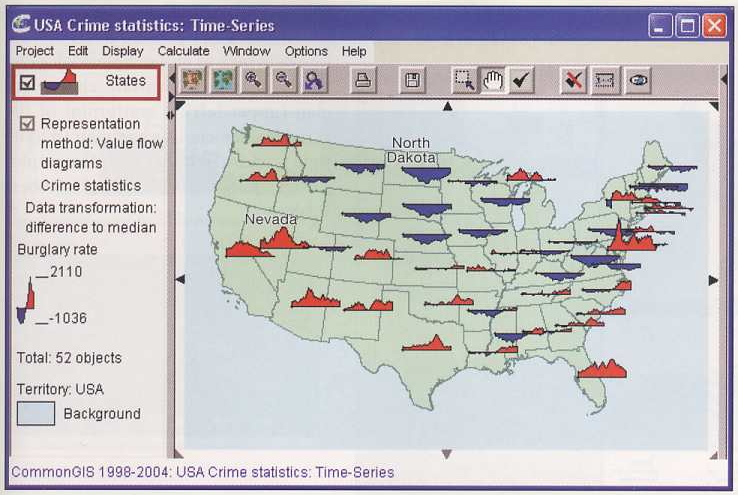
There are also pictographic
symbols
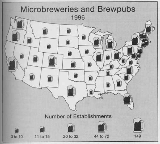
Here is an image showing crime statistics compared to the average over time for the US from CommonGIS via the Thematic Cartography and Geovisualization book showing why this can be tricky ...
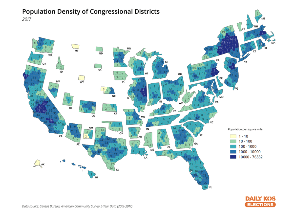
and a 2019 solution to the problem
by making each US congressional district the same size and
trying to keep the states in the correct shape and relative
position to each other, though the locations of the districts
themselves within each state are only correct relative to each
other. In this case geography is distorted to make areas of
roughly equal population more clear.
When looking at much larger
regions of the planet the issues are a bit more complex. A
'flat' map can be a good way to see data from all over the
planet simultaneously, but it does add in distortions as the
earth is sphere-ish, and trying to represent a sphere, or even a
portion of it, on a rectangular plane will generate errors.
Other tools like Google Earth can be used to map data onto a
spherical Earth model, but then there are issues of only being
able to see part of the planet at one time.
Project 1 Presentations