There is more and more data in digital form out there. Much of
it is private, so there aren't many large public datasets to
investigate. Most likely the data that you will be visualizing
and analyzing will be from a specific project with specific
rules on how it can be used.
Privacy We looked into some data that has
privacy issues when we looked at the personal utility data back
in week 2. Visualization is good for spotting patterns and
outliers.
AOL search data release / fiasco regarding privacy concerns
20 million AOL queries ( 10
million unique) from 650,000 users from March 1st to May 31st,
2006 2GB of uncompressed
tab-delimited files
G. Pass, A. Chowdhury, C.
Torgeson, "A Picture of Search" The First International Conference on
Scalable Information Systems, Hong Kong, June, 2006.
The authors do give a
warning about sexually explicit language in the queries, but
not about the credit card numbers and social security numbers:
"CAVEAT EMPTOR -- SEXUALLY EXPLICIT DATA! Please be
aware that these queries are not filtered to remove any
content. Pornography is prevalent on the Web and
unfiltered search engine logs contain queries by users who are
looking for pornographic material. There are queries in
this collection that use SEXUALLY EXPLICIT LANGUAGE.
This collection of data is intended for use by mature adults
who are not easily offended by the use of pornographic search
terms. If you are offended by sexually explicit language
you should not read through this data. Also be aware
that in some states it may be illegal to expose a minor to
this data. Please understand that the data represents REAL
WORLD USERS, unedited and randomly sampled, and that AOL is
not the author of this data."
The data is still available
on the internet. Once something appears on the internet there
is going to be a copy of it stored somewhere. However there
are serious ethical issues about using it, and disagreements
about under what circumstances its use could be ethical.
We are going to conduct a similar search using the data on
user 4417749 in class. You should create a new
Jupyter Notebook, and use the cells in Markdown mode to
document your search using typical internet tools (maps,
search engines, phone number lookups). Note you can (and
should) be able to drag and drop images into the notebook
cells as well as text. You should spend about 30-45 minutes
on this.
Here is a simplified pdf version of
the user 4417749 searches with just the topics in alphabetical
order, without the date and time and link information.
You can find the answer with a simple google search. That's
not the point. The point is to use the data provided and
typical consumer internet based search tools to see what you
can find, and how easy it can be to find people. Print out a
copy of your notebook as a pdf and add it to your gradescope
submission for the week.
"Privacy" refers to our right to control access to
ourselves and to our personal information. It means that we
have the right to control the degree, the timing, and the
conditions for sharing our bodies, thoughts, and experiences
with others.
"Confidentiality" refers to agreements made about how
information that has been provided will be protected. These
agreements may include descriptions about whether identifiers
will be retained, who will have access to identifiable data,
and what methods will be used to safeguard data, such as
encrypted storage or locked files.
There is currently no consensus in the research community
about whether online communications in open forums constitute
private or public behavior. E-mail is not private
Another major issue is that its at best difficult if not
impossible to verify the age of someone on the internet. In
many cases data can not be collected from or about minors
without their parent's consent and asking/forcing people to
click on a "I am 18 or older" button is not enough of a
guarantee.
in 2009 Netflix released data to see if other groups could
improve their recommendation system with a $1,000,000 prize if
a group could get a 10% improvement. I used the data for one
of the class projects that year. The data included movie or TV
show title, ID of person who rented it, what rating they gave
it, and when they rented it for a subset of the overall
Netflix database.
Here is a paper
looking at how much knowledge is needed to identify someone
from the Netflix contest data. (100,000,000 ratings from
500,000 users) Section 5 goes into the Netflix example in
detail. https://arxiv.org/PS_cache/cs/pdf/0610/0610105v2.pdf
"An adversary may have auxiliary information about some
subscriber's movie preferences: the titles of a few of the
movies that this subscriber watched, whether she liked them or
not, maybe even approximate dates when she watched them.
Anonymity of the Netflix dataset thus depends on the answer to
the following question: How much does the adversary need to
know about a Netflix subscriber in order to identify her
record in the dataset, and thus learn her complete movie
viewing history?"
"Very little auxiliary information is needed for de-anonymize
an average subscriber record from the Netflix Prize dataset.
With 8 movie ratings (of which 2 may be completely wrong) and
dates that may have a 14-day error, 99% of records be uniquely
identified in the dataset. For 68%, two ratings and dates
(with a 3-day error) are sufficient."
Netflix was going to do a second contest.
According to the New York Times:
"The new contest is going to present the contestants with
demographic and behavioral data, and they will be asked to
model individuals 'taste profiles', the company said. The
data set of more than 100 million entries will include
information about renters' ages, gender, ZIP codes, genre
ratings and previously chosen movies. Unlike the first
challenge, the contest will have no specific accuracy
target. Instead, $500,000 will be awarded to the team in the
lead after six months, and $500,000 to the leader after 18
months."
But then decided to cancel the contest.
Malte Spitz from the German
Green party decided to publish his own data collected from
August 2009 to February 2010. However, to even access the
information, he had to file a suit against Deutsche Telekom.
and there is a TED talk - https://www.youtube.com/watch?v=Gv7Y0W0xmYQ
This is a major concern with medical data. Even
removing a patient's name and social security number, the very
data stored about a patient may be enough to identify him or
her if a patient has a rare condition, or even a less rare
condition in a sparsely populated area.
This means that 'raw' data may be unavailable, or that the raw
data may need to be anonymized - e.g. instead of knowing what
town a person lives in, maybe a zip code, or a county, or a
state is given. Maybe instead of a particular age (e.g. 42) an
age range is given (40-45)
General ways to safeguard data:
Collect data without
identifiers.
Remove all direct
identifiers as soon as possible.
Substitute codes for
identifiers.
Maintain code lists
and data files in separate secure locations.
Use accepted methods
to protect against indirect identification, such as
aggregate reporting or misleading identifiers.
Use and protect
computer passwords.
Access and store data
on computers without Internet connections.
To de-identify medical data
the following 18 identifiers must be removed:
names
all geographic subdivisions smaller than a state
all elements of data (except year) for all dates directly
related to the individual. For individuals > 89 years old
the year must also be removed
telephone number
fax number
e-mail address
social security number
medical record number
health plan beneficiary numbers
account numbers
certification / license number
vehicle identifiers and serial numbers (eg license plate
numbers)
device identifiers and serial numbers (ie for anything
placed in the body)
URLs
IP addresses
biometric identifiers (finger print, voice print)
full face photographic images or comparable images
any other unique identifying number characteristic or code
Uncertainty
There are many different ways to try and formalize uncertainty
from different fields.
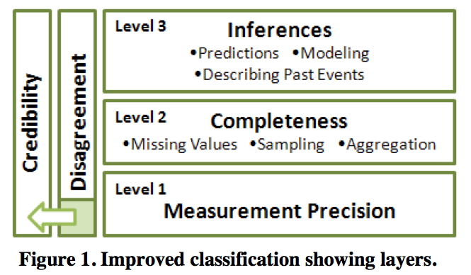
level
1: Measurement Precision
- imprecise measurements -
might have explicit range of imprecision
level
2 Completeness
- sampling strategy often used
since its impossible to collect / simulate / compute /
visualize 'all the data'
- missing values
- aggregation / summarization
- detailed data is replaced by higher level concepts
known knowns - information you
know
known unknowns - information
you know exists but you don't have
unknown unknowns - information you don't even
know that you are missing - scary ones
level
3: Inferences - adding meaning to the data and
using it to make decisions
- modelling
- prediction
- extrapolation
disagreement
- measurement - multiple measurements of
the same value do not agree
- completeness - overlapping but not
identical datasets
- inference - multiple models generate
different results from the same input data or
multiple people come
to different conclusions from the same data
credibility
- measuring instrument or
source of data may lack credibility based on past performance
- different investigators may
rate different sources more or less credible
- different investigators may
rate other investigators as more or less credible
FlowingData has a nice overview
here on different ways to show uncertainty here
Next are some real world examples
of uncertainty visualization.
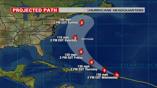
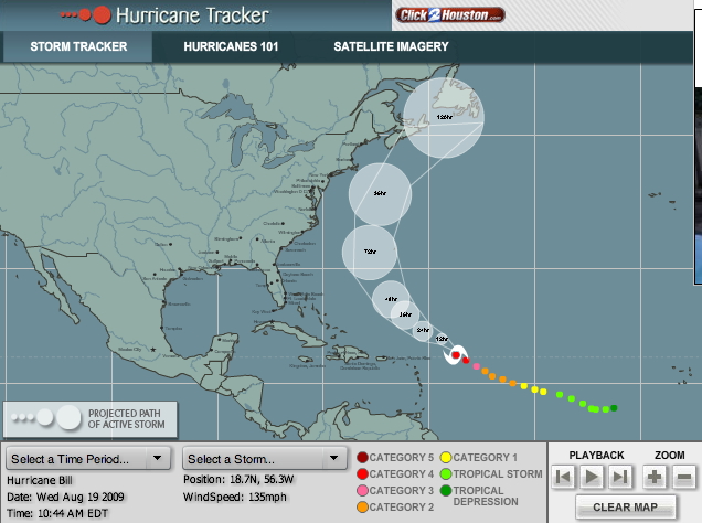
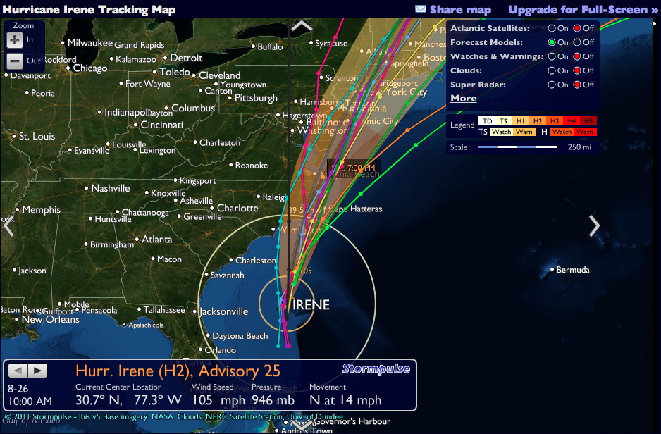
Here are several visualizations
of the possible path of a hurricane
The previous path is known
with a high degree of certainty and based on that path and
many other variables the potential future paths are shown.
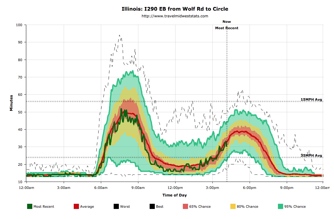
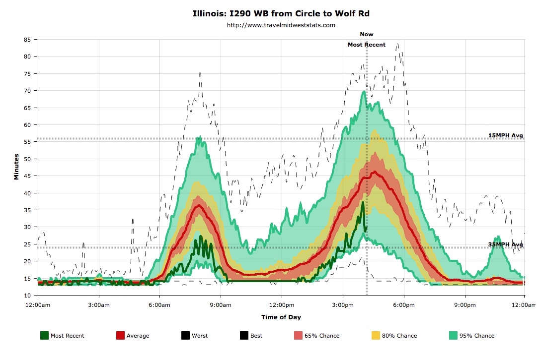
Here is a visualization of travel times from the
Jane Byrne Interchange in and out I-290 to Harlem for Fridays
over the past 5 years, and this particular Friday, which did
follow the pattern eastbound, but not westbound. The average
travel time and the 68 percent region show me the typical
pattern, and the line for today shows me how well its
currently been matching that pattern.
Here a large amount of
collected data is used to show the most likely traffic times for
a given day. That allows the user to make some predictions.
Having the known values for earlier in the current day tell the
user how the current day is comparing to the typical day and
should allow the user to make better predictions.
We can go
back to the visual variables from the Thematic Cartography and
Geovisualization book that we talked about in week 3 of the
course.
size - The
width of a line could be used to show uncertainty in a path, the
size of a dot could be used to show uncertainty in a position.
There is a danger here that the user might interpret the thicker
line or the bigger dot as indicating 'more' rather than
uncertainty so it may be a good idea to combine this with
saturation, lightness, or transparency so the point or line is
thicker, but also less saturated or lighter or more transparent.
saturation
- Saturation of a colour can be used to show uncertainty
in a point, path, or area. A fully saturated hue could show
certainty while a less saturated hue shows uncertainty, but the
use of more than three levels of saturation is discouraged.
Lightness could be used for similar purposes but like size one
must be careful the user doesn't mistake darker for more.
transparency
- as with saturation, a shape or hue could be more opaque to
show certainty and more transparent to show uncertainty
crispness -
for boundaries a crisp edge suggests a known / reliable boundary
where a fuzzy edge suggests uncertainty. Similarly a high
resolution edge suggests reliability where a low resolution edge
suggests uncertainty.
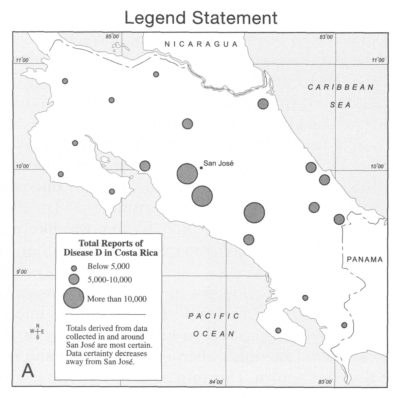
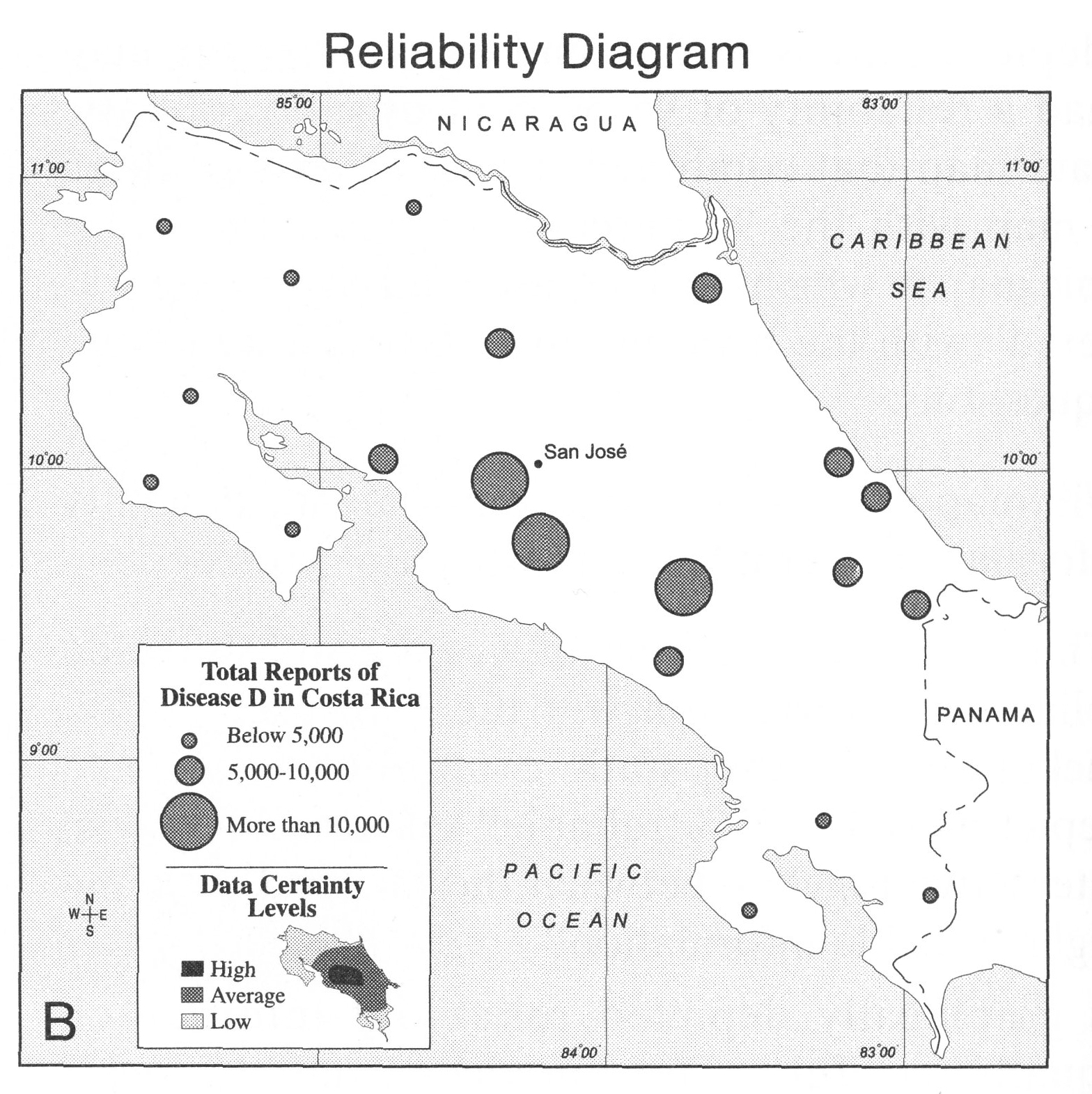
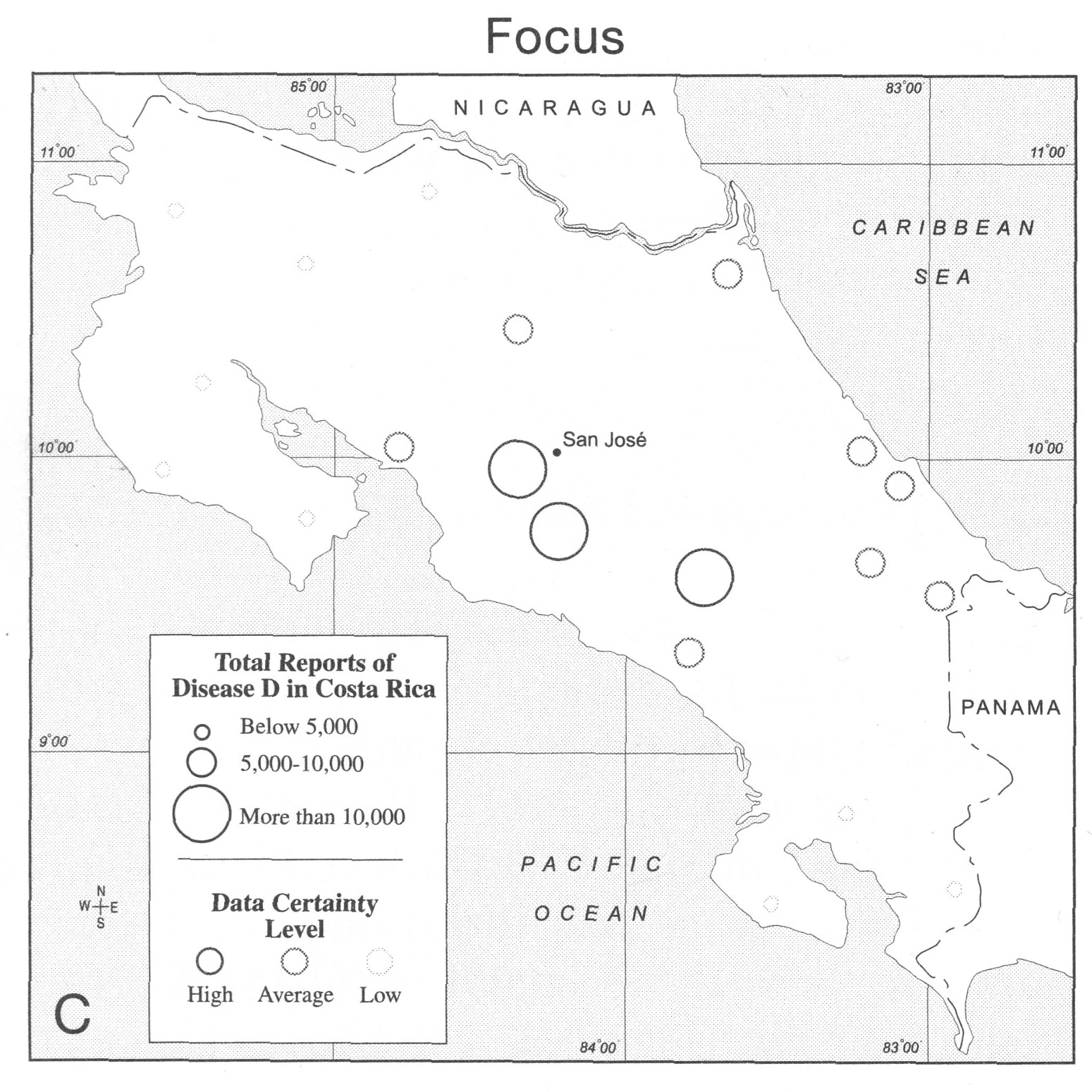
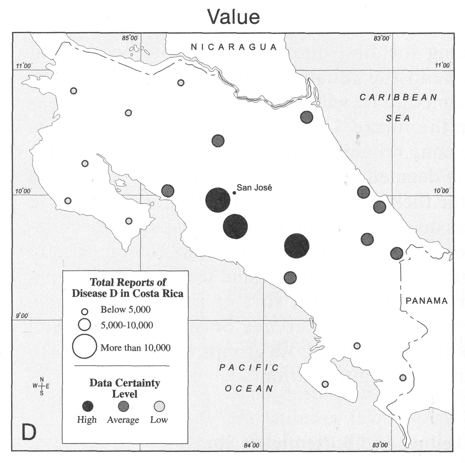
another example comes from chapter 23 of the Thematic
Cartography and Geovisualization book that we frequently turn
to. In this case the visualizations are from a 2001 study
Which of
these do you think is more effective? and why? write the
positives and negatives for each of the four visualizations
and submit this as part of your PDF for the week into
gradescope.
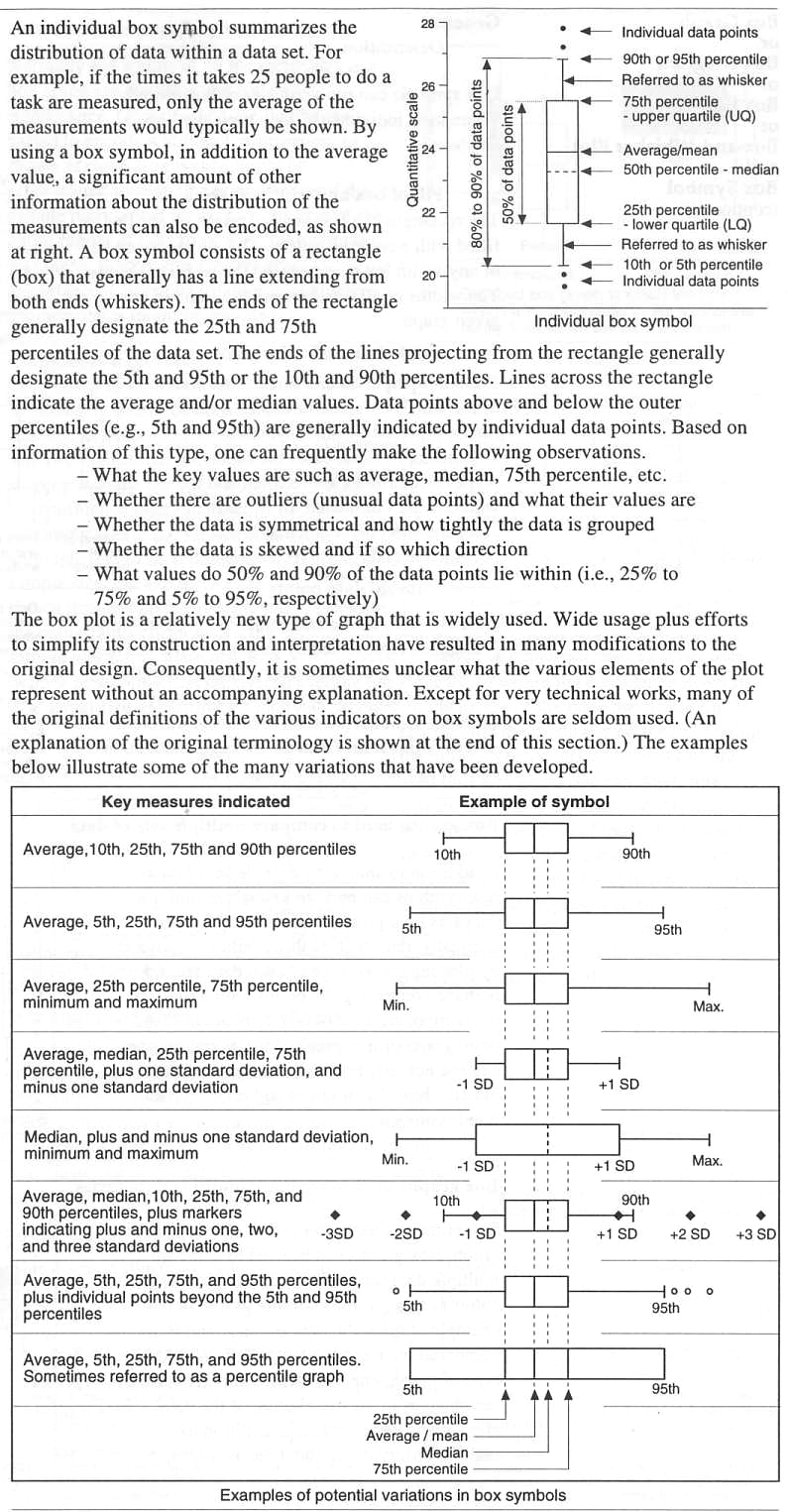
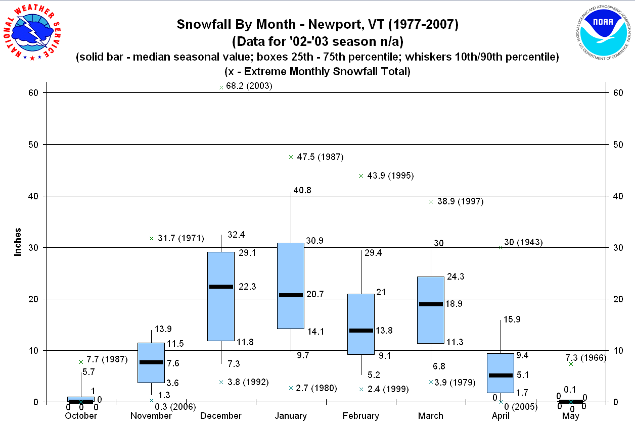
here is
another nice reference page from Information Graphics - A
Comprehensive Illustrative Reference that deals with numeric
data and the common box and whisker (box plot, 5 number summary)
format.