(as an aside, for more info
about Bob and friends, see: http://www.imdb.com/title/tt0064100/ ) 5
phases in how these images have been generated
1930s - images drawn by hand
1950s - computers used to
algorithmically compute where the points and lines should be
1970s - computers drawing
images on plotters
1980s - personal computers
displaying images on (low resolution) monitors in colour
1990s - interaction,
spring systems (force
directed placement),
common platforms (e.g. java) on WWW
Jacob Moreno 1930s
"We have first to visualize . . . A process of
charting has been devised by the sociometrists, the sociogram,
which is more than merely a method of presentation. It is first
of all a method of exploration. It makes possible the
exploration of sociometric facts. The proper placement of every
individual and of all interrelations of individuals can be shown
on a sociogram. It is at present the only available scheme which
makes structural analysis of a community possible."
"The fewer the number
of lines crossing, the better the sociogram."
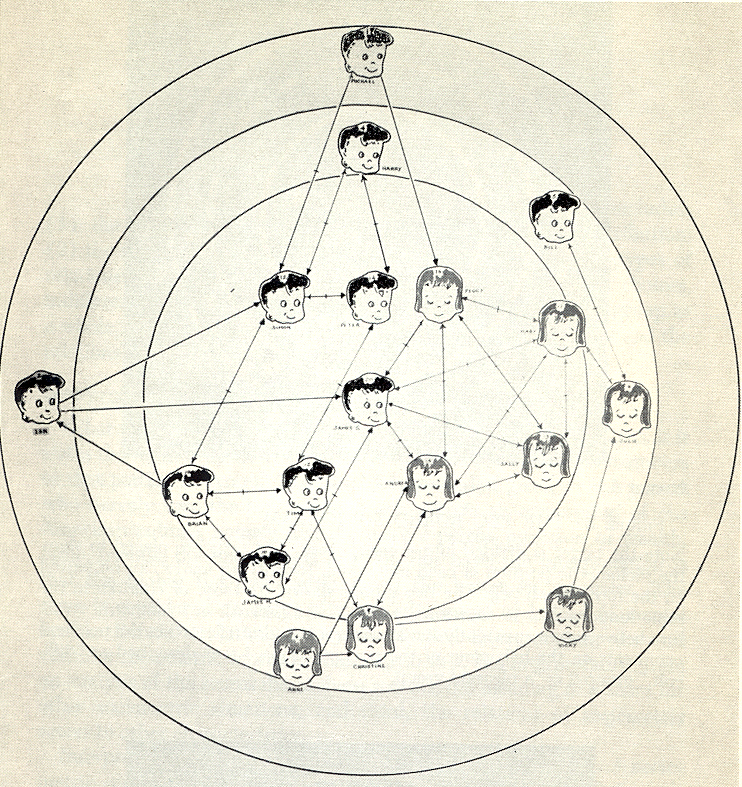
The most famous of his graphs
is the friendship networks among elementary school students
Boys are represented as Triangles, girls as circles.
The arrows show whether person A considers person B to be a
friend (there is a line from A to B.) If both people consider
the other to be a friend then there is a dash in the middle of
the line.
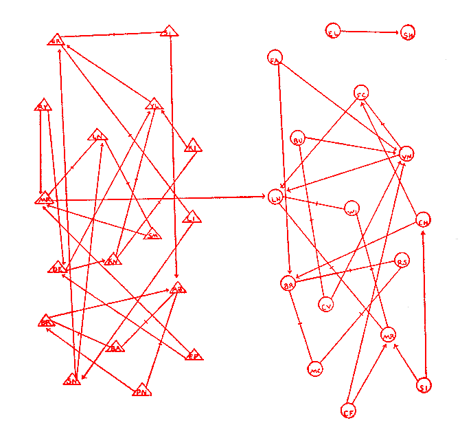
another example shows both liking someone (red) and
disliking someone (black) for the players on an American
Football team. Note that no-one likes 5RB and several people
actively dislike him. How well are they likely to block for him
when he has the ball?
He would
often try to position the points on the page in relation to
their actual location in physical space. If he had no particular
reason to put the nodes in particular locations he would default
to a circle.
Moreno introduced five important
ideas about the proper construction of images of social networks:
he drew graphs
he drew directed graphs
he used colors to draw
multigraphs
he varied the shapes of
points to communicate characteristics of social actors
he showed that variations
in the locations of points could be used to stress important
structural features of the data.
Lundberg and Steel 1930s emphasized the sociometric
status of each node by making nodes with high status larger and
placing them near the center of the graph
Northway 1940s created the target sociogram where
nodes in the center are chosen more often than nodes further out
and all the points in the same ring are chosen the same number
of times. She emphasized that lines should be short. Here is her
target sociogram of a first grade class.
Clearly this is all pretty
straight forward when there aren't that many nodes, but as the
number of nodes and edges increases the visualizations get
crowded and confusing very quickly.
With more modern technology
users should have the ability to move the nodes around, collapse
and unroll hierarchies
Stanley Milgram 1967 - small-world phenomenon -
Networks that exhibit this property are composed of a number of
densely knit clusters of nodes, but at the same time, these
clusters are well connected in that the average path length
between any two randomly chosen nodes is 6 on average.
I have created a set of csv
files for the nodes and the edges located at
https://www.evl.uic.edu/aej/424/social/social_nodes.csv
https://www.evl.uic.edu/aej/424/social/social_edges.csv
You should create a new
Jupyter notebook and generally follow (and adapt) the
instructions on this page:
to visualize the DIRECTED
network that I gave you using igraph. In particular you should
try different graph layouts to try and make the network more
clear. You should also try to color code the girls and the boys
differently, based on your best guesses from the names, to see
if that highlights any patterns - feel free to create a less
binary coding.
Note that when you draw these
networks they will be somewhat different each time they are
drawn due to having a different random seed value each time.
This would be annoying to a user, so you can also set a seed
value for the random number generator with set.seed(#) to make
the layout more predictable.
igraph installs really easily
in R-studio. In anaconda, as of Jan 2022, it seems best to
install it by clicking on your R environment and then changing
the view on the right from installed packages to all packages,
and then searching for igraph. You should then be able to check
the box next to r-igraph, and apply to let anaconda load in the
igraph package.
If you have issues getting it
installed under anaconda, you can do your work in R-Studio and
and take screen captures and upload those.
As
usual, printout your notebook and turn in the PDF through
gradescope.
Common Data
Transforms
What should I do when I get a new
dataset
look at the meta-data
(ideally the rules for this dataset should have been set up
before the data was collected and written down including the
formats, bounds, null values)
is the data for each
attribute within bounds?
are there values that are
missing?
are attributes that are
supposed to be unique really unique?
look at the data
distribution of the good data - are there any odd outliers?
Data mining By Jiawei Han,
Micheline Kamber
Data Cleaning
missing values
values out of range
inconsistent formats
Data Integration - How can I combine different data sets from
different sources
different date formats ( e.g. Jan-10-90 or 01.10.90
or 10.01.90 or 01/10/1990 or ...)
different units of
measure (metric vs imperial, lat/lon vs UTM)
different coverage areas
(some data at neighborhood level, county level, state level,
some collected per month and some per year)
Data Transformation
smoothing - emphasizes
longer trends over shorter duration changes
generalization -
replaces detailed concept with a general one (e.g. for each
data value, replace a 9 digit zip code with a state name, or
a specific age with an age range 20-30)
normalization -
depending how the data will be visualized you may need to
transform it to a given range (e.g. 0 .0 to 1.0)
aggregation - combines
/ summarizes data (e.g. add up all data for M, T, W, Th, F
and store the weekly total, or the monthly total, or the
yearly total, or average the data for all zip codes in a
state and store the state average)
aggregation leads us into the
more general concept of data reduction
Miles and Huberman (1994):
Data reduction is not something separate from
analysis. It is part of analysis. The researcher's decisions
on which data chunks to code and which to pull out, which
evolving story to tell are all analytic choices. Data
reduction is a form of analysis that sharpens, sorts, focuses,
discards, and organizes data in such a way that final
conclusions can be drawn and verified.
Data Reduction - gives you a
reduced dataset that gives you similar analytical results
reduce the number of dimensions
attribute subset selection
- one attribute (e.g. age) may be derived from another or
directly correlated to another, or might be irrelevant in
the work you are doing so those attributes can be removed
data cube aggregation - if you think of all
the data you collected as forming a multidimensional cube
which each attribute being an edge of the cube then you can
collapse various dimensions down by aggregating the values
(e.g. the example above taking data for each day of the week
and storing only the weekly total)
dimensionality reduction
- encoding used to reduce dataset size - may be lossy or
lossless - e.g. using principal component analysis,
wavelets, math increases rapidly here.
reduce the amount of collected/generated data
replace data by a model
that generates the data values,
clustering (e.g. replace
all of the attribute values collected between depths 10 and
15 with the average of those attribute values)
sampling (keep every nth
value, or one random value within each cluster)
Data Discretization and Concept
Hierarchy Generation - reduces the number of possible values for
a given attribute by
replace data values with ranges or higher level concepts (e.g.
numerical age could become 0s, 10s, 20s, 30s, ... 80s, 90s, 100s
or young, middle-age, old, addresses could become city or state
or country.)
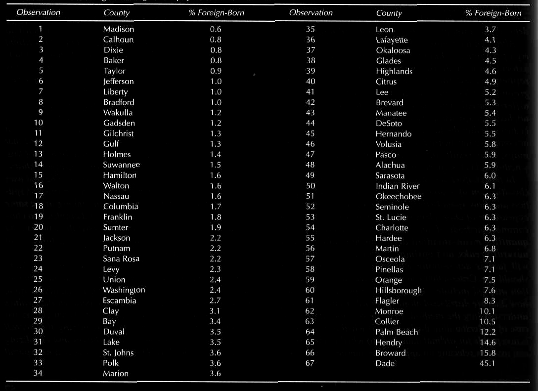
Here is a nice clustering example from thematic
cartography on data of the percentage of the population that was
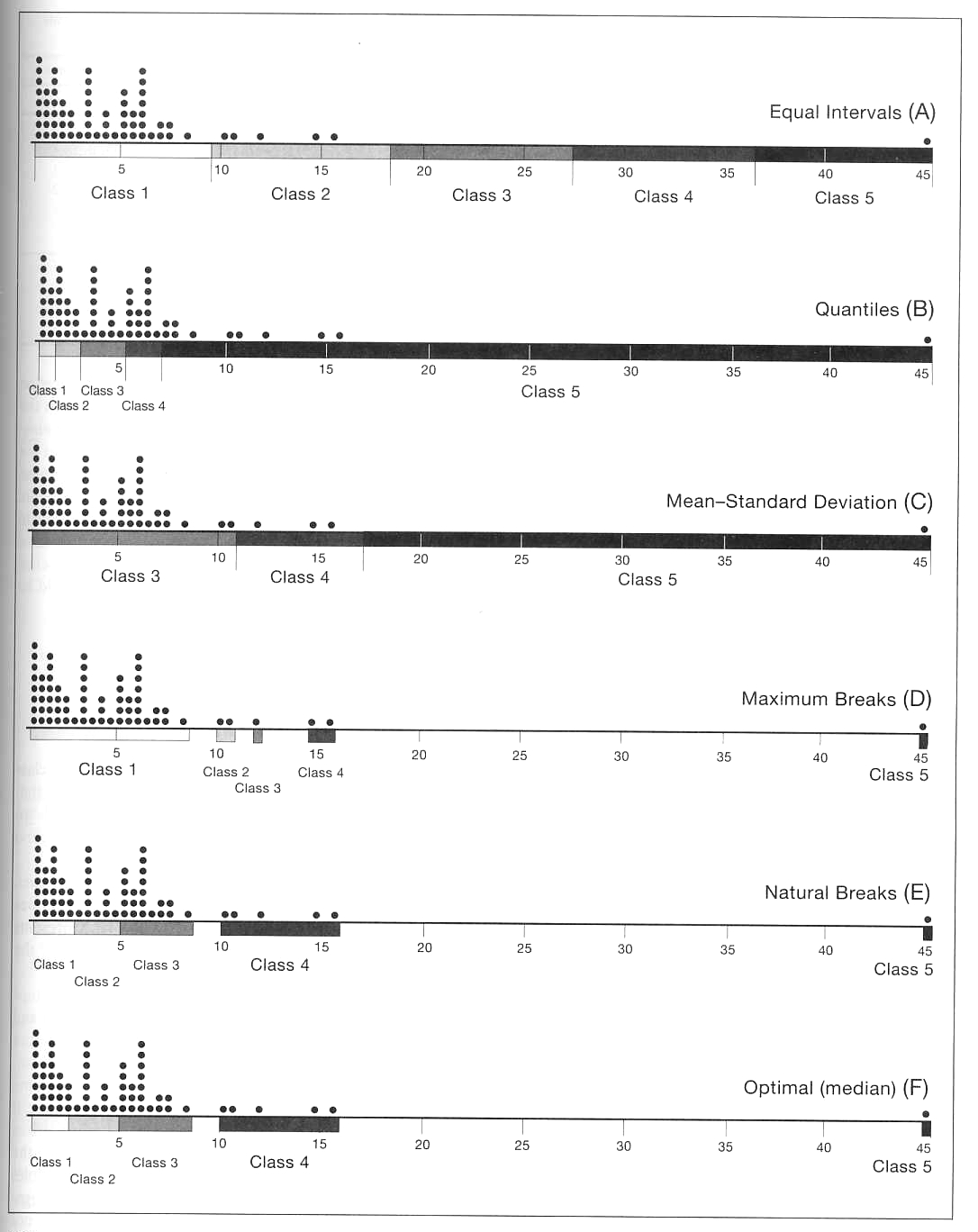
foreign-born in Florida in 1990. Here is the original data:
Start by ordering the data in whatever order seems
appropriate, in this case by increasing % foreign-born,
then there are several typical ways to try and categorize the
data.
Equal Intervals:
We take the range of data and divide it by the number of classes
(5 in this case.) This is really easy to compute but doesn't
take into account the distribution of the data.
Quantiles:
Starting with the number of classes, 5 in this case, an equal
number of data points are placed into each class. This is also
easy to compute, and lets you easily see the top n% of the data,
but again it fails to take into account the distribution of the data.
Mean-Standard
Deviation: Starting with the mean and standard
deviation of the data, data points are placed in appropriate
classes e.g. (less than mean - 2 standard deviations, mean -2 standard deviations to mean -1 standard deviation, mean +/- 1 standard deviations, mean +1 standard deviation to mean +2 standard deviations, greater than mean + 2 standard deviations). This works well with
data that follows a normal distribution, but not in cases like
the one shown above.
and a quick refresher on standard deviation from Wikipedia: https://en.wikipedia.org/wiki/Standard_deviation
for a normal distribution: 68% are within 1 standard deviation, 95% are within 2 standard deviations
Maximum Breaks:
Starting with the number of classes and the differences between
adjacent data points, the largest breaks are used to define the
classes. Maximum breaks is course in that it only takes into
account the breaks and not the distribution between the breaks.
Natural breaks
tries to finesse this by making the classifications more
subjective.
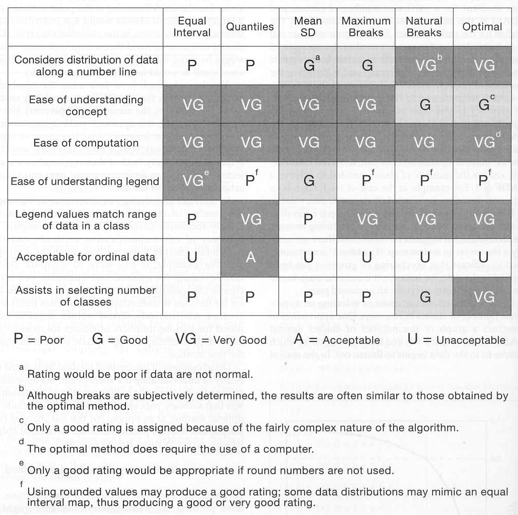
Here is a table summarizing the benefits of each approach.
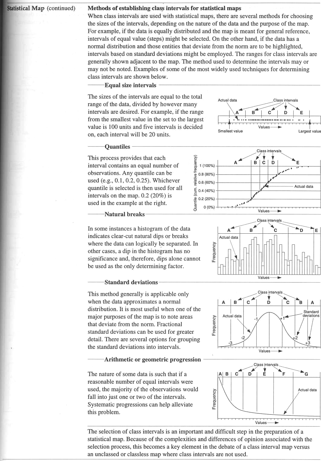
and here is the overview from
Information Graphics - a Comprehensive Illustrated Reference
Here is some data
from the US Census to play with - population estimates for the
50 US states in 2014
Alabama
4849377
Alaska
736732
Arizona
6731484
Arkansas
2966369
California
38802500
Colorado
5355866
Connecticut
3596677
Delaware
935614
Florida
19893297
Georgia
10097343
Hawaii
1419561
Idaho
1634464
Illinois
12880580
Indiana
6596855
Iowa
3107126
Kansas
2904021
Kentucky
4413457
Louisiana
4649676
Maine
1330089
Maryland
5976407
Massachusetts
6745408
Michigan
9909877
Minnesota
5457173
Mississippi
2994079
Missouri
6063589
Montana
1023579
Nebraska
1881503
Nevada
2839099
New Hampshire
1326813
New Jersey
8938175
New Mexico
2085572
New York
19746227
North Carolina
9943964
North Dakota
739482
Ohio
11594163
Oklahoma
3878051
Oregon
3970239
Pennsylvania
12787209
Rhode Island
1055173
South Carolina
4832482
South Dakota
853175
Tennessee
6549352
Texas
26956958
Utah
2942902
Vermont
626562
Virginia
8326289
Washington
7061530
West Virginia
1850326
Wisconsin
5757564
Wyoming
584153
Wyoming
584153
Vermont
626562
Alaska
736732
North Dakota
739482
South Dakota
853175
Delaware
935614
Montana
1023579
Rhode Island
1055173
New Hampshire
1326813
Maine
1330089
Hawaii
1419561
Idaho
1634464
West Virginia
1850326
Nebraska
1881503
New Mexico
2085572
Nevada
2839099
Kansas
2904021
Utah
2942902
Arkansas
2966369
Mississippi
2994079
Iowa
3107126
Connecticut
3596677
Oklahoma
3878051
Oregon
3970239
Kentucky
4413457
Louisiana
4649676
South Carolina
4832482
Alabama
4849377
Colorado
5355866
Minnesota
5457173
Wisconsin
5757564
Maryland
5976407
Missouri
6063589
Tennessee
6549352
Indiana
6596855
Arizona
6731484
Massachusetts
6745408
Washington
7061530
Virginia
8326289
New Jersey
8938175
Michigan
9909877
North Carolina
9943964
Georgia
10097343
Ohio
11594163
Pennsylvania
12787209
Illinois
12880580
New York
19746227
Florida
19893297
Texas
26956958
California
38802500
and some statistics
max
38802500
ave +2 SD
20522107
ave +1 SD
13443035
average
6363963
ave - 1 SD
-715109
min
584153
and a CSV version is located at
https://www.evl.uic.edu/aej/424/us_state_populations.csv
As of Jan 2022, the mapping package albersusa is not happy running
in Jupyter so for this part you should use R-Studio and take
screen snapshots of your progress to combine into a pdf.
Read
in the state population data and show the different breakpoints
(equal intervals, quantiles, mean-standard deviation, maximum,
and what you think are the natural breaks. Note that R has a
quantile function, a standard deviation function, as well as the
summary function. For the natural breaks you should plot the
data (hist can be helpful here) and
then decide on where you think the breaks should be and defend
your decision.
We can also
color in the states based on this data. The visuals making use
of albersusa at the link below show a similar process, and
albersusa is a convenient way to map data on the 50 US states
including Alaska and Hawaii. There are similar versions of
albers that also include US territories. (note that albersusa
needs to be installed with a special command:
devtools::install_github("hrbrmstr/albersusa")
and if you don't have
devtools installed then you need to install it with
install.packages("devtools").
On Windows you may also
first need to install Rtools from this page
https://cran.r-project.org/bin/windows/Rtools/history.html and
be sure to check the version number of R from the Anaconda
terminal (at this point you will likely need the older
Rtools35.exe)
The albersusa section and in particular the Fill
(choropleth) subsection of this link will be helpful.
you can read in the alberusa library
library(albersusa)
you can look at the data
usa_sf()
and see that it has various information
including population data from various years including pop_2014
which matches the dataset I provided above.
you can show a blank map
ggplot(data = usa_sf()) +geom_sf()
you can show a map colored by the 2014
population with
ggplot(data = usa_sf()) + geom_sf(aes(fill = pop_2014))
you could break that range of data into 6
discrete intervals with a bad color scheme
usa_sf() %>% mutate(pop_cut = cut_interval(pop_2014, n = 6))
%>% ggplot() + geom_sf(aes(fill = pop_cut))
we can see the visualization with a nicer color scheme
usa_sf() %>% mutate(pop_cut = cut_interval(pop_2014, n = 6))
%>% ggplot() + geom_sf(aes(fill = pop_cut)) +
scale_fill_brewer(palette = "Blues")
or break it into 6 discrete bins with
roughly the same number of states in each bin
usa_sf() %>% mutate(pop_cut = cut_number(pop_2014, n = 6))
%>% ggplot() + geom_sf(aes(fill = pop_cut)) +
scale_fill_brewer(palette = "Greens")
Make maps of this 2014 population data using cut_number and
cut_interval with values of 2, 3, 4, 5, 6, and a nice color
scheme of your choice, and explain what you see in each case in
terms of how the data is bring broken up and what that is
showing on the map.
Then as
usual submit your PDF via gradescope.
Provenance
- data moves through several forms and filters on its way
to being visualized and analyzed. Its important to keep track of
who has done what to the data at each step so the validity of
the final product can be ascertained, and if any issues arise
with the original data collection or the intermediate steps then
its easy to find which data products are affected.
You wouldn't just grab data off the web and assume that its
correct, would you? would you?
Data Quality: Lineage
can be used to estimate data quality and data reliability
based on the source data and transformations. It can also
provide proof statements on data derivation.
Audit Trail: Provenance
can be used to trace the audit trail of data, determine
resource usage, detect errors in data generation, help
determine who gets the patent.
Replication Recipes:
Detailed provenance information can allow repetition of data
derivation, help maintain its currency, and be a recipe for
replication.
Attribution: Pedigree
can establish the copyright and ownership of data, enable
its citation, and determine liability in case of erroneous
data.
Informational: A generic
use of lineage is to query based on lineage metadata for
data discovery. It can also be browsed to provide a context
to interpret data.
The meta
data that moves along with a dataset should give these details,
and as the information moves from raw data through various
stages of processing the meta data should be updated in
sufficient detail.
Different computer hardware, operating systems, and versions of
libraries can also affect the data products. Documenting these
are important to be able to replicate the data manipulations.
Containers allow us to create and package virtual versions of
the machine with a given set of software, making it easy to do
this replication.
Coming Next Time
Medical Visualization and Scientific Visualization
last
revision: 3/3/2022 - more specifics on the data binning
homework/classwork
2/24/2022 - updated dead link on sociogram example to wayback
machine version