The data being analyzed may not
be a static database - it may be a constantly flowing stream of
data that you are dipping into to look at the current state at
this instant, typically in the form of a dashboard.
There is a wide variety of data and tasks here:
actively assisting /
routing
an air traffic
controller
monitoring and looking for
anomalies where you need to react quickly
monitoring the telemetry
while launching a rocket
tracking various stocks,
currencies, world events for a wall street broker
city traffic management,
buses, cabs, trains
casually keeping track of
the current situation
Importance of context
Often very important not just
knowing the current value (e.g. position, price) of an entity, but
also the recent values of that entity, to show how it is changing
(e.g. value increasing or decreasing, moving N / S / E / W, etc)
How do the characteristics and recent history of this entity
compare to other similar entities (airplanes, currencies, stocks,
etc) at the current time? Is there a larger pattern or is this one
an anomaly.
How do the
characteristics of the current data compare to the expected /
common / average / historical data?
in value, volume,
diversity, density, location, direction, content, etc
is that earthquake in a
spot that we expect earthquakes in?
is that airplane
following a typical flight path?
do sales tend to
increase at this time of year?
is there usually more
traffic this time of day?
is this what is expected
on a weekend?
how has this patient
been doing over the last 24 hours
Is the expected data explicitly
shown or is that kept within the individuals using the
visualization
And as usual when we look at
statistics for different states, cities, and countries it is
important to know how many people live there and what is the
rate per n people, not just the raw numbers. And it is important
to know what was the rate yesterday, and the week before to know
if things are getting better or worse, and at what rate.
Another example is what is
happening in the stock market. Google Finance is a nice example
- lets see how apple and amazon and microsoft are doing
individually and compared to each other. Some events may only
affect one company, other events may affect all of them, and the
current context for the day can be related to news items.
and how they compare to
other tech companies and US stocks in general. The history gives
us some context, the news tab gives us some more context.
If you are working in shifts
then its very important to effectively hand off control to someone else (air traffic
controllers, nurses.)
What is the current general situation?
What are the most important points of interest that someone should
keep track of?
How can the visualization
draw the viewers attention to a new important event? (from Schneiderman)
intensity: 2 levels
(normal and high intensity attention getting) - remember human
perception of intensities
marking: ___, *,
arrows, boxes
size: up to 4, larger
attracting more attention
color: up to 4 standard
colours with additional colours used occasionally
blinking: (2-4 Hz) on off,
inverse, or colour changes - use sparingly
audio: soft for regular /
harsh to attract attention
animation: bouncing /
wiggling / shaking
What happens if multiple
parts of the visualization are trying to get your attention at
the same time?
It can be helpful to put
these under user control so the user can set the thresholds or
manually label interesting entities.
If the alert is very important
then the visualization should continue trying to get the user's
attention until he/she acknowledges the event.
How do these things work in real life - e.g. the 'done' signal on
your clothes washer and dryer vs your stove
Similarly on your phone - what is the right level of importance
for interrupts? which ones generate sounds or vibrations or bring
up notifications?
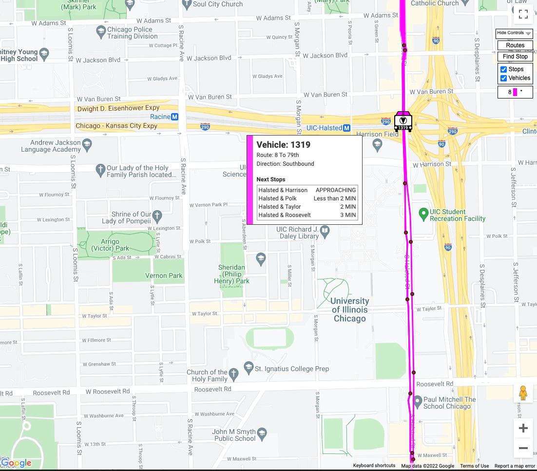
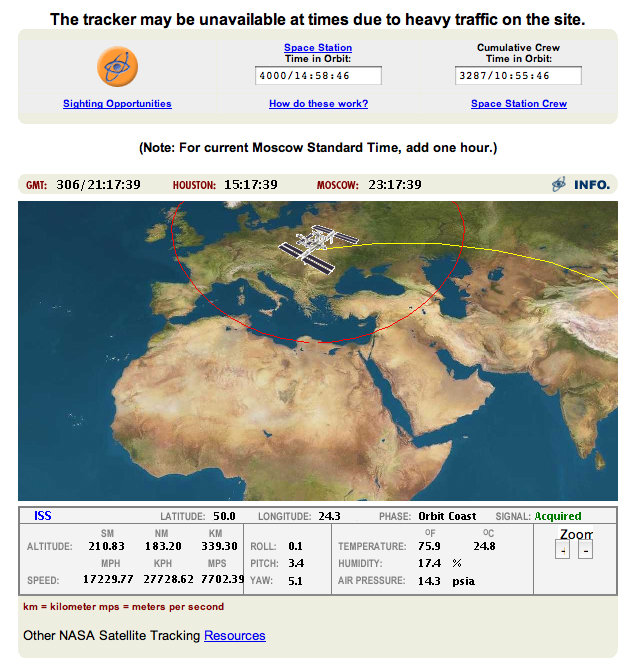
Flight
tracking software is a good example of this. There is similar
data for buses in Chicago , and many other types of vehicles.
This kind of data tends to be rather small though, there may be
many entities.
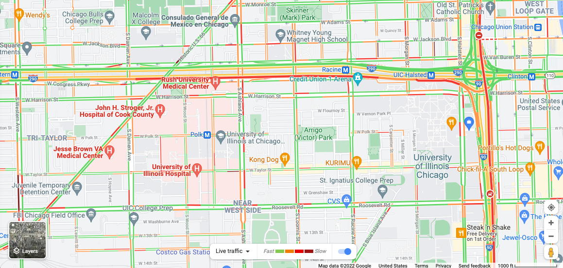
We looked at the Chicago
traffic data in graphic form when talking about uncertainty
We can also look at in a map form and that form may
be better to show recent accidents or lane closures that explain
why travel times have suddenly changed and give more accuracy as
to where those events may have occurred (i.e. where the road
turns from red to green.) Google maps and other services also
nicely update the colour of tracked road in something close to
real-time. Here are the traffic conditions around UIC on
February 3rd, 2022 at 4:30pm. In the future fixed sensors
communicating to a central server will likely be replaced by
auto to auto communication systems for more timely
communication.
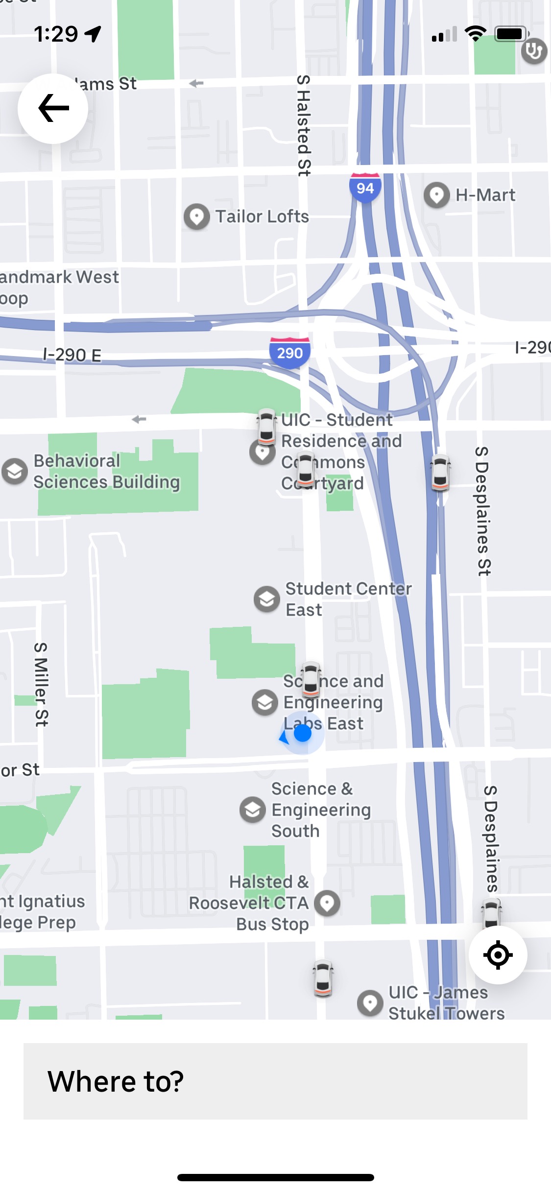
Other sites allow you to track individual entities
While buses
and trains follow fixed paths, automobiles do not. If you are
looking for a ride from a ride sharing service on your
smartphone the location, orientation, speed, and movement of the
vehicle are important as it gets closer. From our knowledge of
the location we can tell if the car is stopped at a light, or
arriving from the opposite side of the street, etc. making it
easier to meet the driver efficiently.
and of course today there is
not only 'official' data but also data that people contribute
through apps like Waze which can give more immediate unfiltered
unverified data with the pluses and minus that brings to
drivers. https://www.waze.com/livemap
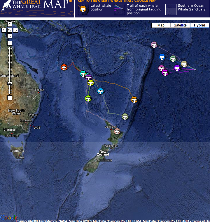
People also track slower things like whales, which bring up
additional issues of certain people using this kind of data for
purposes that the original visualization designers would not
approve of, so additional levels of security may be needed to
keep the things that you are tracking safe.
Its pretty common for people to
visualize the current state of their computer (CPU, network,
battery, temperature, etc.) In the old days of the 70s and 80s
you could listen to the hard drive or the modem and know what
the computer was doing. Even today with our almost silent
computers you can often hear the fans turn on if the CPUs are
really working hard but most often we need to visualize the
data from multiple sensors to know what is going on. Are
things slow because the CPUs are in use, or because there is
no more space on the drive, or because the network is slow,
etc.
How much data do we want
available at a glance in the menu bar, and how much data do we
want when we bring up an application to show us more detailed
information?
or current data about ourselves
through watches and fitness trackers. What data do we want to
have easily available at a glance without interacting, and
what data do we want when we bring up a specific weather app
or health app on that device.
Animations
Animations can be an end product of an analysis, and
can also be used within a visualization and analysis tool as we
have seen in the class projects.
Animation allows us to look at the pace of change in the data
(velocity), and changes in that pace (acceleration). In
visualizations with many entities it helps us follow the path of
individual entities rather than just seeing 'snapshots' of
static positions. In many cases the original phenomena being
studied was continuous but was discretized when it was sampled /
measured so animation can bring us back to a more 'natural'
representation of the information. One must be careful that any
interpolation done for an animation remains true to the original
data.
Initially animation can
be used to get a sense of dynamic data, and also to see if
entities suddenly appear or disappear suggesting potential data
loss, or an interesting event in the data.
Multiple animations can be used in an ensemble to show data over
n months or years to look for similarities and differences.
As an end product animations
allow their creators to focus attention on particular facets
of the data. The animations can also include explicit text and
imagery highlighting important features and events for context.
In terms of the lie factor, here you need to be
careful of how time appears to progress. You should have an
indication of the current time, and you should not change
the speed that time passes or cut out sections of time
without informing the viewer in an obvious way.
As our computers get faster it is becoming more common
to create these animations in real-time, giving the user
control over the parameters, the viewpoint, the zoom factor,
but data is also increasing in size and complexity, so
interactive animations that can be run in a browser and
pre-packaged animations that can be placed on YouTube will
both remain useful. Pre-packaged animations in a common video
format will also be likely playable for longer into the future
as they can be converted to the latest video codecs.
Some examples
At the beginning of the course
we started with a video on Gap Minder by Hans Rosling. His 20
minute Ted talk from 2007 is still one of the best and worth your
time - https://www.youtube.com/watch?v=hVimVzgtD6w