We've talked about various
pieces of visual analytics throughout the course - this brings all
of that together into a process.
The bible of the field is James
J. Thomas and Kristin A. Cook. Illuminating the Path: The Research
and Development Agenda for Visual Analytics. IEEE Computer
Society, 2005. ISBN: 0-7695-2323-4.
"Visual Analytics is the science of analytical
reasoning facilitated by interactive visual interfaces. People
use visual analytics tools and techniques to synthesize
information and derive insight from massive, dynamic, ambiguous,
and often conflicting data, provide timely, defensible, and
understandable assessments; and communicate assessment
effectively for action. The overall goal is to detect the
expected and discover the unexpected. "
The goal of visual analytics is to facilitate this analytical
reasoning process through the creation of software that
maximizes human capacity to perceive, understand, and reason
about complex and dynamic data and situations.
It must build upon an understanding of the reasoning process, as
well as an understanding of underlying cognitive and perceptual
principles, to provide mission-appropriate interactions that
allow analysts to have a true discourse with their information.
The goal is to facilitate high-quality human judgment with a
limited investment of the analysts' time.
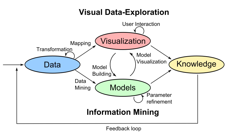
Here are a couple diagrams from the Konstanz whitepaper:
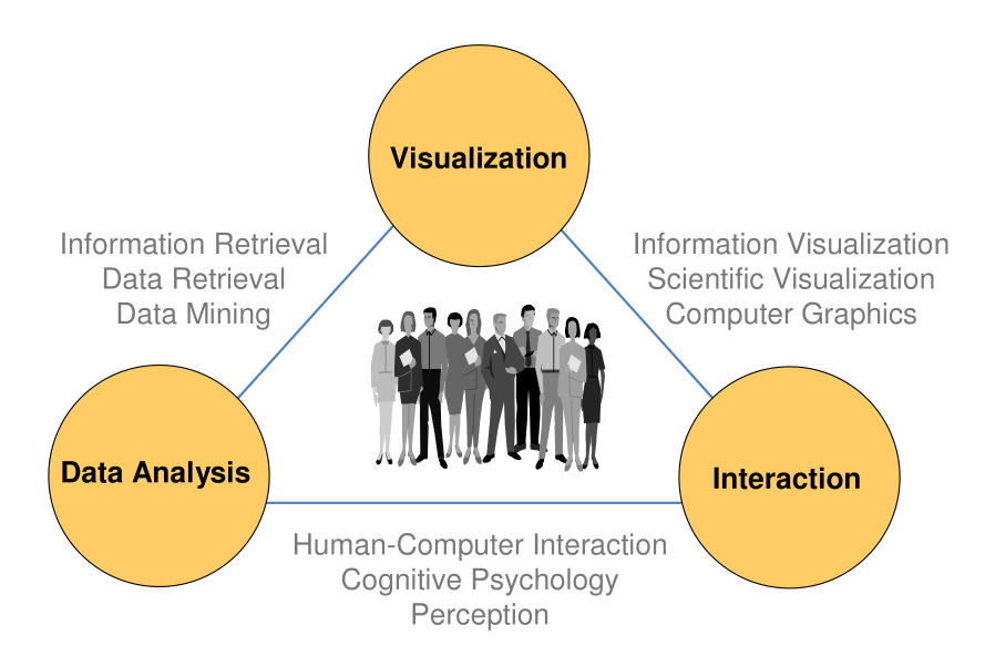
Visual analytics is a multidisciplinary field that includes the
following focus areas:
Data
representations
and transformations that convert all types of
conflicting and dynamic data in ways that support
visualization and analysis
Visual
representations
and interaction techniques that take advantage of
the human eye's broad bandwidth pathway into the mind to
allow users to see, explore, and understand large amounts of
information at once
Analytical reasoning
techniques that enable users to obtain deep
insights that directly support assessment, planning, and
decision making
Techniques
to
support production, presentation, and dissemination of the results of an
analysis to communicate
An analysis session is a dialogue
between the analyst and the data where the visual representation
is the interface into the data.
The use of visual
representations and interactions to accelerate rapid insight
into complex data is what distinguishes visual analytics
software from other types of analytical tools. Visual
representations translate data into a visible form that
highlights important features, including commonalities and
anomalies. These visual representations make it easy for users
to perceive salient aspects of their data quickly. Augmenting
the cognitive reasoning process with perceptual reasoning
through visual representations permits the analytical reasoning
process to become faster and more focused.
Visual representations invite
the user to explore his or her data. This exploration requires
that the user be able to interact with the data to understand
trends and anomalies, isolate and reorganize information as
appropriate, and engage in the analytical reasoning process. It
is through these interactions that the analyst achieves insight.
Analysts may be asked to
perform several different types of tasks:
Assess - Understand
the current world around them and explain the past.
Forecast - Estimate
future capabilities, threats, vulnerabilities, and
opportunities.
Develop Options -
Evaluate multiple reactions to potential events and assess
their effectiveness and implications.
Steps in the Analytical Process
Determine how to address
the issue that has been posed, what resources to use, and
how to allocate time to various parts of the process to meet
deadlines.
Gather information
containing the relevant evidence and become familiar with
it, and incorporate it with the knowledge he or she already
has.
Generate multiple
candidate hypotheses.
Evaluate these
alternative explanations in light of evidence and
assumptions to reach a judgment about the most likely
explanations or outcomes.
Consider alternative
explanations that were not previously considered.
Create reports, presentations,
or other products that summarize the analytical judgments.
These products summarize the judgments made and the supporting
reasoning that was developed, and the uncertainties that
remain during the analytical process. These products can then
be shared with others.
Analysts must deal with data that is
dynamic, incomplete, often deceptive, and
evolving and they often must come to conclusions within a
limited period of time, and be able to defend those
conclusions.
Analysis products are expected to clearly communicate
the assessment or forecast, the evidence on which it is based,
knowledge gaps or unknowns, the analyst's degree of certainty in
the judgment, and any significant alternatives and their
indicators.
Visual analytics systems must capture this information
and facilitate its presentation in ways that meet the needs of
the recipient of the information.
Its very important to quickly
identify competing explanations and chains of reasoning for the
issue under study and actively maintain awareness of those
competing idea so that they are kept 'alive' as analytic possibilities.
Often the most plausible
explanation will be researched extensively, analysts should
always revisit the key alternatives. Visual analytics tools must
facilitate the analyst's task of
actively considering competing hypotheses.
Another important analytic
technique is the enumeration and testing of assumptions. Explicit representation of these
assumptions facilitates this process.
Feedback
want 'constant' feedback from the visualization
application:
~100 milliseconds. Bare minimum update rate to perceive smooth
animation (50 ms is a better minimum)
~1 second. Simple user actions (bringing up a menu, making a
menu selection, etc) should get a response or some feedback
(progress bar appears) within this time.
~10 seconds. More complex user actions (generating a new view of the
data, doing a complex query) should get a response or some
feedback (progress bar appears) within this time.
~100 seconds (minutes to hours). Higher level reasoning
processes, including the analytic reasoning take place in this
time frame.
Issues with streaming data
Provide
situational awareness for data streams.
Show
changes in the state of the system and help users identify
when the changes are significant.
Fuse
various types of information to provide an integrated view
of the information.
One part of this process
that we haven't talked much about is the reporting phase -
taking the results of an analysis and presenting them to the
target audience.
Discussion of the
Challenger disaster, Jan 28, 1986, on its 10th flight (and the
25th shuttle flight overall), with refs from Tufte's "Visual
Explanations."
The Challenger example gets talked about a lot in
terms of ethics and responsibility and there are various views
on the topic.
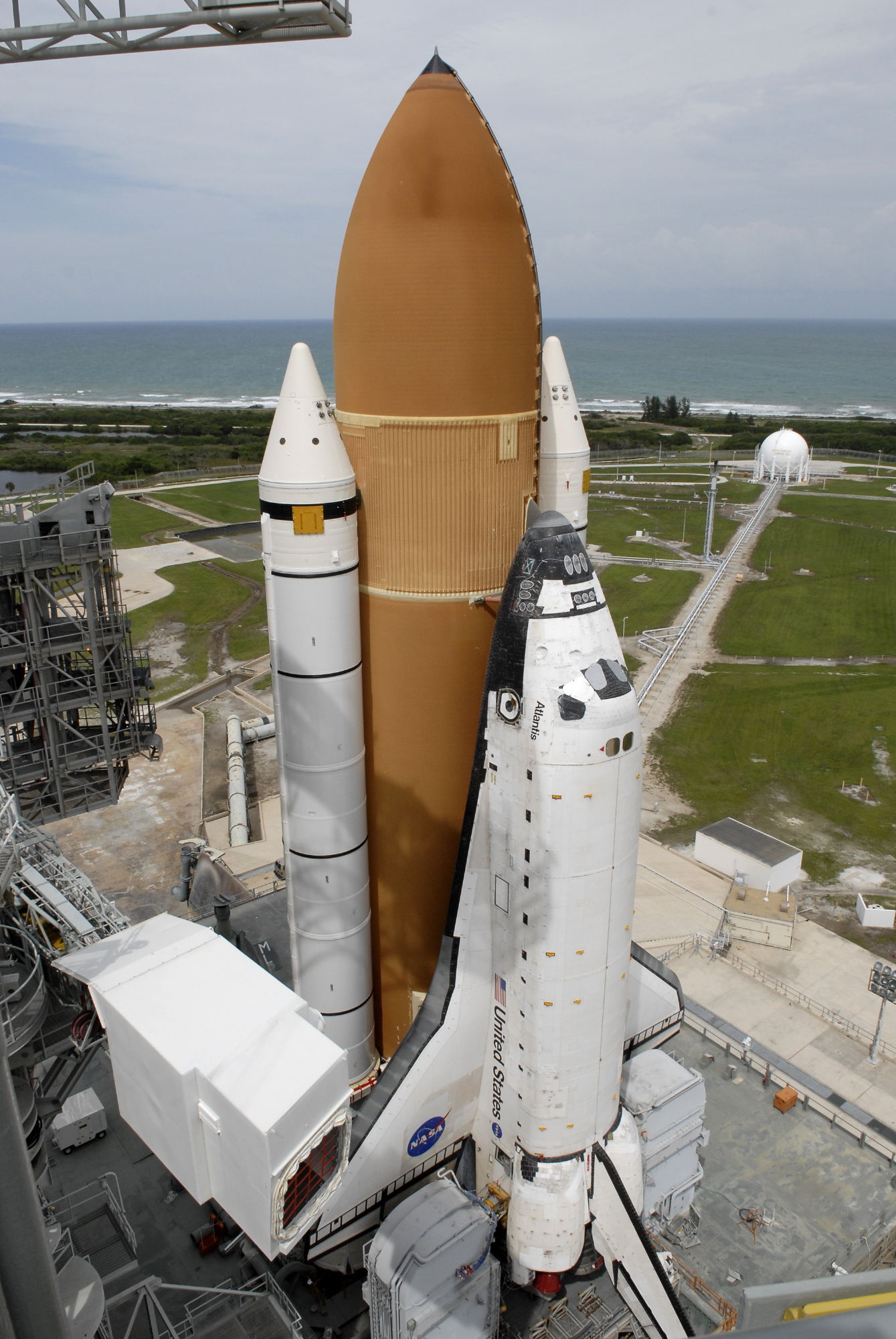
Since we stopped flying the shuttle in 2011, just
for reference, here is a photo of Atlantis on the launch
pad:
The engineers at Morton Thiokol who designed the
solid rocket boosters for the shuttle opposed the launch of
Challenger due to the expected low temperatures that day
(26-30 degrees F (-2 C), and faxed 13 diagrams to NASA
management to make their case. They failed in large part
because of what information they chose to present and the
way they presented that information, but also because of
time and information constraints.
'We discussed what might happen below our 40F (4C)
qualification temperature and practically to a man we
decided it would be catastrophic' added Morton Thiokol's Bob
Ebeling.
"Thiokol recommended that we could not launch
until the weather warmed up in the afternoon" said NASA
senior manager Jud Lovingood. "Well I told them they
couldn't make that recommendation. They had to give us a
temperature that we could launch with."
A formal presentation would have to be made, two hours after
speaking with Lovingood and just 15 hours before launch, via
a teleconference at which Thiokol would need to given their
reasoning for a no launch decision, a power contractors
held, but were scared to make given the effects on the
shuttle schedule.
Thiokol engineer Roger Boisjoly, one of two specialists (the
other being Arnie Thompson) on the SRB joint seals grabbed
anything he could from his office to show how the
temperature would lead to a failure of the SRB's O-ring and
the destruction of the Shuttle.
"Unfortunately in our rush we didn't have time for a dry run
at what we'd present to NASA" noted Boisjoly. "I had no idea
what my colleagues would present and I had no idea what I'd
bring to the meeting."
"The entire Thiokol group recommended no launch"
remembered Ebeling, as they recommended a minimum launch
temperature of 53F (11C). The expected rubber stamping of
that recommendation was expected from NASA on the other end
of the teleconference. However, they would be proven wrong.
There had been several earlier flights with O-ring
problems and the issues were being worked through to create
a less flawed design, so NASA knew there were continuing
concerns, but the amount of data available from the 24
previous shuttle flights was limited. For example the Morton
Thiokol engineers did not have temperature data available
for all of the previous shuttle flights (air temperature, or
the much more useful O-ring temperature.) Seven earlier
flights had O-ring issues, and those launches were at
temperatures of 53, 57, 58, 63, 70, 70, 75F, (12, 14, 14,
17, 21, 21, 24C) and only two of those had serious 'blow by'
issues, one at 53F (12C) and one at 75F (24C). There were
problems when it was warm; there were problems when it was
cool. No shuttle had launched below 53F (12C) before.
Mr Mulloy, the Solid Rocket Booster Project
Manager, testified: It was Thiokol's calculation of what the
lowest temperature an O-ring had seen in previous flights,
and the engineering recommendation was that we should not
move outside of that experience base.
Another person present said "One of my colleagues
that was in the meeting summed it up best. This was a
meeting where the determination was to launch, and it was up
to us to prove beyond a shadow of a doubt that it was not
safe to do so. This is in total reverse to what the position
usually is in a pre-flight conversation or a flight
readiness review. It is usually exactly opposite that."
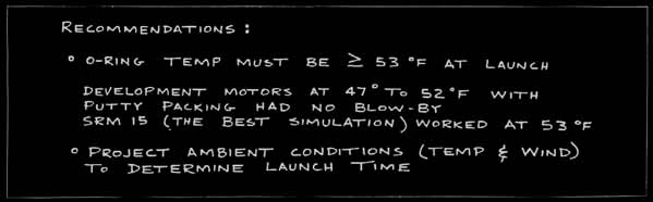
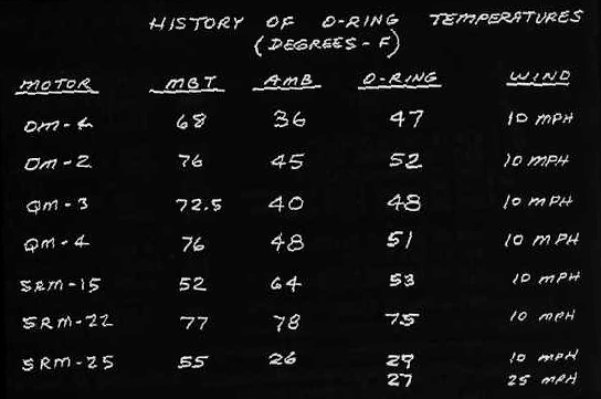
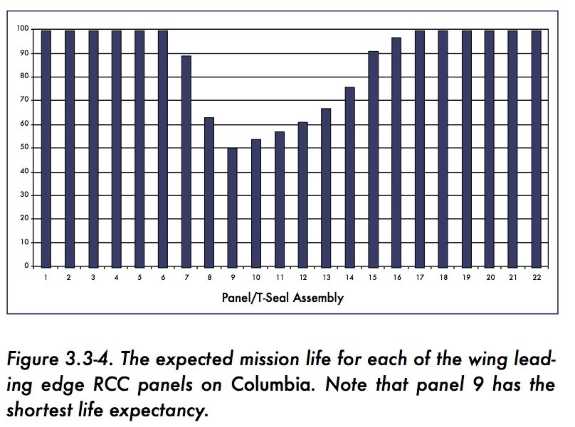
The key table that the engineers produced was:
The table shows that there were problems seen in
four rocket tests, and two actual launches, and then what the
assumption would be for the temperatures at the Challenger
launch. This table should also be seen in the larger context
of many years of work between NASA and Morton Thiokol on the
development of the rockets, so everyone involved in the
meeting should
have been able to put this data into context. One thing this
table leaves out is data on tests and launches where there
were no problems.
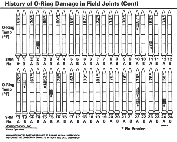
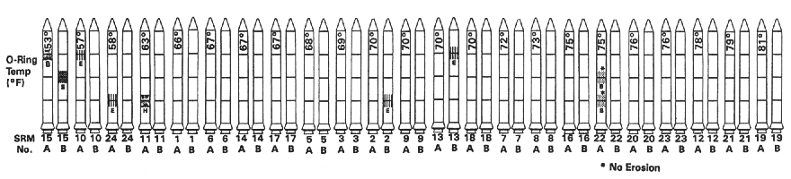
The Rogers Commission shows this data in a graphical form as
well as a revised version which gives context by showing
launches with no problems here
When NASA basically asked Morton Thiokol to prove that it was
unsafe to launch the engineers were given an almost impossible
task given the time and information available to them.
Chapter 5 of the Rogers report gives a lot of detail on this.
NASA had promised for over a decade that they could provide a
launch every two weeks (using both Kennedy and Vandenberg) as
part of giving regular access to space. If these recommendations
were accepted then that promise had to be broken
and some of the findings:
l. The Commission concluded that there was a serious flaw in the
decision making process leading up to the launch of flight 51-L.
A well structured and managed system emphasizing safety would
have flagged the rising doubts about the Solid Rocket Booster
joint seal. Had these matters been clearly stated and emphasized
in the flight readiness process in terms reflecting the views of
most of the Thiokol engineers and at least some of the Marshall
engineers, it seems likely that the launch of 51-L might not
have occurred when it did.
4. The Commission concluded that the Thiokol Management reversed
its position and recommended the launch of 51-L, at the urging
of Marshall and contrary to the views of its engineers in order
to accommodate a major customer.
Back to Tufte:
Even after the disaster and the during the investigation when
there was more time and more information available bad graphics
were still being created. Looking at the O-Ring damage over the
previous 24 shuttle missions, the data was presented in
chronological order showing the location and extent of the
damage sustained to the left and right boosters and the
temperature at launch time. It shows a lot of data, but it hides
the pattern.
If instead of using chronological order the same
data was presented in ascending temperature order the pattern
is a bit more clear
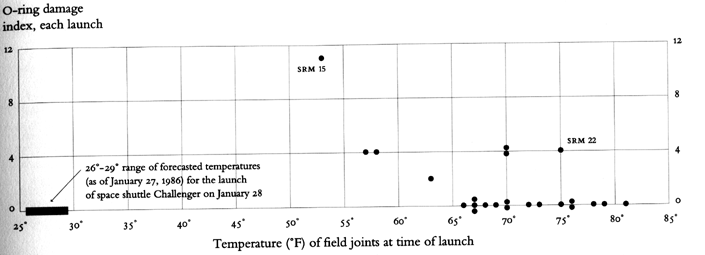
If instead
we remove all the extraneous imagery and do a simple plot of
temperature vs damage (a weighted average of erosion, heating,
and blow-by) as shown below then the pattern becomes much
clearer, which is the point that Tufte stresses. This chart is
almost the same as the revised Rogers Commision chart in pdf
form above.
To really do
analysis you would still want to be able to get access to the
more detailed data - this just gives you a nice overview.
(note that 15 and 22 mentioned in the original memo are
highlighted in this chart)
It would be 2.5 years
before the next shuttle flight
Discussion of Columbia
disaster in 2003 on its 28th mission, with refs from Tufte's
"Beautiful Evidence" - how you organize, present text, and
choose words can be just as dangerous as how you present
graphical information. Do all of the necessary words even fit
readably on a PowerPoint slide?
Unlike Challenger, this time the issue was less about what the
engineers knew, and more about what they did not know and
their inability to convince their managers to get them more
information from the astronauts in space or department of
defense imagery.
The results of an analysis
needed to be succinctly presented in a report or set of
PowerPoint slides, with the bulk of the analysis sitting in a
very big report that may not be read. Tufte spends a fair
amount of time in this book talking about the dangers inherent
in a PowerPoint presentation.
first a bit
of background from the Columbia report which we will hit the
highlights of ...
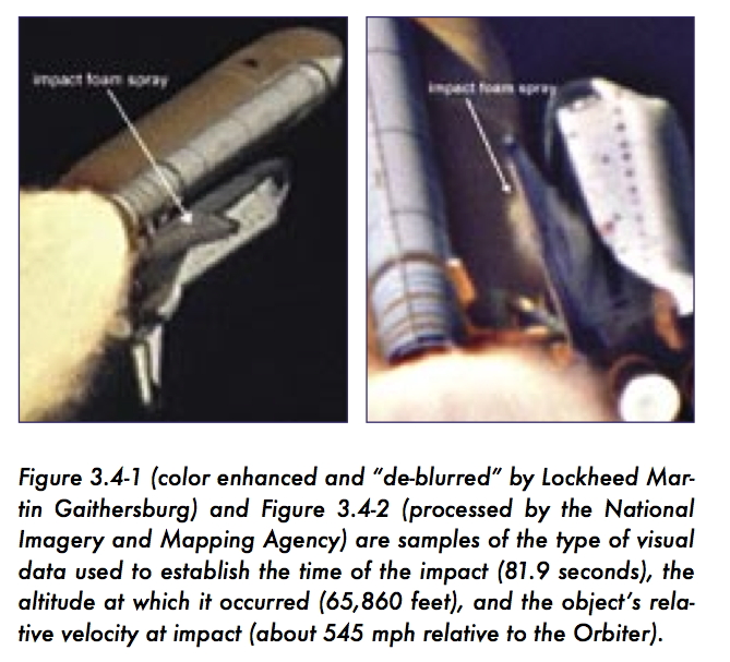
"Columbia
was launched from Launch Complex 39-A on January 16, 2003, at
10:39 a.m. Eastern Standard Time (EST). At 81.7 seconds after
launch, when the Shuttle was at about 65,820 feet and traveling
at Mach 2.46 (1,650 mph), a large piece of hand-crafted
insulating foam came off an area where the Orbiter attaches to
the External Tank. At 81.9 seconds, it struck the leading edge
of Columbiaʼs left wing. This event was not detected by the crew
on board or seen by ground support teams until the next day,
during detailed reviews of all launch camera photography and
videos. This foam strike had no apparent effect on the daily
conduct of the 16-day mission, which met all its objectives."
"Post-launch
photographic analysis showed that one large piece and at least
two smaller pieces of insulating foam separated from the
External Tank left bipod (Y) ramp area at 81.7 seconds after
launch. Later analysis showed that the larger piece struck
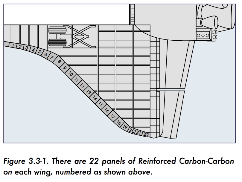
Columbia on the underside of the left wing, around Reinforced
Carbon-Carbon (RCC) panels 5 through 9, at 81.9 seconds after
launch (see Figure 2.3-2). Further photographic analysis
conducted the day after launch revealed that the large foam
piece was approximately 21 to 27 inches long and 12 to 18 inches
wide, tumbling at a minimum of 18 times per second, and moving
at a relative velocity to the Shuttle Stack of 625 to 840 feet
per second (416 to 573 miles per hour) at the time of impact."
"The
objectʼs large size and the apparent momentum transfer concerned
Intercenter Photo Working Group personnel, who were worried that
Columbia had sustained damage not detectable in the limited
number of views their tracking cameras captured. This concern
led the Intercenter Photo Working Group Chair to request, in
anticipation of analystsʼ needs, that a high-resolution image of
the Orbiter on-orbit be obtained by the Department of Defense.
By the Boardʼs count, this would be the first of three distinct
requests to image Columbia on-orbit. The exact chain of events
and circumstances surrounding the movement of each of these
requests through Shuttle Program Management, as well as the
ultimate denial of these requests, is a topic of Chapter 6."
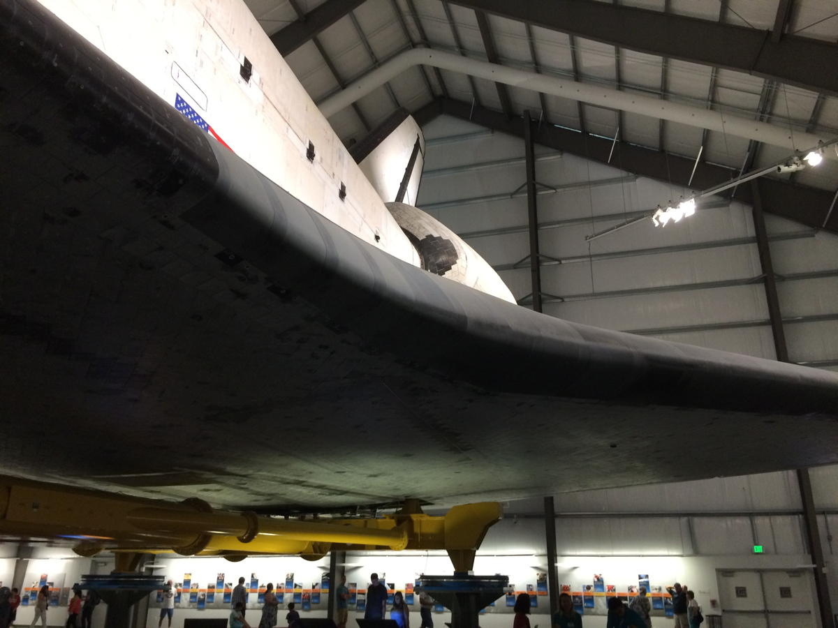
and here are
a couple photos of that same area on Endeavour, taken in the
summer of 2015
"Boeing
analysts conducted a preliminary damage assessment on Saturday.
Using video and photo images, they generated two estimates of
possible debris size: 20 inches by 20 inches by 2 inches, and 20
inches by 16 inches by 6 inches, and determined that the debris
was traveling at a approximately 750 feet per second, or 511
miles per hour, when it struck the Orbiter at an estimated
impact angle of less than 20 degrees. These estimates later
proved remarkably accurate."
"To
calculate the damage that might result from such a strike, the
analysts turned to a Boeing mathematical modeling tool called
Crater that uses a specially developed algorithm to predict the
depth of a Thermal Protection System tile to which debris will
penetrate. This algorithm, suitable for estimating small (on the
order of three cubic inches) debris impacts, had been calibrated
by the results of foam, ice, and metal debris impact testing. "
"Until
STS-107, Crater was normally used only to predict whether small
debris, usually ice on the External Tank, would pose a threat to
the Orbiter during launch. Engineers used Crater during STS-107
to analyze a piece of debris that was at maximum 640 times
larger in volume than the pieces of debris used to calibrate and
validate the Crater model (the Boardʼs best estimate is that it
actually was 400 times larger)."
"For the
Thermal Protection System tile, Crater predicted damage deeper
than the actual tile thickness. This seemingly alarming result
suggested that the debris that struck Columbia would have
exposed the Orbiterʼs underlying aluminum airframe to extreme
temperatures, resulting in a possible burn-through during
re-entry. Debris Assessment Team engineers discounted the
possibility of burn through for two reasons. First, the results
of calibration tests with small projectiles showed that Crater
predicted a deeper penetration than would actually occur.
Second, the Crater equation does not take into account the
increased density of a tileʼs lower 'densified' layer, which is
much stronger than tileʼs fragile outer layer. Therefore,
engineers judged that the actual damage from the large piece of
foam lost on STS-107 would not be as severe as Crater predicted,
and assumed that the debris did not penetrate the Orbiterʼs
skin."
"Prior to
STS-107, Crater analysis was the responsibility of a team at
Boeingʼs Huntington Beach facility in California, but this
responsibility had recently been transferred to Boeingʼs Houston
office. Even though STS-107ʼs debris strike was 400 times larger
than the objects Crater is designed to model, neither Johnson
engineers nor Program managers appealed for assistance from the
more experienced Huntington Beach engineers, who might have
cautioned against using Crater so far outside its validated
limits. Nor did safety personnel provide any additional
oversight. NASA failed to connect the dots: the engineers who
misinterpreted Crater, a tool already unsuited to the task at
hand, were the very ones the Shuttle Program identified as
engendering the most risk in their transition from Huntington
Beach."
Team members
concluded over the next six days that some localized heating
damage would most likely occur during re-entry, but they could
not definitively state that structural damage would result. On
January 24, the Debris Assessment Team made a presentation of
these results to the Mission Evaluation Room, whose manager gave
a verbal summary (with no data) of that presentation to the
Mission Management Team the same day. The Mission Management
Team declared the debris strike a 'turnaround'
issue and did not pursue a request for imagery."
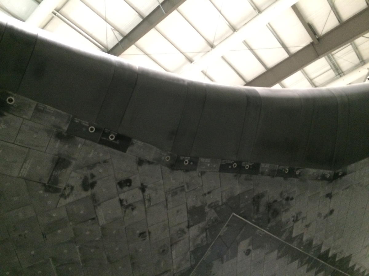
"Columbia
re-entered Earthʼs atmosphere with a pre-existing breach in the
leading edge of its left wing in the vicinity of Reinforced
Carbon-Carbon (RCC) panel 8. This breach, caused by the foam
strike on ascent, was of sufficient size to allow superheated
air (probably exceeding 5,000 degrees Fahrenheit) to penetrate
the cavity behind the RCC panel. The breach widened, destroying
the insulation protecting the wingʼs leading edge support
structure, and the superheated air eventually melted the thin
aluminum wing spar. Once in the interior, the superheated air
began to destroy the left wing."
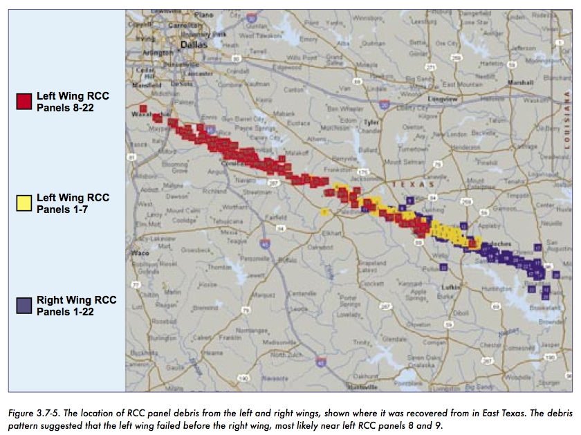
"By the time
Columbia passed over the coast of California in the pre-dawn
hours of February 1, at Entry Interface plus 555 seconds,
amateur videos show that pieces of the Orbiter were shedding.
Analysis indicates that the Orbiter continued to fly its
pre-planned flight profile, although, still unknown to anyone on
the ground or aboard Columbia, her control systems were working
furiously to maintain that flight profile. Finally, over Texas,
just southwest of Dallas-Fort Worth, the increasing aerodynamic
forces the Orbiter experienced in the denser levels of the
atmosphere overcame the catastrophically damaged left wing,
causing the Orbiter to fall out of control at speeds in excess
of 10,000 mph."
and for a bit of perspective:
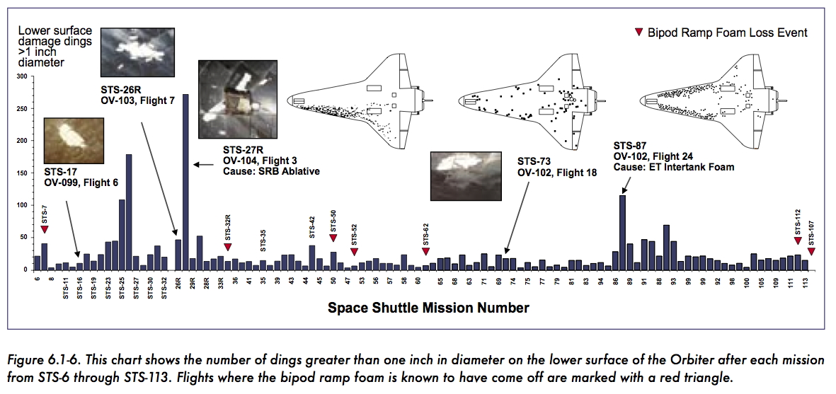
One debris
strike in particular foreshadows the STS-107 event. When
Atlantis was launched on STS-27R on December 2, 1988, the
largest debris event up to that time significantly damaged the
Orbiter. Post-launch analysis of tracking camera imagery by the
Intercenter Photo Working Group identified a large piece of
debris that struck the Thermal Protection System tile at
approximately 85 seconds into the flight. On Flight Day Two,
Mission Control asked the flight crew to inspect Atlantis with a
camera mounted on the remote manipulator arm, a robotic device
that was not installed on Columbia for STS-107. Mission
Commander R.L. "Hoot" Gibson later stated that Atlantis "looked
like it had been blasted by a shotgun." Concerned that the
Orbiterʼs Thermal Protection System had been breached, Gibson
ordered that the video be transferred to Mission Control so that
NASA engineers could evaluate the damage.
When
Atlantis landed, engineers were surprised by the extent of the
damage. Post-mission inspections deemed it "the most severe of
any mission yet flown." The Orbiter had 707 dings, 298 of which
were greater than an inch in one dimension.
One issue is
whether anything could have been done. Given its orbit there is
no way that Columbia could have docked with the (still
incomplete) International Space Station, but Atlantis was on the
second launch pad in Florida being readied for its mission, so
its possible that a rescue could have been attempted. It is also
possible that the astronauts could have done repair work to keep
the shuttle together long enough for them to be able to bail out
at a reasonable altitude.
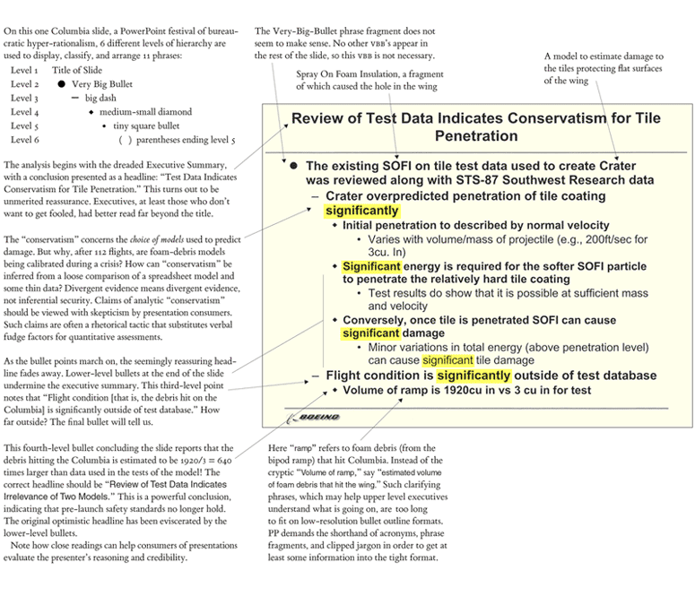
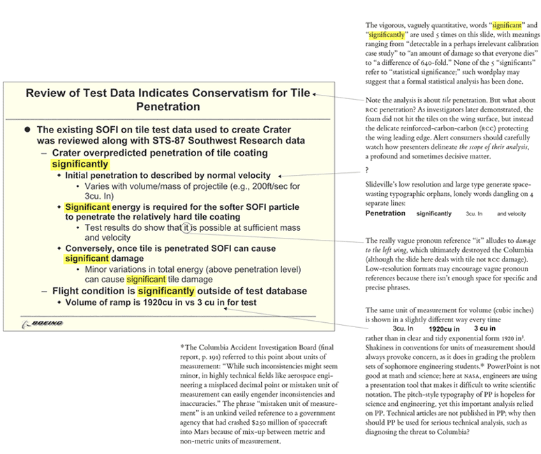
Below is the
Tufte analysis of the powerpoint slides used by the Debris
Assessment Team, which is also part of the official report:
again from
the report:
"As
information gets passed up an organization hierarchy, from
people who do analysis to mid-level managers to high-level
leadership, key explanations and supporting information is
filtered out. In this context, it is easy to understand how a
senior manager might read this PowerPoint slide and not realize
that it addresses a life-threatening situation."
"At many
points during its investigation, the Board was surprised to
receive similar presentation slides from NASA officials in place
of technical reports. The Board views the endemic use of
PowerPoint briefing slides instead of technical papers as an
illustration of the problematic methods of technical
communication at NASA."
It would be
another 2.5 years before the next shuttle launch.
There
is a nice Covid-19 dataset on GitHub from the NY Times (https://github.com/nytimes/covid-19-data),
and we are going to use that for one more R in Jupyter exercise
to look at visualizing that data for Illinois in charts as well
as on maps. You should start by starting up Jupyter with R as
before in class.
grab the appropriate map data
for Illinois and make sure it works
usa <- map_data("county")
il <- subset(usa, region == "illinois")
il$county = str_to_title(il$subregion)
#basic map with county boundaries and county names at the
centroid of the county
getLabelPoint <- # Returns a county-named list of label
points
function(county) {Polygon(county[c('long',
'lat')])@labpt}
centroids = by(il, il$county,
getLabelPoint) # Returns list
centroids2 <- do.call("rbind.data.frame", centroids) #
Convert to Data Frame
centroids2$county = rownames(centroids)
names(centroids2) <- c('clong', 'clat', "county")
#simple map with county borders and county names
ggplot() + geom_polygon(data = il, aes(x = long, y = lat, group
= group), fill = "white", color = "gray") +
coord_fixed(1.2) + geom_text(data = centroids2, aes(x =
clong, y = clat, label = county), color = "darkblue", size =
2.25) + theme_map()
read in the current Covid-19 data by county in the US - note
this command is slightly different than we used before with the
EV data to keep things happy with this file.
first take a look at the data
over time for Cook County
covidILCook <- subset(covidIL, county =="Cook")
ggplot(covidILCook, aes(x=newDate, y=cases)) +
geom_point(color="blue") + labs(title="Cases in Cook
County", x="Day", y = "Degrees F") + geom_line()
then take a look at the data
for a given day on a map of Illinois counties. Note that today()
can be a useful function to get today's date. Similarly
today()-1 is yesterday. Note that the data in the file may be a
day or two behind.
ggplot() + geom_polygon(data = ilCountyCovid, aes(x = long, y =
lat, group = group, fill = deaths), color = "black") +
coord_fixed(1.2) +
geom_text(data = centroids2, aes(x = clong, y
= clat, label = county), color = "black", size = 2.25) +
scale_fill_distiller(palette = "Blues", direction=1) +
labs(fill = "deaths") + theme_map()
but since there is a huge
variation between cook county and the rest of the state we can
also convert the data to log base 10 format and show that on the
map as is fairly common in Covid-19 visualizations.
ggplot() + geom_polygon(data = ilCountyCovid, aes(x = long, y =
lat, group = group, fill = logDeaths), color = "black") +
coord_fixed(1.2) +
geom_text(data = centroids2, aes(x = clong, y
= clat, label = county), color = "black", size = 2.25) +
scale_fill_distiller(palette = "Blues"
, direction=1) +
labs(fill = "deaths") + theme_map()
Note that there are some issues with some of the county names
being different in the two datasets (St. Clair, Mc Henry, etc.),
so first, fix that so the data is complete across the state.
Then make the legends more
readable and choose a color scheme that you think would work as
a visualization for most people.
Then create plots showing
what has happened over the last week in more detail.
And if you still have some
time, create some other visualizations that you think would be
useful for someone trying to understand Covid-19 in Illinois.
You should have a combination of cells with
explanatory text, code, and visualizations. When you are done
you can use the File Menu to Download As a number of different
formats. When you
are done print out your notebook and upload it to
Gradescope.
Note that there other similar
datasets on GitHub such as data for the US:
https://raw.githubusercontent.com/nytimes/covid-19-data/master/us-states.csv