(material from: Designing Visual Interfaces by Mullet and Sano)
need to achieve a balance in the relationsips between elements in the design
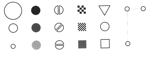
Scale - relative size or magnitude of a given design element in relation to other design elements - always relative
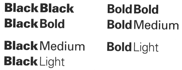
Contrast - noticeable differences along a common visual dimension (shape, size, color, position, orientation, movement)
Proportion - ratios of dimensions
Differentiation - contrast provides differentiation
Emphasis - scale and contrast are used to emphasize important elements of the design
Activity - scale and contrast move the viewer's eye through the composition in a predictable sequence
Interest - scale and contrast add visual interest
Visual contrasts established by manipulating perceptual qualities
the following are retinal variables - perceived immediately and effortlessly
Information represented in a visual display is characterized by
Nominal - categories
Associative variable does not affect the visibility of other dimensions (e.g. we can recognize hue regardless of orientation.) Variable is dissociative if visibility is significantly reduced for some values along that dimension (hard to determine hue of a very thin line or small dot)
Hue, Orientation, Texture, Shape, Position are associative
Size and Value are dissociative - they dominate perception and disrupt processing of other correlated dimensions
In selective perception viewer attempts to isolate all instances of a given category and perceptually group them into a single image. Task is to ignore everything but the target value on the dimension of interest - to see at a glance where all the targets are within the display
All the variables except shape are selective
Orientation is selective when represented by points or lines but not when represented by an area

In ordered perception the viewer must determine the relative ordering of values along a perceptual dimension. Given any two visual elements, a natural ordering must be clearly apparent so the element representing 'more' of the corresponding quality is immediately obvious
Texture is ordered to the extent that value covaries with the granularity of the texture
In quantitative perception the viewer must determine the amount of difference between two ordered values. The user does not need to refer to an index or key - the relative magnitudes must be immediately apparent
Visual variables differ substantially in length-
Principles:
Common Errors:
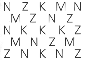
Insufficient contrast
Excessive contrast
Visual interference
Spatial tension
Overextension
Awkward dimensions
Techniques:
Establishing perceptual layers
Sharpening visual distinctions
Integrating figure and ground

Here is some informative text ... its all one paragraph, all the same font, the same font size:
ILLINOIS STATE FORECAST, NATIONAL WEATHER SERVICE CHICAGO IL, 430 PM CST TUE MAR 23 1999 TONIGHT...CLEAR NORTH...CLEARING CENTRAL...MOSTLY CLOUDY FAR SOUTH. LOWS FROM THE UPPER 20S FAR NORTHWEST TO NEAR 40 FAR SOUTH. WEDNESDAY...MOSTLY CLOUDY NORTHEAST...PARTLY SUNNY ELSEWHERE. HIGHS NEAR 40 NORTH...45 TO 50 CENTRAL AND NEAR 60 FAR SOUTH. WEDNESDAY NIGHT...PARTLY CLOUDY. LOWS IN THE 20S NORTH TO 30S SOUTH. THURSDAY...PARTLY OR MOSTLY SUNNY. HIGHS FROM NEAR 40 NORTH TO THE 5OS SOUTH. EXTENDED FORECAST... FRIDAY THROUGH SUNDAY...DRY WITH A SLOW WARMING TREND. LOWS FROM THE 20S NORTH TO 30S SOUTH FRIDAY...WARMING TO THE 30S NORTH TO 40S SOUTH SUNDAY. HIGHS FROM THE 40S NORTH TO 50S SOUTH FRIDAY...GRADUALLY WARMING TO THE MIDDLE 50S NORTH TO LOWER 60S SOUTH BY SUNDAY.
1 - Given a blank page, and without changing the font size, lay out this text on the page in a better format
2 - Given another blank page, and starting from the original paragraph above, and given the ability to change the font size, lay out this text on the page in a better format