Lecture
2
Visualization
Basics
Some basic
principles from Norman:
- Appropriateness
Principle – The visual representation should provide neither
more nor less information than that needed for the task at hand.
Additional information may be distracting and makes the task more
difficult.
- Naturalness Principle
– Experiential cognition is most effective when the properties of the
visual representation most closely match the information being
represented. New visual metaphors are only useful for representing
information when they match the user’s cognitive model of the
information; purely artificial visual metaphors can actually hinder
understanding.
Representations that make use of spatial and perceptual relationships
make more effective use of our brains. If these representations use
arbitrary symbols then we need to use mental transformations, mental
comparisons and other mental processes, forcing us to think
reflectively. In experiential cognition we perceive and react
efficiently. In reflective cognition we use our decision making skills.
- Matching Principle –
Representations of information are most effective when they match the
task to be performed by the user. Effective visual representations
should present affordances suggestive of the appropriate action.
Many analytical
reasoning tasks follow this process
- information gathering
- re-representation of the information in a form that aids analysis
- development of insight through the manipulation of this
representation
- creation of some knowledge product or direct action based on the
knowledge insight.
People
understand new information relative to what is already understood
Schneiderman:
“Overview first, zoom and filter, details on demand”
When information
is first presented, the user should be able to quickly orient
themselves.
When
a map program starts up it should start up with a view that makes it
obvious what the map is showing. Maybe that is using your current
location with your position clearly labelled, or maybe its a view the
country or city that you are accessing the map program from. The zoom
factor should also be appropriate enough - if you are initially zoomed
in too far you may not see enough landmarks to judge the scale of the
map.
Naturalness is an important design principle - better when the
properties of the representation match the properties of the thing
being represented. Representations that make use of spatial and
perceptual relationships make more effective use of our brains. If
these representations use arbitrary symbols then we need to use mental
transformations, mental comparisons and other mental processes, forcing
us to think reflectively. In experiential cognition we perceive and
react efficiently. In reflective cognition we use our decision making
skills.
The purpose of
visualization is to make it easy for the user to see the
patterns, the similarities, the differences in the data. This involves
both the variation in the data itself and the ability of a human being
to perceive variation.
In general you
do not want to let the computer use its default values.
Unless you are using a specific program for a specific field the
default values will not be right for your work.
Principles of
graphical excellence from Tufte
- well-designed presentation of interesting data - a matter of
substance, statistics and design
- complex ideas communicated with clarity, precision, and efficiency
- gives to the viewer the greatest number of ideas on the shortest
time with the least ink in the smallest space
- requires telling the truth about the data
- the representation of numbers, as physically measured on the
surface of the graphic itself, should be directly proportional to the
numerical quantities represented - the lie factor = size of effect
shown in graphic vs size of effect in data
- clear, detailed, and thorough labeling should be used to defeat
graphical distortion and ambiguity. Write out explanations of the data
on the graphic itself. Label important events in the data
- show data variation not design variation
- the number of information carrying dimensions depicted should not
exceed the number of dimensions in the data
- graphics must not quote data out of context
Significant
Digits
Your table should not show more accuracy than the accuracy of the data
collection. The computer will happily compute an average out to an
alarming number of digits, but if you only took measurements to one
decimal point then that's as far as you should show any derived
(average, min, max, median, etc) values. Programs may also reduce your
significant digits by eliminating trailing zeros (turning 4.20 into
4.2) so you will want to force all the data of the same type collected
in the same way to have the same number of significant digits.
Keep your audience in mind when creating a table. You will want to keep
all of your data in its highest resolution form, but when you present
it, present just the right amount of detail for the people you will be
speaking to. More technical people will want more detail; less
technical people will want the information at a higher level. Some
people want to see detailed trends, others just overall trends. Don't
reuse your charts for different audiences, create new ones targetted
towards the specific audience.
Text
You have several
general choices of font styles to use
- sans-serif (eg Helvetica, Arial, Verdana, Tahoma) good for
on-screen text - eg 72 dpi
- serif (eg Times, Georgia) - good for printed text - eg 150-300 dpi
- monospace - good for certain ocassions when you need exact
alignment of the text
- fantasy / cute / brush strokes / cursive / dripping blood - just
say no, unless you are creating a party invitation
Since
we are focusing on interactive computer-based visualizations, you
should start with a sans-serif font like Helvetica and only change it
if you have a very good reason.
all
visualizations should be well labeled with a meaningful title and an
explanatory legend
Colours
Avoid fully
saturated colours (e.g. 255 0 0 red.) Look around you, most
of the world is not bright primary colours. Pastels and colour mixtures
are easier on the eyes - color brewer etc
And some more
about colour:
- Use colour conservatively
- Limit the number of colours
- Colour can speed recognition, or hinder it depending on what is
coloured and how its coloured. Colour must support the task(s)
- Colour can help in grouping related items
- Colour can help in dense information displays
- Colour coding should appear with minimal user effort and be under
the user's control
- Keep colour blindness in mind (see above)
- Be consistent
- Think about what certain colours commonly mean / represent
- Be careful what colours are used together (eg bright red on
bright blue is really annoying)
It would be good
if the colours you choose also work for people who are colour blind.
8 percent of men
1 percent of
women
Are you colour
blind? You can check on wikipedia - http://en.wikipedia.org/wiki/Ishihara_color_test
Here is an image
from my backyard run through vischeck to show how it would look for 3
of the more common types of colour blindness.
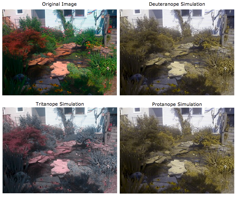
You
should at least make sure that you data doesnt blend together or
disappear for people who are colour blind The colours I chose in the
last couple graphs are OK, but an even better way is to avoid using
green in your charts since red/geen is the most common form of colour
blindness. Photoshop can be used to check images (View menu,
Proof Seup, Color Blindness), as can the tool at
http://colororacle.cartography.ch/
and couple good web sites to check your graphics are:
http://www.vischeck.com/vischeck/
and
http://colorfilter.wickline.org/
A really good
book to look at for an introduction to this sort of thing is Edward
Tufte's 'The Visual Display of Quantitative Information.'
Another good
reference is Robert Harris' Information Graphics - A Comprehensive
Illustrated Reference.
What should I do
when I get a new dataset
- look at the meta-data (ideally the rules for this dataset should
have been set up before the data was collected and written down
including the formats, bounds, null values)
- is the data for each attribute within bounds?
- are there values that are missing?
- are attributes that are supposed to be unique really unique?
- look at the data distribution of the good data - are there any
odd outliers?
Data mining By Jiawei Han, Micheline Kamber
Data Cleaning
- missing values
- values out of range
- inconsistent formats
Data Integration
- How can I combine different data sets from different sources
- different date formats ( eg Jan-10-90 or 01.10.90 or 10.01.90 or
01/10/1990 or ...)
- different units of measure (metric vs imperial, lat/lon vs UTM)
- different coverage areas (some data at neighbourhood level,
county level, state level, some collected per month and some per year)
Data
Transformation
- smoothing
- emphasizes longer trends over shorter duration changes
- generalization
- replaces detailed concept with a general one (eg for each data value,
replace a zip code with a state name, or a specific age with an age
range 20-30)
- normalization
- depending how the data will be visualized you may need to transform
it to a given range (eg 0 .0 to 1.0)
- aggregation
- combines / summarizes data (eg add up all data for M, T, W, Th, F and
store the weekly total, or the monthly total, or the yearly total, or
average the data for all zip codes in a state and store the state
average)
aggregation
leads us into the more general concept of data reduction
Miles and
Huberman (1994):
Data
reduction is not something separate from analysis. It is part of
analysis. The researcher’s decisions—which data chunks to code and
which to pull out, which evolving story to tell—are all analytic
choices. Data reduction is a form of analysis that sharpens, sorts,
focuses, discards, and organizes data in such a way that “final”
conclusions can be drawn and verified.
Data Reduction -
gives you a reduced dataset that gives you similar analytical results
- reduce the number of dimensions
- atribute
subset selection - one attribute (eg age) may be derived from
another or directly correlated to another, or might be irrelevant in
the work you are doing so those attributes can be removed
- data
cube aggregation - if you think of all the data you collected as
forming a multi-dimensional cube which each attribute being an edge of
the cube then you can collapse various dimensions down by aggregating
the values (eg the example above taking data for each day of the week
and storing only the weekly total)
- dimensionality
reduction - encoding used to reduce dataset size - may be lossy
or lossless - eg using principal component analysis, wavelets, math
increases rapidly here.
- reduce the amount of collected/generated data
- replace data by a model that generates the data values,
- clustering (eg replace all of the attribute values collected
between depths 10 and 15 wtih the average of those attribute values)
- sampling (keep every nth value, or one random value within each
cluster)
Provenance
data moves through several forms and filters on its way to being
visualized and analysed. Its important to keep track of who has done
what to the data at each step so the validitiy of the final prouct can
be ascertained, and if any issues arrise with the original data
collection or the intermediate steps then its easy to find which data
products are affected.
You wouldn't
just grab data off the web and assume that its correct, would you?
A nice overview
is given in http://www.cs.indiana.edu/pub/techreports/TR618.pdf
Visual
Analytics
The
bible of the field is James J. Thomas and Kristin A. Cook. Illuminating
the Path: The Research and Development Agenda for Visual Analytics.
IEEE Computer Society, 2005. ISBN: 0-7695-2323-4. [Available online as
a free PDF.]
A much shorter overview whitepaper from the University of Konstanz:
http://infovis.uni-konstanz.de/papers/2009/edbs2008.pdf
"Visual Analytics is the science of analytical reasoning facilitated by
interactive visual interfaces. People use visual analytics tools and
techniques to synthesize information and derive insight from massive,
dynamic, ambiguous, and often conflicting data, provide timely,
defensible, and understandable assesments; and communicate assesment
effectively for action. The overall goal is to detect the expected and
discover the unexpected. "
The goal of visual analytics is to facilitate this analytical reasoning
process through the creation of software that maximizes human capacity
to perceive, understand, and reason about complex and dynamic data and
situations.
It must build upon an understanding of the reasoning process, as well
as an understanding of underlying cognitive and perceptual principles,
to provide mission-appropriate interactions that allow analysts to have
a true discourse with their information. The goal is to facilitate
high-quality human judgment with a limited investment of the analysts’
time.
Visual analytics
is a multidisciplinary field that includes the following focus areas:
- Data representations and transformations that convert all types
of conflicting and dynamic data in ways that support visualization and
analysis
- Visual representations and interaction techniques that take
advantage of the human eye’s broad bandwidth pathway into the mind to
allow users to see, explore, and understand large amounts of
information at once
- Analytical reasoning techniques that enable users to obtain deep
insights that directly support assessment, planning, and decision making
- Techniques to support production, presentation, and dissemination
of the results of an analysis to communicate
- An analysis session is a dialogue between the analyst and the
data where the visual representation is the interface into the data.
The
use of visual representations and interactions to accelerate rapid
insight into complex data is what distinguishes visual analytics
software from other types of analytical tools. Visual representations
translate data into a visible form that highlights important features,
including commonalities and anomalies. These visual representations
make it easy for users to perceive salient aspects of their data
quickly. Augmenting the cognitive reasoning process with perceptual
reasoning through visual representations permits the analytical
reasoning process to become faster and more focused.
Visual representations invite the user to explore his or her data. This
exploration requires that the user be able to interact with the data to
understand trends and anomalies, isolate and reorganize information as
appropriate, and engage in the analytical reasoning process. It is
through these interactions that the analyst achieves insight.
Analysts may be
asked to perform several different types of tasks:
- Assess – Understand the current world around them and explain the
past.
- Forecast – Estimate future capabilities, threats,
vulnerabilities, and opportunities.
- Develop Options – Evaluate multiple reactions to potential events
and assess their effectiveness and implications.
Steps in the
Analytical Process
- Determine how to address the issue that has been posed, what
resources to use, and how to allocate time to various parts of the
process to meet deadlines.
- Gather information containing the relevant evidence and become
familiar with it, and incorporate it with the knowledge he or she
already has.
- Generate multiple candidate hypotheses.
- Evaluate these alternative explanations in light of evidence and
assumptions to reach a judgment about the most likely explanations or
outcomes.
- Consider alternative explanations that were not previously
considered.
- Create reports, presentations, or other products that summarize
the analytical judgments. These products summarize the judgments made
and the supporting reasoning that was developed, and the uncertainties
that remain during the analytical process. These products can then be
shared with others.
Analysts must deal with data that is dynamic, incomplete, often
deceptive, and evolving and they often must come to conclusions within
a limited period of time.
Analysis products are expected to clearly communicate the assessment or
forecast, the evidence on which it is based, knowledge gaps or
unknowns, the analyst’s degree of certainty in the judgment, and any
significant alternatives and their indicators.
Visual analytics
systems must capture this information and facilitate its presentation
in ways that meet the needs of the recipient of the information.
Coming
Next
Time
VTK
last
revision
1/2/11