Lecture
7
Visualization
reports
from
the
00s
- Part I
still editing
these ...
NIH/NSF
Visualization
Research
Challenges
- January 2006
 available in pdf
format here
available in pdf
format here
20 years since
the last report - what's changed? what's the same?
Visualization is
fundamental to understanding models of complex phenomena. Visualization
reduces and refines data streams rapidly and economically, thus
enabling us to winnow huge volumes of data.
Although
well-designed visualizations have the power to help people enormously,
naive attempts to create
visualizations typically lead to “reinventing
the wheel” at best, and all too often result in poorly designed
visualizations that are ineffective or even actively misleading.
Designing effective visualizations is a complex process that requires a
sophisticated understanding of human information processing
capabilities, both visual and cognitive, and a solid grounding in the
considerable body of work that has already been introduced in the
visualization field. Further research in visualization, and the
technology transfer of effective visualization methodologies into the
working practice of medicine, science, engineering, and business, will
be critical in handling the ongoing information explosion. The insights
provided by visualization will help specialists discover or create new
theories, techniques, and methods, and improve the daily lives of the
general public.
While
visualization is itself a discipline, advances in visualization lead
inevitably to advances in other disciplines. Just as knowledge of
mathematics and statistics has become indispensable in subjects as
diverse as the traditional sciences, economics, security, medicine,
sociology, and public policy, so too is visualization becoming
indispensable in enabling researchers in other fields to achieve their
goals. Like statistics, visualization is concerned with the
analysis
and interpretation of information, both quantitative and qualitative,
and with the presentation of data in a way which conveys their salient
features most clearly. Both fields develop, understand, and abstract
data analytic ideas and package them in the form of techniques,
algorithms, and software for a multitude of application areas.
People are
biologically equipped to make spatial inferences and decisions, and
experience refines their ability to do so. Visualizations can bootstrap
this facility metaphorically, by mapping elements and spatial relations
in the abstract domain onto elements and relations in a concrete
visualization. Through such maps, the human ability to make
spatial
inferences can be transferred to abstract domains. However, human
information processing capabilities, both visual and cognitive, are
limited and systematically biased. Effective visualizations must take
these facts into account, selecting and highlighting essential
information, eliminating distracting clutter, and conveying ideas that
are not inherently visual, such as transformations or causality,
through visual channels. Although there are tools and methods for
designing effective visualizations, too many naive designers fail to
use them, and their failure results in poor visualizations.
While many areas
of computer science aim to replace human judgment with automation,
visualization systems are explicitly designed not to replace the human
but to keep the human in the loop by extending human capabilities. The
user
is
an active participant, interaction is common and flexible, and
the process of exploration using visual display and interaction happens
in many different ways throughout a complex process.
The invention of
abstractions, models, and mechanisms to explain the world around us is
an inherently human endeavor. Ultimately, the practice of visualization
should assist in the generation, evaluation, and exploration of
hypotheses about the information under study, allowing the rapid
consideration and possible rejection of old hypotheses and facilitating
the creation of new hypotheses. Visualization leverages a
combination
of imagination, computer tools, and interactive interfaces to extend
the power of human insight to aid in the discovery and synthesis of
truth.
During the 17
years since the last NSF Visualization Report, the world has
experienced an “information big bang,” an exponential explosion of
data. New data produced in the two years since 2003 exceeds the
information contained in all previously created documents. Of all this
new data produced since 2003, more than 90% takes digital form, vastly
exceeding information produced in paper and film forms. This
growth in
data does not necessarily mean a corresponding proportional increase in
useful information. Raw data is, in and of itself, of questionable
value. We are continually challenged to make sense of the enormous
growth and onslaught of information and use it in effective and
efficient ways. The 1971 observations of Nobel Prize winning economist,
Herbert Simon, are more true now than ever:
What
information
consumes
is rather obvious: it consumes the attention of its
recipients. Hence a wealth of information creates a poverty of
attention, and a need to allocate that attention efficiently among the
overabundance of information sources that might consume it.
Among the
greatest scientific challenges of the 21st century, then, is to
effectively understand and make use of the vast amount of information
being produced. Our primary problem is no longer acquiring sufficient
information, but rather making use of it. By its very nature,
visualization addresses the challenges created by such excess – too
many data points, too many variables, too many timesteps, and too many
potential explanations. Visualization harnesses the human perceptual
and cognitive systems to tackle this abundance. Thus, as we work to
tame the accelerating information explosion and employ it to advance
scientific, biomedical, and engineering research, defense and national
security, and industrial innovation, visualization will be among our
most important tools.
Moving
Beyond Moore’s Law
Loosely interpreted, Moore’s Law is now taken to mean that processing
power will double every couple of years without impact on cost. The
beauty of Moore’s Law is that certain problems will solve themselves if
we just wait. Many extremely important areas of visualization research
tackle problems not governed by Moore’s law. Advances in these areas
can yield new capabilities, new visions, new applications, and a firmer
theoretical basis for visualization research and practice.
Collaborating
with
Application Domains
To achieve greater penetration of visualization into application
domains we must better integrate visualization capabilities with the
requirements and environments of these domains. To achieve this
integration, we must allow
application goals, domain knowledge, and
domain-specific conventions and metaphors to shape visualization
methods. Visualization methods must address the characteristics of
real, rather than ideal, data, addressing among others the challenges
of heterogeneity, change over time, error and uncertainty, very large
scale, and data provenance.
Integrating
with
Other Methodologies
Visualization is rarely a stand-alone process: visualization is often
necessary but not sufficient for solving problems. Visualization tools
and methods should provide tighter integration with other analytic
tools and techniques, such as statistics, data mining, and image
processing, in order to facilitate analysis from both qualitative and
quantitative perspectives. The newly-coined term Visual Analytics is
a good example of an explicitly cross-disciplinary approach.
Examining
Why and How Visualizations Work
Human perceptual and cognitive capacities are largely fixed, not
subject to Moore’s Law. Even our understanding of these capacities
grows slowly rather than doubling in a matter of years. Addressing the
human element in visualization may require not simply making the system
faster, but rather making the system different in order to better
leverage human characteristics, strengths, and limitations. To
this
end, visualization research must actively seek to identify perceptual
and cognitive influences on visualization effectiveness in order for
visual displays to best augment human reasoning. Many current design
principles of visualization are based on the century of work
characterizing human psychophysical responses to low-level visual
stimuli. We would benefit immensely from a more thorough understanding
of higher level phenomena such as spatial memory and environmental
cognition. We can furthermore distinguish between the noun
visualization, which refers to a display showing visual information,
and the verb to visualize, which refers to the process of how a human
uses that display. We need to identify more accurately when, why, and
how visualization provides insight to enable analytic thinking and
decision making in a world of changing data sources, input and display
devices, and user needs.
Designing Interaction Research in new interaction techniques will allow
users to interactively manipulate and explore data and extract meaning
from it. Fluid interaction
requires that we create user interfaces that
are less visible to the user, create fewer disruptive distractions, and
allow faster interaction without sacrificing robustness. In addition to
developing novel interaction metaphors, future visualization interfaces
will need to respond to rapid innovation in visual display technology
that is resulting in a range of hardware devices quite different from
the current standard, including high resolution and lightweight
projectors, flat panel displays, and touch-sensitive display surfaces.
Haptic and tactile devices for both input and output are becoming
commercially available, along with embedded and wireless technologies
that make computing power ubiquitous. The challenge will be to
characterize the strengths and weaknesses of these new kinds of
hardware when they are used to support visualization for both
single-user and collaborative systems.
Determining
Success
As with all computer disciplines, visualization occasionally makes
ground-breaking and innovative advances that provide obvious advantages
and orders of magnitudes of improvement over previous techniques. More
often, however, we must
quantify advances and measure improvement
through benchmarks and carefully designed evaluation studies.
Evaluation allows a researcher to answer the question “Did this
technique actually help human users solve their targeted problems?” or
“How much does this new approach improve the confidence or accuracy of
human insight?” To
effectively answer these questions, a visualization
researcher must have an active connection with a domain researcher with
a driving problem, providing context for the measured improvements. The
very act of measuring the performance and value of a visualization
helps to guide the field and help it grow.
The field of visualization has unique evaluation challenges. While we
can quantitatively measure the time and memory performance of an
algorithm, such metrics do not shed light on the ultimate measure:
human insight gained by computation or visualization.
We do have some methods for determining whether or not a visualization
tool has helped a person solve a problem. A quantitative user study
performed in a formal laboratory setting can measure the performance of
users on an abstracted task using metrics such as task completion times
or error rates. The human-computer interaction and psychology
communities teach sound study design and statistical analysis in order
to ensure good methodologies and accurate results.
However, there are also many ways to qualitatively evaluate systems.
Anecdotal evidence from satisfied real-world users that a visualization
system is helpful can be useful in demonstrating that the system has
succeeded in its design goal. These anecdotes include accounts of
“eureka moments” in which something previously unknown was discovered.
The size of the user community can also demonstrate a system’s
usefulness, because voluntary adoption reflects a judgment from the
users that a visualization tool is effective. Indeed, a powerful
measure of success is provided when visualization tools become so
pervasively deployed in an application domain that their use is
considered unremarkable. Qualitative user studies, ranging from
ethnographic analysis of target user work practices to longitudinal
field studies to informal usability evaluation of a prototype system,
also play an important role in both design and evaluation.
Finally, an analysis that
relates design choices to a conceptual
framework is a powerful evaluation method. Measuring the
effectiveness
of the design of a visualization requires the use of case studies, in
which design choices are discussed and justified in the context of the
theoretical foundations of the research field. The outgrowth of these
studies is the ontological organization of visualization itself,
organizing the very structure, utility, and expressiveness of visual
tools along guidelines and design principles. The resulting frameworks
help us move beyond simply asking whether something helps by offering
tools to answer questions of why and how it helps.
Too often, visualization is considered the last step of a research
project, in which the visualization specialist is engaged to present
the results of an experiment already completed. However, visualization
can help to frame questions, to guide an investigation, and to develop
intuitions and insight about the problem under study. In order to
foster these capabilities and empower the field of visualization as an
equal partner with domain experts in the exploration of science and
society, we need to encourage the formalization of visualization design
and the rigorous development of evaluation metrics. When improved
formalizations and quantitative performance metrics are established for
visualization, the field will more effectively assist research in
almost all areas of human endeavor.
Supporting
Repositories
and
Open Standards
One of the basic requirements of science is that experiments be
repeatable. For visualization, this requirement entails sharing data,
models, and tasks to verify and benchmark new algorithms and
techniques, comparing them to the results of previous work.
Many of the arguments for open source software also hold for open
science; that is, making the fruits of publicly funded science
available to the community.
Open
data and task repositories are
critical for continued progress in visualization. However, the
difficulty is that visualization practitioners are typically not
themselves the primary source of the data. We must depend on the
willingness of those who generate the data to share it. Thus, we can
and must be advocates for data sharing whenever possible. The
visualization community must consider this advocacy, and the curation
of visualization-oriented data and task repositories, as part of our
own contribution to open science.
Designing and building systems that solve real-world problems is the
best way to make significant progress in refining and adding rigor to
both the techniques and the theoretical foundations of visualization.
The iterative process of science is to make observations, construct
theories to analyze and explain them, and continue the cycle by using
the theory to guide the next set of observations.
In visualization, we
must build a working system before we can gather observations of its
use. Building systems for real users with real tasks allows
researchers
to gather valid data and evaluate whether and how visualization
techniques are effective for the intended task. These observations and
explanations grounded in specific techniques create a foundation from
which we can draw general theoretical conclusions about visualization.
Another advantage of using
real datasets is that researchers are then
driven to create robust and scalable algorithms. Many visualization
algorithms that work well for “toy” datasets do not scale to the large
or noisy datasets of interest to real users.
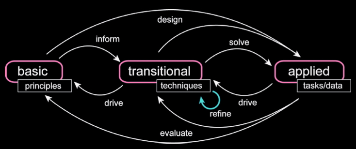
(transitional (translational) research is a term that comes from the
behavioural sciences -
http://en.wikipedia.org/wiki/Translational_research - with the goal of
reducing the barriers between basic research (long term, focused on
large changes) and applied research (short term, incremental
improvements) through collaboration of multi-disciplinary teams.)
We must close the loop, accelerating the maturation of basic research
into applied research. Visualization already functions as a crossroads
connecting foundation research with applications, integrating the
capacity of computational techniques to simulate and model natural and
societal phenomena and to predict and report results. However, we must
refine the precision with which we balance the resources in research
support, working to promote visualization solutions to realworld
problems by providing end-to-end approaches for growing new science
into practical answers to hard and important questions.
National
Infrastructure
One of the key
emphases of the 1987 NSF Report was the need for a national
infrastructure to enable visualization research and application. Many
of the specific needs discussed have been satisfied in the intervening
years, but others have remained a challenge.
Many of the
hardware concerns from the original NSF report have been allayed by the
passage of time and Moore’s Law. Processors with what used to be
considered supercomputer-class power are now available in commodity
desktop PCs that cost a few thousand dollars. Graphics performance that
used to require special-purpose workstations costing tens or hundreds
of thousands of dollars is now available as a commodity graphics card
for desktop PCs that cost a few hundred dollars. The good news is that
fast and cheap hardware aimed at the business and entertainment mass
markets allows unprecedented access to computational and graphics power
for visualization, a boon for both visualization researchers and end
users. The flexibility of the latest generation of programmable
graphics pipelines on these cards has sparked an explosion of
sophisticated rendering techniques that are feasible in real time for
the first time, which also benefits visualization users by providing
real-time interaction when exploring large datasets.
In contrast,
display technology
improvements have historically lagged far behind the
Moore’s Law curve. In the past 20 years, cathode ray tube (CRT)
displays have little more than doubled in physical display size and
resolution and have retained the same weight and form factor. In the
past, our ability to design user interfaces has been constrained by
fact that a monitor is a relatively heavy and expensive object.
However, recent
breakthroughs in flat panel and projector technology
have broken the strangle-hold of the CRT. The combination of low cost,
high resolution, and freedom from the weight and bulk constraints of
CRTs will lead to an explosion of computer-driven displays in many new
contexts, far beyond simply replacing the bulky CRT on a user’s
desk
with a sleek flat panel display that has a smaller footprint.
Pixels are
currently a scarce resource. The
primary limitation in interactive
visualization interfaces is the number of available pixels: we are
pixel-bound, not CPU-bound or even render-bound. High-resolution
displays will allow us to investigate new and exciting parts of the
interface design space as displays approach the resolution of paper.
Large wall-sized displays
with a resolution of dozens or even hundreds
of megapixels can be created by tiling the output of many projectors.
Although active surfaces will still be relatively expensive in the near
term, a longer-term vision is that gigapixel displays will eventually
be as cheap, lightweight, and ubiquitous as wallpaper.
Physically large
displays that encompass the entire field of view of an observer allow
applications that use peripheral vision as well as the foveal vision
that we use with medium-sized desktop displays. Small gadget displays
will have the one megapixel resolution that we currently associate with
desktop displays. Small handhelds have high availability because they
can be carried around, and when networked can be used as control panels
for a shared large display.
Networking
As of 2005, we
have reaped vast benefits from the expansion and commoditization of the
Internet. However, as the sizes of data sets continue to grow, it is
still difficult, and sometimes prohibitive, to move large-scale data
sets across even the fastest networks to visualize data locally.
As
such, there is a need for advances both in networking and in remote and
collaborative visualization algorithms, such as view dependent
algorithms, image based rendering, multiresolution techniques,
importance based methods, and adaptive resource aware algorithms.
Visualization
Software
The 1989
introduction of the AVS dataflow toolkit heralded the first generation
of general-purpose software for visualization. Other systems of that
generation include IBM’s DataExplorer, now the open-source OpenDX
system; IRIS Explorer from SGI and then NAG; and the University of
Wisconsin Vis5D/VisAD systems. The open-source VTK system
(http://www.vtk.org/) stands out as
the most widely used of the next generation of systems. Others
currently in use include ParaView (http://www.paraview.org/) ,Amira
(http://www.amira.com/), and the InfoVis Toolkit
(http://ivtk.sourceforge.net/) with
the continuing presence of OpenDX (http://www.opendx.org/) and AVS
(http://www.avs.com/software/soft_t/mpe.html). Many packages that focus
on
application-specific needs have been developed, including Ensight,
Fieldview, SCIRun, and ITK53.
The movement
known as open source is the current incarnation of an idea that has
been active for decades in the academic community, namely that there is
great value in providing free software. One of the new aspects of the
movement is formalizing the value of open source for industry as a
business model. We note that there is bidirectional technical transfer
with open-source software. In some cases, open-source government-funded
research prototypes later evolve into commercial products. In other
cases, commercial projects change to open source because the business
model is more appealing.
There is a
tradeoff between quickly creating a one-off prototype that suffices for
a research paper but is too brittle to be used by anybody but the
authors and devoting the time to create releasable code at the expense
of making progress on the next research project. One of the benefits
for researchers of releasing code to a user community is that
real-world use typically spawns new research challenges strongly tied
to real problems. Such ties are extremely important for our field as it
matures. One benefit of the
open-source model is that the user
community itself sometimes takes over some or all of the support
burden. Releasing software does not have to be a gargantuan task; often
people who find that a particular piece of research software closely
matches their needs are happy to use software that is less polished
than a commercial product.
The VTK system
began as an open-source initiative within the General Electric Global
Research division, and has rapidly moved into mainstream use in
universities, national laboratories, and industrial research labs
worldwide. It continues to accelerate development by providing reusable
software, relieving programmers from reinventing necessary
infrastructure. The spinoff company Kitware is built around an
open-source business model, where customers can pay for support and
customization while development of the free codebase continues.
Similarly, ITK was an NIH open-source software initiative intended to
support a worldwide community in image processing and data analysis. It
is designed to interface openly with visualization platforms such as
VTK and SCIRun. The University of Utah’s SCIRun visualization system
has also made the move to open-source infrastructure software to ease
its integration into public and private research.
Funding
- where is support for this research coming from
papers in IEEE Visualization Conference 1998 - 2004 cited support:
- 34% from
NSF (virtually all from CISE)
- 19% from
non-U.S. governments
- 18% from
industry
- 14% from
DOE
- 14% from
U.S. military sources (including NRO, ARO, DARPA, and ARDA)
- 8% from
NASA
- 7% from NIH
- 5% from
other sources (including other U.S. government agencies and private
foundations)
- 30% of
papers have no acknowledgment of financial support
papers in IEEE Information Visualization Symposium 1998 - 2004 cited
support:
- 23% from
industry
- 12% from
non-U.S. governments
- 10% from
NSF (virtually all from CISE)
- 9% from
U.S. military sources
- 6% from DOE
- 3% from NIH
- 1% from
NASA
- 3% from
other sources
- 41% of
papers have no acknowledgment of financial support
(industry figures include authors employed by in- dustry, even if no
explicit acknowledgment of support is given)
Coming
Next
Time
Visualization
reports
from
the
00s,
Part II
last
revision 1/31/11