Old
Final
Exams
Final Exam -
Spring 2009
Its all about me
...
In the past I've had
students collect their own data for the final exam and then conduct
investigations to answer some questions that I had, like "does the
refrigerator get warmer inside if you leave the door open?" or "where
are the rogue wireless networks in ERF?" or "what is the magnetic field
around a microwave oven?"
This year I
found myself asking questions about electricity / water / natural gas
usage at home. How much am I using? Have any of the improvements I've
put into place (CF lightbulbs, programmable thermostat, etc) made any
obvious difference or have they been outweighed by buying a bigger TV
and putting in a pond? At the same time I was also curious to know what
you could learn about a person from just their utility bills. I decided
to combine the 'green' topic and the 'cyber-stalking 101' topic
together into this final exam.
I've kept all my
old utility (electricity, natural gas, water) bills in a file cabinet
in the basement, but I've never actually looked at the numbers, so I
grabbed them and typed in the relevant information to create a table
containing 10 years of data on:
- Year
- Month
- Average
temperature (accoriding to the electric company)
- Electricity
Usage
(kWh / day)
- Natural
Gas Usage (Therms / day)
- Water Usage
(gallons / day)
The data is available
here: http://www.evl.uic.edu/aej/526/526finaldata.csv
Electricity is
typically billed once a month, but typically every other meter reading
is
an estimate. Water is typically billed every 2 to 3 months, and natural
gas every 1 to 2 months. This makes it harder to see short term trends,
but longer term trends should still be visible.
The temperature
data in the file comes from the electricity company. I'm not sure how
much I trust that data. You might want to get temperature data from
another source, and probably in addition to the average also look at
the
minimum and maximum.
You should start
by looking at data itself and do some simple plots in your favourite
spreadsheet / plotting program. There will be some obvious cyclical
patterns such as air conditioning driving up electricity usage
dramatically in the summer and the furnace driving up natural gas usage
dramatically in the winter.
Your job is to
look beyond the cyclical patterns for longer term trends and
aberrations that are hiding there, and see what changes in the real
world could have caused them. Some of these changes are related to hot
hot a summer was or how cold a winter was, others are related to human
behavior. This is where the cyber-stalking / privacy issues part of the
project comes in. If you have access to this utility data and can
filter out the repeating patterns, and the general environmental
changes, can you find interesting events or trends that tell you about
the people?
The goal here is to create a set of effective visualizations to aid in
your analysis and to back up any conclusions you draw.
- The house
stayed basically the same throughout the 10 years of data collection.
- The house uses
electricity to run the air conditioner for cooling, and to run the
blower on the furnace for heating
- The house uses
gas for heating and cooking, and drying laundry
I did some
measurements of my electricity usage last month in the spring:
- Electronic
gear (computers, plasma TV, videogame consoles) 6.5 kwH / day (yeh,
that's a lot)
- Cooking
& Cleaning 3.5 kWh / day
- Furnace
fan 3 kWh / day
- Pond in
winter 2 kWh / day
- Pond in
summer 4.5 kWh / day
- Space
heater in winter takes 1 kWh / day
In a common
house:
- taking a bath takes 50 gallons
- taking a shower takes 2 gallons per minute
- flushing a toilet takes 3 gallons
- a dishwaser uses 20 gallons
- a top loading clothes washing machine uses 60 gallons, a front
loading machine uses 30 gallons
This data should
allow you to break up the daily usage into components that can vary
over the months and years.
Here are some
relevant facts that should give you some things to look for. Many of
these I don't remember the dates for. Maybe you can come up with some
guesses as to when they happened.
- We replaced
our top loading clothes washing machine with a front loading machine
- We switched
the house over to CF bulbs
- I had an SGI
indy that was running all the time that I turned off. It was replaced
by a PC that ran all the time, which was turned off a couple years
later. Now all the machines are mac minis or laptops which take much
less power.
- There is only
one TV in the house but it was replaced/upgraded twice during those 10
years.
- We started using a
programmable thermostat to make the air-conditioning and heating less
aggressive when no-one was expected to be home
- We started
gardening aggressively which used more water. Later we started using
mulch and began using much less water for the plants
- We started a
400 gallon pond in 2000 and expanded it to 650 gallons in 2002. Ponds
require complete water changes at least a couple times a year. In 2002
we did many water changes as we had a bunch of sick fish in the pond -
this is really obvious in the water data.
- We put in a
new (more efficient) air conditioner
- We had a
couple people staying with us for 3 weeks.
You will very
likely need to look up some other reference material on the web about
water, gas, and electricity usage. I did. I also found that some sites
over-inflate the usage numbers by 50 to 100% compared to the numbers
that I was able to measure. I would recommend looking at a few
different sites to get a better feeling about what good average numbers
might be. Be sure to cite the websites that you use.
You can use
whatever software you want to extract the patterns in the data and to
visualize the results. Please document this work in your web page. The
web page should show visualizations of the data itself, and
visualizations of divergence from the norms. Show all the valuable
visualizations that you created and used to do your analysis work.
Task #1 -
document the repeating seasonal patterns and what affects those
patterns (e.g. temperature)
Task #2 - given
the results from task #1, document the long term trends and short term
variations in those patterns (e.g. given temperature readings and a
spreadsheet program, you should be able to work out expected values for
gas and electricity usage, and then any variation you see might suggest
a human cause.)
Task #3 - given
the results from task #2, try to make some hypothesis as to what human
activities caused those long term trends or short term variations.
This exam is
going out during the Project 3 presentations, and during that time
people will have the ability to ask questions in class about the data
to try and clarify any questions you have that would help your
analysis. I think I've given you all the relevant facts, but maybe I've
forgotten something. As you look at the data maybe you will find
something in a particualr month/year - ask me about it and I'll see if
I can go back through my records and find some event that may be
applicable.
Here are some of the dates that I have found:
June 2000 - Air conditioner replaced
July 2004 - New programmable thermostat installed
July 2006 - 2 week trip out of the country
Fall 2006 - Started using mulch and less water in the garden
2007 - Transition to compact fluorescent bulbs
March 2008 - Front loading washer repalces top loading washer
By the beginning
fo the final exam period each person should create a
web page of their results. Again as usual everyone should send
me a 320 x 240 jpg snapshot for the web.
There is no
software to turn in for this project, just a series of screen snapshots
(possibly from different pieces of software)
During the final
exam period itself each student will have 10 minutes to describe their
visualization work and their findings.
Final Exam -
Spring 2007
Visualizing the
Invisible
Since the final
exam period can get a bit monotonous if everyone is presenting exactly
the same thing, we are going to have a bit of variety in the final exam
work and visualizations. Half of the class will investigate sound
levels in EVL. Half the class with investigate electromagnetic fields
around various household appliances.
I will be supplying the probes for this activity.
Sound Levels in EVL
In this activity half of the class (5 people)
will work together to collect sound level data throughout the main
floor of the lab (i.e. the part that is on the second floor of ERF),
and then each person will visualize that data on their own. This data
will be collected on an irregular grid based on the various sound
levels you find, so more detail can be collected near areas of changing
sound levels; the floor tiles make a nice grid. There are lots of
machines in the lab that typically generate noise, and we have two
anechoic chambers where the audio levels drop below measurable levels,
so there is a range of levels in the lab. There are also issues of
sound levels at different heights in the lab, so the final datafile
generated should have x, y, z coordinates. Since those sound levels are
static, this group will also look at how those background sound levels
when all the phones in the lab ring. This group may also want to look
at the affect of the paper shredder, or the Xbox/wii/PS3, etc.
We have an existing map of EVL that was
generated during a previous version of the class where the students
mapped out wireless strength in the lab. That map can be used here.
As an aside, the anechoic chamber can also be used
to measure how loud your cell phone ring is, or how loud you can shout.
maps of evl from a previous class can be found at
http://www.evl.uic.edu/rlk/evl/index.html
E/M fields around common
appliances
In this activity half of the class (6 people)
will break into three groups of two, and each group will measure the
E/M field around a common household item to see what the field looks
like. This field will be measured on 3 axis (X, Y, Z for each
location.) By default the items to be measured are a microwave oven,
hair dryer, and CRT monitor but if there is something else interesting
that a group wants to measure that should be OK as well. The E/M field
will be measured on a more regular grid. Each person will then create
their own visualization based on the data.
Please do not microwave the sensor.
By the beginning fo the final exam period each person should create a
web page of their results including the source code and executable to
run their visualization as usual. Again as usual everyone should send
me a 320 x 240 jpg snapshot for the web.
In both cases, the various groups should get together ahead of time to
plan out the data collection. The audio should be collected either in
the evening or on the weekend. when people are not around The E/M data
could be collected during the day but it ma be easier during the
evening or weekend.
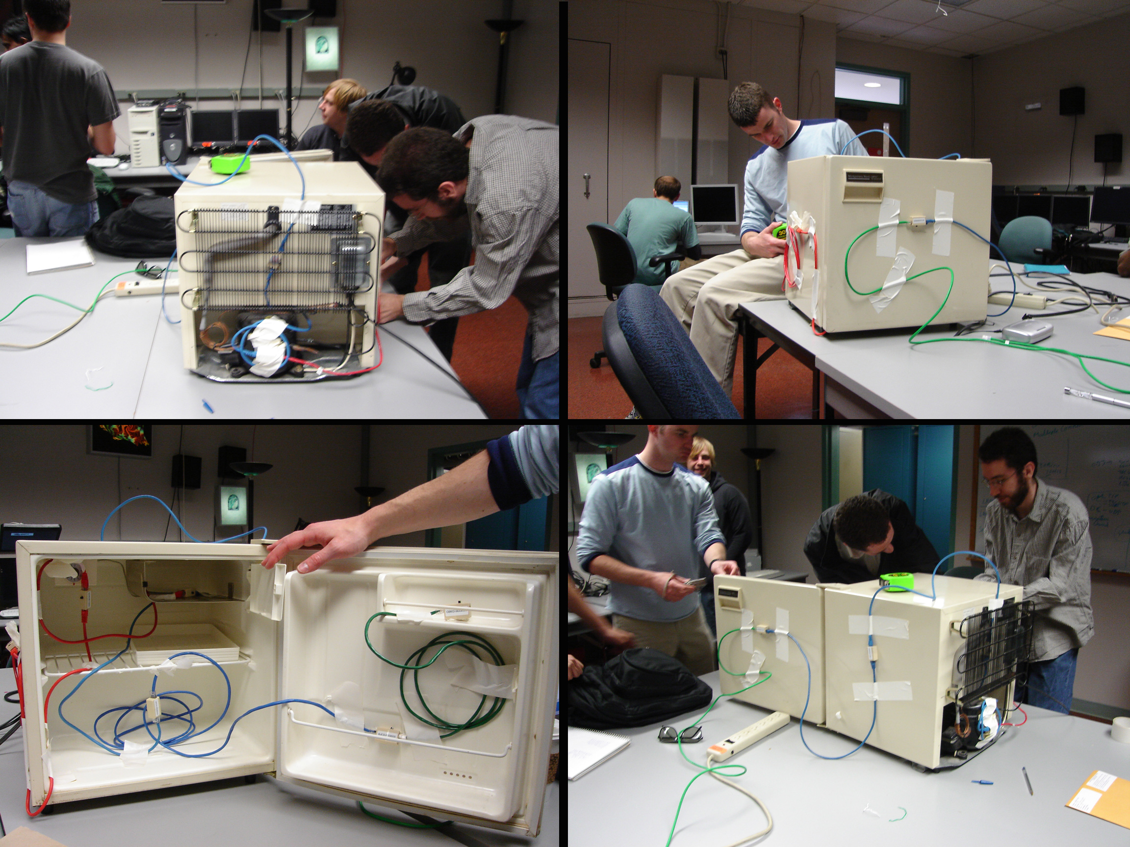
Final Exam -
Spring 2005
Andy's Fridge
One
thing
that you haven't dealt with so far is time varying data, so in
this final exam we will do another data collection and visualization
assignment on a smaller scale (both in time and space) - in this case
measuring the temperature in and around a refrigerator.
We
have
a set of 10 small 1-Wire temperature sensors that are connected
through ethernet cables and then attach to a computer through a USB
port. These have an advertised maximum cable run length of 300 meters
though we will be working in a much smaller volume. The sensors are
also rated to +/- 0.5 degrees C.
There
are
several places that sell these 1-wire temperature sensors, or you
can build them yourself. We bought ours through
http://www.pucebaboon.com/
There
is
some windows software (Version 4.00 beta 4) including an API that
works with these sensors at
http://www.maxim-ic.com/products/ibutton/software/tmex/index.cfm and I
have tried this out and it works for graphically viewing one sensor at
a time nicely.
There are also
linux based software at http://www.digitemp.com/software.shtml
One job for someone
in the class is to find or write a better piece of logging software for
the sensors to dump all of the data to a file. This should be pretty
easy under linux, or re-writing the java code under windows.
Another job for
someone is to do a test to see how fast the sensor responds to
temperature change, without hurting the sensor. For example taking the
sensor from a known cold temperature to a known hot temperature and
seeing how long it takes for the sensor to correctly register the
change. For this experiment the temperature should not change very
quickly, but its still good to know the limitations of the sensor.
Another job is to
decide where to place the sensors. We will investigate several things
in the data collection. First, how long does it take a room temperature
refrigerator to reach a steady state temperature inside. Second how
much heat is generated as a result of this. Finally, once the
refrigerator has reached a steady state, what is the effect of opening
the door and holding it open while you decide what you want to grab.
Was your mother right to tell you not to stand there with the door
open? Lets find out. A fridge is also nice for this kind of
visualization because part of it gets cold and part of it gets hot.
The default
refirgerator for this study (and you can feel free to suggest another
one you prefer) is my 20 year old Montgommery Ward compact dorm room
fridge. EVL also has a larger fridge with multiple compartments that
usually needs to be defrosted, so that may make a more interesting
visualization.
There should be
some sensors placed inside (say in the general cool area, and in the
small colder area, and some placed outside or on the surface. That way
some sensors will get colder, some hotter, and others stay the same.
As with the wireless
measurements all of the data will be shared with the entire class, and
then each person should do their own visualization of the data using
vtk.
The compact
refrigerator is pretty simple in design so you should be able to use
the basic vtk geometry primitives to create one.
- The use
should be able to interactively move time forward and backward in time
through the experiment conveniently
- The user
should be able to vary the colour map used.
- The user
should be able to see both the original data and an interpolated
space-filling version, so you will probably want to divide up the
experimental space into zones
During the final exam
period each person will give a short 8 minute presentation about their
solution, just as for the 3 class projects. Each person should also
create the typical project web page with source code and screen
snapshots.
Here are some photos taken during the data collection
Final
Exam
- Spring 2004
For
the
final exam you will revisit the work you have done already in the
class and create a step-by-step tutorial to highlight certain features
of vtk and help new users learn to program them.
You
can
choose either part of project 2 as a basis for your tutorial. That
is, you can choose isosurfaces or volume rendering for the topic.
This
html
(web or cdrom based) tutorial should start with the assumption
that the user has vtk correctly installed along with the language of
your choice (java, python, visual studio, tk, etc.) The user should
then start through a multipart tutorial that begins simply, and by the
end has the user with a functional version of that part of the
assignment. The entire tutorial should take the user an afternoon to
finish. The tutorial should be divided into sections and have headings,
and goals for each section.
The
tutorial
should provide:
- code that can be downloaded or copy and pasted and then run
successfully for each step
- links to necessary data files available on the web, or as a CDROM
with an html front end
- snapshots of what the code should do (movies if you are really
motivated)
Obviously
having
a lot of good comments in your code is part of this but you
should also extract and highlight important sections of your code and
describe what they do and what they can allow the user to do. The idea
here is to teach what the user can do with vtk, not just what your code
does. The code and the examples are the means, not the end on this
assignment.
Its
probably
a good idea to give options at various points in the tutorial
along with their results. If we do this we get this result, but if we
do this other thing we get that result and then instances where each
result may be useful. Highlighting any particularly sneaky wrong things
that people may think to do but should not do is also a good idea.
The
tutorial
should provide some simple user interfaces as well. They do
not have to be as complex as the ones from the project assignments but
you should not ignore user interfaces in your tutorial. The user should
be able to interact with the visualization. You may want to have very
simple interfaces at first and then talk more about interfaces at the
end of the tutorial, or you can add in new interface capabilities as
you go along.
Important
point
to note:
This
tutorial
should show your understanding of which vtk tools and filters
are used for doing what; and you should be able to present this
knowledge in a way that is valuable to a new user who has data to
visualize. For example, its not just saying that you should use filter
X before filter Y but rather what doing that sequence of filters will
allow the user to see in their dataset. Its not just that you 'could'
do this with vtk, but 'why would' you do this with vtk.
Also
note
that you can modify/improve the version of project 2 that you
turned in for this final exam.
During
the
final exam period each person will have 8-10 minutes to describe
their tutorial.
We
will
also have a contest where each of the students gets to vote for
the top 3 tutorial web sites from the class for some extra points. You
can't vote for your own, and along with your vote you also have to tell
me why you think these are the top 3.
last
revision 10/25/10