Project 3, CS 526: Allan Spale (aspale@evl.uic.edu)
Background
This program was written
using Python 2.1, VTK 4.2, and Tkinter (a Python
module that supports GUI widgets) and allows a user to visualize predefined
datasets of the Visible Woman. The
files for the project are simply project3.py in addition to having a
data named directory with the appropriately named text files and a maps
directory with the appropriately named files. These directories should be at the same
level as project3.py. To run the program, type the following:
python project3.py. Since Python is an interpreted language,
there is no need to compile; although there is an ability to compile a Python
script to decrease the startup time.
The program meets most of the basic requirements for displaying the
requested visualizations. Some
additional functionality was provided which will be described in the next
section.
Sources
The sources of information
used to create this code include the following:
·
Python in a Nutshell, ISBN 0596001886 (used source as guideline to
construct GUI classes)
·
VTK Book,
ISBN 1930934076
·
Websites
o
An Introduction to Tkinter
o
VTK Docs
o
Python Docs
·
VTK Tk/Tcl example code
·
Recommendations
and suggestions of other classmates
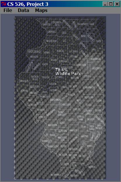
Usage
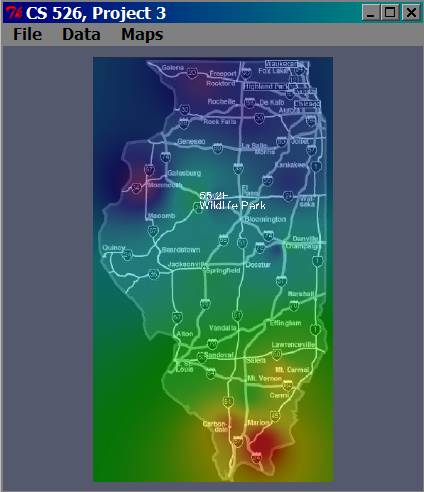
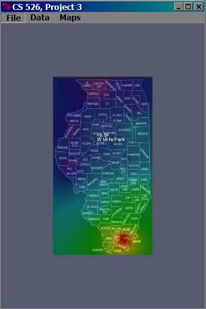
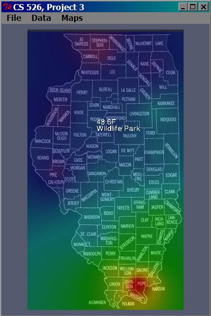
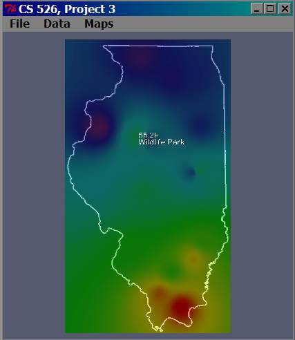
The default data that
appears is air temperature data for
Some problems include the
following. An attempt was made to
try to get the cities to appear as text actors with the appropriate data for
a visualization.
Unfortunately, only one city worked, but it gives an idea how this would
appear if all cities worked.
Additionally, there may be a clipping problem that occurs after some
combination of visualizations (although I am not sure at this time how to
reproduce this error). I recommend
zooming into the map initially so that this problem may go away (this seems to
work…not sure why). If switching
between data visualizations does cause clipping to occur, zoom out and rotate
around the y-axis until the map reappears.
Maps used in this assignment
were adapted from the following sources:
County map: http://www.censusfinder.com/mapil.htm
State border map: http://www.sws.uiuc.edu/warm/icnstationmap.asp
Road map: http://www.mrcusa.com/page4.htm
The menus are used in the
following manner:
·
File -->
Exit: Since the file is “hard coded”, the only option here is to quit the
program. To quit the program,
either close the “main window” (i.e. the one with the menu) or select Exit.
·
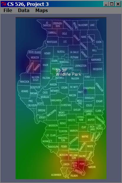
Data --> 4”
Soil Temperature: This is a colormap that displays the
data for the average 4” soil temperature for a particular date. The color for the lowest temperature is
purple, and the hottest temperature is red.The data
was normalized according to the date’s min and max values.
·
Data --> Air
Temperature: This is a colormap that displays the data
for the average air temperature for a particular date. The color for the lowest temperature is
purple, and the hottest temperature is red. The data was normalized according to the
date’s min and max values.
·
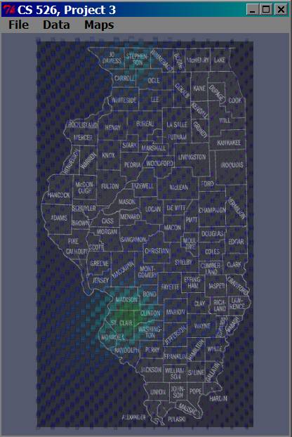
Data -->
Humidity: This visualization displays spherical glyphs that represent the data
for the average relative humidity for a particular date. The glyphs are evenly spaced. The spheres were chosen so as to create
the effect of a cloud. The sphere
is smaller and more opaque at lower humidities and
larger and more transparent at higher humidities. They are all the same color regardless
of value. The data was normalized
according to the date’s min and max values.
·
Data -->
Precipitation: This visualization displays “cube” glyphs that represent the data
for the total precipitation for a particular date. The glyphs are evenly spaced. The cubes were chosen so as to create
the effect of an elevation map. The
cube is smaller and closer to magenta at lower precipitation totals and taller
and more green at higher precipitation totals. The opaqueness of each glyph is the same
regardless of value. The data was
normalized according to the date’s min and max values.
·
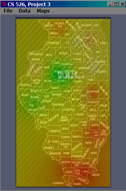
Data -->
Wind: This is a colormap and glyph visualization that
displays the data for the average wind direction and speed for a particular
date. The colormap represents the speed of the wind, while the glyphs
represent the speed of the wind.
The direction of the wind is assumed to be from the S at 0 degrees. This idea was directly mapped to the HSV
color wheel on page 39 of the VTK text.
As a result, S is red, north is cyan, west is bluish magenta, and east is
yellowish green. The sphere glyphs
represent speed. The dark, opaque,
small glyphs are low wind speed, while the large, less opaque, large glyphs are
higher wind speeds. The data was
normalized only according to the date’s min and max wind speed while the
directional data was not.
Design
There is a class that takes
care of all of the rendering. In
the constructor part of this class, all of the visualization pipeline parts are
created. Objects mapped to the
renderer are usually done in a way appropriate for the
visualization. Below is the contruction of the pipelines:
City Labels
vtkVectorText -> vtkPolyDataMapper
-> vtkFollower
Maps
vtkJPEGReader -> vtkDatasetMapper
-> vtkActor
Data
vtkPoints, vtkFloatArray -> vtkPolyData -> vtkShepardMethod
Colormap
vtkCubeSource OR vtkSphereSource ->
vtkGlyph3D
<data pipeline> -> vtkMaskPoints (used value of 40) ->
vtkGlyph3D
vtkGlyph3D, vtkLookupTable -> vtkPolyDataMapper -> vtkActor
Images
(not to scale)
Opening screenshot
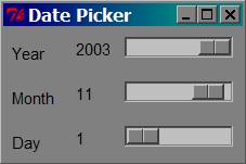
Date picker dialog
Air
temperature for
4”
soil temperature for
Humidity for
Precipitation for
Wind speed and direction for
Air
temperature for
Air
temperature for