|
Copyright © 2000 by Daniel D. McCracken
|
This is a test bed for our section on text in the chapter on color, of User Centered Web Site Design, by Rosalee Wolfe and myself, to be published by Prentice Hall. Or maybe parts of it will end up in the chapter on typography. Eventually there will be something like this on the book Web site, to illustrate the points made in the book. For now, I'm just trying a lot of stuff. The question of text color and its background is a major interface issue, for a variety of good and bad reasons.
Jump to 10 point tests. (You're here.) Jump to 12 point tests. Jump to white on black. Jump to hopeless red-green mixes. Jump to samples of backgrounds for white text on black background. Jump to combinations that differ in the blue component only. Jump to section of backgrounds for black text. Jump to patterned backgrounds. Dad, to show what can be done with natural light only. 8 point black on white. Can anybody at all read it? 10 point tests 10 point Times Roman on white. You see a lot of it. But usually in small doses, like on buttons or links. Web Design. Links. About Me. Home. 10 point Times Roman on white. You see a lot of it. But usually in small doses, like on buttons or links. Web Design. Links. About Me. Home. 10 point Times Roman on white. You see a lot of it. But usually in small doses, like on buttons or links. Web Design. Links. About Me. Home. 10 point Times Roman on white. You see a lot of it. But usually in small doses, like on buttons or links. Web Design. Links. About Me. Home. FF,0,0 10 point Times Roman on white. You see a lot of it. But usually in small doses, like on buttons or links. Web Design. Links. About Me. Home.0,FF,FF cyan 10 point Times Roman on white. You see a lot of it. But usually in small doses, like on buttons or links. Web Design. Links. About Me. Home. 0,FF,0 green 10 point Times Roman on white. You see a lot of it. But usually in small doses, like on buttons or links. Web Design. Links. About Me. Home. 10 point Times Roman on white. You see a lot of it. But usually in small doses, like on buttons or links. Web Design. Links. About Me. Home. 0,80,0 green 10 point Times Roman on white. You see a lot of it. But usually in small doses, like on buttons or links. Web Design. Links. About Me. Home. 80,0,0 readable, more or less, but why do it? 10 point Times Roman on white. You see a lot of it. But usually in small doses, like on buttons or links. Web Design. Links. About Me. Home. 80,80,80 gray. Dumbness, but I'll bet you could find it on some site. (This is black.) 10 point Times Roman on white. You see a lot of it. But usually in small doses, like on buttons or links. Web Design. Links. About Me. Home.66,66,66 = a web-safe gray. But why? (This is black.) 10 point Times Roman on white. You see a lot of it. But usually in small doses, like on buttons or links. Web Design. Links. About Me. Home. 99,99,99 = another web-safe gray. (This is black.)
I tell students that 12 point type is the smallest they should use routinely. Well, it's the only font size they should use routinely, except for headings and special circumstances like a site for the sight-impaired. But this is black on white. See what happens with white on black. Black = #000000 I tell students that 12 point type is the smallest they should use routinely. Well, it's the only font size they should use routinely, except for headings and special circumstances like a site for the sight-impaired. But this is black on white. See what happens with white on black. Red = #FF0000. I tell students that 12 point type is the smallest they should use routinely. Well, it's the only font size they should use routinely, except for headings and special circumstances like a site for the sight-impaired. But this is black on white. See what happens with white on black. Green = #00FF00 Ugh. Can you pick out the italicized word here? I tell students that 12 point type is the smallest they should use routinely. Well, it's the only font size they should use routinely, except for headings and special circumstances like a site for the sight-impaired. But this is black on white. See what happens with white on black. Blue #0000FF. Doesn't look too bad, but our visual acuity is least for blue, so this may tend to look blurry. (Rosalee: Help! Is that the reason?) I tell students that 12 point type is the smallest they should use routinely. Well, it's the only font size they should use routinely, except for headings and special circumstances like a site for the sight-impaired. But this is black on white. See what happens with white on black. Magenta #FF00FF. I can't see anything good to be said about this, except that it is neither red nor blue, so can be used to indicate a visited link. But links are usually a small amount of text, and in many cases people don't really have to read for meaning.
|
Now two terrible uglies. Bad for everybody; illegible for color-deprived people with red-green confusion. If you can't see anything in the next two panels, you are "color blind," as the term is used in everyday language. Even for a person with no impairment, these will hurt the eyes if used for an extended body of text. I don't think I've ever seen that, but with 300 million Web sites out there (give or take a hundred million), somebody has probably done it. |
| Now two terrible uglies. Bad for everybody; illegible for color-deprived people with red-green confusion. If you can't see anything in the next two panels, you are "color blind," as the term is used in everyday language. Even for a person with no impairment, these will hurt the eyes if used for an extended body of text. I don't think I've ever seen that, but with 300 million Web sites out there (give or take a hundred million), somebody has probably done it. |
| Now two terrible uglies. Bad for everybody; illegible for color-deprived people with red-green confusion. If you can't see anything in the next two panels, you are "color blind," as the term is used in everyday language. Even for a person with no impairment, these will hurt the eyes if used for an extended body of text. I don't think I've ever seen that, but with 300 million Web sites out there (give or take a hundred million), somebody has probably done it. |
| And that was 12 point type. The rest, which you almost certainly can't read, is 10 point. Now two terrible uglies. Bad for everybody; illegible for color-deprived people with red-green confusion. If you can't see anything in the next two panels, you are "color blind," as the term is used in everyday language. Even for a person with no impairment, these will hurt the eyes if used for an extended body of text. I don't think I've ever seen that, but with 300 million Web sites out there (give or take a hundred million), somebody has probably done it. |
| Well, let's end on a bang: 8
point centered italic green on red. Don't hurt your eyes trying to read
it!
Now two terrible
uglies. |
Here are six other nasty color combinations.
Since you probably can't read the text, here is what it says.
"If you go to the Custom Colors dialog of any Microsoft Office product and specify fully saturated red, you will be told that the luminance (brightness) is 128. Ditto for fully saturated green and blue. But forgetting all the technical talk, the yellow will look brighter than the red, which will look brighter than the blue."This means that two colors that differ only in their blue component will not look very different, and will therefore be a terrible choice for text color and background color."
Anybody want to bet that we can't find at least one of these combinations somewhere on the World Wide Web?
| If you go to the Custom Colors dialog
of any Microsoft Office product and specify fully saturated red, you will
be told that the luminance (brightness) is 128. Ditto for fully saturated
green and blue. But forgetting all the technical talk, the yellow will
look brighter than the red, which will look brighter than the
blue.
This means that two colors that differ only in their blue component will not look very different, and will therefore be a terrible choice for text color and background color. |
| This is yellow on white. Bad. |
| If you go to the Custom Colors dialog
of any Microsoft Office product and specify fully saturated red, you will
be told that the luminance (brightness) is 128. Ditto for fully saturated
green and blue. But forgetting all the technical talk, the yellow will
look brighter than the red, which will look brighter than the
blue.
This means that two colors that differ only in their blue component will not look very different, and will therefore be a terrible choice for text color and background color. |
| This is white on yellow. Really bad. |
| If you go to the Custom Colors dialog
of any Microsoft Office product and specify fully saturated red, you will
be told that the luminance (brightness) is 128. Ditto for fully saturated
green and blue. But forgetting all the technical talk, the yellow will
look brighter than the red, which will look brighter than the
blue.
This means that two colors that differ only in their blue component will not look very different, and will therefore be a terrible choice for text color and background color. |
| This is cyan on green. Very bad. |
| If you go to the Custom Colors dialog
of any Microsoft Office product and specify fully saturated red, you will
be told that the luminance (brightness) is 128. Ditto for fully saturated
green and blue. But forgetting all the technical talk, the yellow will
look brighter than the red, which will look brighter than the
blue.
This means that two colors that differ only in their blue component will not look very different, and will therefore be a terrible choice for text color and background color. |
| This is green on cyan. Just barely readable. |
| If you go to the Custom Colors dialog
of any Microsoft Office product and specify fully saturated red, you will
be told that the luminance (brightness) is 128. Ditto for fully saturated
green and blue. But forgetting all the technical talk, the yellow will
look brighter than the red, which will look brighter than the
blue.
This means that two colors that differ only in their blue component will not look very different, and will therefore be a terrible choice for text color and background color. |
| This is red on magenta. Not good, but more slightly readable than the others. |
| If you go to the Custom
Colors dialog of any Microsoft Office product and specify fully saturated
red, you will be told that the luminance (brightness) is 128. Ditto for
fully saturated green and blue. But forgetting all the technical talk, the
yellow will look brighter than the red, which will look brighter than the
blue.
This means that two colors that differ only in their blue component will not look very different, and will therefore be a terrible choice for text color and background color. |
| This is magenta on red. Don't do it. (And I have seen this.) |
Background colors for black text I'm putting text and graphics on various colored backgrounds. The primary issue here is legibility of the text, but a non-white background generally makes colors and even black-and-white photographs look better, too. NOTE: This is a sampling only. Assuming you don't require Web-safe colors, a great many other light tones work nicely as backgrounds for text. And if you go to hybrid colors, the possibilities are essentially endless. See Section 4.x of the text, although a complete coverage isn't possible in this book. All of the photographs are by or of me, with the obvious exception of the picture of my mother.
|
|
| This background
color is a light-medium gray, 230/230/230 = #E6E6E6. It is clearly
distinguishable from white. A possible choice, if you just want to make
reading a little easier on the eyes. But test your choice, on different
monitors and on the Mac. (Spoken from Windows, obviously.)
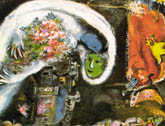
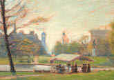
Now here is some random text, just to give you a better chance to judge legibility and effect. RGB stands for Red/Green/Blue, the additive primaries. An artist would just stare at you: the artist's primaries are red, blue, and yellow. The painting is "Woman with a Blue Face," by Marc Chagall. The picture was taken in Bear Mountain State Park, New York. |
 |
 |
| This background color is a
medium gray, 204/204/204 = #AAAAAA. It is at the lower edge of what
you would want to do.
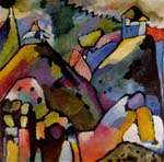
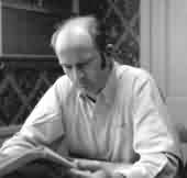
Now here is some random text, just to give you a better chance to judge legibility and effect. RGB stands for Red/Green/Blue, the additive primaries. An artist would just stare at you: the artist's primaries are red, blue, and yellow. The painting is "Improvisation 9," by Wassily Kandinsky. The photograph is "Dan McCracken, Self Portrait, 1946." But see the alt text. (Hold the pointer over the picture for a couple of seconds.) |
 |
 |
| This background color is
pink, 250/240/240 = #FAF0F0. It's a bit easier on the eyes than
white, but not by much. See the slightly darker versions below.
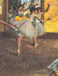
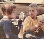
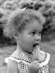
The painting is "Ballet Class," by Degas. Note the attentive audience in the foreground. This picture of my daughter Cindy and a friend was taken in the mid-60s. We used to call her "Poker Face." |
 |
 |
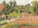
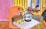
| This background color is a
light green, 240/250/240 = #F0FAF0. About the same level as the blue
above.
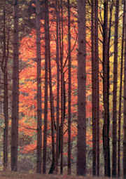
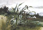
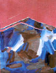
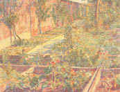
The painting is "Mr. River's Garden," by Andrew Wyeth. The landscape is a picture I took while in high school, at farm near where I lived in Ellensburg, Washington. The view is toward Menastash Canyon; from ten miles east of here on a clear day you would see Mt. Rainier in that direction. I've discovered a virtue of 72 dpi reproduction: scratches on the negative don't show. Probably taken with a red filter to enhance the clouds. |
 |
 |
| This background color is a
light blue, 240/240/250 = #F0F0FA. Better than white; could probably
be a little darker.
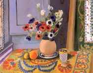
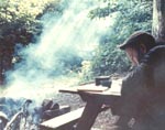
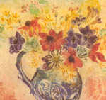
The artist calls orange, green, and violet secondaries. The painting is "Anemones," by Henri Matisse. The photograph is another self portrait, this time reading at a lean-to on the Appalachian Trail, which I have hiked from the north end at Mt. Katahdin to the Delaware Water Gap. (In short pieces, I hasten to add: two days to a week at a time.) 1967.
More camping. More on camping, from color slides. |
 |
|
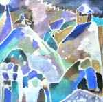
| This background color is a
cyan, 240/250/250 = #F0FAFA. I rather like it, as a hue. See below
for a slightly darker version.
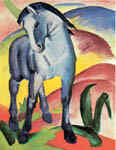
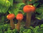
The painting is "Blue Horse," by Franz Macke. The photograph is of mushrooms on the Appalachian Trail. About 1966.
More mushroom pictures. |
 |
 |
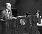
| This background color is a
light magenta, 250/240/250 = #FAF0FA. About the same level as the
blue and green above. Pick what you like.
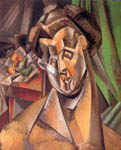
The painting is "View from the Artist's Window, Eragny," by Pissaro. The picture shows me speaking at the General Assembly of the United Nations. I have also sung from the stage of the Metropolitan Opera, and sung with Ron Carter. The catches: the UN audience was high school students, I sang two notes from the Met stage while on a backstage tour, and Ron Carter was in the orchestra when I sang with the City College Chorus. Note that one student looks bored and the other looks skeptical. |
 |
 |
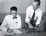
| This background color is a very
light yellow, 250/250/240 = #FAFAF0. It is only slightly off-white,
but it might be a tiny bit easier on the eyes than pure white.
The painting is a negative of "Improvisation 9," by Wassily Kandinsky, produced in Adobe Photoshop. Bill McGee (seated) and I were working on a control panel for the IBM Card Programmed Calculator (CPC). There were once 700 of them, but today not one can be found for a museum. The control panel served the function of a program in a modern computer. It had many hundreds of wires on a board about 1x2 feet. This was at General Electric's Hanford Atomic Products Operation, in 1953. Bill retired from IBM a few years ago. We keep in touch. More with computers. |
 |
 |
| This background color is a
darker pink, 250/224/224 = #FAE6E6. This is a definite possible,
depending on what other colors you have on the page and in the overall
design.
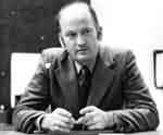
The painting is "Anemones and Chinese Vase," by Matisse. The informal portrait is of Sam Hall about 25 years ago when he was a neighbor. He does the morning news on WQXR in New York. |
 |
 |
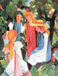
| This background color is a
darker blue, 224/224/250 = #E0E0FA. This is about as dark as you
would want to go with black text, I think. But it's usable.
The painting is "Four Girls," by August Macke. Are these two ladies sharing a secret, or are they having a civilized discussion about getting a lick off that Popsicle? (Possible answer below.) |
 |
 |
| This background color is a
darker magenta, 250/224/250 = #FAE0FA. It has the same amount of
blue as the sample just above, plus more red, so it's a little brighter. I
don't happen to like magenta, but lots of people do.
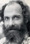
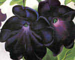
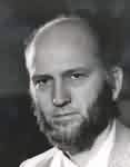
The painting is "Black and Purple Petunias," by Georgia O'Keefe. Here I am with beard but no mustache. A black beard, so it isn't recent. About 1973 I think. Self portrait. |
 |
 |
| This background color is a darker
cyan, 224/250/250 = #E0FAFA. Green on a monitor is very bright
compared with red, so this background is considerably lighter than the
pink above.
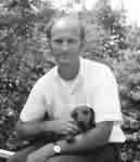
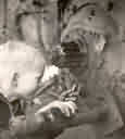
The painting is "Weimar Series, II," by Joshua Neustein. Do you think the cyan background enhances or detracts from the bold red? Here I am with neither beard nor mustache. The dog was one of four dachshunds who have been my friends over the years. About 1965? |
 |
 |
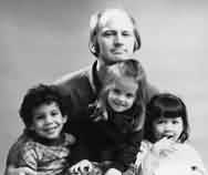
| This is either a dusty rose or
a warm gray, depending on how you look at it.224/192/192 = #E6CCCC. I
don't think I'd put a lot of text on a background this dark, but it's a
pleasant color. If you think there is enough contrast between this and the
black text, then you do have a restful background. I guess.
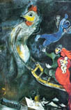
The painting is "The Flying Sleigh," by Marc Chagall. Here I am with three young friends. No beard, no mustache, but lots of hair otherwise. This was during my Flower Child phase.
|
 |
 |
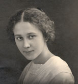
| This is a medium blue,
192/192/224 = #CCCCE6. As above, this is borderline, as to whether there
is enough contrast with the black for easy reading.
The painting is "Garden Wall," by George Morren. This is a picture of my mother as a young woman, 80+ years ago. A treasure.
More of Mother. |
 |
 |
| This is a medium cyan,
192/224/224 = #CCE6E6. With two colors contributing, including the very
bright green, this makes for easy reading. I rather like this, but as
always you would have to consider what else is going on with colors. Do
you think it works with these two graphics?
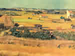
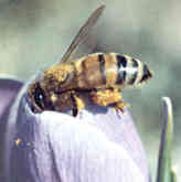
The painting is "Harvest at La Crau," by Van Gogh. I think I took the picture of the bee with a brand new Nikon that I bought in Tokyo. Quick: what is the color harmony scheme here? |
 |
 |
FINALLY here are the seven brightest colors, other than white of course, that are available to you if you want to restrict yourself to the Web safe colors available to people with 8 bit color monitors. That's a steadily decreasing fraction, but will not be near zero for a long time.
| This is the brightest Web-safe
red, 255/204/204 = #FFCCCC. Some people say not to use red
backgrounds, as they are anxiety-inducing. I don't know if that's true,
or, if so, whether is applies to a desaturated red like this.
The painting is "Public Garden, Boston," by Goodwin. The picture of me was taken in about 1968. Note: no beard, no mustache.
|
 |
 |
| This is the brightest Web safe
green, 204/255/204 = #CCFFCC.
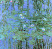
The painting is "Nymphéas Bleu," by Monet. Is it hurt or enhanced by the sickly green background? (Ahem. Personal opinion there.) The picture is of Dr. Roger Shinn, my thesis advisor at Union Theological Seminary. It was taken at a meeting of a task force that he and Margaret Mead co-chaired, on Technology and the Churches. I was one of the editors of the task force report, and this picture was printed in it. Roger does not always look this grim, at all. The fourth editor, the late J. Edward Carothers, made up the caption: "What's your source for that?" More pictures from Task Force. |
 |
 |
| This is the
brightest Web safe blue, 204/204/255 = #CCCCFF.
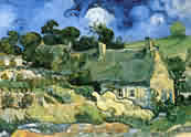
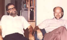
The painting is "Cottages at Cordeville, Auvers-sur-Oise," by Van Gogh. The man on the left is Paul Armer, just about my best friend even though he lives in California and I live in New York. Add up all the times I've stayed with Paul and Joan while working in the area for Intel and a company now part of Sybase, and I've probably stayed in their home for four or five months. Paul and I have been friends since the early 60s, when he was at the RAND Corporation in Santa Monica, CA. Paul was on the executive committee of Computer Professionals Against the ABM. We also worked together on electronic funds transfer. |
 |
 |
| This is the brightest Web safe
cyan, 204/255/255 = #CCFFFF. With the (bright) green as a component,
it is much lighter than most of the others, except for yellow.
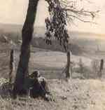
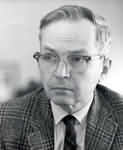
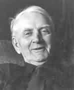
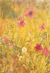
The painting is "Forsythia and Anemones," by Cheeseborough. My Dad hated to have his picture taken. Out of the view of the camera, he's trying to stick his foot in front of the lens. It's the best picture I have of him, by far. He was about 80. Natural light only; taken with a Nikon FTn; probably 85mm lens.
Dad's father's farm. More family. |
 |
 |
| This is the brightest Web safe
magenta, 255/204/255 = #FFCCFF.
The painting is "Woman with Pears (Fernande)," by Picasso. Also the artist's conception of the look on my face in the photo below. A publicity shot taken by a professional photographer. In 1969 and 70 I went on nationwide tours, opposing the Safeguard Antiballistic Missile Systems on technical and public policy grounds. I hired a PR guy, who used this photo and a kit he put together, to get me newspaper, radio, and TV interviews. |
 |
 |
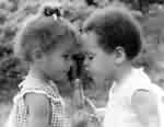
| This is the brightest Web safe
yellow, 255/255/204 = #FFFFCC. It is the color used on the UPS
tracking page.
The painting is "Forsythia and Anemones," by Cheeseborough.. The winner in the Great Popsicle Debate. |
 |
 |
| This is the brightest Web safe gray,
204/204/204 = #CCCCCC.
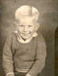
Early days. I was four or five in these pictures, when I was called "Danny." In the one on the right I'm peering into the drive mechanism of a Caterpillar tractor. I have a vague memory that the grease had a very satisfying feel. This was in my mechanical engineering phase, before I was subverted into computer science. Very blond hair; no beard, no mustache. |
 |
 |
Finally (did I say that?) here are two examples of black text on textured backgrounds.
| The
background for this text was produced using a paint program. Set up a
16x16 bitmap, blow it up as large as you can, so that you can color
individual pixels, then put down 256 pixels of a few colors. Do them
randomly if you can, but that's harder than it sounds. Patterns will
usually appear. Maybe that's OK.
You can go to larger bitmaps, of course. You then convert the bitmaps to GIF, using an adaptive palette and as few colors as possible, typically 8. Now specify that this GIF file be used to tile the background, meaning that the one pattern will be repeated - horizontally and vertically - as many times as needed to fill the component, in this case a table cell. |
| This background was produced "randomly" by the author; note that a pattern appears. |
| The
background for this text was produced using a paint program. Set up a
16x16 bitmap, blow it up as large as you can, so that you can color
individual pixels, then put down 256 pixels of a few colors. Do them
randomly if you can, but that's harder than it sounds. Patters will
usually appear. Maybe that's OK.
You can go to larger bitmaps, of course. You then convert the bitmaps to GIF, using an adaptive palette and as few colors as possible, typically 8. Now specify that this GIF file be used to tile the background, meaning that the one pattern will be repeated - horizontally and vertically - as many times as needed to fill the component, in this case a table cell. |
| A variation of the above, created by using lighter-colored pixels. |
| The background for this text was produced using a paint
program. Set up a 16x16 bitmap, blow it up as large as you can, so that
you can color individual pixels, then put down 256 pixels of a few colors.
Do them randomly if you can, but that's harder than it sounds. Patters
will usually appear. Maybe that's OK.
You can go to larger bitmaps, of course. You then convert the bitmaps to GIF, using an adaptive palette and as few colors as possible, typically 8. Now specify that this GIF file be used to tile the background, meaning that the one pattern will be repeated - horizontally and vertically - as many times as needed to fill the component, in this case a table cell. |
| This background was created by taking a screen shot of
the background of Adobe PhotoDeluxe Business Edition. The 16x16 pixel
section I chose was evidently such as to create borders around each copy
of the screenshot. Experimentation could fix that.
As used by Adobe in this product, text is never shown over this background, which is a little too dark for the purpose. You could modify it in a bitmap editor. It is not clear that a background pattern can be copyrighted, so the Web provides you a rich source of backgrounds for your text. The GIF file that produces this background is 163 bytes, so there is
essentially no download penalty. |
|
HOME | USER-CENTERED
DESIGN | COLOR | TYPOGRAPHY
| |