The above iterations also did not address the problem from a proper perspective. The approach created a model of user understanding and interaction from a syntactic, or system dependent[1], [5] point of view rather than a semantic, or system independent[1],[5], perspective.
From a cursory glance at the problem of supporting two user groups, the problem appeared to be merely syntactic whereas it is really semantic. A semantic perspective resembles the user model of the tasks more successfully than a syntactic approach does. The use of the user's description of their work resulted a task model that defined the model of the interface. This approach seemed more appropriate to guide the users in their activities. Marcos Sanz discusses the use of a task model to generate a graphical user interface in his work entitled "Task Model for Graphical User Interface Development" [5]. Coutaz Bass and May Byerley also discuss the use of task models in a user interface in their work [1],[2].
The above iterations enforced a redefinition of the problem at hand. Rather than focusing on the distinction between the two different user groups and the way that distinction reflects on the system tasks, the overall goal emerged as the need to guide the novice user through the complex set of tasks needed to acquire data quickly and effectively. A desire to return to this goal of task simplification and guidance led to a reexamination of the data acquired from the users.
First, two outlines were created. One was extracted from users' descriptions of their work and their priorities while at a beamline. The other came from the operators descriptions of work with the beamline, software, and the experimenters. Interviews with operators indicated that while experimenters felt that they needed a knowledge of the underpinnings of the beamline system to make it work, this false impression actually led them to harm the experiment by attempting adjustments that they were not equipped to make. Ironically, in interviews with experimenters away from the beamline hardware, some stated that such knowledge was not necessary. One user even compared the system to using a computer operating system: she does not know how and why an operating system works, but just that it does what she needs and that is all that is required by her. They did not need to know how the beamline hardware works, just that it does. This finding seems to support the idea that experimenters value the semantic knowledge of their experiments and they tried to control beamline hardware only when under the extreme pressure to complete an experiment. When asked to reflect on the most important steps of an experiment, none of them mentioned knowledge of the beamline hardware as a priority. When the two outlines were compared, the experimenter's point of view emerged clearly and the resulting outline based on a system independent view seemed more suitable to guide the design of the interface and satisfy the needs of the user. This brought the design closer to the original motivation of addressing what the end-users do and how they do it [6]
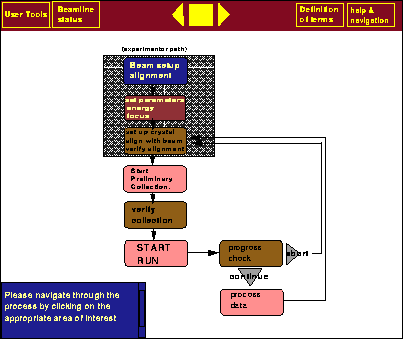
Figure: Task flow outline screen for the experimenter.
After verifying the distilled outline with a group of experimenters, it was incorporated into the interface as a task flow outline. In essence this latest iteration incorporates the participation of users in design to create more effective tools[6]. This interface not only presents the users with options, but also presents them with an overall image of the experiment in order to support a mental model [4] of the process.
A sketch of possible user interaction is as follows.
Once logged in, a user would be presented with a screen such as figure  . This screen is basically a
graphical
representation of the flow of processes that the user can expect to navigate through. Users activate
the stage of the experiment they need with mouse button controls. The top bar would
consistently contain the help and information access and the middle icon would serve to progress the user linearly
through the outline without returning to the main navigational screen-a feature for those who become more
adept with the system-or return to the navigational task flow outline. The lower left-hand corner contains
a scrolling feedback window that would be used to inform users of interaction guidelines and screen functionality.
A larger highlight box will surround
the general area of the outline and indicate where the user is and what the next tasks may be. Arrows indicate
the flow of progress and also indicate branching where more than one task may be executed at one time. This
is due to the fact that once users are finished with a crystal sample, they may begin experiments on another
one while performing on-line data analysis. This design would also help train the experimenter in the way the
software systems on the beamline work.
. This screen is basically a
graphical
representation of the flow of processes that the user can expect to navigate through. Users activate
the stage of the experiment they need with mouse button controls. The top bar would
consistently contain the help and information access and the middle icon would serve to progress the user linearly
through the outline without returning to the main navigational screen-a feature for those who become more
adept with the system-or return to the navigational task flow outline. The lower left-hand corner contains
a scrolling feedback window that would be used to inform users of interaction guidelines and screen functionality.
A larger highlight box will surround
the general area of the outline and indicate where the user is and what the next tasks may be. Arrows indicate
the flow of progress and also indicate branching where more than one task may be executed at one time. This
is due to the fact that once users are finished with a crystal sample, they may begin experiments on another
one while performing on-line data analysis. This design would also help train the experimenter in the way the
software systems on the beamline work.
The issue of the divided user population would be handled with an entirely separate task flow screen for the
operators. This screen would not be as detailed as the experimenter screen yet would contain key points to
access the beamline software. This screen is illustrated in figure .
Here, the task outline is more brief, yet affords operators navigation throughout the entire system.
In addition, the screen maintains enough similarity in look and terminology to the experimenter screen to allow the operators ease of access
to the appropriate points in the process so that they can help the experimenters.
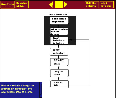
Figure: Task flow outline screen for the operator.
Certification is much more important than making the user understand the entire underlying processes of the system. When an experimenter arrives at a point that requires the intervention an operator, the interface would alert her or him of this with a message. These parameters that require operator access are indicated with certification boxes. At this point, an operator can verify calibrations and type in certification to allow users to continue with an experiment.
When asked to respond to design sketches of all three iterations, users preferred the third iteration to the first two. They stated that the screen was much easier to interpret and navigate through than the other two. Further formal testing on more detailed design prototypes will be conducted before further changes made. Since the outline was reviewed favorably by some of the users, it is expected that the design should also generally be approved. Since users may be expecting a certain standard in the use of windows and menus, for example, the file menu located in the top left hand corner, the graphic design may not meet some expectations. However, the method of essentially allowing the user to define the path will hopefully bridge the knowledge gap for the experimenter in approaching the new control system.