
UIC/EVL Receives Honorable Mention in IEEE VIS 2016’s VGTC VPG Data Visualization Contest
October 24th, 2016
Categories: Applications, Visualization, Visual Analytics, Visual Informatics
About
While most academic conferences attract people who want to learn, the annual IEEE Visualization (VIS) conference attracts people who want to be challenged. Throughout the year, the conference sponsors several contests - to encourage the best visualizations and designs of complex datasets. Awards and recognition are announced at the annual conference, which is taking place this week in Baltimore, Maryland.
Faculty and students of the Electronic Visualization Laboratory (EVL) at the University of Illinois at Chicago were surprised and elated to learn they won Honorable Mention in the IEEE Visualization and Graphics Technical Committee’s (VGTC) third International Data Visualization Contest, organized by the IEEE Visualization Pioneers Group (VPG). This year, the contest was done in collaboration with ACT, Inc., the company that administers the standardized test for college readiness assessment.
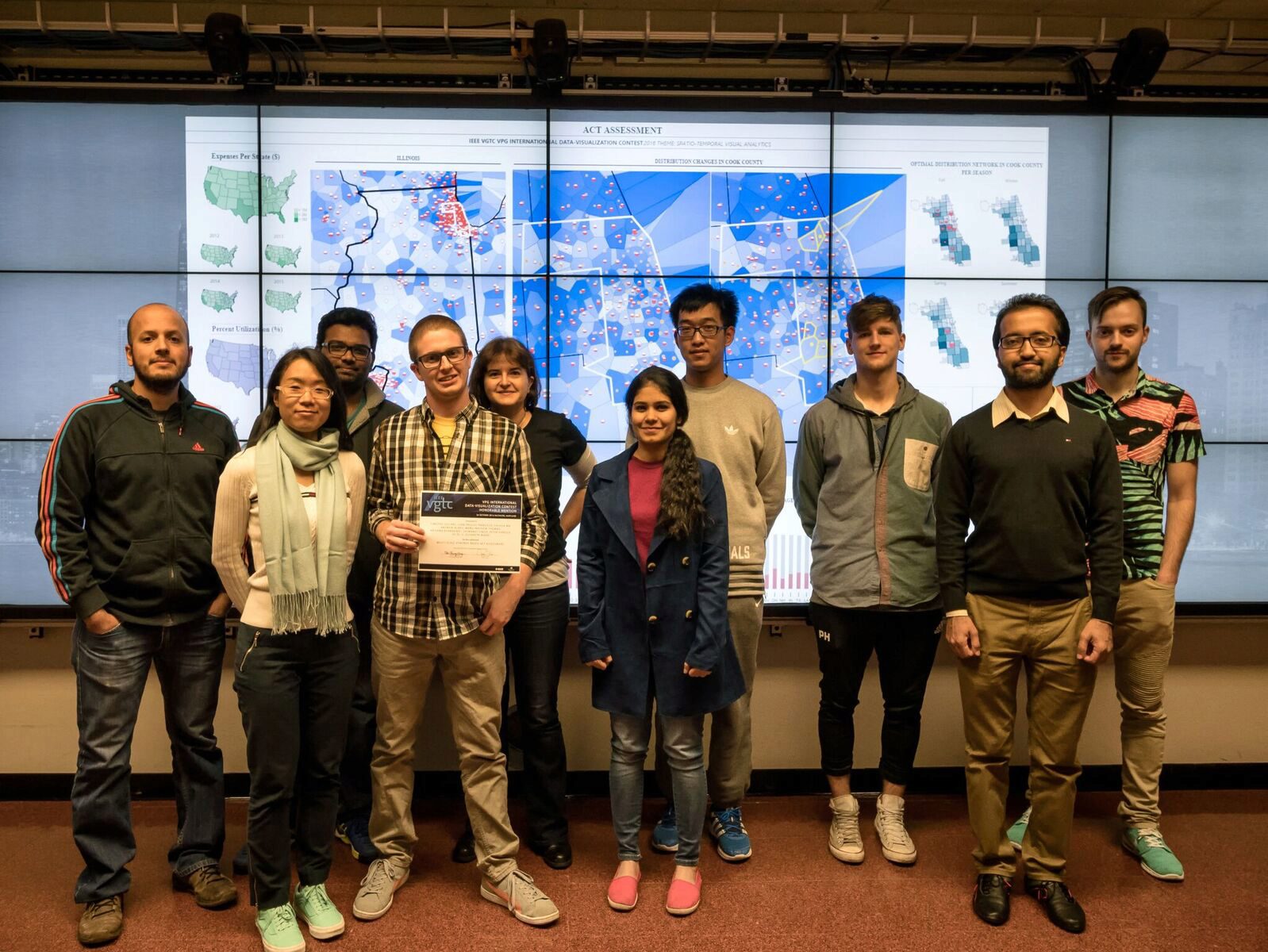
Early in the Fall 2016 semester, UIC Computer Science (CS) associate professor G. Elisabeta Marai gave students in her CS 526 Interactive Scientific Visualization course a design assignment based on the IEEE VGTC VPG Data Visualization Contest. The students - including Timothy Luciani, Juan Trelles Trabucco, Chihua Ma, Andrew Burks, Manu Thomas, Krishna Bharadwaj, Shiwangi Singh, Peter Hanula, and Lei Di - spent several weeks designing, implementing, and integrating pieces for a group submission to the contest. Serendipitously, their visualization effort, called “Multi-Scale Voronoi-Based ACT Assessment” was recognized as one of the winning entries by the judges. The group was honored at the VPG Reception at VIS 2016.
ACT operates nearly 9,000 testing centers annually to deliver the ACT Assessment test to over two million high school students on six different Saturdays each year as part of its open, “National” program. Use of the test data by schools and government agencies has grown significantly in recent years, and is increasing the demands on the ACT network and test seat availability. Thus, ACT seeks to use data it collects to better manage its system and its operating costs.
The 2016 challenge was to develop a static visual representation that shows how geographic and seasonal changes in the availability of the ACT test affects nearby or adjacent testing sites, by moving students or assessments, changing dates, or some other strategy. For example, how does the addition or subtraction of a testing center affect demand in neighboring zip codes, or what is the optimal test center network in a particular season?
The students who worked on the winning entry are UIC CS PhD, MS and BS students, many of whom have EVL Research Assistantships or Research Experiences for Undergraduate (REU) support.
IEEE VGTC VPG third International Data Visualization Contest information.
# # # # # #
IMAGE CAPTION AND CREDITS
TOP LEFT: Choropleth maps showing national-level costs and utilization. The large green map shows aggregate expenses (2012-2015). California, Texas, and Florida have the three highest expenses. The small multiple below shows the expense distribution per year (no significant variation). The purple maps show, similarly, the percent utilization (Assigned/Capacity), and a reasonably fair distribution nationwide.
BOTTOM: Average bar charts. Two bar charts display the average expenses and utilization per state (2012-2015). The charts provide a quantitative comparison across states and complement the choropleths.
TOP MIDDLE: Voronoi visualization of test center distribution at regional level (Illinois). Voronoi diagrams partition the region based on distances to test centers. The Voronoi cell intensity is mapped to Assigned/Capacity. The darker the cell, the higher demand in that region. The partially filled red circle in each cell double-encodes utilization. Circle size encodes the Center capacity, and the filled area shows the assigned number. Orange markers show population sizes per Zipcode. The region with the most test centers in Illinois is the greater Chicago area.K
TOP MID-RIGHT: Side-by-side Voronoi analysis of center addition (Cook County). Two side-by-side Voronoi maps show county-level changes before and after the addition of two new test centers (yellow). The saturation of cells with a yellow boundary captures the effect over nearby centers. Lighter Voronoi cells in the South Side of Chicago indicate lower participation in those neighborhoods.
TOP RIGHT: Seasonal Optimized Network. Four maps show seasonal population density per Zipcode (Chicago region). Partially filled red glyphs encode Centers and show the Assigned/Capacity per season. The Center network shown is a custom optimized network in which under-utilized Centers were iteratively removed and the nearest Center capacity was increased. Summer and Fall are popular in Chicago, and have dense Center networks.