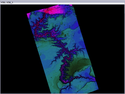
This project was a pretty simple introduction to scientific
visualization for me. We had a nice hieght map and color map of
part of the Grand Canyon, and we were told to visualize the data.
This was my first experience with VTK.
One cool thing I did was to allow users to have HSV values beyond the
normal range of values. That produced the pretty picture above,
which I guess my professor liked, since he used it in his course
webpage.
This was my first experience in volume visualization. Here we
worked with a downsampled version of the Visible Woman dataset from the
NIH.
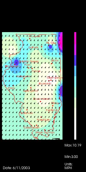
This was an interesting project. I tried to gather data from
neighboring states so that way I can get some data beyond the Illinois
borders. Doing that would have allowed me to do simple
interpolation and not worry about extrapolating the data beyond the
weather stations withing the borders. Unfortunately, the data
from neighboring states was formatted in a very different manner, and I
didn't have enough time to write parsers for each of the different
formats.
The funniest thing I found out after doing this project was that the
color guage was already built into VTK, where as I did it by
hand. While not as pretty as VTK's, I was still proud of the fact
that I did it by hand using other VTK components. I was also
happy to see my professor use one of my screen captures in his course
webpage the following year.